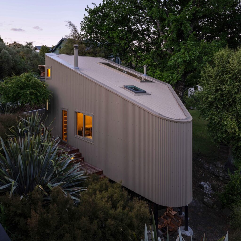
This home on Auckland’s North Shore is three levels of unapologetically bold architecture. Love it or hate it, it’s built to make a statement
The unique footprint of this Auckland home pushes architectural boundaries
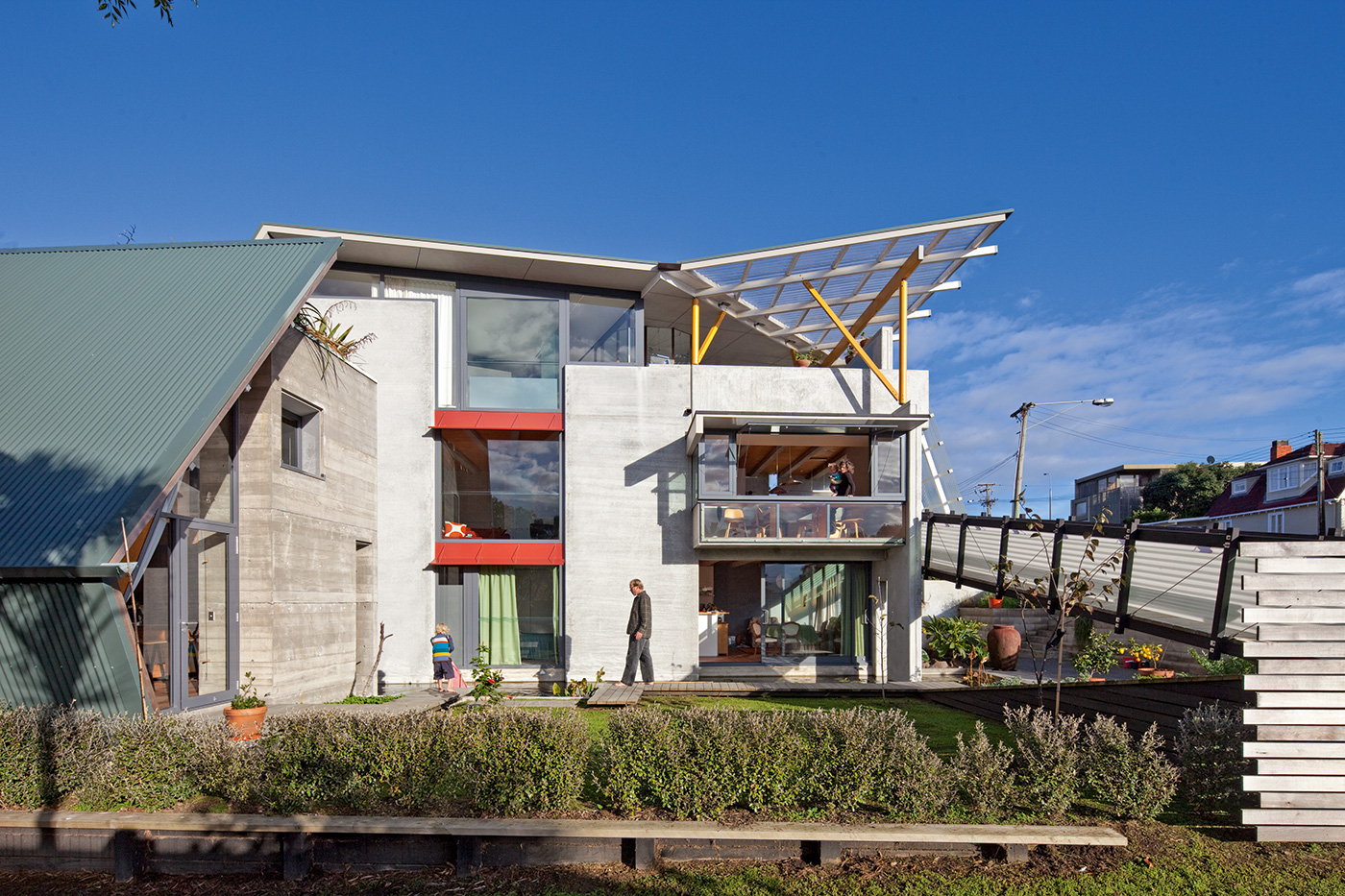
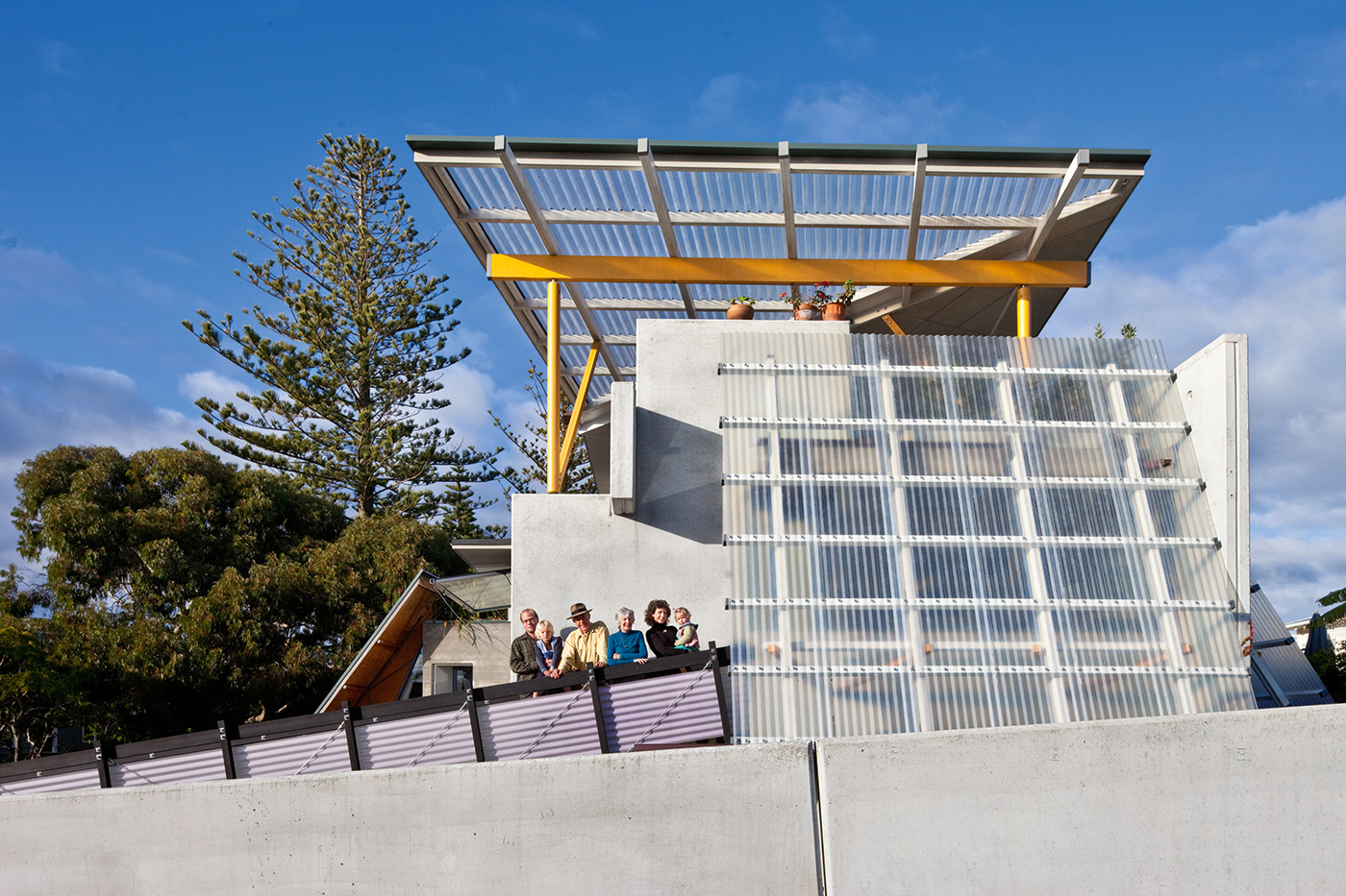
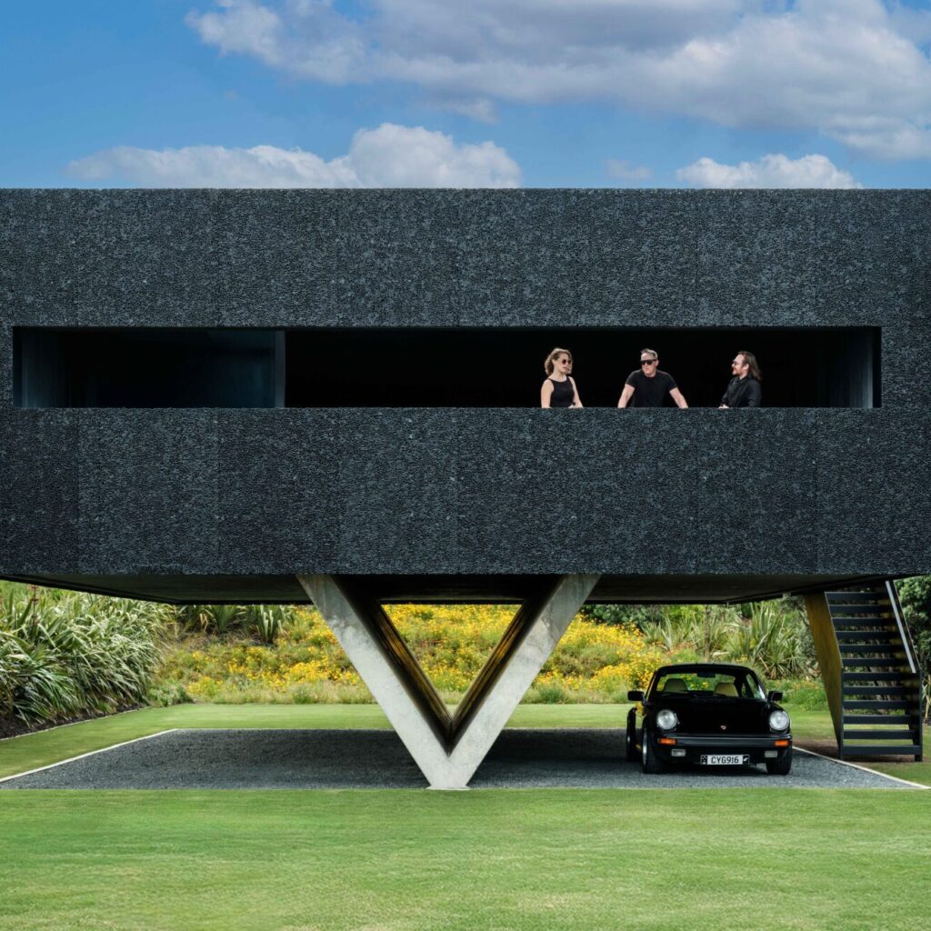
Let’s be clear about this: David Mitchell doesn’t care if you like his house or not. It’s a structure he designed with his partner Julie Stout that makes passersby stop, stare and often argue. It looms over a prominent corner near Narrow Neck Beach on Auckland’s North Shore, a three-storey cacophony of hefty concrete panels, bursts of bright colour, and corrugated plastic sheets that appear to be threatening to blow away in the breeze.
The discussion its unusual form provokes in the street is, to its owners, a good thing – to their minds, any discussion of architecture is – but they couldn’t care less about any judgements that result. “I’m not really concerned about whether people like it or not,” David says, “because there are a lot of their houses that I don’t like.”
It may be a design that they created themselves, but to David and Julie, their house has a unique personality with which they will continue to be acquainted. “There’s a point where every building takes on a life of its own, and you have to obey it – it’s like riding an unbroken horse,” David says. Adds Julie: “We didn’t want to do a timid building. If we couldn’t have pushed ourselves outside our comfort zone, then we would have felt that we were failing ourselves.”
Before this, their comfort zone was a house in the Auckland suburb of Freemans Bay that they had designed in 1990, a structure many considered architectural perfection: charmingly petite and made of timber, it had just two bedrooms and a magical outdoor room with a view of the city. After many happy years there, however, a yearning for a new personal project took hold.
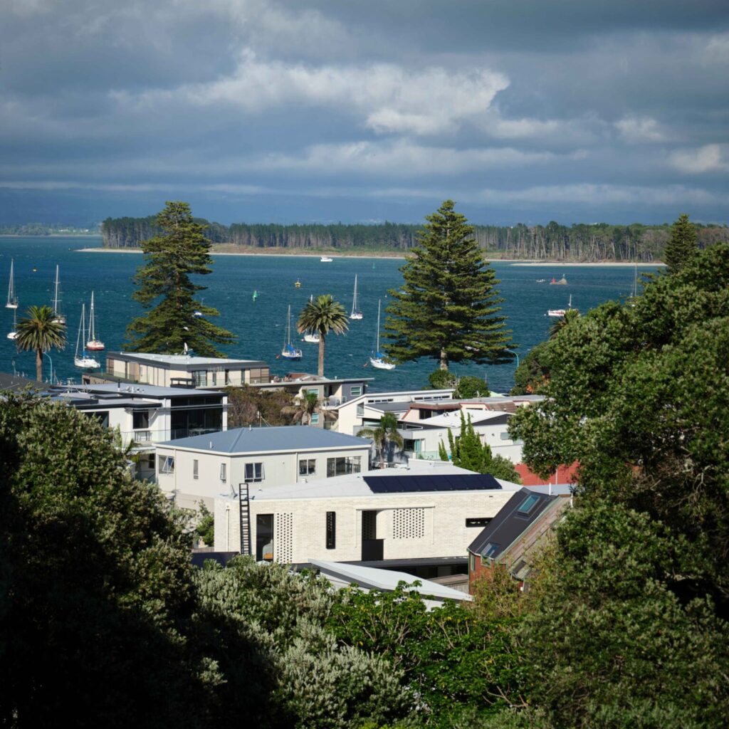
David’s son Julian, an architect who worked closely with the couple on the design of their new home (and built the old one), had moved to the North Shore and raved about his beach-oriented lifestyle there. The location continued to work its magic as they designed a house for a friend just up the road from the site on which their new residence is now located. By the time the site came up for sale, “the thought of being by the beach and waking up to sunrise over Rangitoto every morning was irresistible”, Julie says.
Another factor behind the move was that Julie’s mother Rhonda was moving up from the Manawatu to live with them, so a bigger house was needed to accommodate her as well as visiting grandchildren. “It was about having a bigger family scene, a rough kind of house with the beach, sand and water,” Julie says. The question of what to build on the site was not resolved in an inspirational flash, but through many months of collaborative to-ing and fro-ing in the office.
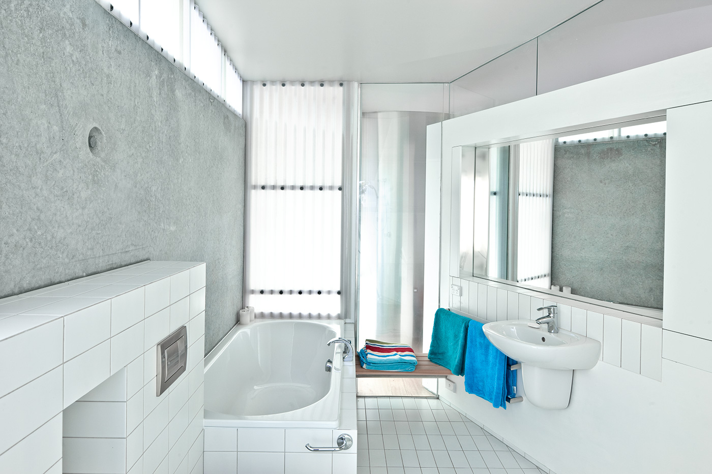
Almost every step of the design process was fuelled by a determination to do things differently. David and Julie had long been entranced by the warmth and textural beauty of timber, so the boundary-pushing ethos of this house demanded they shun wood in favour of insulated, pre-cast concrete panels, a nod to the architectural language of the North Shore’s concrete gun emplacements.
Far from sitting lightly on the land like their previous abode, the enormous concrete slabs were embedded in it. The couple planted creeper that blurs the boundaries between the land and the imposing structure that has been built upon it.
Much of the design process, David says, was “about letting the house be what it wanted to be”, allowing it to take shape according to the function of its rooms, its owners’ needs, and the constraints and potential of the site.
Rather than fashioning an architectural object that was conventionally beautiful from the outside, they wanted something that worked inside first – form following function, to some extent. In a fit of contrarianism in the early stages of the design, David muttered darkly in a magazine interview that he wanted to design a house by the sea with no sun and no views, as if to protest New Zealanders’ obsession with these things.
“You’re always battling the view in architecture,” he says now. “Architecture is diminished by too good a view, but clients can usually only see the view – it’s the architect who’s trying to see the house. Any view they lose, they feel as if it’s been stolen.”
In this case, there wasn’t a client to worry about, but the battle with the view was still far from over. After moving about the site in a cherry picker before design work began in earnest, it was agreed that the view was indeed too good to ignore, so in the end – despite David’s early resistance to being enslaved by the view – the house went to great lengths to accommodate it.
Out in the harbour, Rangitoto sits at a 22.5-degree angle to the front of the house, a volcanic object “so perfect and riveting,” David says, “it’s not something you can take for granted.” They eventually decided to pitch parts of the house and its central stairway to point straight at Rangitoto, a decision that David says “is a critical part of the anatomy of the building” but also “led to all sorts of bloody awkwardness” in accommodating this unusual angle.
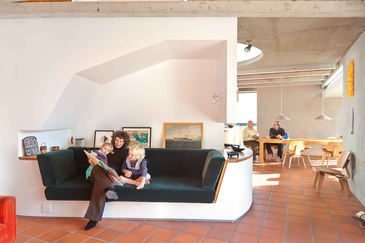
Awkward is an unfairly harsh description; another way to put it is that the house feels as if it works according to its own unique and unpredictable logic. Unconstrained by convention, it asks questions about the design habits we’ve fallen into, but doesn’t presume to provide all the answers. You might initially wander through the house thinking “why?” but soon find yourself thinking “why not?”.
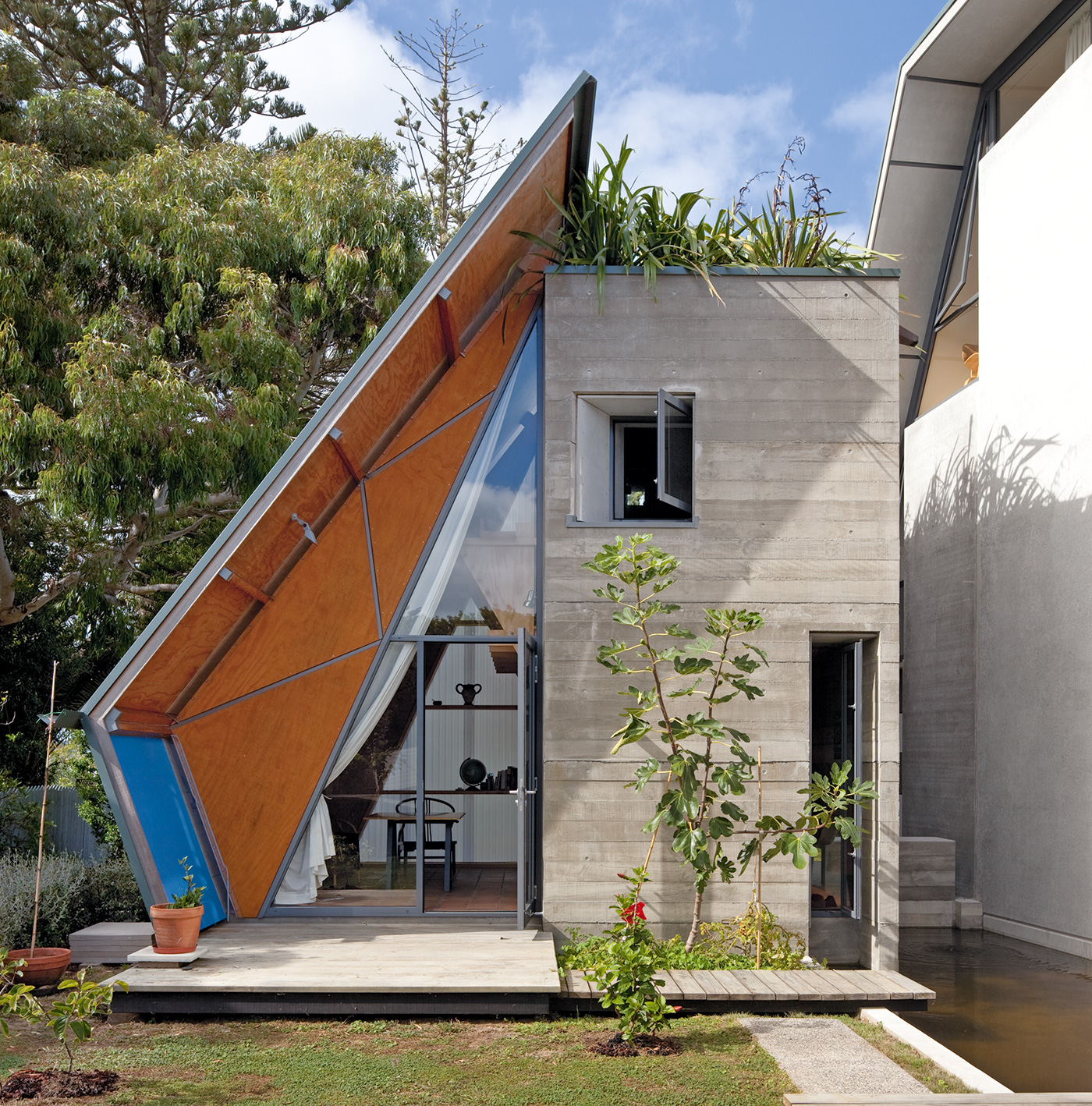
The separate studio, a riff on the notion of the 19th-century English garden folly, has a roof that looks as if it has slid off and allowed flax to flourish like an unkempt hairdo where it once stood; this roof garden, it turns out, makes for a much better outlook from the third-floor bedroom window than a sheet of corrugated iron, and has the bonus of being a popular hangout for local tui.
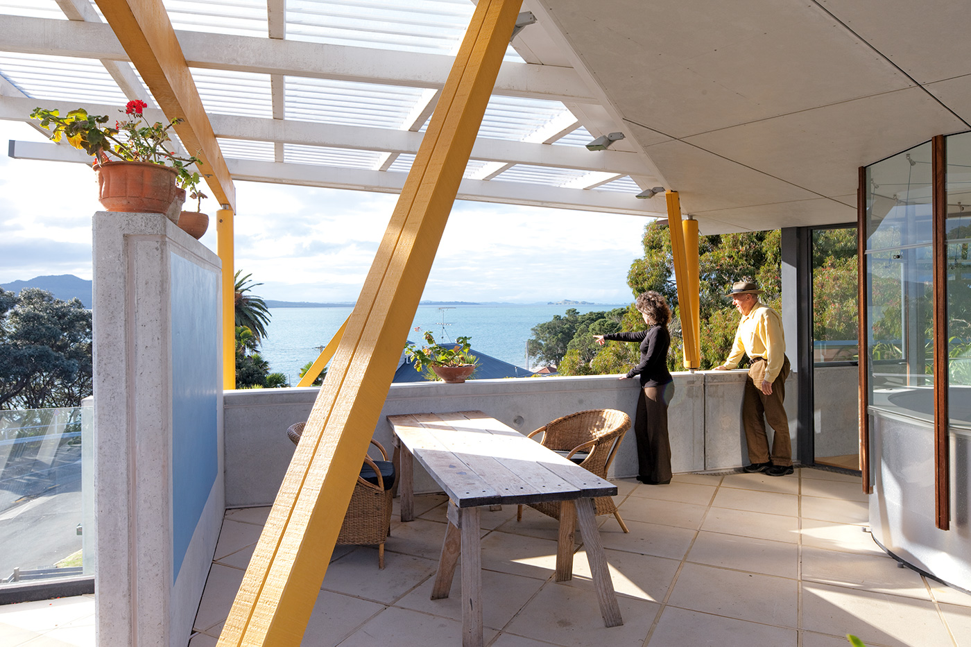
The main outdoor living space, a covered terrace on the top floor where Julie says “you’re literally in the view”, is not directly connected to the living area as convention would demand, but up the stairs from it instead, leading to great initial concern on the architects’ part that it wouldn’t be sufficiently utilised; in fact, they spent most of last summer up there.
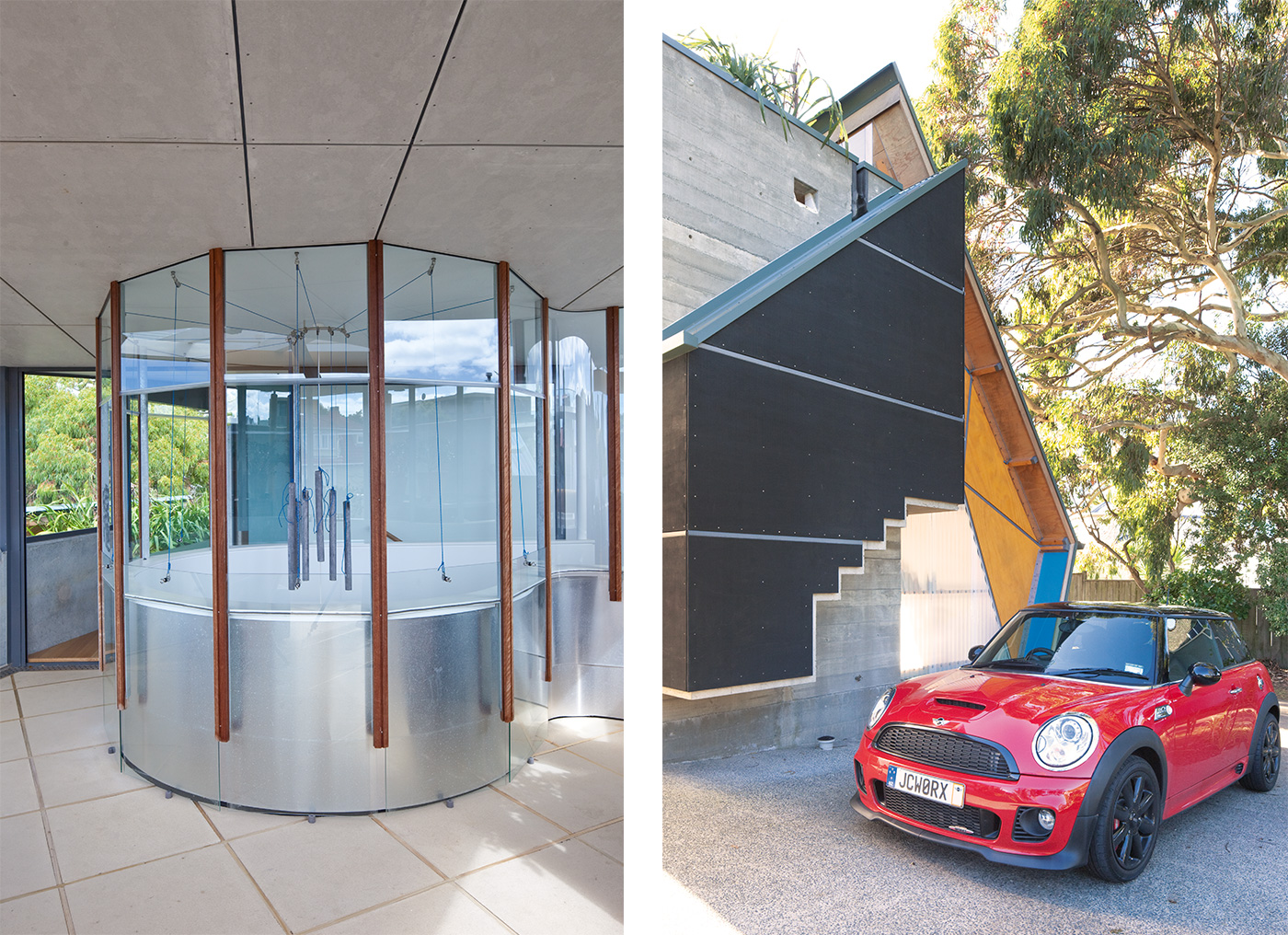
Out the back, at the bottom of the huge corrugated polycarbonate sheet above the home’s main entrance, another polycarbonate sheet has been fashioned into a rudimentary gutter; it initially looks as if the budget didn’t extend to proper guttering, but during rainstorms this improvised half-pipe becomes a thrilling channel that shoots gushes of water towards the tank.
These are small moments, but they add up to a larger challenge to convention, a suggestion that even the smallest details should be scrutinised for lapses into cliché or dumb convenience. This is not a residence that aspires to provide a neutral backdrop for living, but one that feels like an active participant in the process. “We had to do something different,” David says. “You can’t just repeat patterns.”
Early this year Julie and David opened the house as part of a community-group fundraising tour of homes in the neighbourhood. Julian came along to watch the visitors’ reactions. Many of them were local residents who had previously stopped outside, stared and wondered what was going on inside this mad-looking structure.
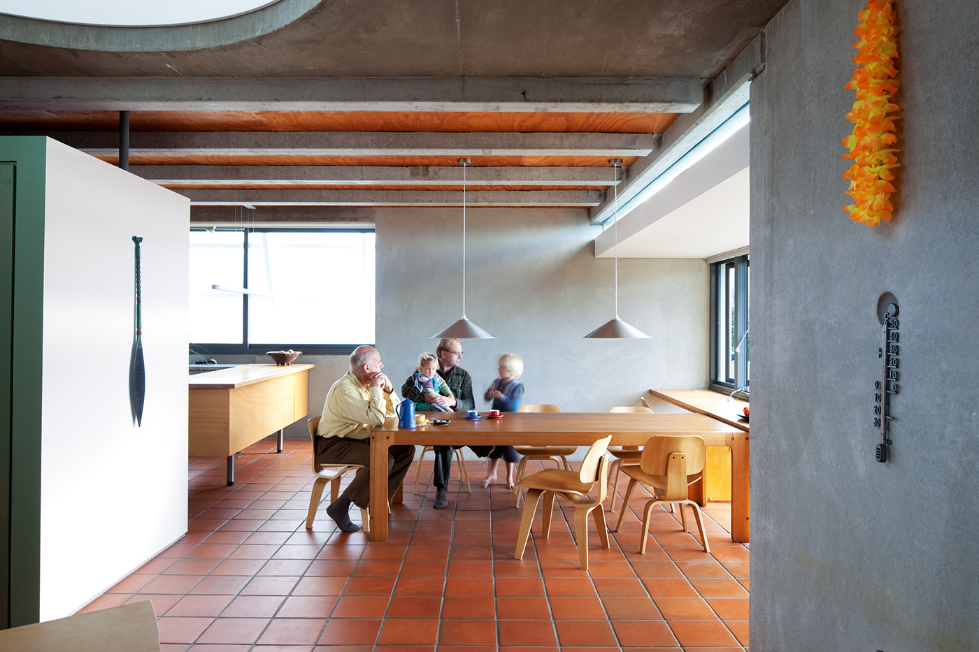
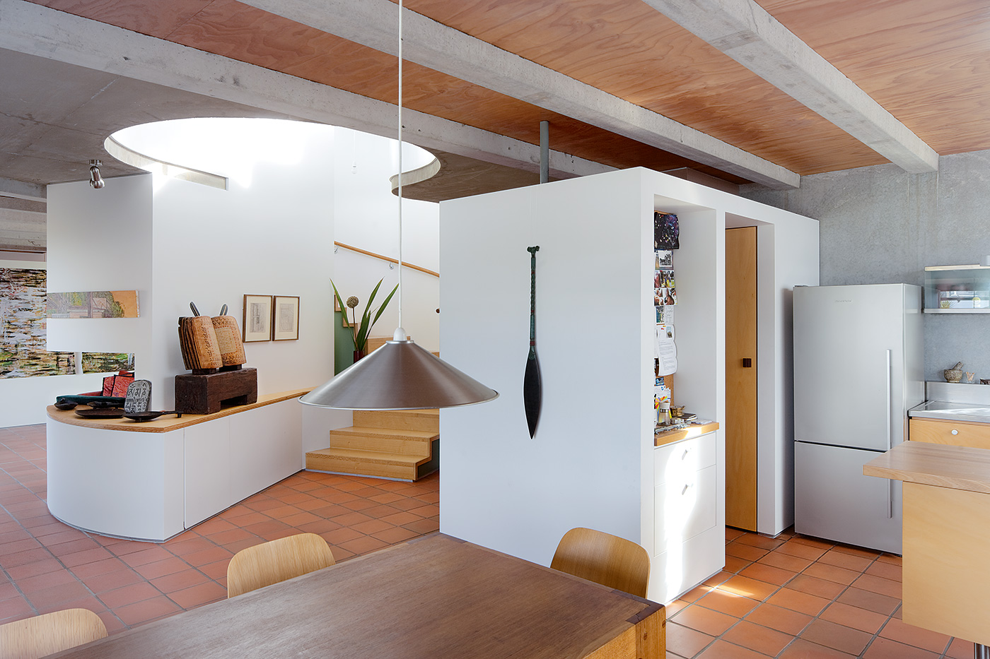
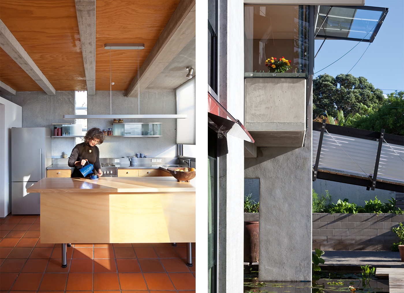
Once they finally had the chance to find out, some of them were strangely disappointed. “It wasn’t as looney as they feared,” Julian says. “There’s actually a dining room and a kitchen and things they understand.” So the strangest house in the area turns out to be liveable after all. Whether the visitors actually liked it or not is a question its architects are delighted for them to keep deliberating.
Q&A with David Mitchell and Julie Stout
HOME You already had a really good house you’d designed yourselves. What made you want a different one?
Julie Stout You have to think about where you want to be in 10 years, and the thought of being by the beach and waking up to sunrise over Rangitoto every morning was rather pleasant. Plus, my mother was coming to live with us so we needed a bit more space.
David Mitchell There had to be a desire to do something more than live in Heke Street [their old house] and rot. We had to do something different.
HOME It’s a house that has attracted a lot of attention from passersby. Were you interested in their reactions? Did you want them to like the place?
David Mitchell People used to have arguments with each other on the street about what was going on. But I’m not really concerned about whether people like it or not, because there are a lot of their houses I don’t like.
Julie Stout We would get crowds of schoolkids looking. They were intrigued – it’s terrific when people respond like that.
Photography by: Patrick Reynolds. Words by: Jeremy Hansen.
[related_articles post1=”2315″ post2=”68665″]
