Cooper and Company’s transformation of the Britomart precinct in Auckland’s waterfront was a game-changer not just for the City of Sails but as a wider-reaching example of respectful and forward-thinking urban regeneration.
The 5 Green Star–rated Hotel Britomart, set within the former Britomart Country Club, is a very fitting gem in this particular crown. As much of its work within the precinct, Cheshire Architects created a structure that blends well with the highly urbane retail and heritage warehouse texture of the area.
“The hotel is small,” says Dajiang Tai, lead designer for the project, “so it is natural that there wouldn’t be swimming pools and restaurants and gyms … but if you zoom out and treat the entire Britomart as part of the hotel … then the hospitality experience starts as soon as you step into the precinct rather than just into the lobby.”
The first thing one notices is that the building is clad in handmade bricks that somewhat echo the nearby, heritage material palette but with a modern, light colouration and more streamlined proportions so as to hint at something quite rare happening design wise.
There is much to be said about the laneway created by the hotel but in brief: it is a sort of deconstructed, porous block of hospitality venues — kingi, Cafe Hanoi, and others still to come — that connect Customs and Galway streets and intermingle and recede to allow pedestrian flows between them.
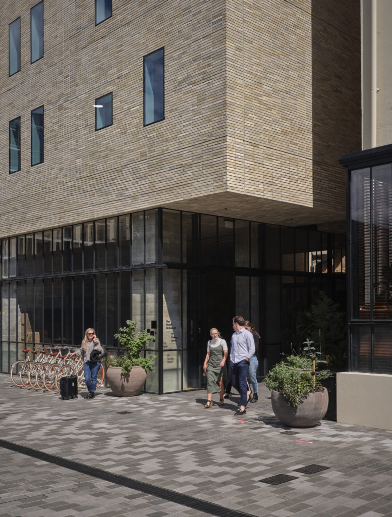
The windows are unevenly placed and of varying sizes, alluding perhaps to Le Corbusier’s Ronchamp chapel — the frames flush against the facade rather than imploding. The building seems to have an inherent heaviness yet it cantilevers above the ground floor where a pavilion glass box forms the lobby. This juxtaposition of permanence and lightness, openness and privacy adds sculpture, movement, and intrigue.
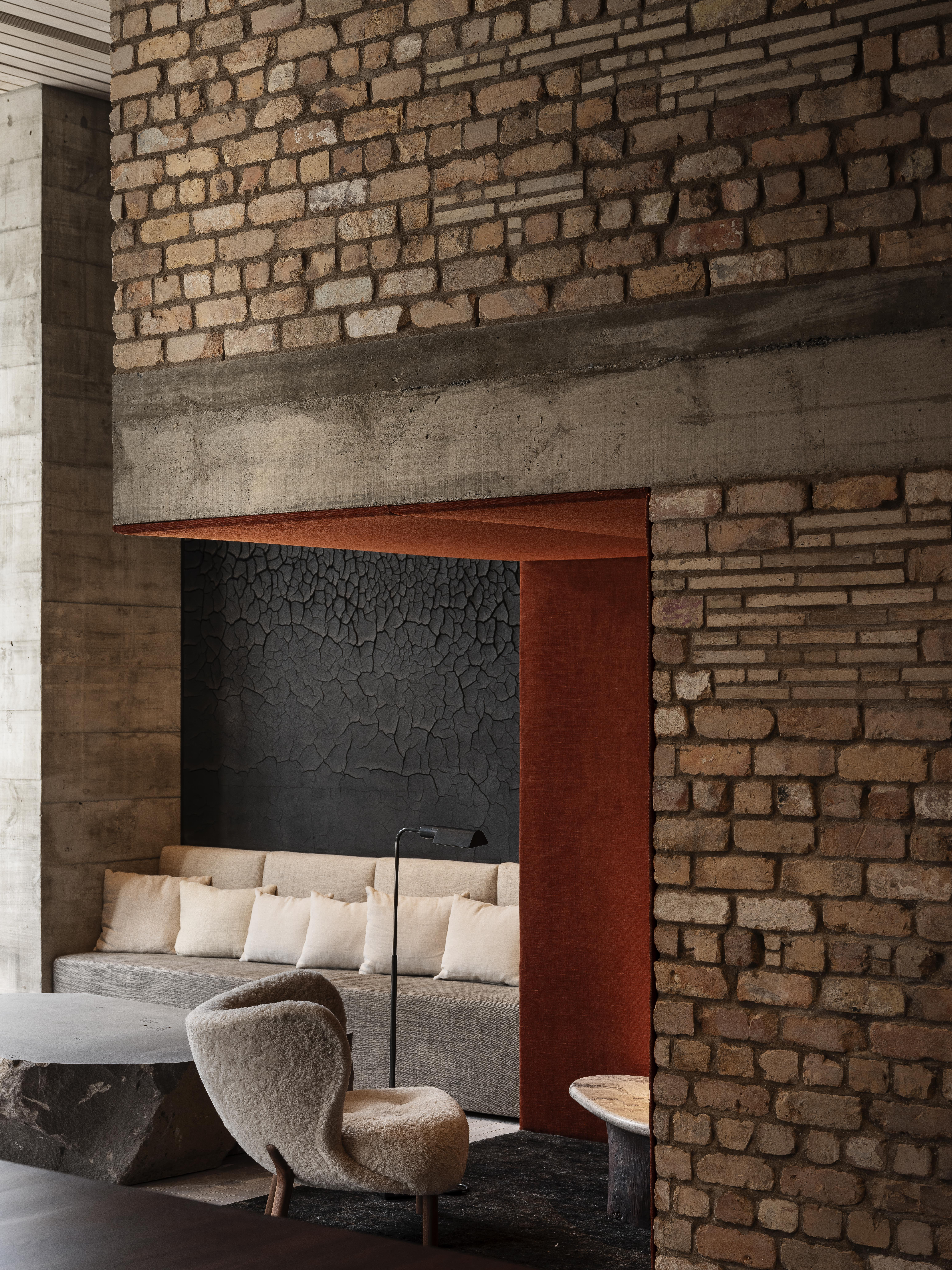
The lobby itself is a careful symphony of materials that emulate and develop, in varying degrees, some of Cheshire’s hospitality DNA: Tara Iti clubhouse’s neutral tones, Pilkingtons’ curated excess, Tantalus Estate with its chandeliers and twigs.
We see: burlap, exposed concrete pillars, a window bench made out of salvaged timber beams, glass and steel, a raw boulder forming a coffee table, bluestone pavers that spill from the sidewalk into the lobby and then smoothly transition into coarse carpet. The level of customisation and attention given to every touchpoint here is impressive, yet it is something as basic as door handles which bring home the fact that this interior is personal, a labour of love of sorts for a massive number of stakeholders.
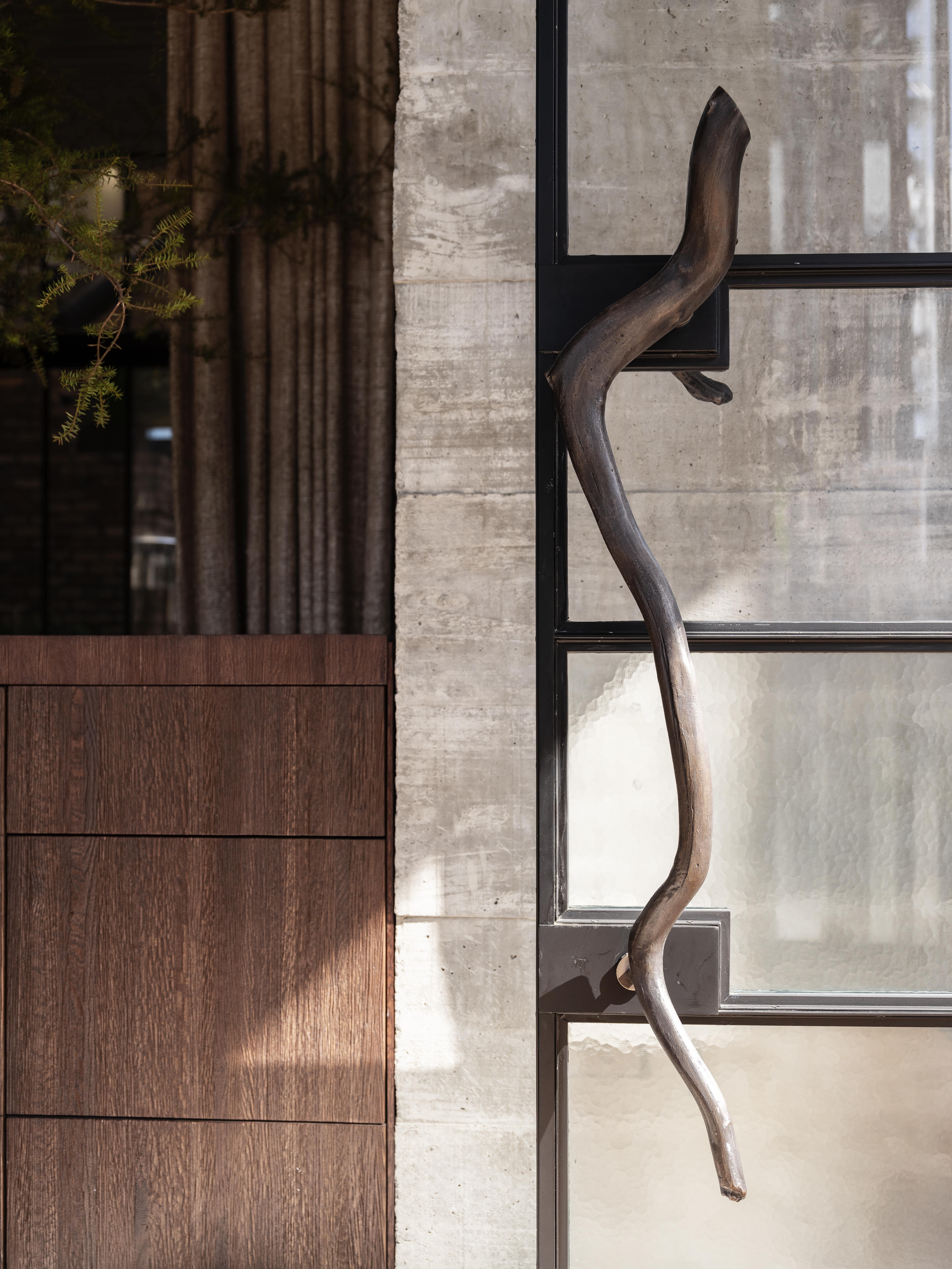
Some originated in Dajiang’s own home garden as cut-offs from one of his trees; others as pieces of driftwood he found on walks along Tamaki Drive. The pieces were then cast in bronze at a foundry in West Auckland and carted back for best positioning throughout the hotel.
This is the best aspect of the hotel: it feels as though every bit of design has been personalised, customised, and placed there as an embodiment of customer service and a human touch.
Could one speak about an overarching narrative in this interior? Possibly — but, like the best pieces of literature, that is best left to the ‘reader’ to decide.
