Four mid-century enthusiasts resurrect an original design by Allan Mitchener
Q&A with Matt Arnold, of Sons & Co, and Prue Johnstone of JCA
You describe yourself as a glutton for architecture.
Matt Arnold— I can’t get enough and Christchurch is a wonderful place for mid-century architecture in particular. There was a burst of creative energy in Christchurch during the 1960s, it had quite a moment, and I’m magnetically attracted to those buildings as they represent the best period of modern architecture in the city.
What aspects of the home do you enjoy most?
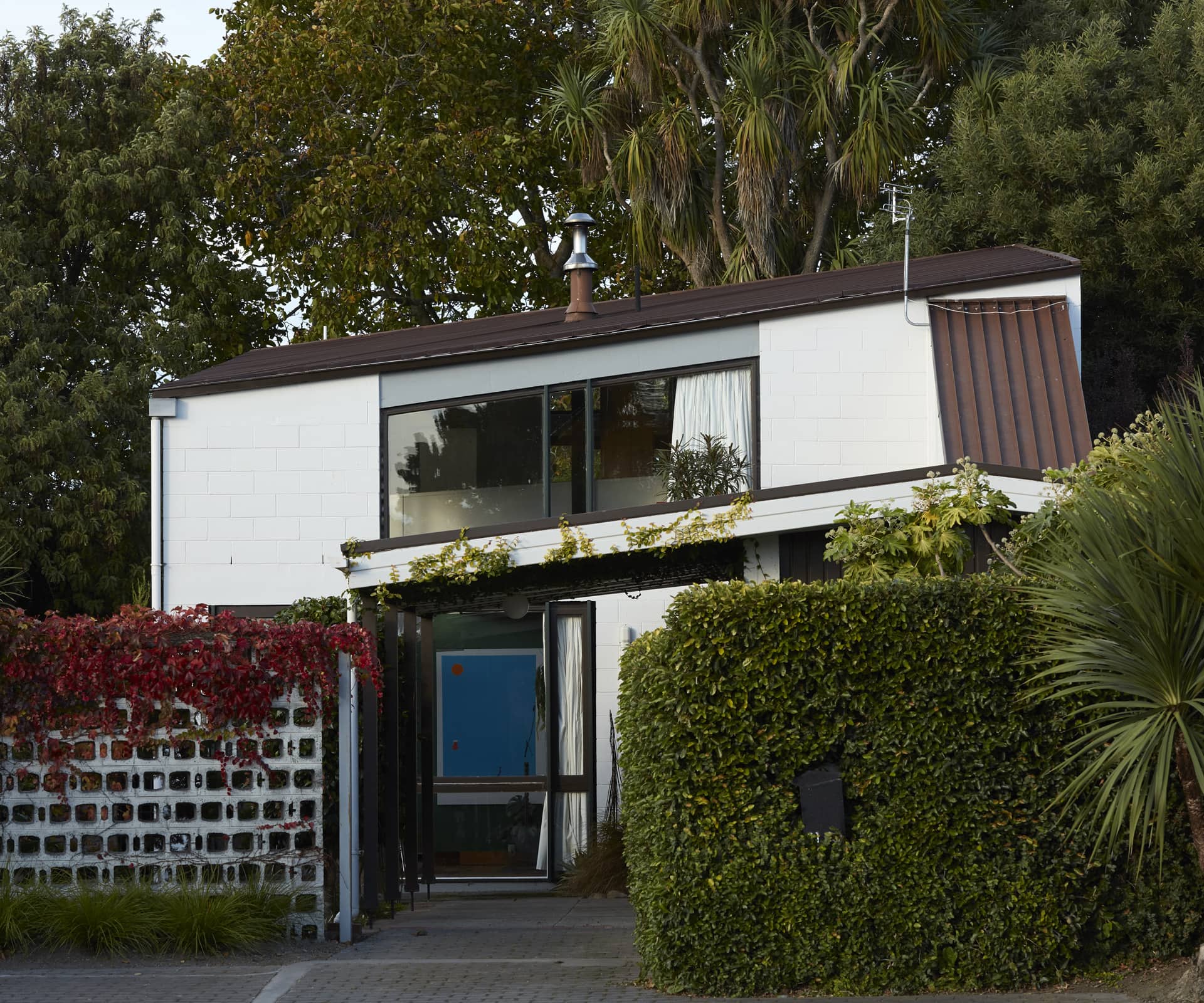
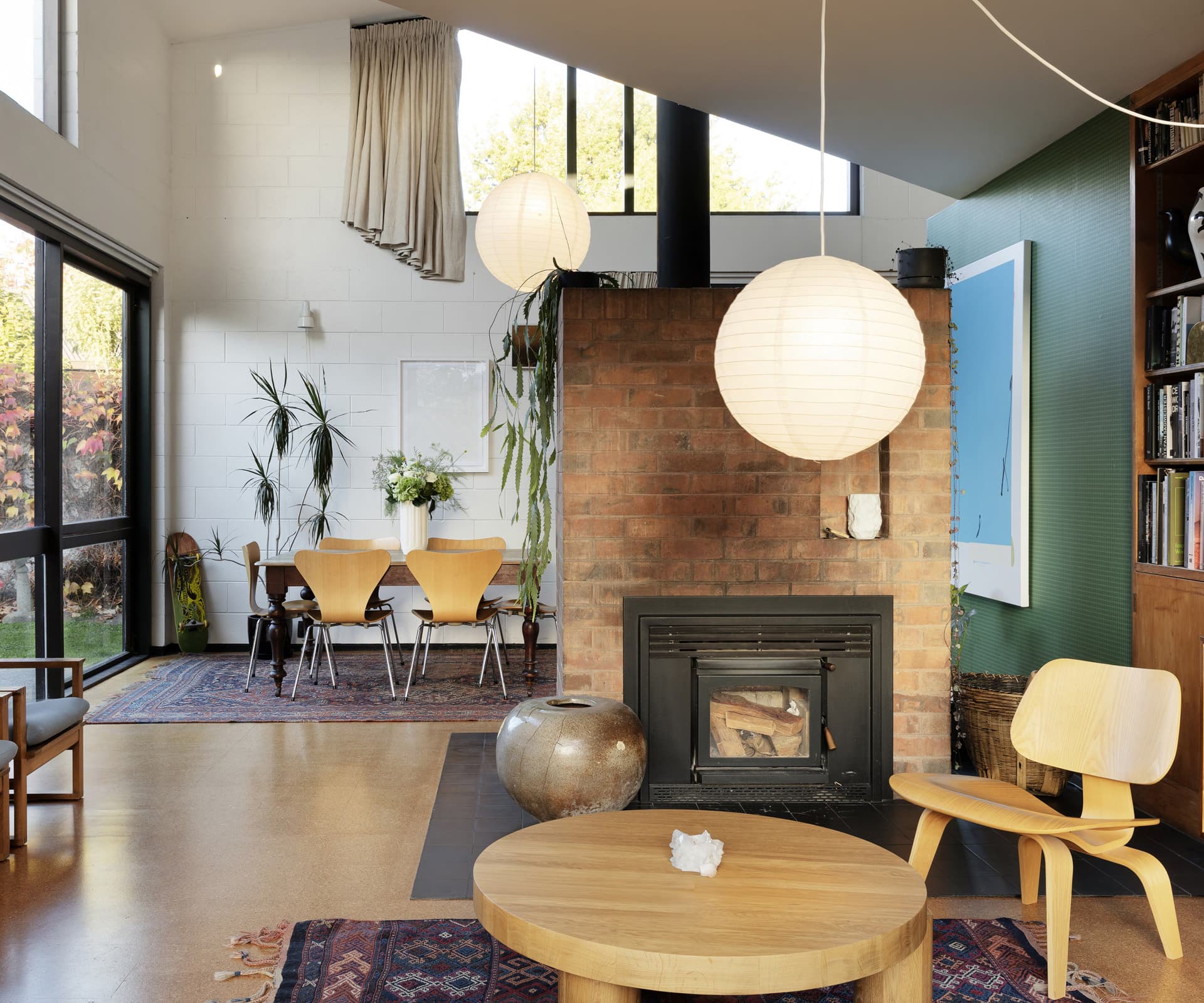
MA— It’s a fun design and an original expression of the Christchurch Style. The mezzanine, which runs diagonally above the double-height living room, is a big feature. Along with the red-brick fireplace that divides the space, it’s a practical heat sink and the exposed flue acts as a radiator upstairs, too. There’s glass on three sides, the sun streams in and large sliding doors open into private courtyards. These are common ideals of how people like to live today, I think, but it was highly unusual in New Zealand at the time.
Do you know much about Mitchener’s other designs?
MA— Very little. He didn’t do a lot of work under his own name – mostly while working for others – but everything I’ve seen of Allan’s is good, without exception. There’s a handful of houses scattered around the city and he designed the little concrete Anglican church at Le Bons Bay. It’s well worth a visit and rarely locked – poke your head in, you won’t be disappointed.
You are passionate about mid-century design. Why did this home first capture your attention?
Prue Johnstone— The unique form was different to anything I had seen in Christchurch. While it shares similarities with other local mid-century houses, it’s a departure from the more traditional gabled forms. I had seen photos of the house while Biddy Messervy owned it and it had always stuck with me. Inside, I remember being surprised around every corner. The double-height space with the open mezzanine was dramatic and the use of colour throughout makes you smile. A feature of mid-century houses I have long admired is built-in joinery. The kitchen in the Messervy House is a particular highlight – the joinery floats above the bench and frames views to the garden and park beyond.
What approach did you take to improve insulation, both sound and warmth, in the home?
PJ— The same features that drew us to the architecture were ones we had to learn to live with. The combination of concrete, cork and large amounts of single glazing meant the spaces were quite hard. The skillion roof and exposed concrete block meant there weren’t too many opportunities to add insulation. The flooring on the mezzanine was degraded in parts, so we lifted the original particle board and added acoustic batts, new floor-mounted powerpoints and re-carpeted with sisal carpet. This softened the space aesthetically and acoustically, reducing noise transfer from the mezzanine.
See more of the home below
