This small home takes its inspiration from the environment it sits in. Traditional bivouacs motivated its design for it is a place to relax, retreat and enjoy the spectacular mountain views
The first time architect Vaughn McQuarrie met his clients on site, they were about to leave on a 12-day back-country tramp, with no fixed route and plans to sleep rough “under logs and rocks”. The conceptual die was cast: a ‘Bivvy’ house. As McQuarrie looked around the building platform, carved out of a sub-alpine, schist-heavy hillside above the Queenstown-Glenorchy Rd, he had a further thought. “We began to imagine the house was formed around large fragments left during the excavation – a rock bivvy, perhaps.”
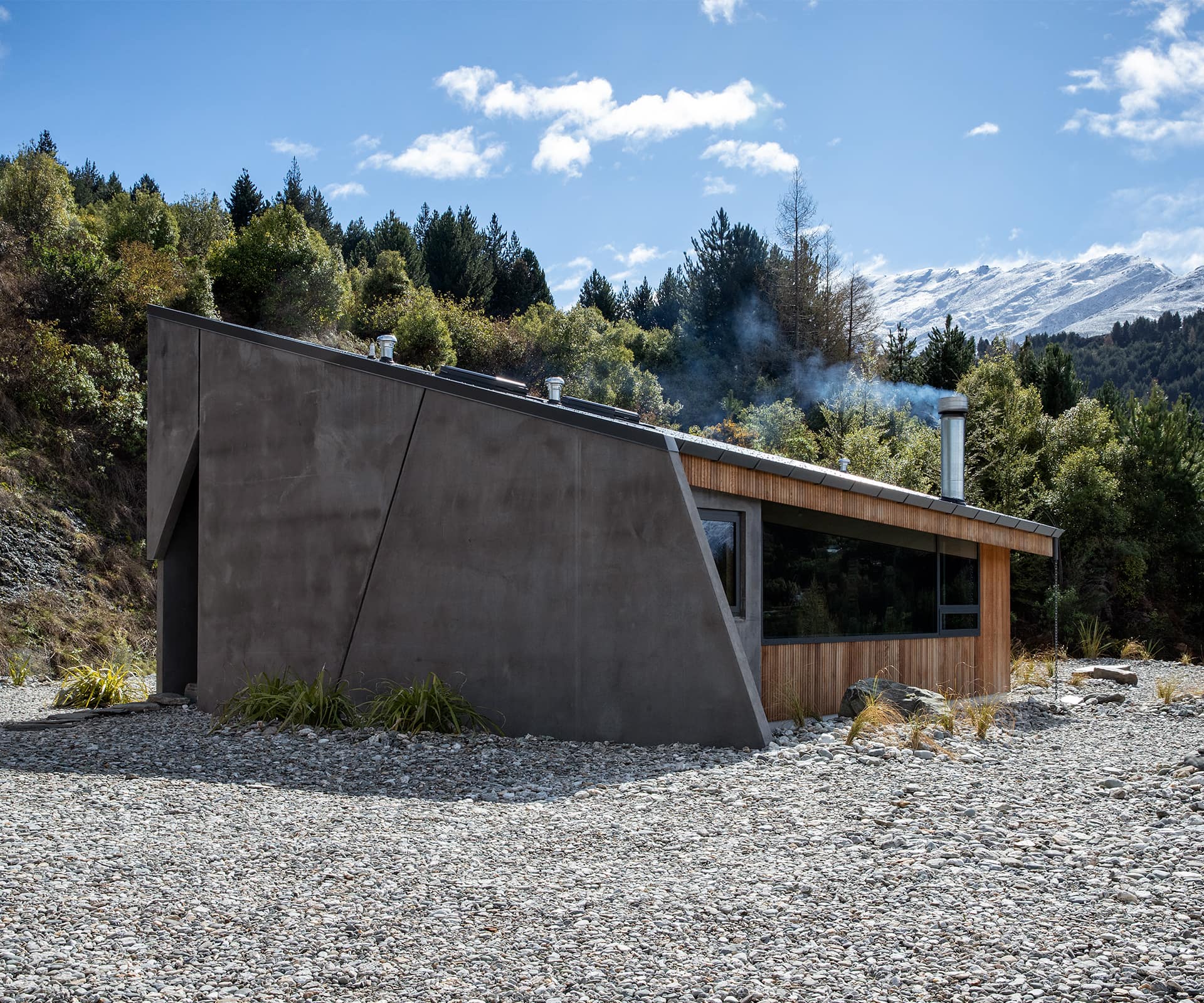
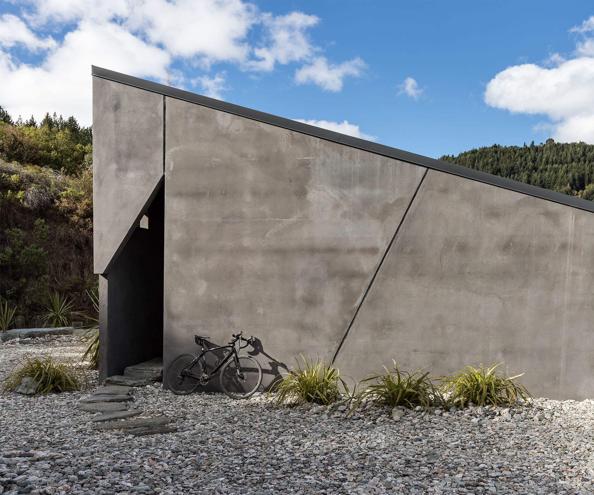
Bivouacs by definition are insubstantial. By contrast, the house that McQuarrie designed for Australia-based Alan Luckie and Jen Arnold feels hewn by natural forces, all heft and raw elements. A series of stepping stones curve through scree towards an opening in the house’s angular concrete panels, then disappear into darkness. It’s less of a front entrance than a cleft in a rock face.
The owners have an unconventional partnership. Arnold, an expat Southlander, practises in Sydney, Luckie, originally from the Waikato, lives and works in Victoria, where a few years ago he built a highly idiosyncratic house in Bethanga that won an Australian National Architecture sustainable architecture award. They have a long-standing tradition of flying to Queenstown several times a year to hike in the backcountry or ski.
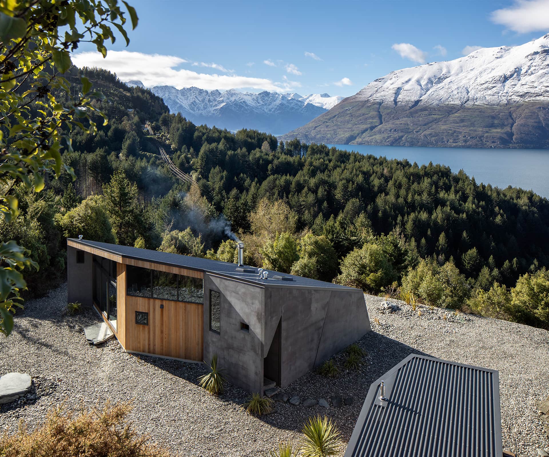
The Bethanga house clued in Waiheke Island-based McQuarrie to their mindset. “It showed that, as far as architecture goes, they were prepared to push the boat out.” If there were constraints, they arose from the site, which looks south-east over Wakatipu to Walter and Cecil Peaks and The Remarkables, and is exposed to some brutal weather.
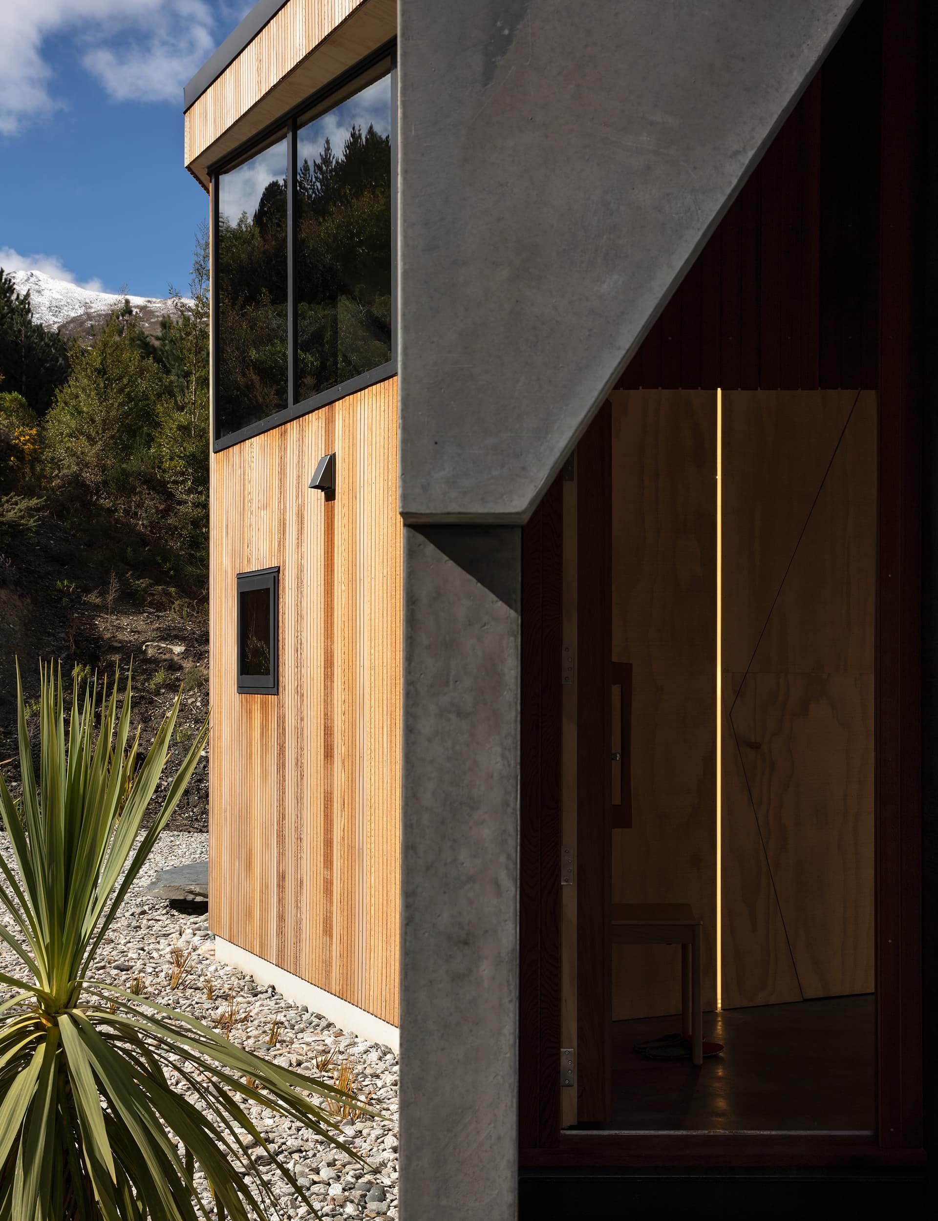
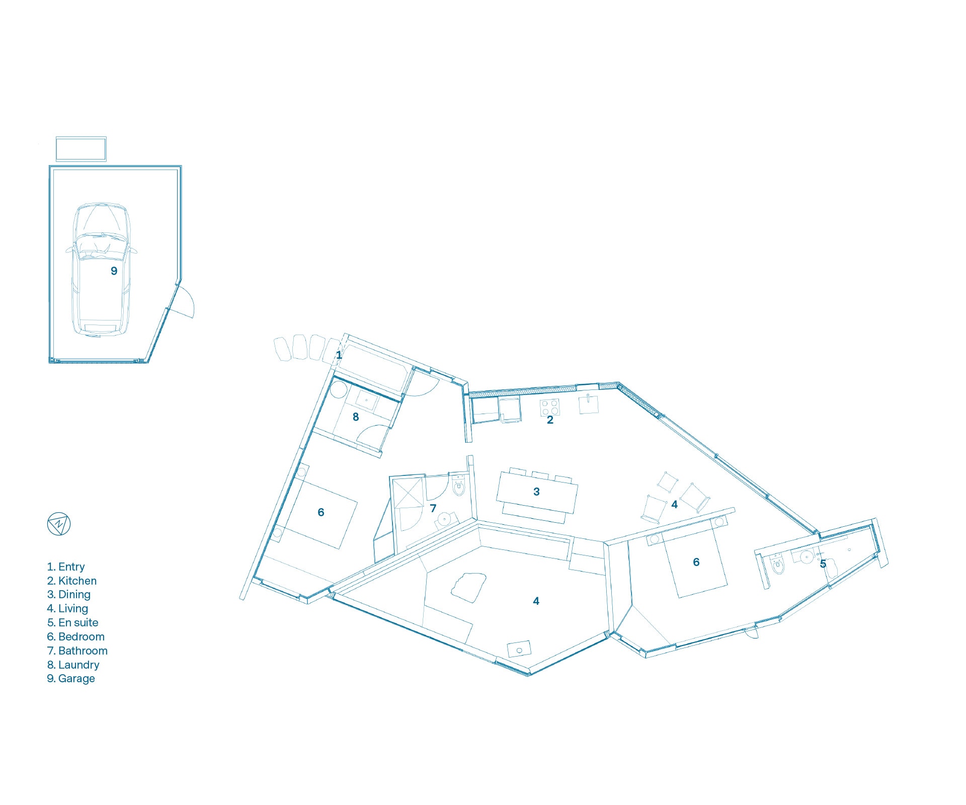
McQuarrie began by hammering a peg into the middle of the site and having a surveyor map all the key surrounding points, which – when combined with the winter sun path – gave rise to the irregular, fragmented building form. The monopitch roof follows the pre-excavation sloped contour, creating a high-ceiling design with heavy glazing at its northern end to draw in low-level winter sun, and a low and focused approach to the south, where the views are.
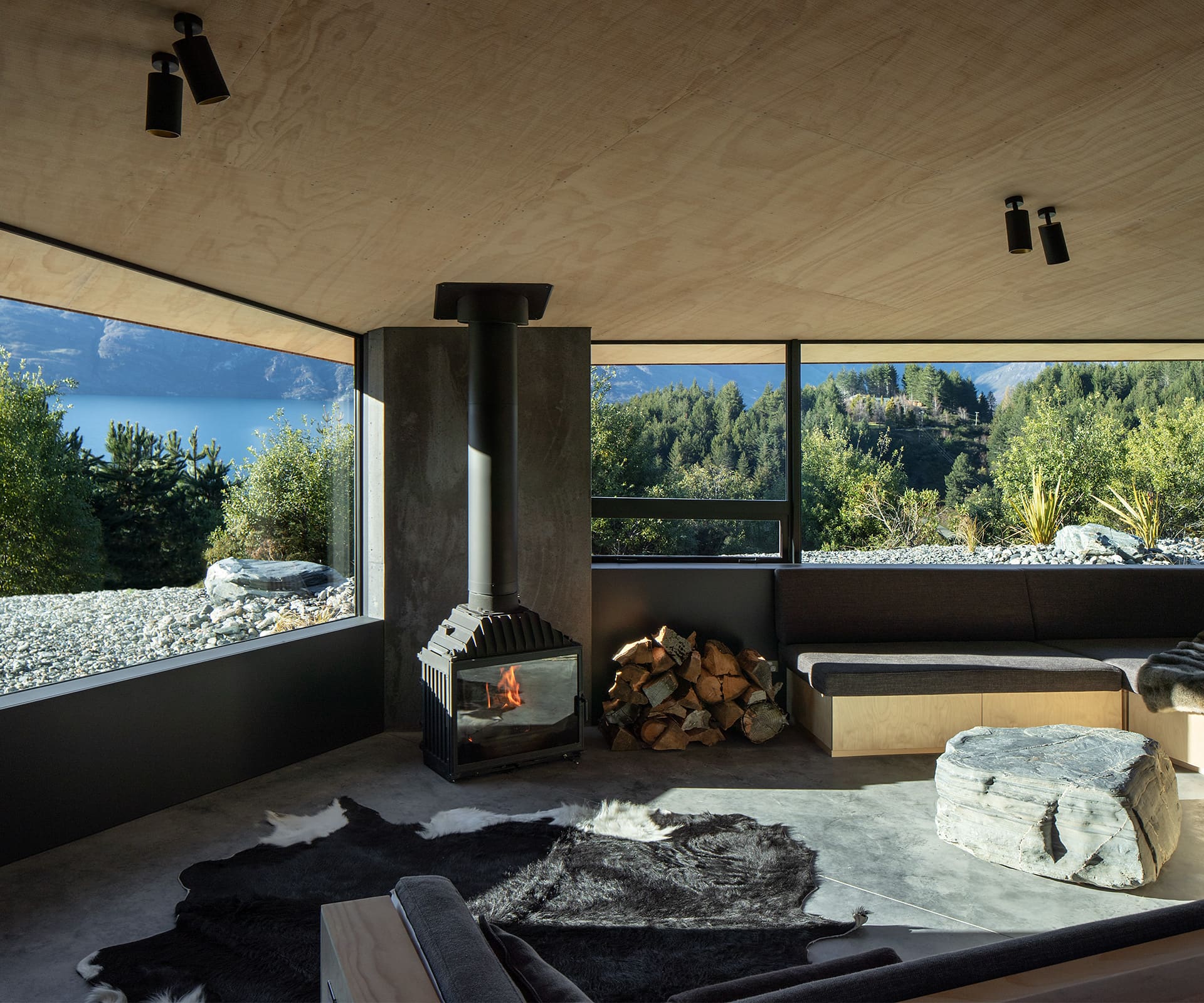
It’s only when you step down into the sunken living area, however, that you get the full, widescreen spectacle of bright lake and sharp mountains. Likewise in the main bedroom, the view is beautifully framed through a narrow pillar box window set at bed height.
“I didn’t want to do a house where everywhere you go you get the same big lake and mountain view,” he says. As for the delayed reveal of the fabulous view in the living area, he was also playing with “the idea that you have to go to the cave’s mouth to see the openness”.
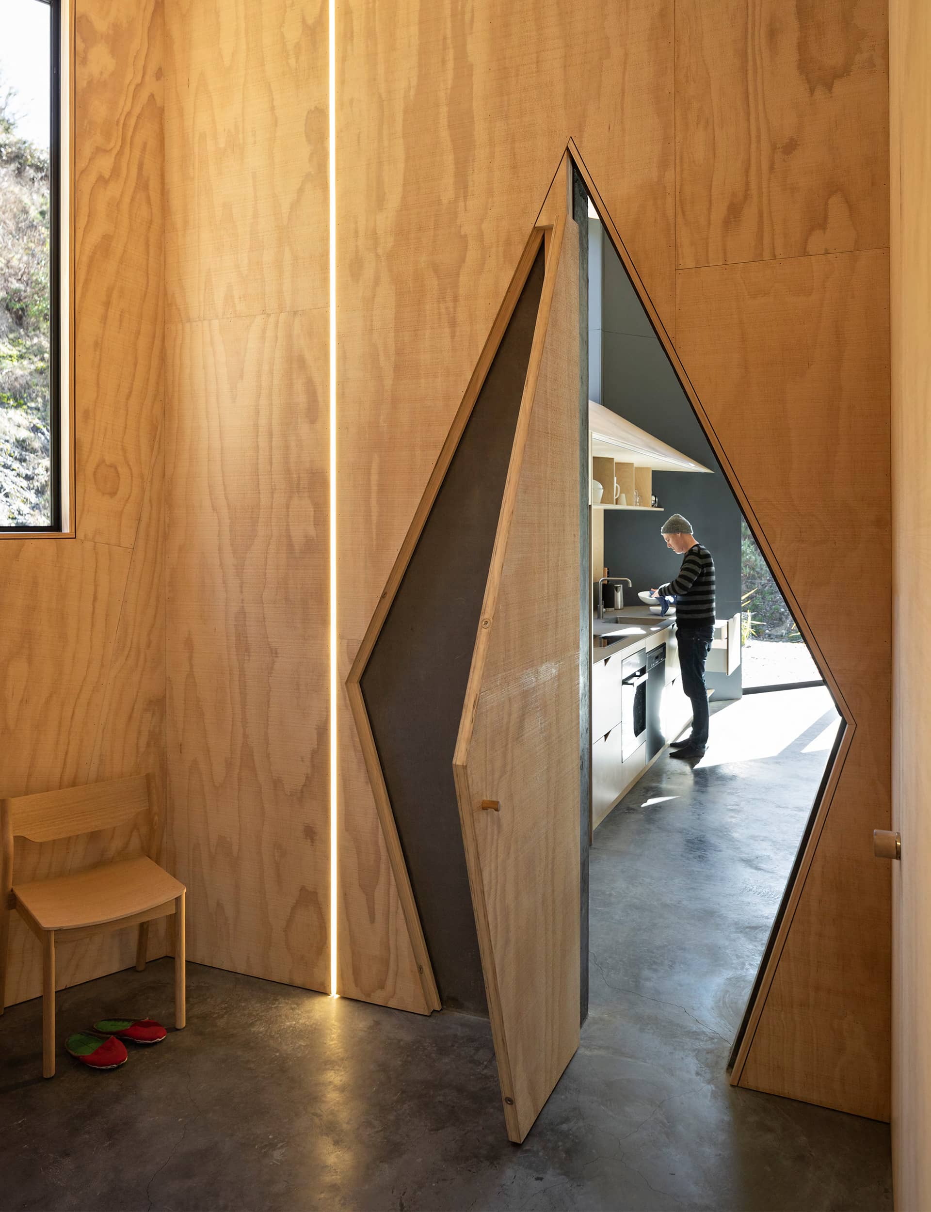
Throughout the house, McQuarrie doesn’t retreat for a moment from his animating concept. You enter the kitchen, for example, through a fissure-like slanted doorway. Concrete is tinted to the colour of schist, and during the curing process it developed a streaked patina that reads like surface water penetrating a crevice. A happy accident? “The whole idea of using concrete is that you can’t control it 100 percent. It will never be uniform, there’s always variation in the face, rather than something that’s machined to perfection.”
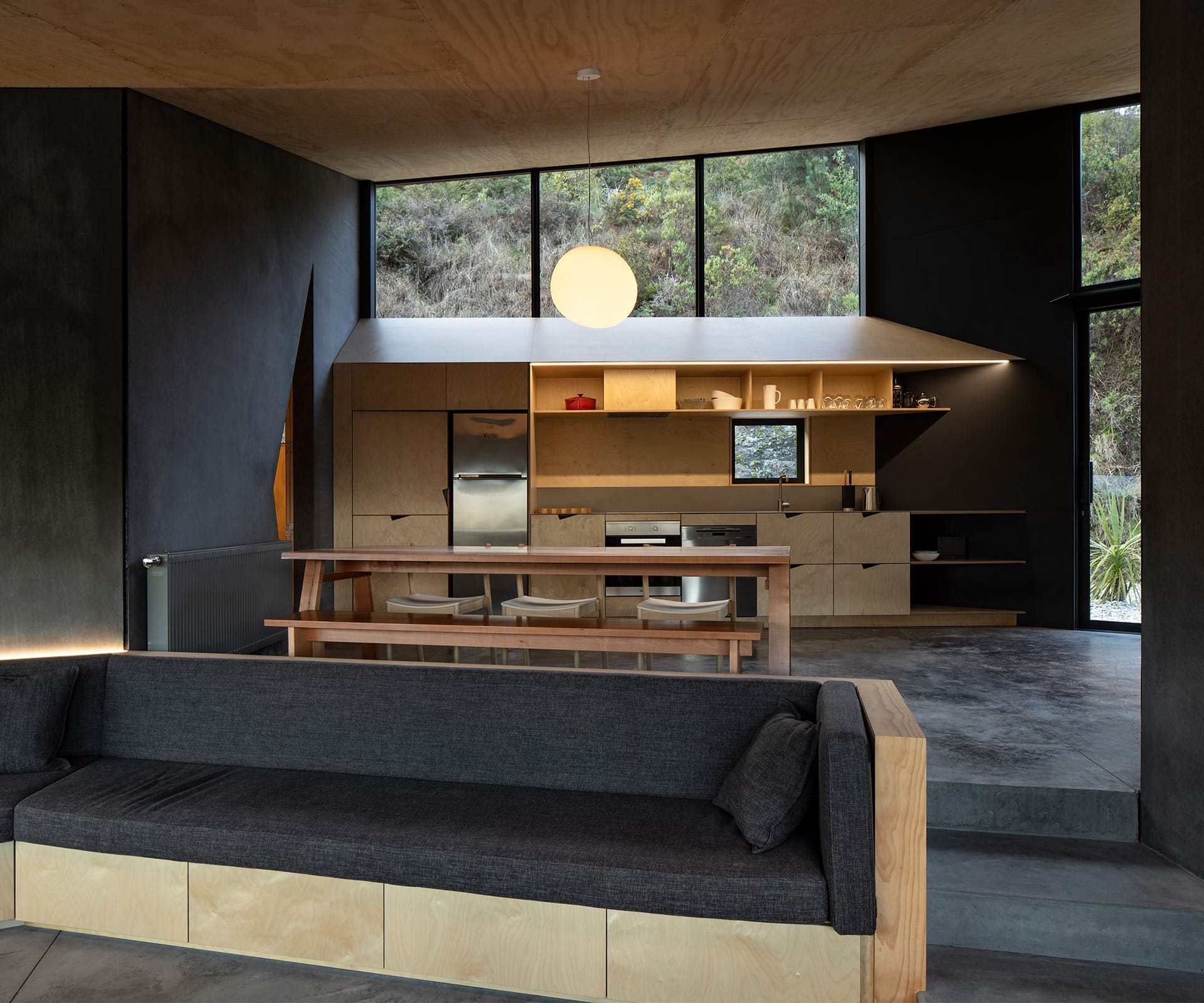
In the same vein, the timber elements are all roughly bandsawn, reminiscent of a tramping hut, but also of lined rock. “And like a seam in rock, I wanted the seams where each sheet meets in the ceiling to continue down the walls.” The vertical cedar cladding will grey off.
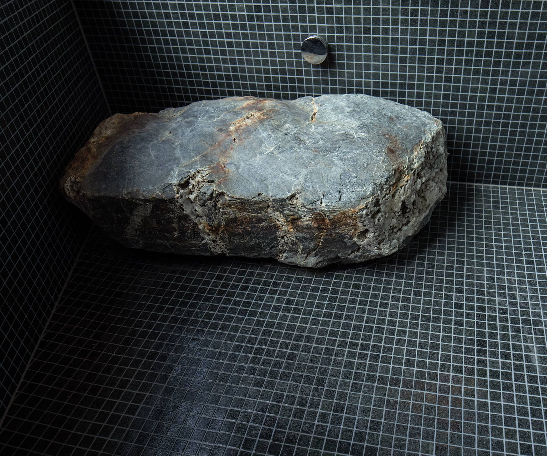
In a couple of instances, the Southern Lakes geology has been assimilated into the home. In place of a coffee table, there’s a handsome schist boulder, and a smaller slab functions as a step into the Japanese bath in the en suite.
It’s a small house – just 112 metres – in a part of the country where the default setting is to go big. “We were very anti having a large house,” says Jen Arnold. “Around the world, the impulse is to see what you can do in small spaces that reflect the environment and that have a smaller ecological footprint. We don’t need more.”
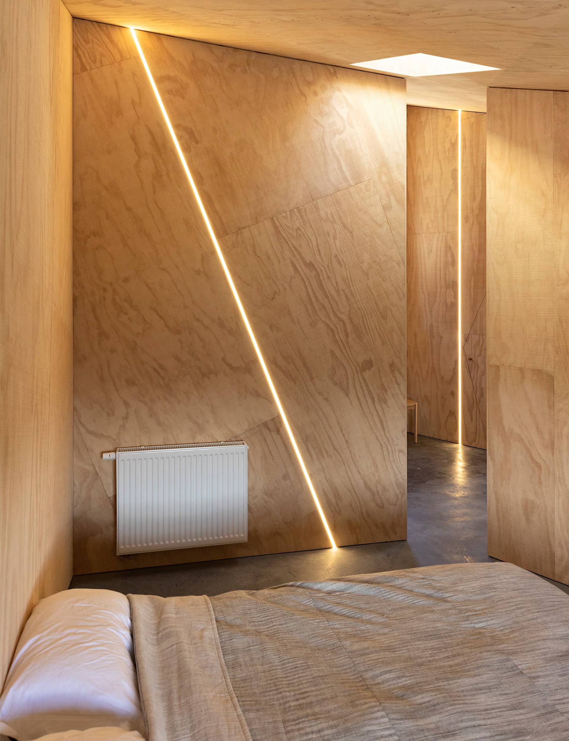
It doesn’t feel pinched. The high ceilings help, and there’s some clever use of space, such as a compact hidden laundry and inbuilt seating around the walls of the living area which provides a spillover sleeping option for extra guests. “It’s a bit like when you’re up the Matukituki Valley in one of those tramping huts, and people end up sleeping on the bench seating around the edge of the room,” says Luckie.
[gallery_link num_photos=”17″ media=”https://www.homemagazine.nz/wp-content/uploads/2019/04/BivvyhutQueenstown_HOTY2019_7.jpg” link=”/real-homes/home-of-the-year/how-this-house-was-designed-for-the-winter-suns-path-and-mountain-views” title=”See more of the Queenstown home here”]
McQuarrie and his clients were on the same page, too, in prioritising thermal efficiency. Hence all the high glazing to the north, which draws sun to the thermal mass. As well, internal concrete is kept thermally separate to the external panels. “The house is completely thermally broken,” says McQuarrie. “There’s a continuous layer of insulation that wraps up the entire house, so there’s no cold bridging.”
It’s shelter from the storm, as per the elemental client brief. The other requests Arnold and Luckie made of their architect? Design us somewhere to sleep and eat, and which reflects its surroundings. They got their wish list – and something more. “When you’re here, you feel like you’re in an artwork,” says Arnold, in response to an observation about the absence of any adornment. “The house itself is the artwork.”
Words by: Matt Philp. Photography by: Simon Devitt
[related_articles post1=”93111″ post2=”93117″]
