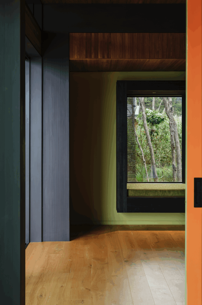
We look back fifteen years to a home that was designed by Hugh Tennent. With a lodge-like sensibility, we rediscover how this home bends and contours to its bush-clad site to maximise sun
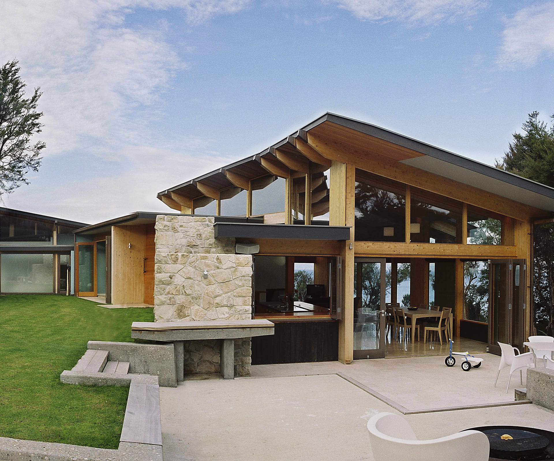
Take a look back at Hugh Tennent’s Home of the Year 2003 finalist
Project: Split Apple Rock House
Architect: Hugh Tennent
Location: Kaiteriteri
On April 24, New Zealand’s population hit four million. Ahmed Zaoui was declared to be a genuine asylum seeker. And the Supreme Court found that Donna Awatere Huata had no right to her parliamentary seat after being expelled from the ACT party.
Ken Crosson’s own bach at Otama on the Coromandel won Home of the Year – and later went on to win Home of the Decade. “It was an attempt to try and create another experience,” Crosson said at the time. “I wanted to get back to nature and give my kids something like the lifestyle I had in my childhood.”
Among the finalists, meanwhile, was a striking house near Nelson by Hugh Tennent, designed for a couple with a young child. Built on a cliff overlooking the ocean, the home was constructed from hefty timber beams and thick stone walls, with volumes closer to a lodge than a home. “The clients had two potential sites,” says Tennent now, “one to the north of the headland with big views to the open sea. The other site was tree-clad, contained, reflective – with deep views down to jade water and the remnant headland of Split Apple Rock.” The resulting house could have been sited nowhere else.
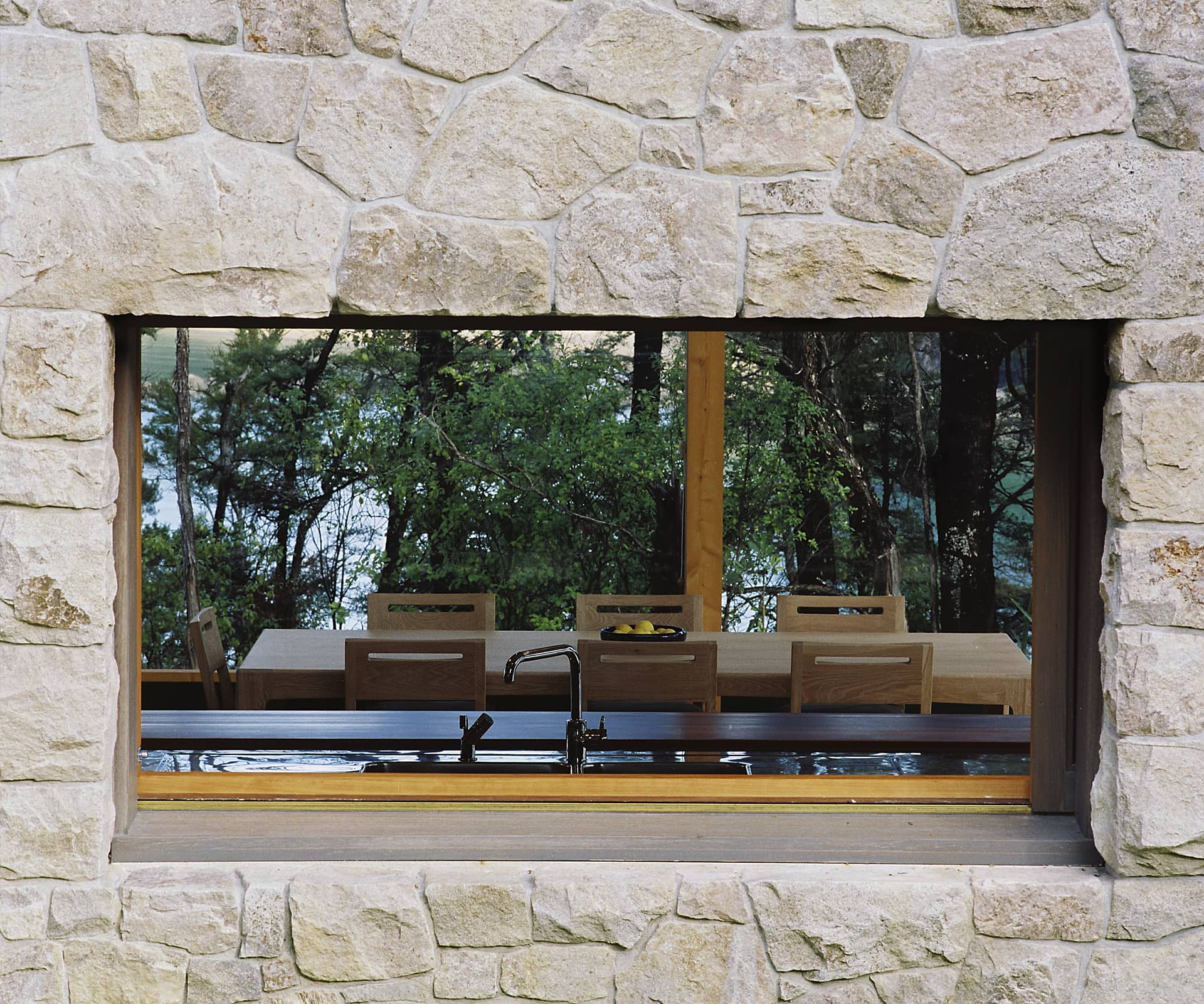
The owners wanted a house that would look good in 100 years. How did you respond?
We used local stone elements, engineered timber and timber rainscreens to give it a longer-lasting feel.
It’s quite a big house. How did you keep it discreet?
We spent a lot of time weaving the form between existing skyline trees when seen from the water, which is really the only place it can be seen from, and having the building follow the contours, draping it across and down the site.
Tell us about the L-shaped plan.
This is about working across the contours for the living wing, and creating a flat, sunny entrance sequence and outdoor areas, when the views are the other way to the south and east.
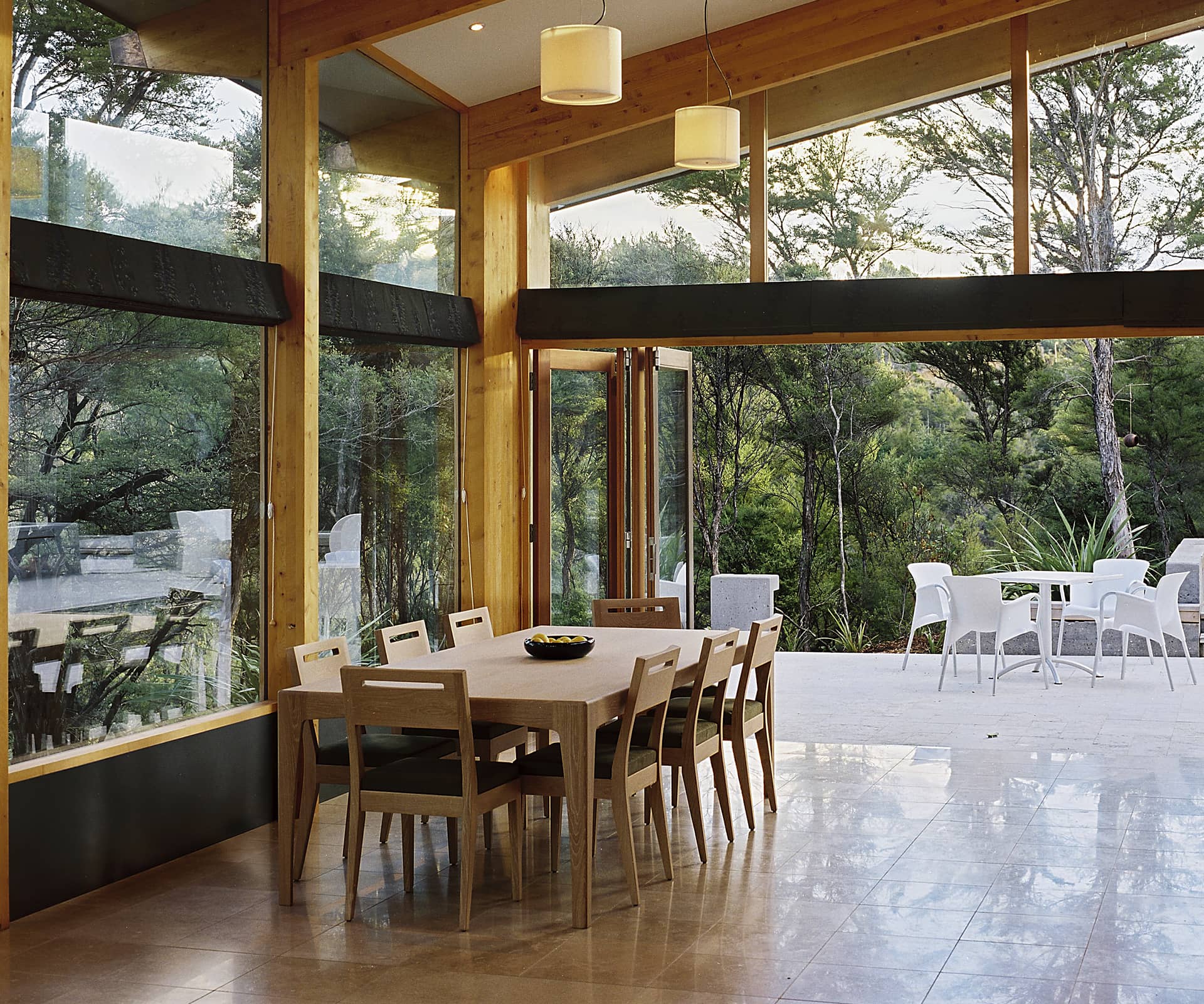
The clients wanted a change of lifestyle – did this house do that for them?
The house has served them well and supported their warmth and hospitality. As their children have reached secondary school age they have moved to Nelson for these years and the house is currently a weekender.
[related_articles post1=”80078″ post2=”79764″]

