An unstable foundation meant the original 1930s home on this section had to be demolished, which helped make way for a clean-design-slate.
Light and air in the treetops
Most people think of blissful simplicity as the greatest springboard for creativity – a blank slate from which the mind can soar. But the best architecture can thrive on constraints and complexity, and often flounders without them. Just as well that the Sydney-based husband-and-wife architectural duo, Chris Adams and Bianca Pohio of Pohio Adams Architects, are not the type to moan about limitations, because they had plenty of them on this project in Sydney’s east.
While the limitations they faced might have seemed like frustrating forced compromises to some designers, their thoughtful embrace of them has led to a house much richer and more interesting than anything that might have risen from a tabula rasa. “We like having some boundaries to push up against,” Bianca says. “You’re not designing in a vacuum. New builds always have a context, but having an actual structural remnant to work against gives you even more information.”
The project, for a couple and their three young children, started out as a renovation of a two-storey 1930s house on a steep site (it drops 16 metres from the street to the bottom of the garden) which already had council consent for the addition of a third floor. Chris and Bianca developed a plan to renovate the bottom two floors and add a new upper level of bedrooms, but then geotechnical engineers discovered the site wasn’t stable enough to allow the existing house to support this.
This meant the house had to be demolished but for the retention of a couple of walls, but rather than go back to the drawing board and risk the delays and extra expense of getting permits for a brand-new scheme, the project proceeded according to Chris and Bianca’s original floor plans. “We kept the original footprint, and [our clients] were really pleased with the internal planning we had proposed anyway,” Chris says. “By taking it all down and building up from scratch, there was some opportunity to rationalise the structure and get all the alignments set perfectly.”
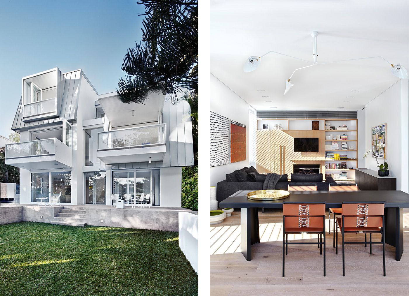
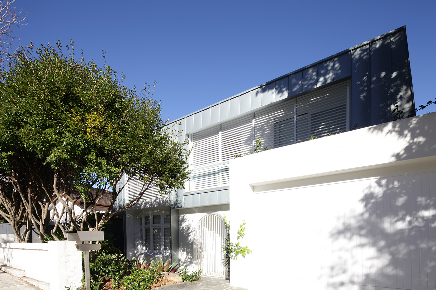
The home’s southern and street-facing eastern walls were mostly retained in the demolition, meaning visitors to the house are confronted with a mysterious hybrid structure, part-Deco-era heritage and part-contemporary. The steep site means the home’s lowest level isn’t visible from the street, but Chris and Bianca still wanted to ensure their design didn’t make it look like an old house had been monstered by a contemporary structure. They developed the idea of a zinc mansard roof that folded downwards over the original walls and fudged the scale of the building’s additional floor, which had the additional benefit of unifying what could have been a schizophrenic structure. “It could have looked like an apartment building with three stacked levels,” Bianca says.
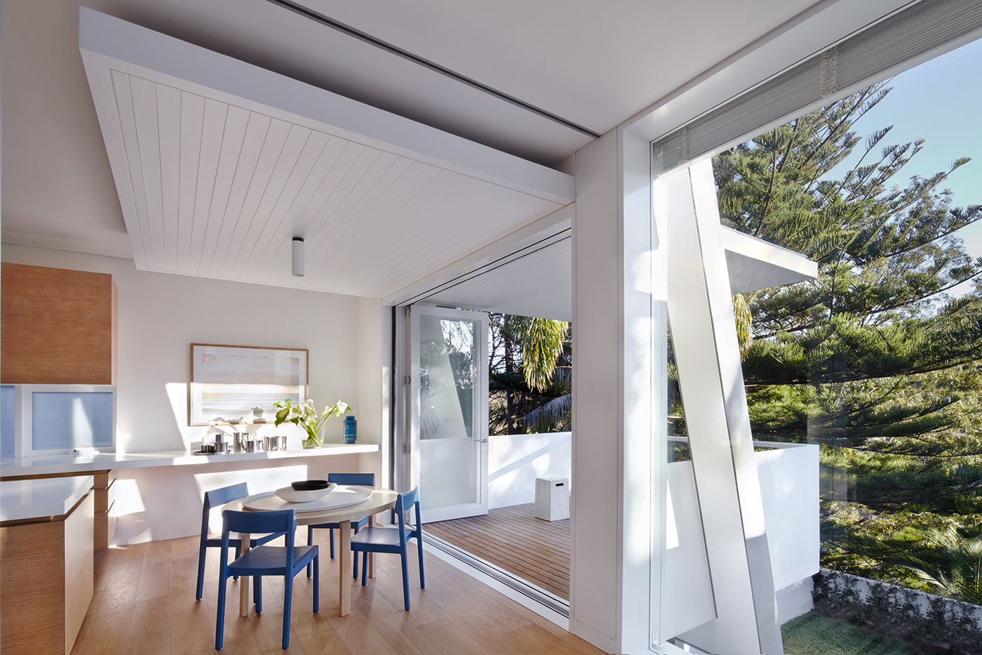
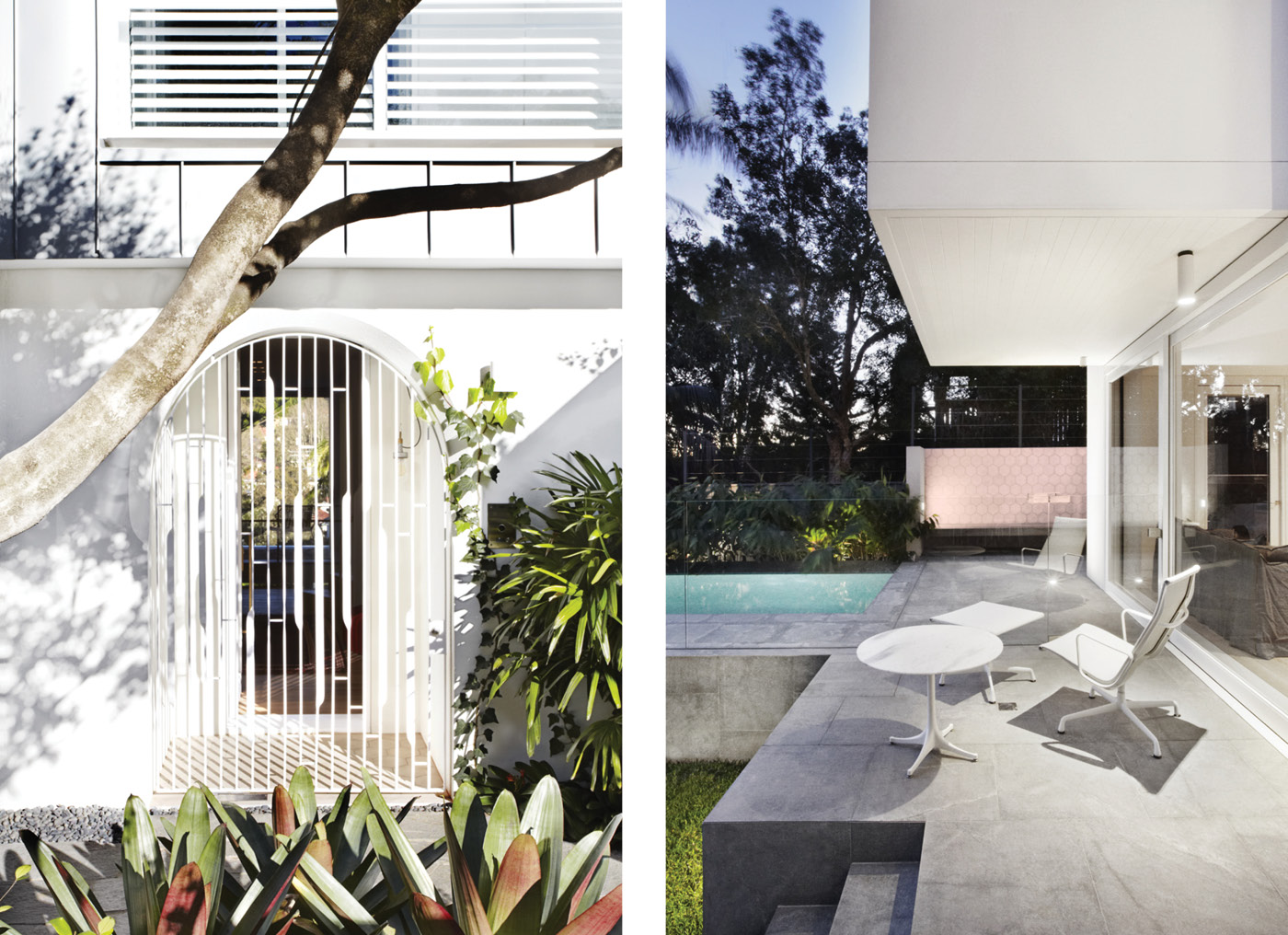
Now, however, looking from the bottom of the site up at the home, “the roof folds down, following the topography of the site,” she says. Balconies project from the middle living level, as well as a small enclosed deck from the top-floor main bedroom. The bottom floor opens out to a lawn and swimming pool. It’s a house with a muscular but far from monolithic form.
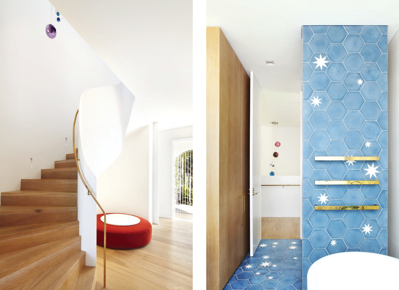
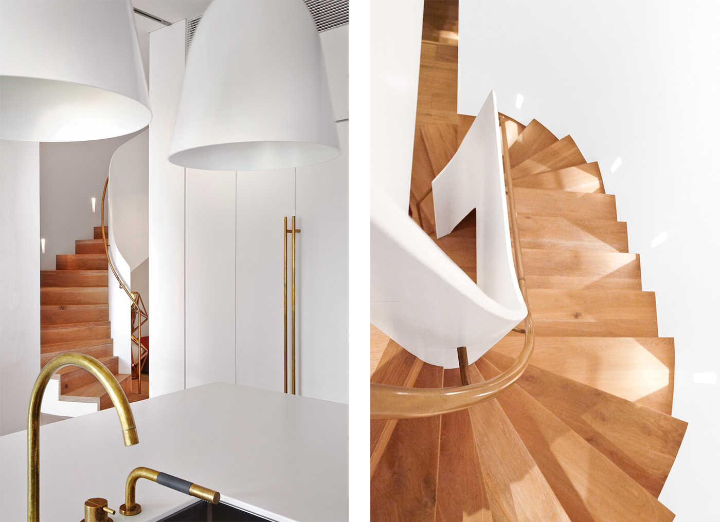
Chris and Bianca are great proponents of modernist rigour, but they have allowed the curvaceous cues from the original building to soften the rectilinearity of their internal planning. They retained the home’s arched street-facing entrance and designed an elegantly decorative steel gate for it. The shape of the arch is echoed inside the entrance in the soft swoop of white-painted steel that forms the staircase leading from the hallway to the private quarters upstairs. The staircase was designed in collaboration with artisanal steel workers, lowered in by crane and gently refined on-site. Its curves continue underneath it, thanks to the work of a talented plasterer.
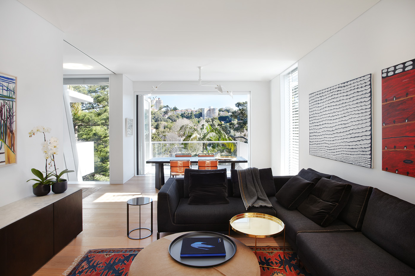
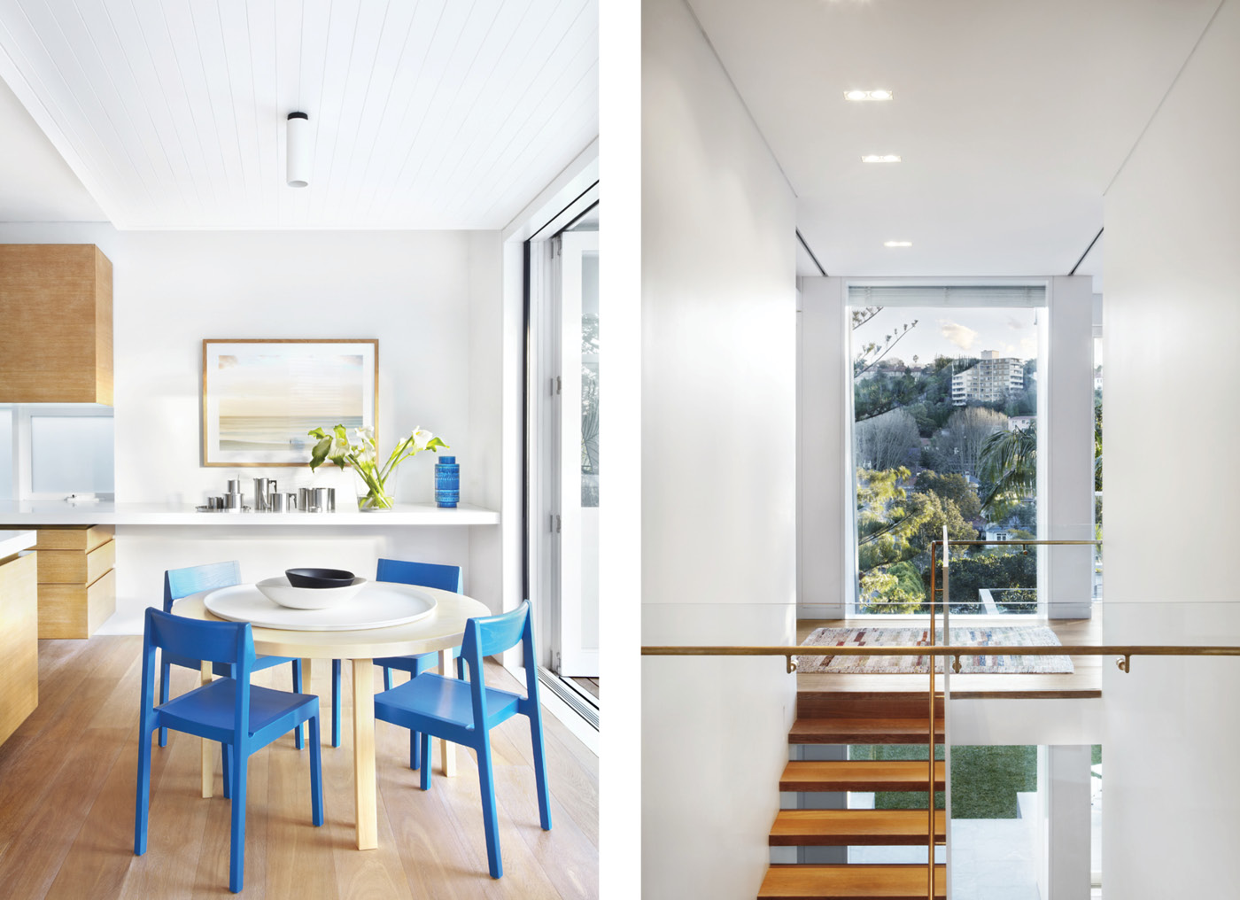
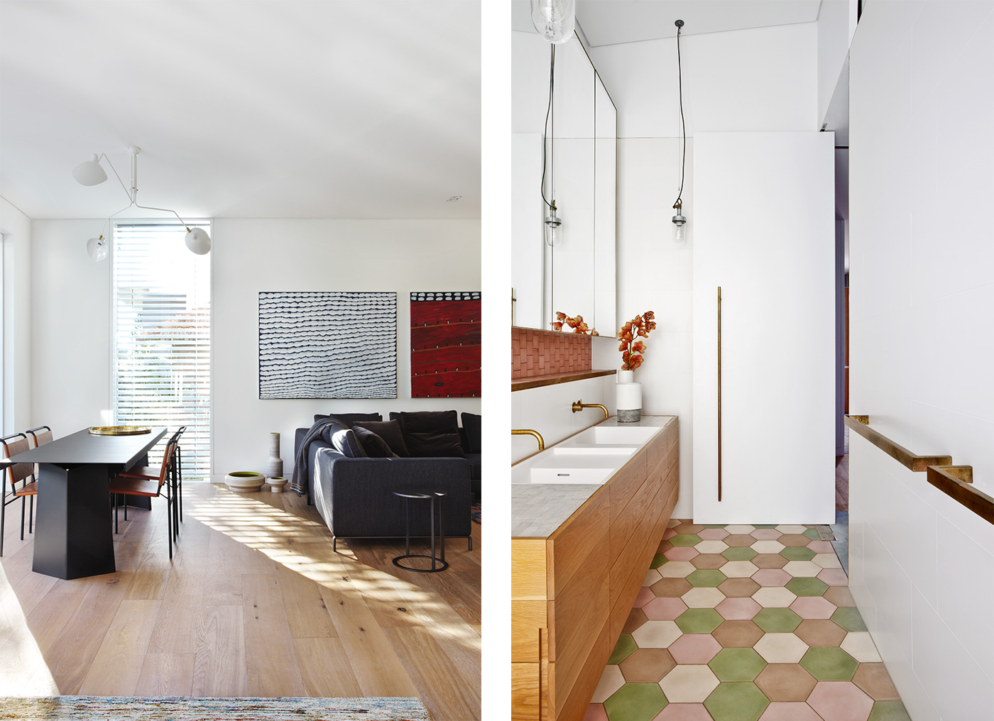
The surprise of this voluptuous insertion reverberates through the home’s interiors in other ways. Chris and Bianca both wanted to avoid kitting the house out in the standard-issue, marble and stainless steel accoutrements that have become commonplace in homes of its ilk, and the owners were happy to join them on this pursuit of interior individuality. While the walls are a calm gallery white, there are wide floorboards of European oak, an earthy counterpoint to the cleanness of the architecture.
The taps, door handles and towel rails throughout the house are made of unlacquered brass that will acquire a patina with age. The bathrooms are decorated with beautifully coloured, hand-made tiles from Morocco, and the upstairs carpet is an ethereal 1950s eggshell blue. All of these are individual touches that make the home anything but generic.
“It’s richer than your stripped-back minimalist contemporary aesthetic,” Bianca says. “Lots of the projects we do have that unique character, particularly with material detail and selection. The clients had the courage and creativity to imbue the house with a character unique to them. This was about creating a family home they are planning to live in for a long time.”
While the home’s main living floor is accessed at street level from the east, the way the site falls away means its western side feels as if it is hovering among the trees. This lofty sensation has many benefits, but Bianca and Chris were also anxious to ensure that this floor still felt connected to the garden and pool below.
They have achieved this not only through the addition of the balconies that project off the kitchen and dining areas, but by creating a view shaft through the house from the entrance that looks down another staircase to the lower level and straight out to the garden. “You don’t feel dislocated or disconnected,” Bianca says.
The completion of this home also marks a professional transition for Bianca and Chris. The couple (who studied architecture at the University of Auckland) have worked as Pohio Adams Architects in Sydney since 2003, but this year have teamed up with New Zealand firm Warren & Mahoney to help extend that company’s reach into the Australian market. The aim is to combine Chris and Bianca’s immaculate approach to residential projects with Warren & Mahoney’s ability to take on larger-scale work. Chris and Bianca are, of course, relishing the idea that this bigger canvas will bring with it even larger challenges and constraints.
Q&A with Chris Adams and Bianca Pohio
HOME Was this a renovation or a new build? It looks like it could be either.
Chris Adams, Pohio Adams Architects We had achieved a very favourable planning approval for a renovation and addition of a new upper floor to an existing 1930s rendered brick villa. However, during site investigations with structural and geotech engineers we came to the realisation that the house wasn’t founded on rock and couldn’t support the additional load of the top floor. We went back to the council to seek approval to demolish and rebuild which was complicated by the fact that a new house wouldn’t enjoy the same planning concessions a renovation did. We got the approval by sticking with our existing footprint and working to retain just enough of the south and east walls. The clients had the option of revisiting the overall scheme, but by this stage had fallen for the plan, design, and enigmatic mix of old and new which we managed to hold onto.
HOME What do you think is most successful about the project?
Bianca Pohio, Pohio Adams Architects I adore the feel of the house; it has a heavenly calmness to it. It is elevated in the treetops, but you don’t feel disconnected from the site. I love the moments of counterpoint to the rational, rectilinear plan. These come through the forms of the curved stair, the arch, the floating roof over the kitchen, but also through the unexpected material choices: the tiles, brass, the ribboned flatbar entry gate, and the links with what remains of the original house. Another key aspect is the variety of spatial experience available in the house, and particularly the transitional spaces. There is always a view, shade, or sun as desired. The greatest success of the project is our client’s satisfaction. They lived in the old house for five years before the rebuild, and are now enjoying a novel and revitalised experience of the site they thought they knew.
Written by: Jeremy Hansen. Photography by: Sharrin Rees.