With its striking concrete diagrid roof and sense of fun, HOME magazine’s Home of the Year 2019 is a truly Auckland house
[jwp-video n=”1″]
“It’s sort of simple on purpose,” says architect Jack McKinney, self-deprecatingly of our Home of the Year 2019. McKinney designed the home in Grey Lynn, Auckland, for his long-time clients and friends, builder Cameron Ireland and Rachael Newnham, and their three children.
“Sometimes a project depends on whether it’s immaculately perfect, where this lines up with that. But what we’ve learned with Cam is that his mind is an impatient one. So we had to come up with something that was a big shape, robust enough to survive a bit of editing onsite.”
By McKinney’s count, he and Ireland have built 11 alterations, three commercial buildings, four-and-a-half new houses “and two billboards” over 12 years. It’s an extraordinary output that speaks to an ongoing friendship and trust that has developed, project by project, between architect and clients. The pair meets every morning at 10 to talk through the day’s issues. “That allows him some freedom, but it keeps me in the dialogue so I can say, ‘Oh you might regret that’.”
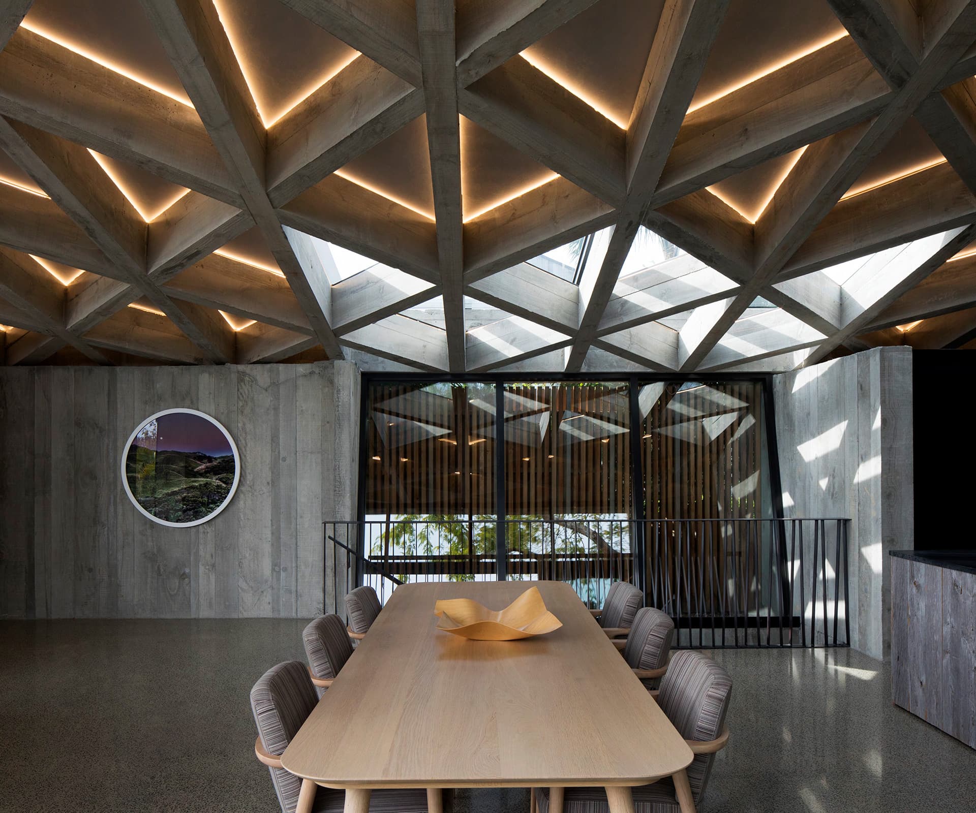
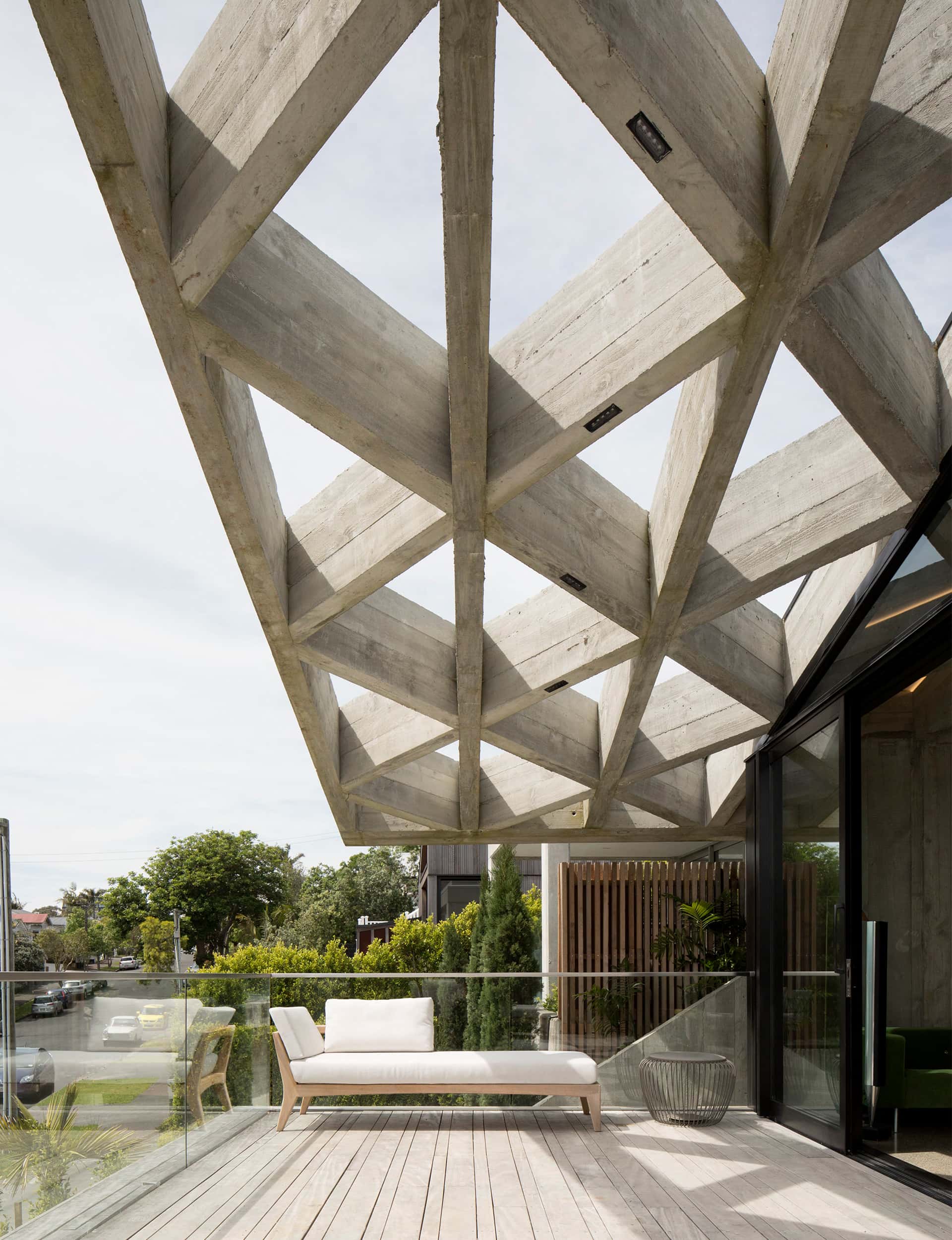
McKinney’s design is centred around an in-situ concrete roof, laid in a diagrid pattern of verticals and angles, over which he laid a glass roof in some places, and an insulated roof in others. It weighs 56 tonnes and soars from 2.2 metres up to 4.3 metres. You know it’s heavy and you know it’s made from concrete, but you can see the sky and it floods the space with light. “You somehow know that it’s 56 tonnes of weight above your head. It’s quite different to timber beams – it’s not oppressive, but there is drama to it.”
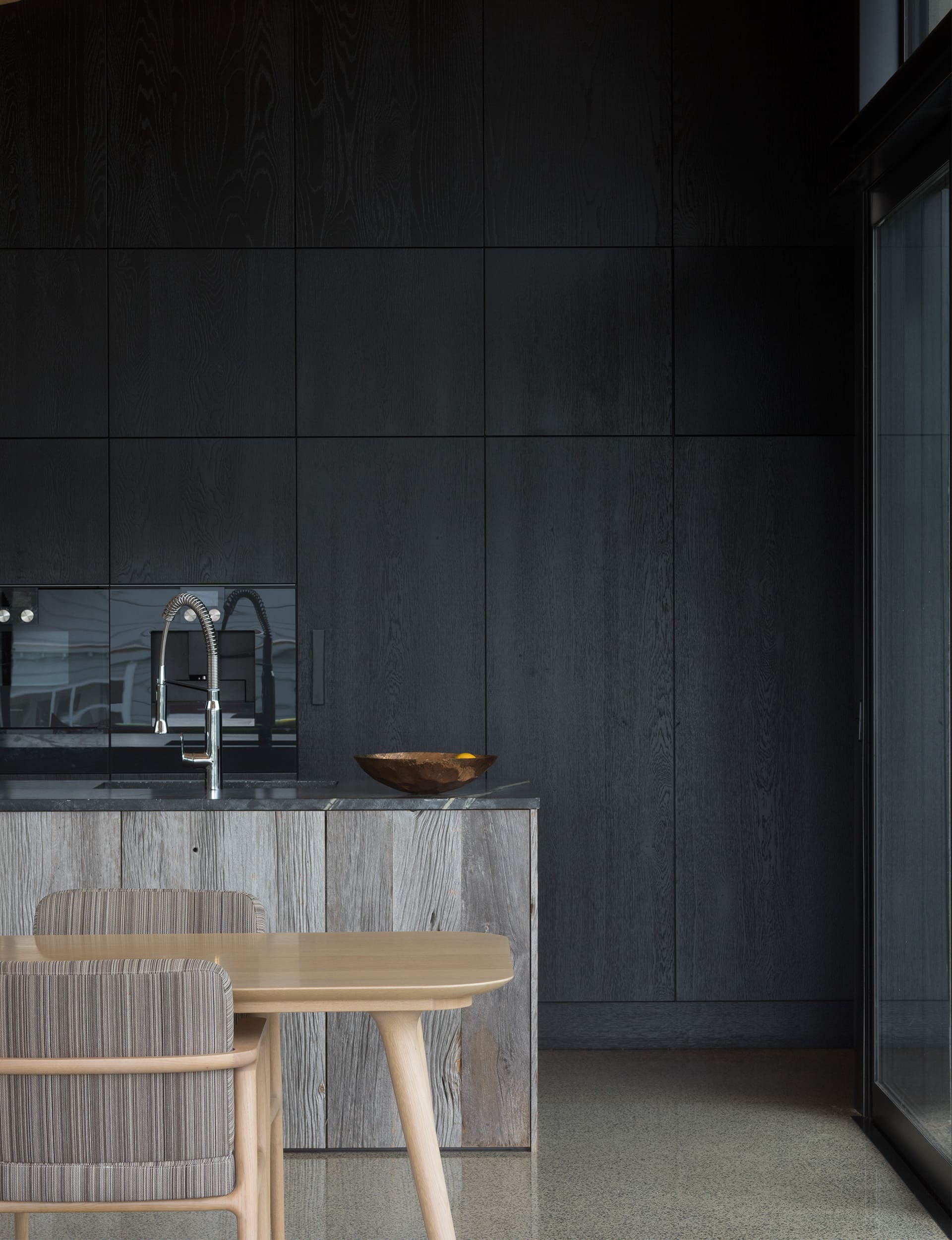
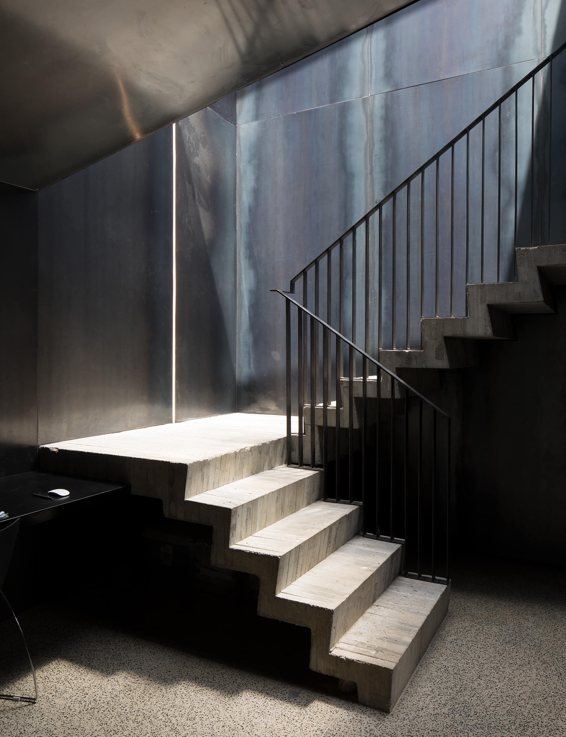
The concrete is deliberately left rough, not ground or polished or tidied up. The day the concrete for the stairs was poured, it rained, leaving big sploshes and puddled dents in the steps; they’re left exactly as they came out of the formwork. It’s not unpolished, and where it needs to be crisply detailed it is, but there’s a joy in the making, a roughness that would – let’s be honest – probably freak out most clients. “We toyed with making it smooth,” says Ireland, “but rough-sawn is rich in texture – we wanted it to feel hand made.”
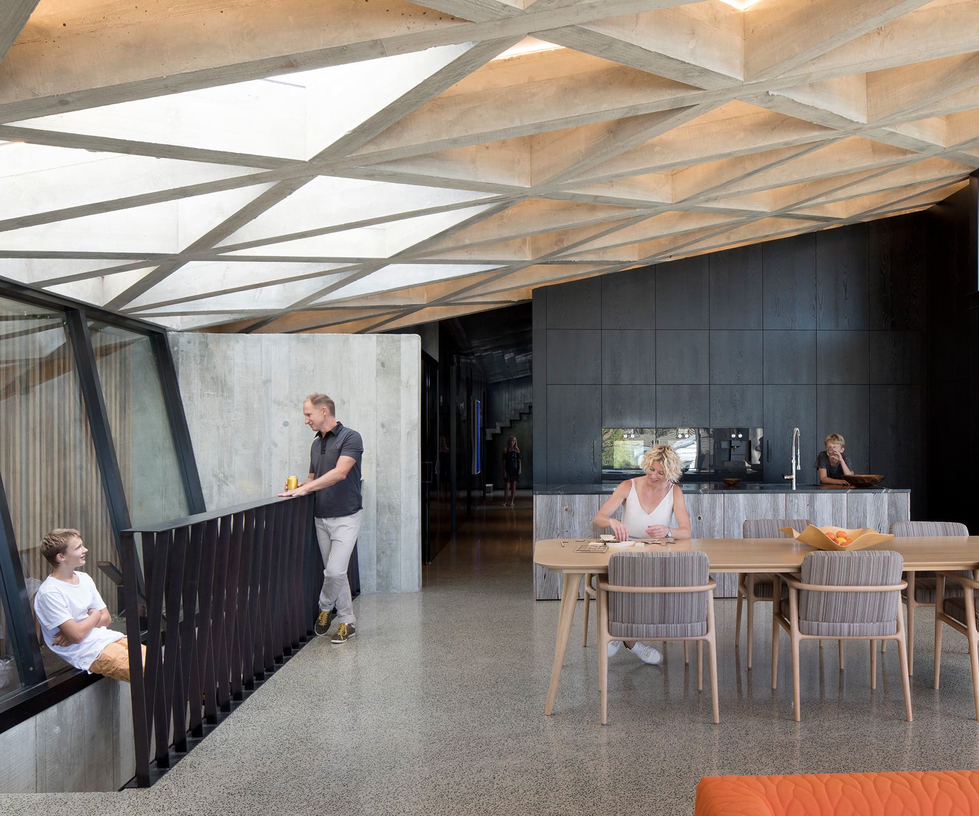
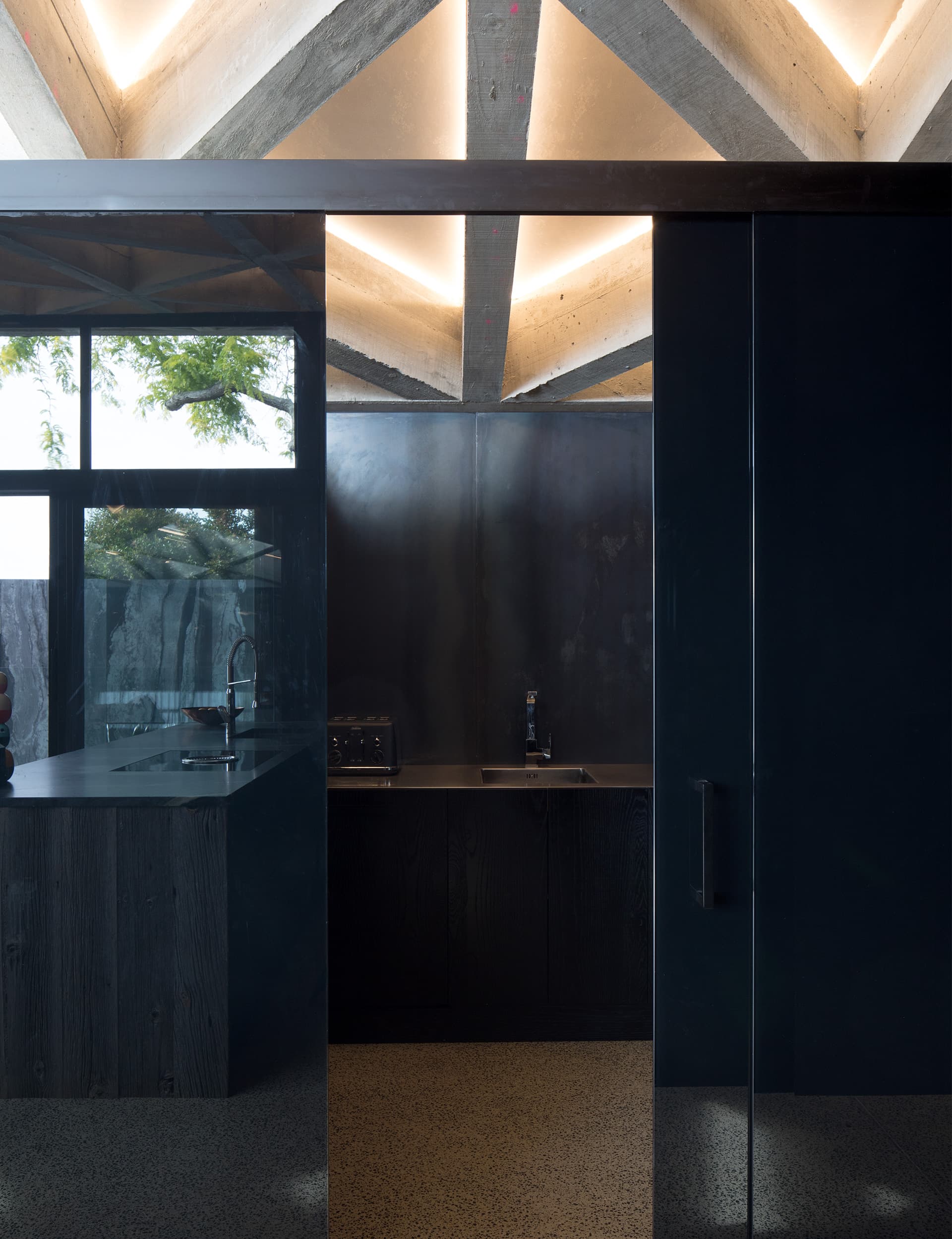
Things get clever in the contrasts between light and dark, which emphasise the seeming lightness of the roof. Details below the roof – walls, joinery, cabinetry, cladding – are black, which makes it look even more floaty. When you leave the living area you go down a long hallway clad in waxed steel, which is dark and moody and sucks in light from either end. Always, in this house, you’re drawn towards the light that comes pouring down through the roof in a dappled pattern.
There’s a back story, of course. A few years ago – and heritage lovers of Grey Lynn should probably stop reading now – the Ireland-Newnhams bought a large site between two roads. It accommodated the Bethany Centre, which was built in 1913, a home for ‘unwed’ mothers. They demolished it and McKinney’s first task was to masterplan seven sites that closely match the long, narrow sites nearby.
“It was about a quarter of the block,” says Ireland, “so we had seven sites to create something quite amazing.” They sold a few, and built four, all designed by McKinney: this is the last one, and the family’s permanent home.
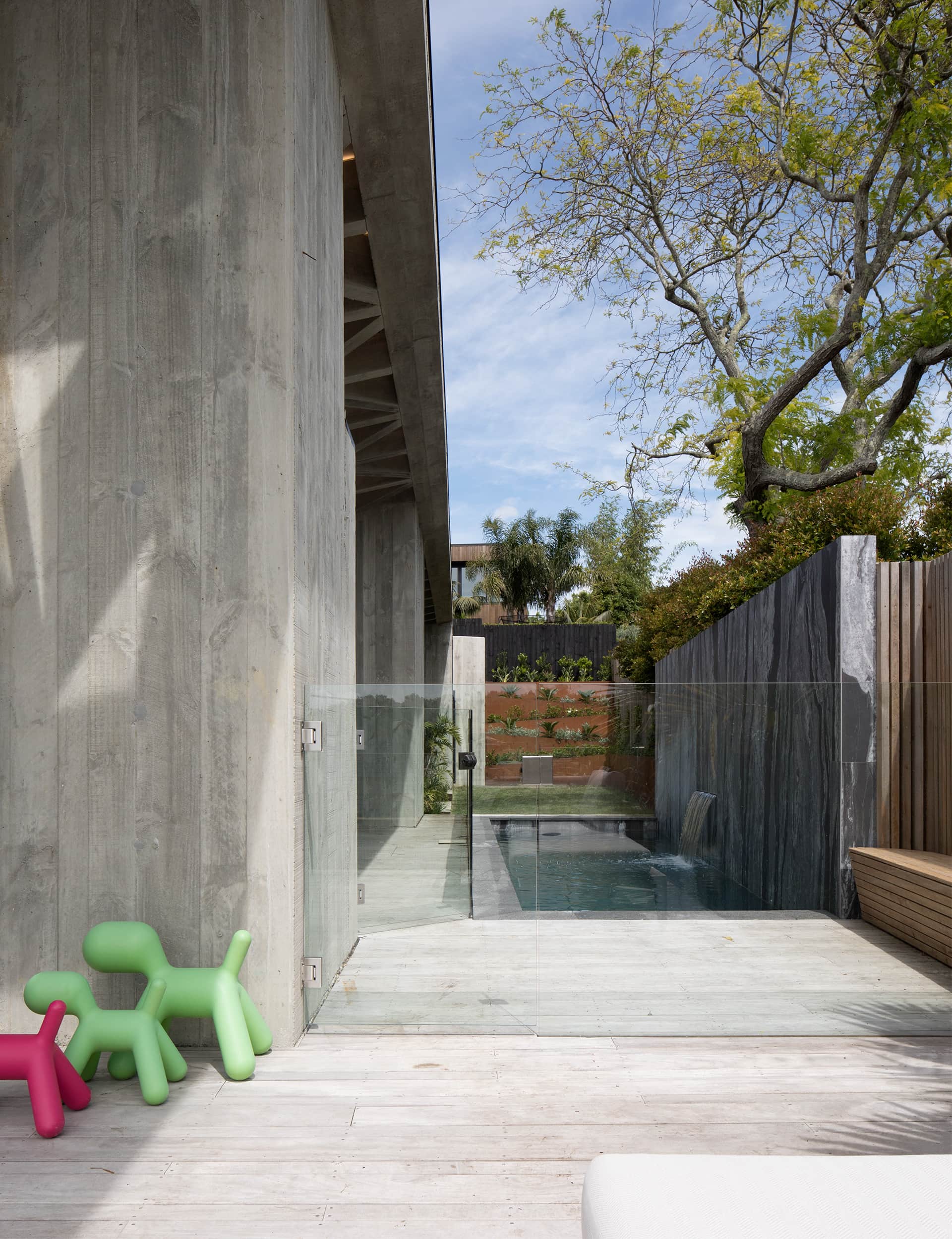
A lot of the work the three of them have done together has been in Auckland’s inner-west suburbs, where tight heritage controls have made contemporary architecture considerably more difficult in recent years. They were delighted when they realised that, thanks to a quirk of planning, there was no heritage overlay for the site, even though it is surrounded by pretty villas. “We’ve done quite well to push things quite far,” says McKinney, of the various houses and alterations, “but there was a bit of pent-up frustration to do something unrestrained on both sides. Just to do something fun.”
McKinney describes the design in breezy, uncomplicated terms. The site is long and narrow, with a two-storey fall from west to east. “Richard Naish built a small hill town to deal with that,” he says of our Home of the Year 2015, two doors up from this one. “But we’ve been much more simplistic.”
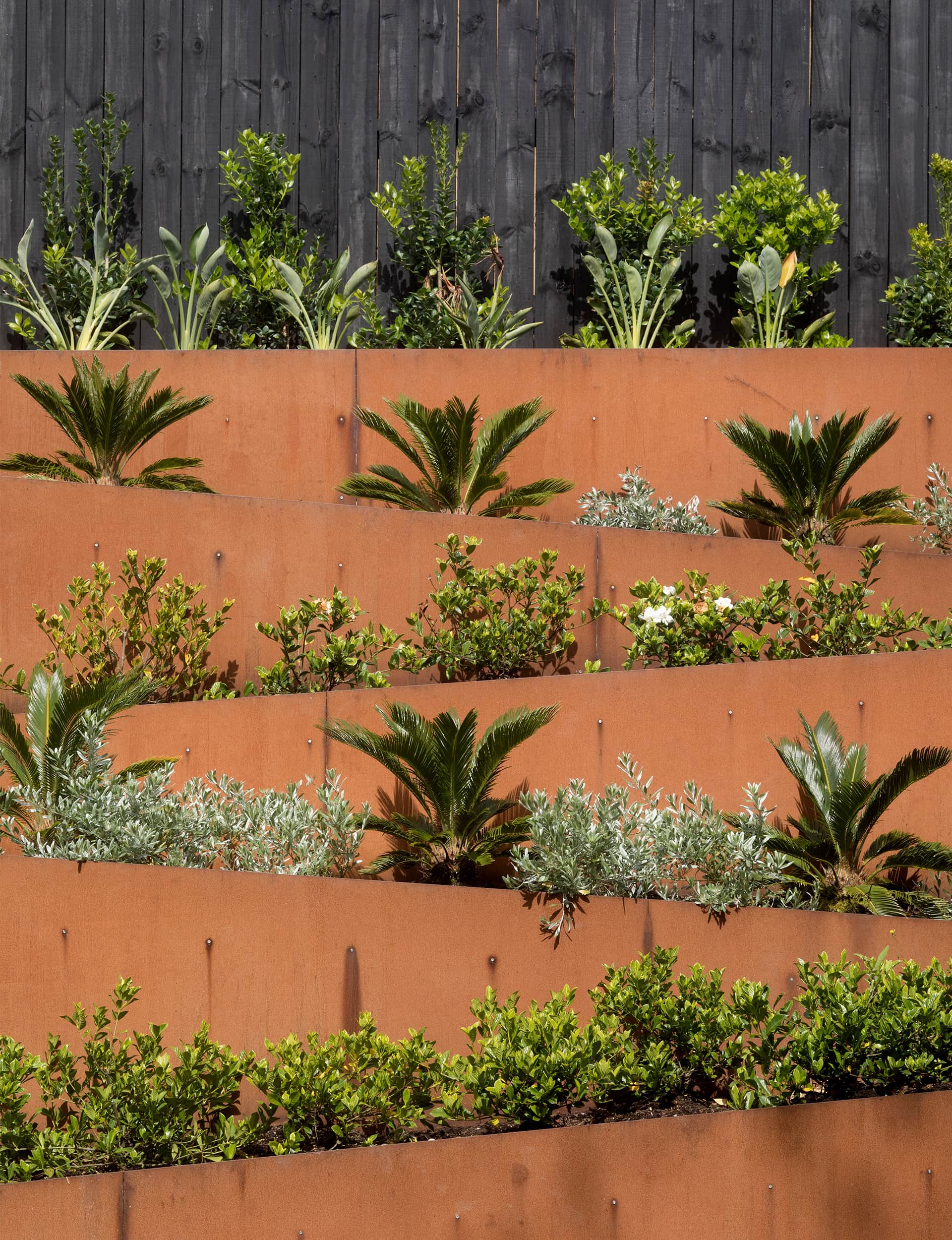
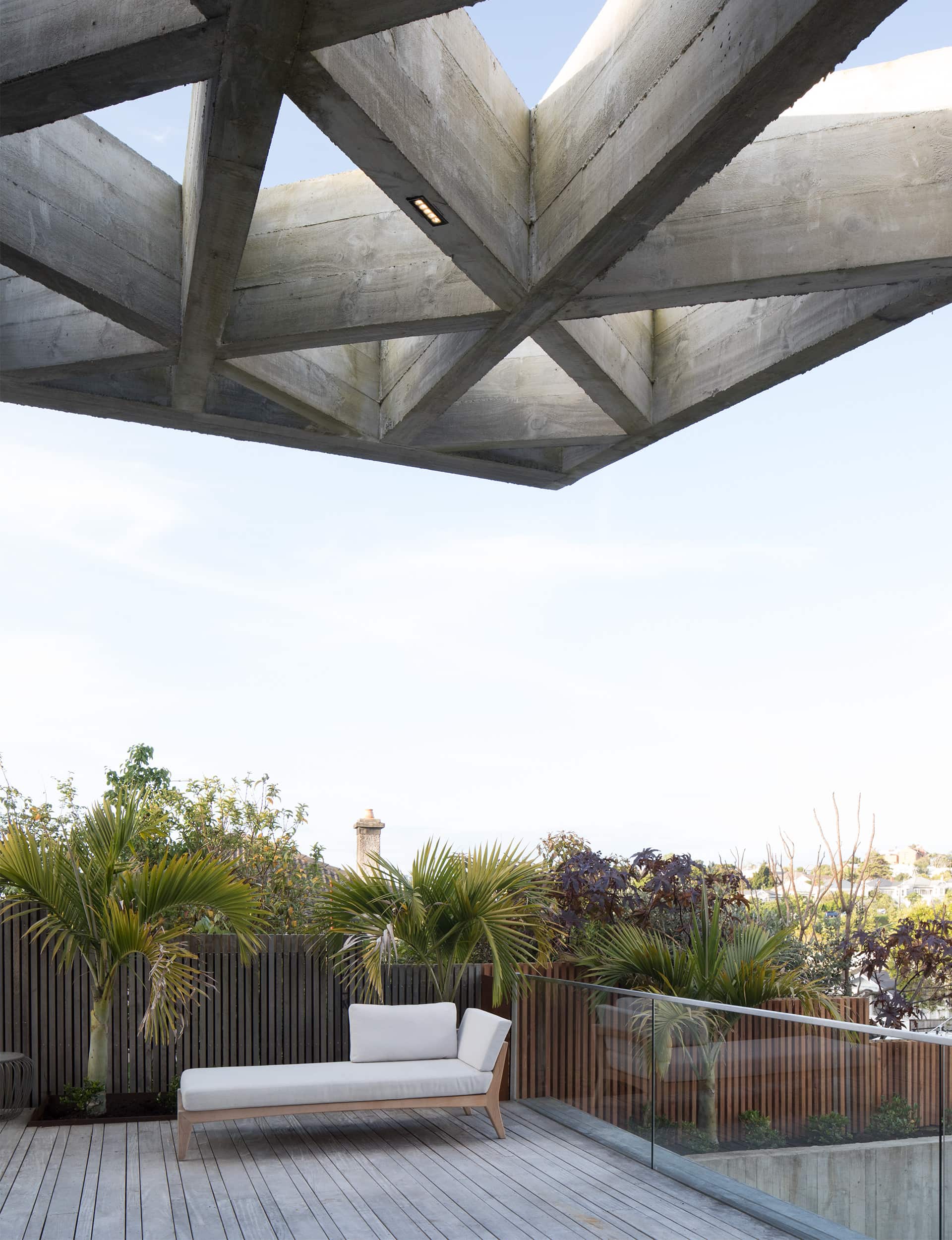
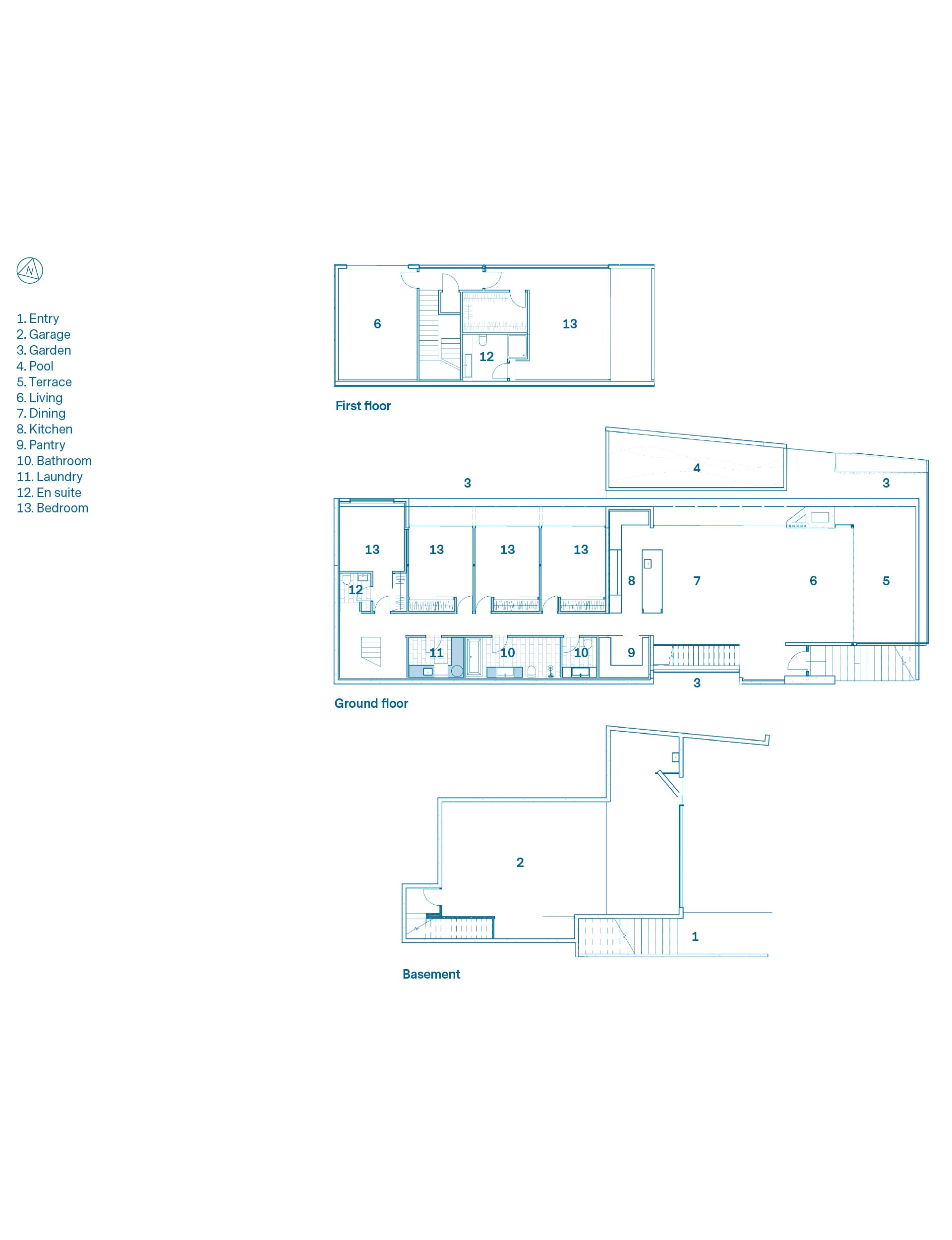
The first big move was to build the house hard on the southern boundary, in breach of the usual rules governing side yards, since the couple also owns the house next door. This gave them as much room as possible on the northern side. The house uses the big basement garage as a sort of podium – without feeling like a fish bowl, there’s a lovely connection to the street and nearby Grey Lynn Park from the living areas and deck. “We spend a lot of time outside on the deck, even in winter,” says Newnham. “It feels like the house continues across to the park – your vision doesn’t stop.”
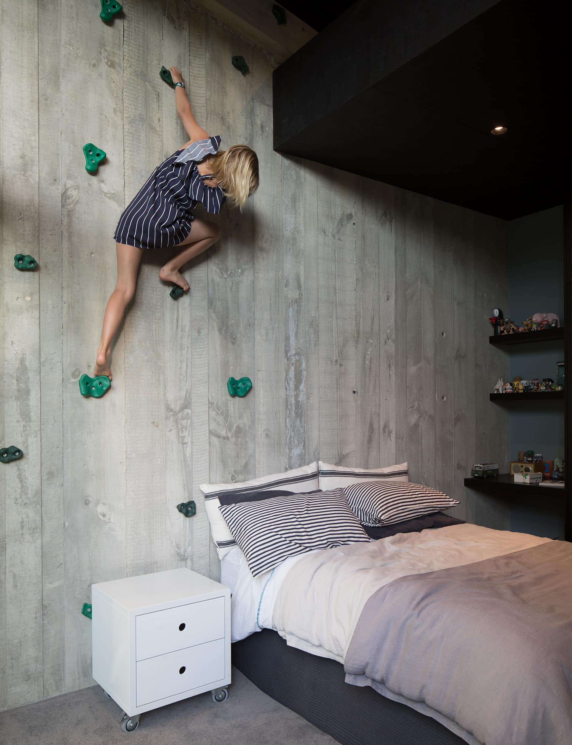
You enter the home up a long flight of poured-concrete steps and into a voluminous, open-plan kitchen and living area, which opens out to a deck on two sides, a narrow pool and a small lawn. Beyond that, a hallway services four bedrooms with lofts – one for each of the kids, plus a spare – on the northern side, and service rooms (bathroom, laundry, guest WC) on the other.

The main bedroom is upstairs, and there’s a separate media room: it’s a straightforward, practical design. “We can have heaps of people here,” says Newnham, “but it never feels chaotic.”
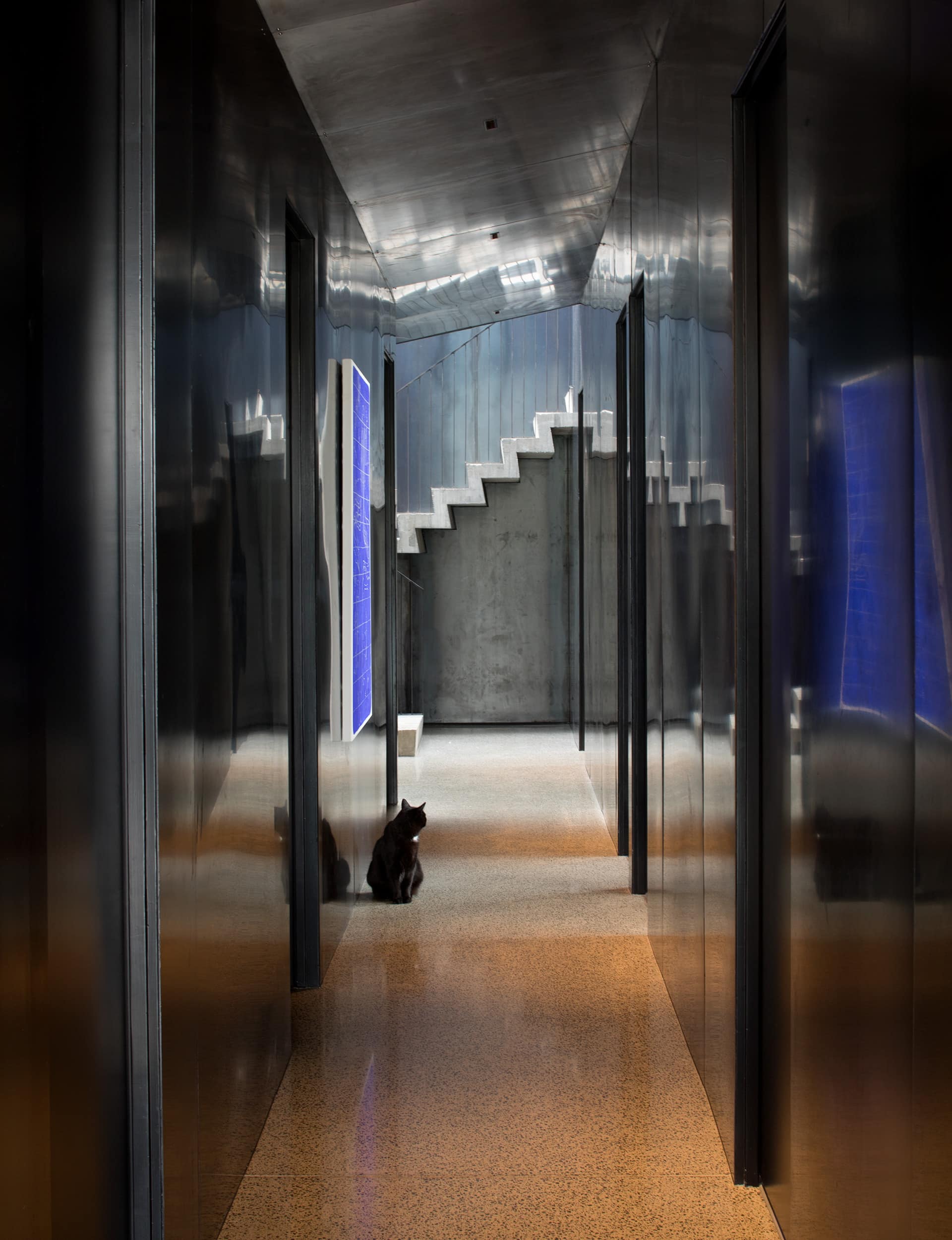
There’s also drama between front and back, thanks to the waxed steel that lines the hallway on three sides. “It didn’t have natural light,” says McKinney. “We knew the living area was expansive, so we thought, why
don’t we just make it really dark?”
[quote title=”There was a lot of freedom in design and licence” green=”true” text=”to be more exuberant than usual.” marks=”true”]
The distinctive diagonals nearly didn’t make it. Pouring the long vertical support beams was a laborious task, which involved building plywood boxing lined with rough-sawn boards and propping them up on an angle. The steel bars inside the concrete are 35mm thick – a gauge so heavy it broke the small plastic feet that held the reinforcing bar up while the concrete was poured around it.
Ireland’s team had to tie the steel bars to the top of the boxing, pour concrete, then gently lower the bars on top before pouring more concrete over the top. Then the concrete slid to the bottom of the slope, so they stayed on site until long after dark, raking it back into place until it cured.
[gallery_link num_photos=”18″ media=”https://www.homemagazine.nz/wp-content/uploads/2019/04/DiagridHouseJackMcKinney_HOTY2019_8.jpg” link=”/real-homes/home-of-the-year/56-tonne-concrete-roof-winning-home-isnt-oppressive” title=”See more of the award-winning home here”]
McKinney tells the story neatly: “As we were designing it, I said, ‘It would be great to have these diagonals in here Cam… So you’re fine to do them Cam? Because if you’re not going to do them we’ll give you a different house, because it needs those diagonals.’ And then half way through, he said, ‘We don’t need these diagonals do we?’” McKinney waits a beat. “And that’s why I’m there every day at 10.”
Words by: Simon Farrell-Green. Photography by: Patrick Reynolds
[related_articles post1=”94167″ post2=”94461″]
