Through several Auckland cafes and restaurants, Clare and Joost Van Den Berg have opened a series of dining rooms for the city. But with their latest, Hugo’s Bistro on Shortland Street, they’ve created a space at once polished and homely
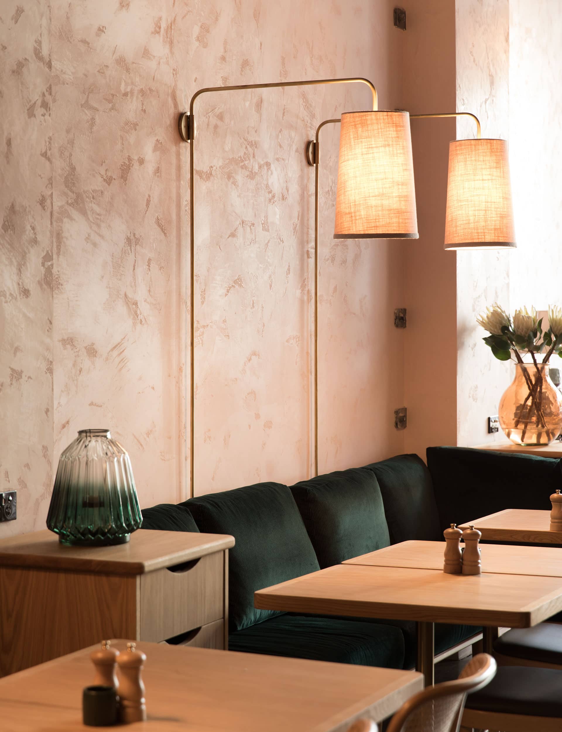
Inside the elegant yet rustic interior of Hugo’s Bistro
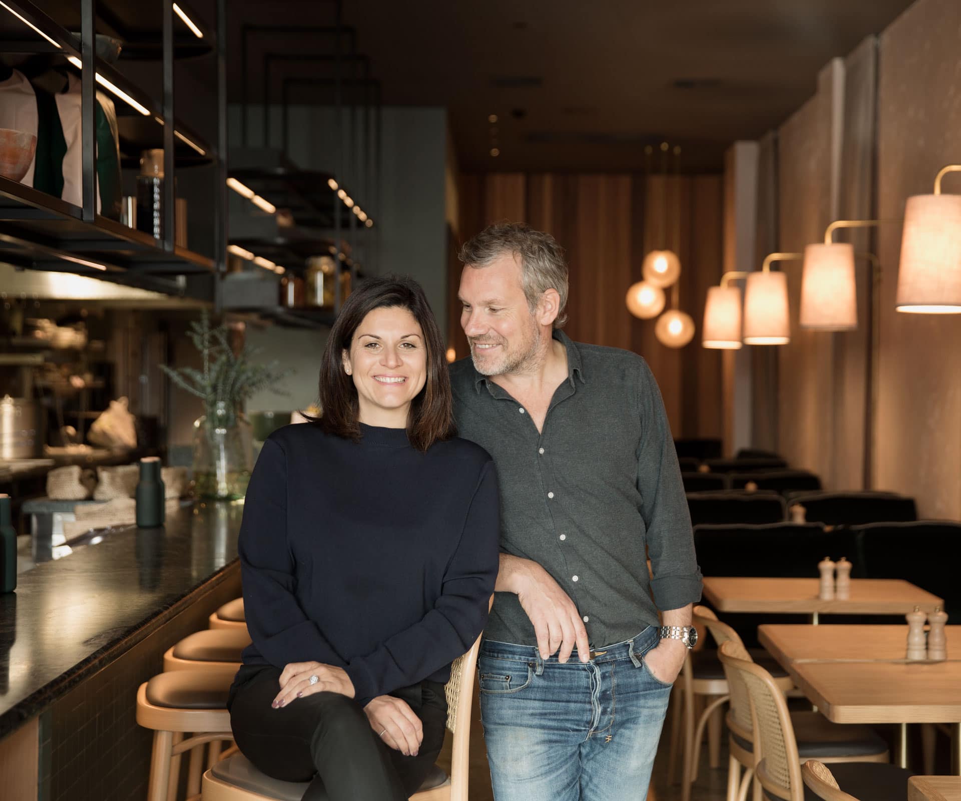
Hugo’s is the fourth Auckland restaurant of husband-and-wife owners Clare and Joost Van Den Berg. They started with the celebrated café Zus & Zo in Herne Bay, then moved on to Takapuna with Zomer, before opening Odettes three years ago, which happens to be right next door to the HOME office and functions a little like our meeting room, only with really good food (and better cushions).
Now, with Hugo’s, they’ve built another living room for the city. It’s a long, thin space on Shortland Street, handy to the towers across the road and the shopping precincts around High Street. “We wanted that European everyday bistro feel,” says Clare.
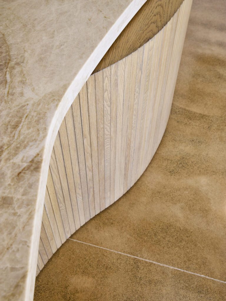
The refit took close to a year and involved gutting the space and replacing all the services, right through to the new steel-framed front windows and doors. To this, Clare added rounded oak furniture and green corduroy upholstery, along with bespoke brass lights made by Jimmy’s Handbuilt. It’s elegant but warm, neither masculine nor feminine.
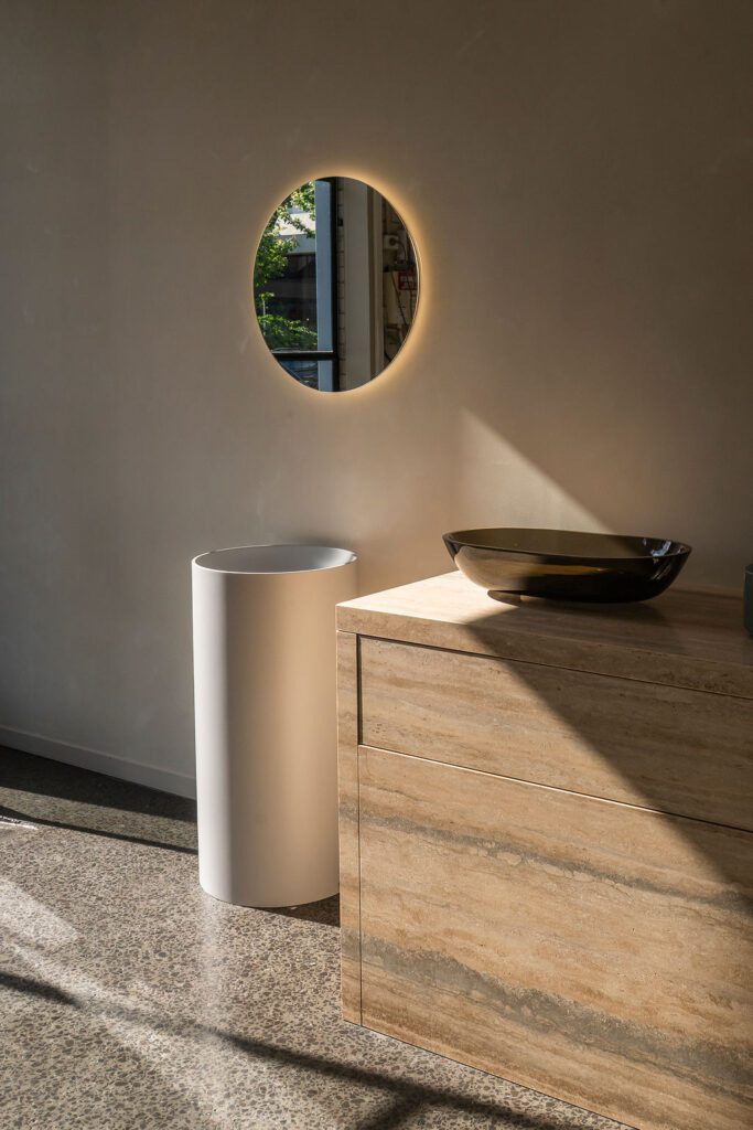
There’s a terrazzo floor and a green marble bar, offset by a wall of cedar shiplap on one side and another plastered with Marmorino, an Italian plaster made from lime and marble dust (the Romans used it, and so did Renaissance Venetians), tinted pink and laid on so its roughness and imperfections are on show. “I wanted it to look lived in,” says Clare, “and I didn’t want to paint that wall.”
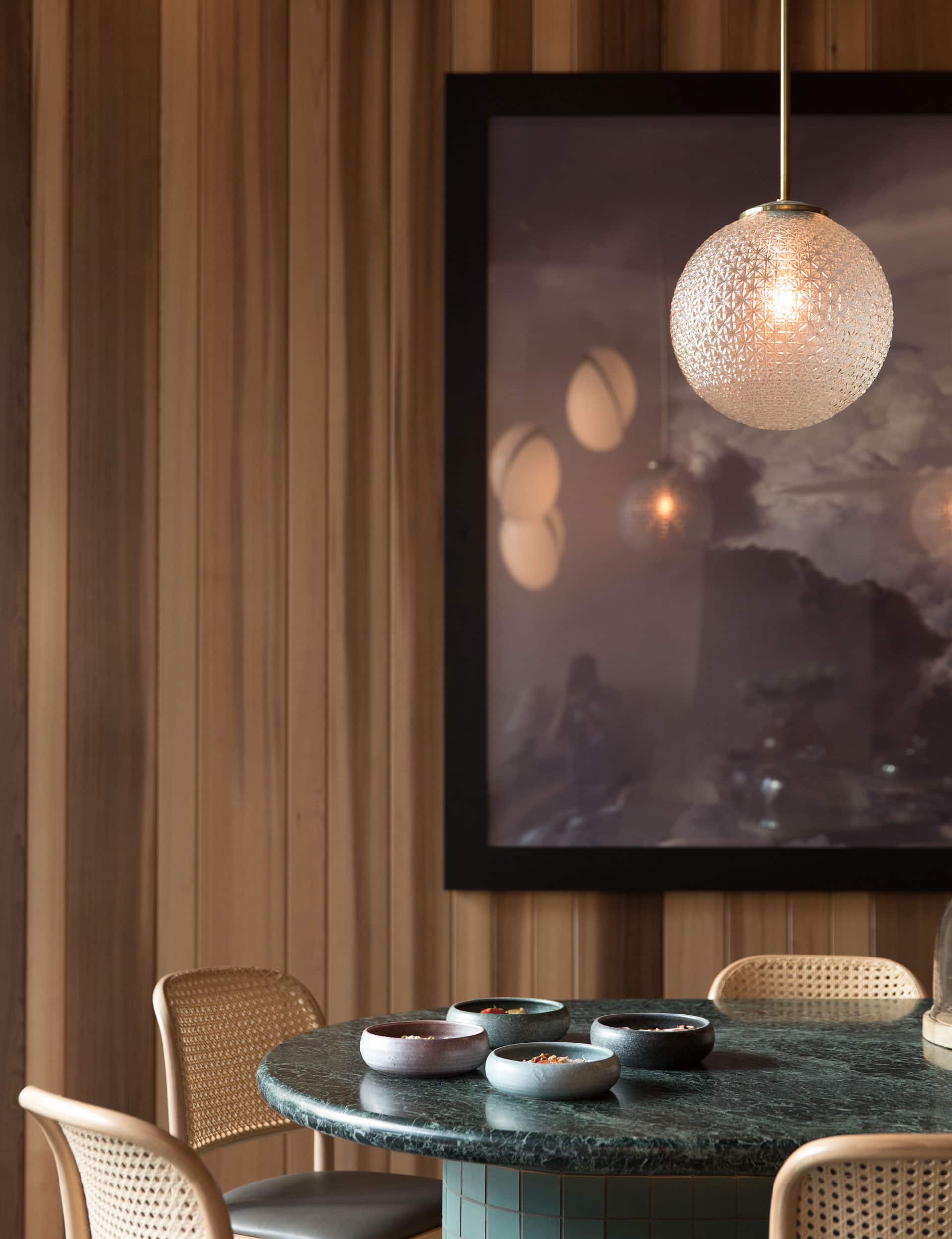
Daytime is busy, with corporates and lawyers doing breakfast and lunch. For the dinner service, the lights are low, pooled over the tables. The menu runs through comfort food, with a twist: you might find a special of meatballs on pappardelle with pickled celery cutting through the meaty-tomatoey sauce, or you might find schnitzel with mushroom jus, or salt-fish fritters. The wine list is short, elegant and tends to European: an Italian soave to go with your meatballs, say, on a sunny day at the bar.
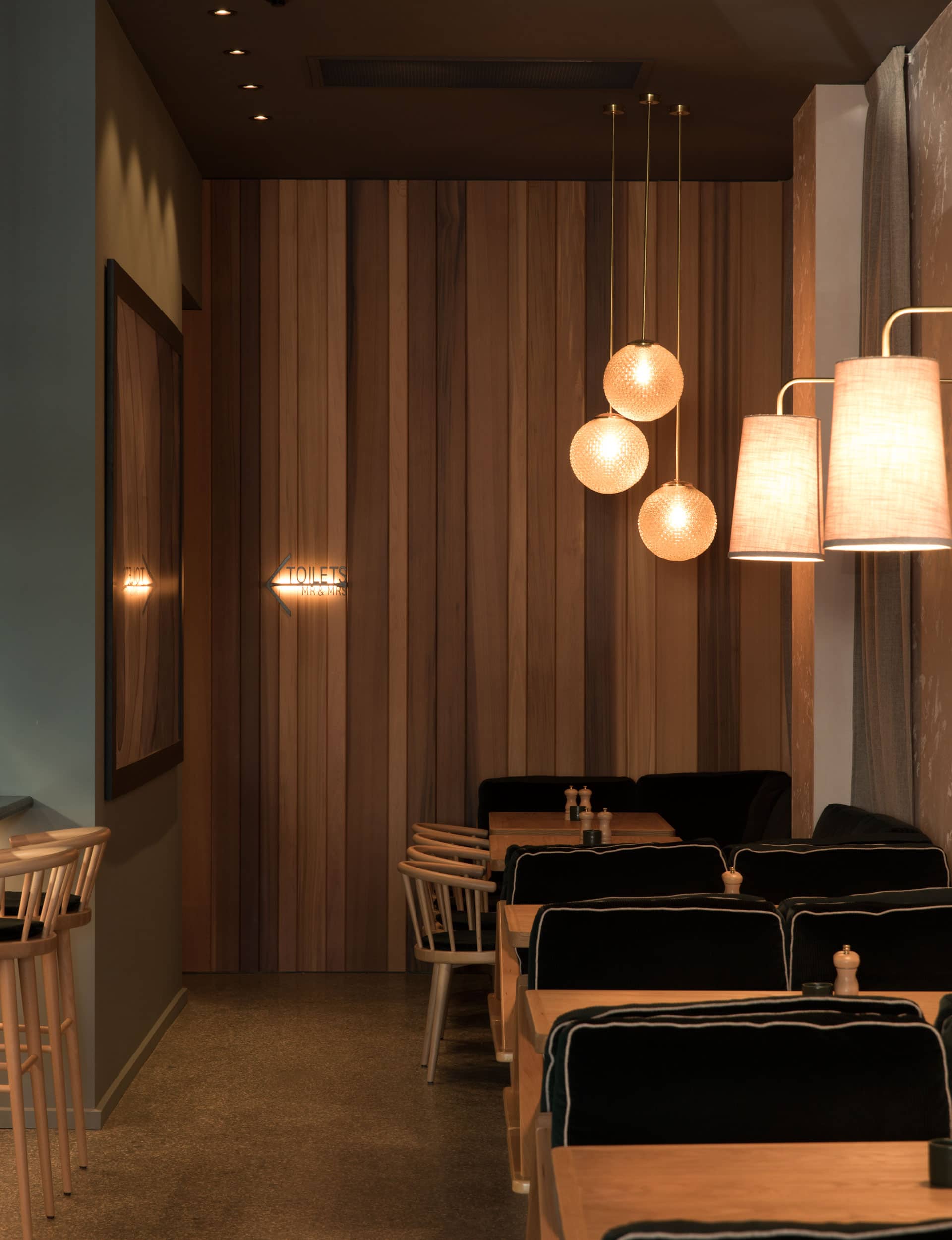
As with Odettes, the couple worked on the design with Nat Cheshire and Dajiang Tai at Cheshire Architects, who helped this time with the initial layout of the restaurant as well as elevations and construction drawings. They also act as a sounding board when needed, says Clare.
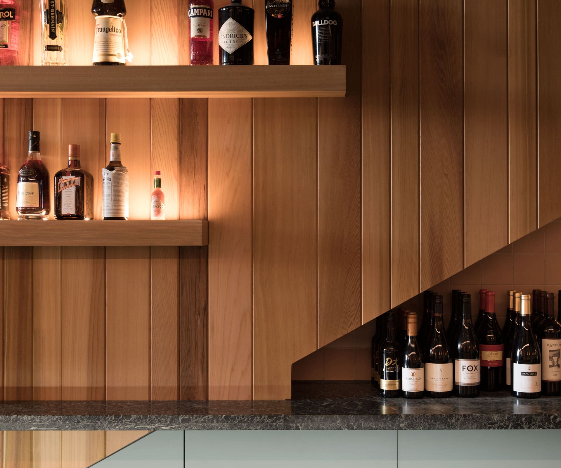
Through the four projects, Clare has slowly refined her design sensibility. “I guess your interior changes and your direction changes and you grow up a bit,” she says of the gradual progression from scrubbed tables and vintage light fittings in Herne Bay, to polished inner-city bistro.
Though she has no formal training, Clare worked in film for years and, in a sense, her interiors have all the appeal and dance of a film set. “These ones have to last a bit longer though,” she says, recalling her horror at the first ding in the bar at Odettes – which now looks nicely worn.
Words by: Simon Farrell-Green. Photography by: David Straight.
[related_articles post1=”56206″ post2=”72458″]
