Sixteen years on, Daniel Marshall reworks an early design with a fresh new perspective. See inside this impressive concrete home below
In some ways, 2003 doesn’t seem like such a long time ago – until you count all the things that have changed. Sixteen years ago, the world was still reeling from the aftermath of September 11 and George W Bush’s subsequent invasion of Iraq; Helen Clark was New Zealand’s prime minister. Finding Nemo was released at the box office and the best-selling cellphone was the Nokia 3200. The October/November cover of New Zealand Home & Entertaining – the predecessor to HOME – meanwhile, featured a crisp, urbane house in Remuera, Auckland, by a young architect called Daniel Marshall.
At a time when the fashion of Auckland’s eastern suburbs ran to French country or faux-Mediterranean – and the leafy street this home sits on has plenty of that – the house, designed for former All Black captain Sean Fitzpatrick and his family, was something of a departure. Accessed down a long right-of-way, the recently subdivided site was sloping and north-facing, with some beautiful established trees and a fabulous view over Hobson Bay and out over the harbour to Rangitoto. “It was extraordinary,” recalls Marshall. “It was just a paddock, a farm with fence posts and grass in the middle of Remuera.”
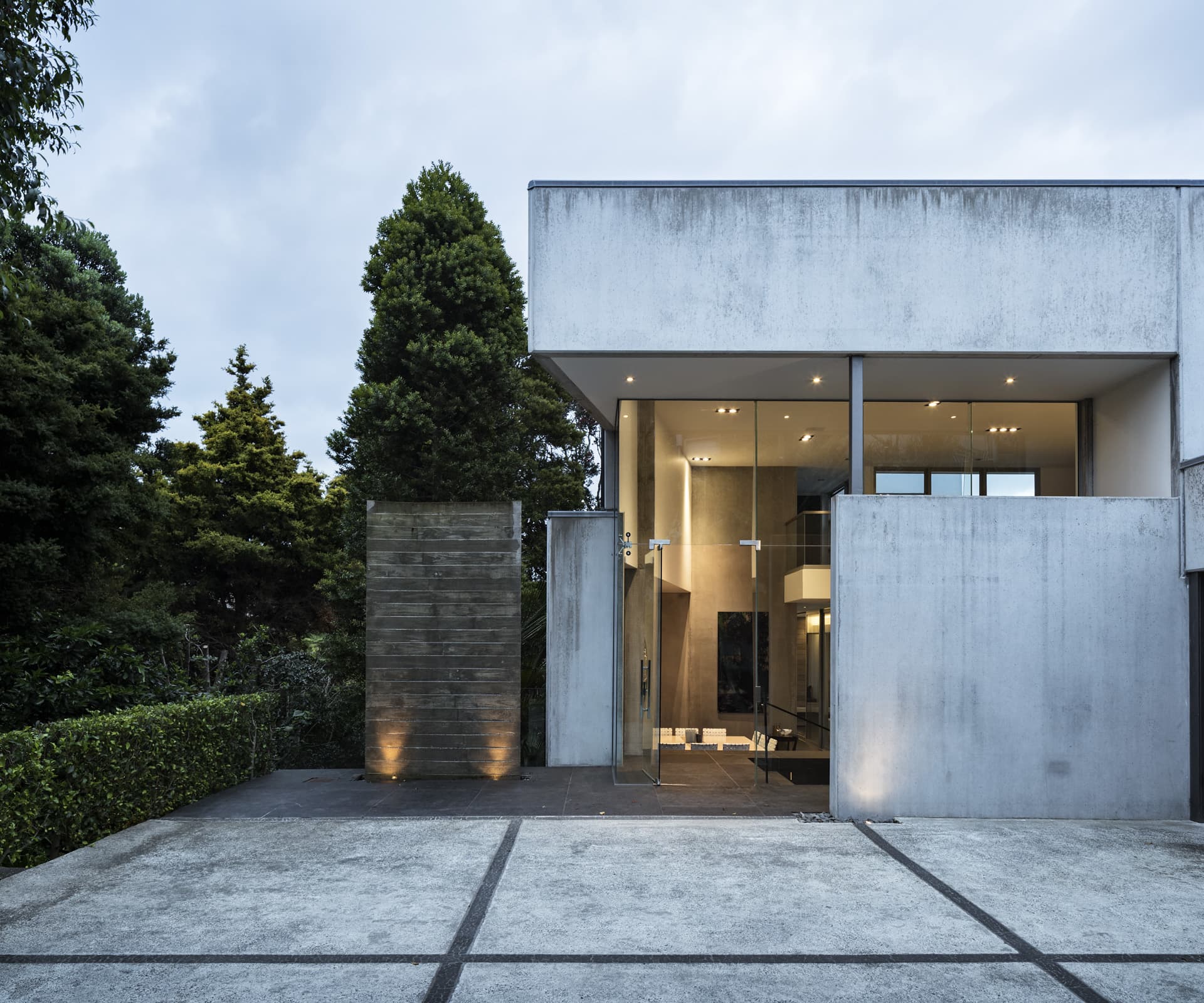
Marshall’s response to the site was driven by concrete, which came to define many of his houses in the intervening years. The home featured tilt-slab concrete walls and lots of glass, arranged in an L around a sheltered outdoor living area and pool. About the time he designed the house, Marshall spent some time in Bali, and while the materials are different, you can see the influence of the Bali villa. “I loved the landscape quality of how they do houses – villas around courtyards, and the relationship with the ground,” he says.
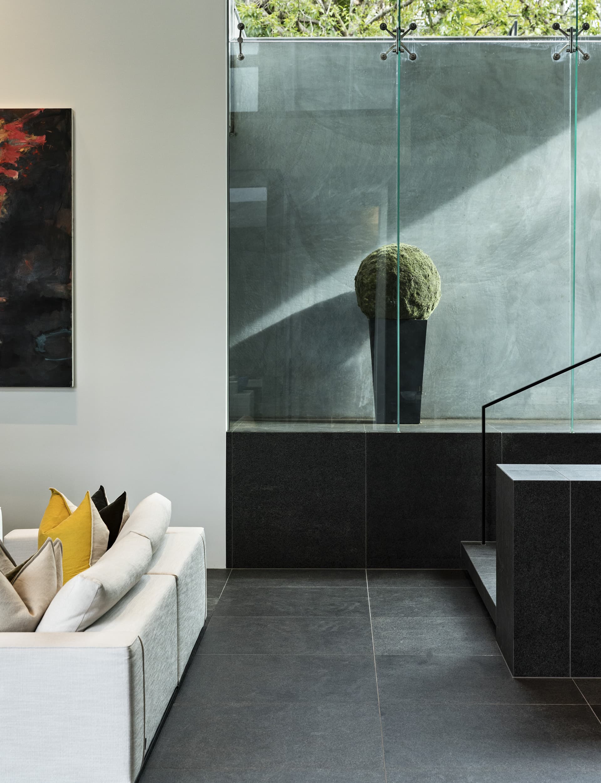
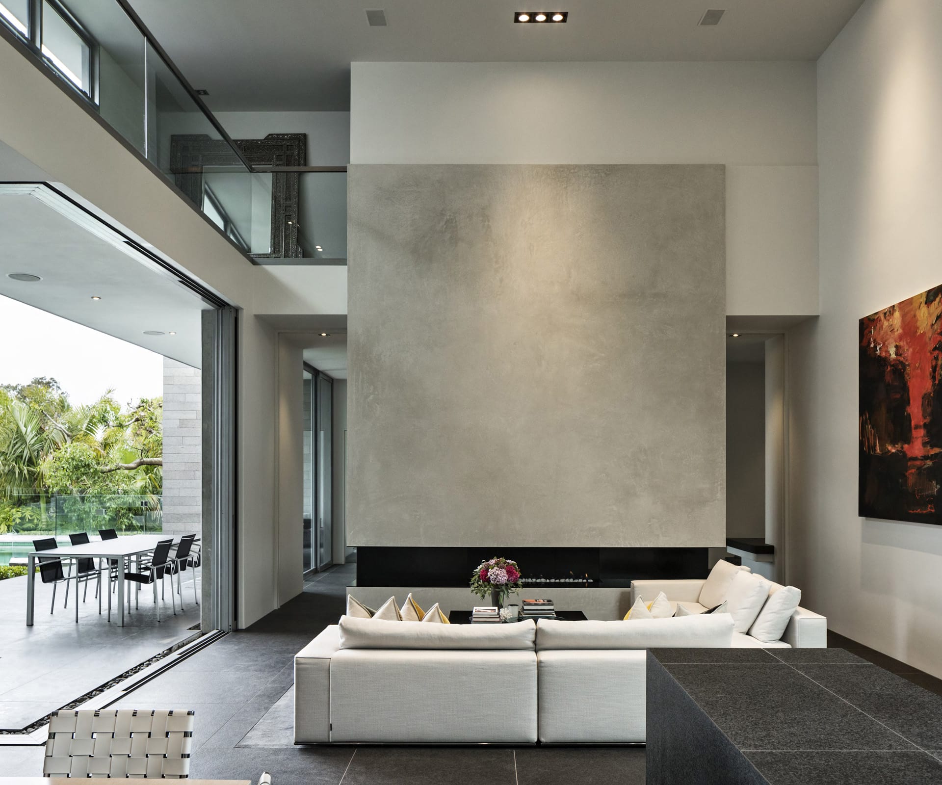
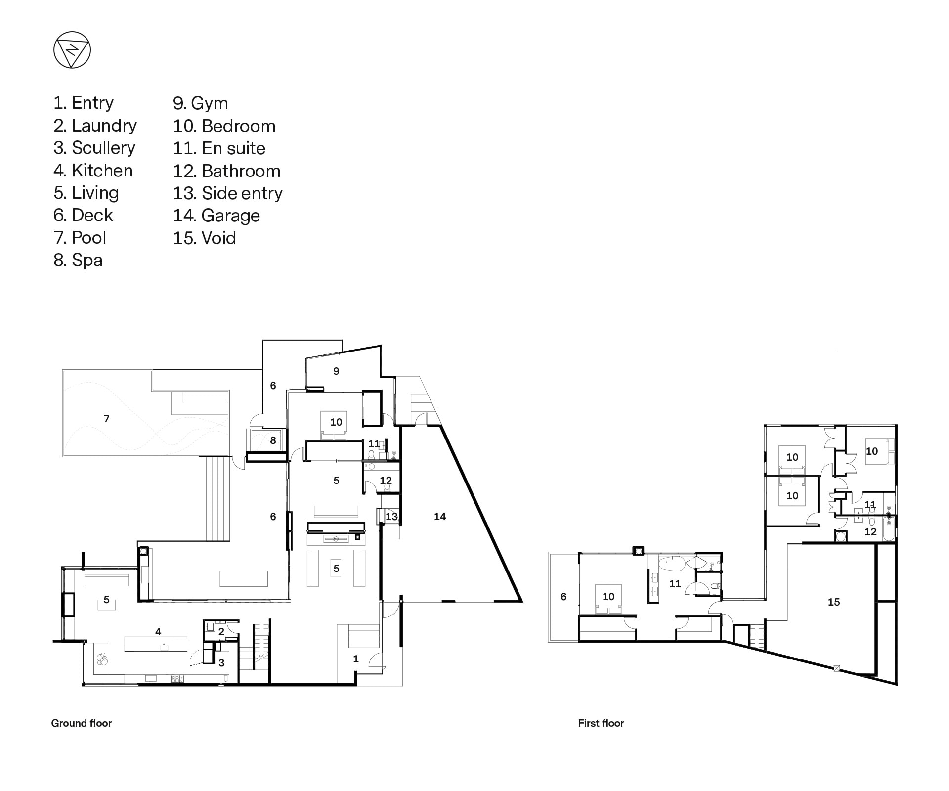
The entry is dramatic – on the diagonal, down wide steps through the point of the L and into a large, double-height space that connects the two wings of the house around a fireplace. To your left is the kitchen and dining area with the main bedroom above; on the other, a family room and den with bedrooms above. Outdoor spaces and the pool – now sheltered by mature planting – are straight ahead. It was a clever move, which turned the back of the house to the driveway. “It’s something I stole from John Scott, actually,” says Marshall. You enter Futuna Chapel in a similar way, on the diagonal of an orthogonal space – the dynamic approach enlivens a square.
Sixteen years and four owners later, Marshall has just completed a large renovation of the home for a couple and their three children – his third crack at the project. The house had changed over the years – the second owners asked Marshall to design a gym to one side, a wine cellar in the basement and a water feature at the entry. The bones were still there but some of the spaces weren’t quite right for a social family in 2019.
“We loved the light and openness,” recalls one of the owners, of first seeing the house. “It’s so practical living in a house like this with a big family. You’ve got your space and you go to your corners, but you can still see and hear each other.”
Not long after buying, the family spent a lengthy period working in Singapore – a logical time to bring the place up to date. They emailed Marshall to ask who he’d recommend for the project and, to their surprise, he said he’d do it. Not long afterwards, the architect visited the house and ran straight into a frameless glass balustrade that a previous owner had erected at the entry. “Well, that’ll have to go,” he said.
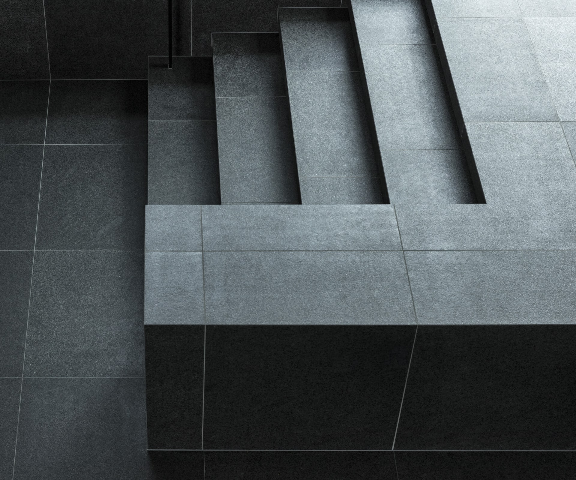
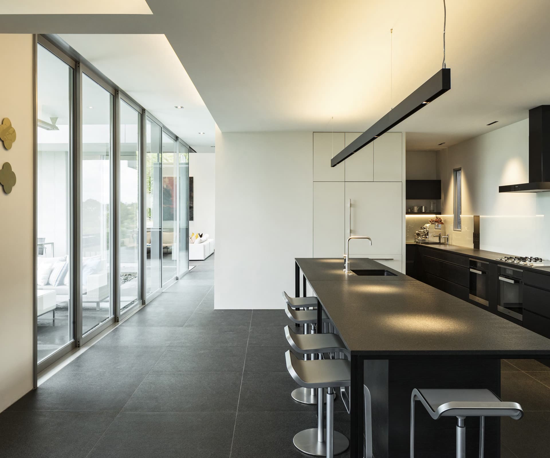
The work took a year, and while the spaces are broadly in the same place, much has changed. The kitchen, once white and U-shaped, is now a darkly minimalist island arrangement that’s been moved back a step, allowing room for mingling between the island and sliding doors to the outside. Marshall chopped the laundry down, extending the kitchen behind it to create a scullery. The limestone floor – all the rage in 2003 – came up, to be replaced by large black basalt tiles, flamed and ground to a leather-like finish.
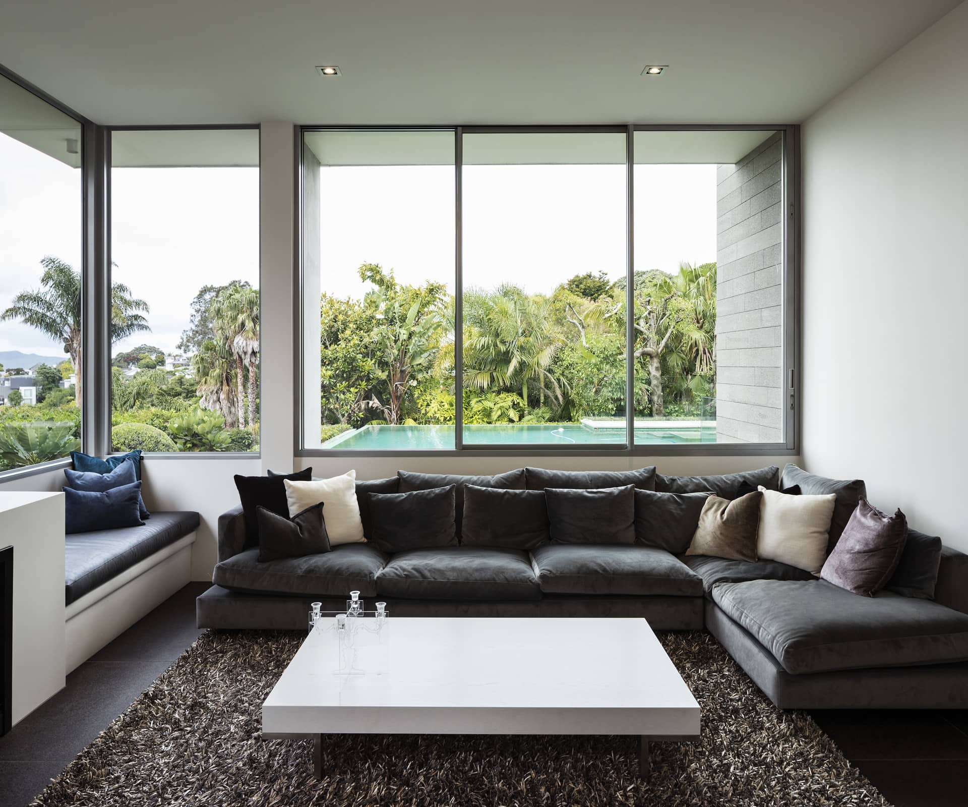
In the dramatic living area, Marshall had originally designed a silk covering to disguise speakers and soften the space. He freely admits it didn’t quite work and there’s now an elegantly rendered wall. Outside, the old schist walls were ripped apart, rebuilt, waterproofed and clad with rectangular grey tiles. Upstairs in the en suite, which is open to the main bedroom, separated only by a fin wall, he had to make way for a box to accommodate automated blinds. Overall, the palette is the same, but the house feels truer to its minimalist intent. And while it has been updated, it doesn’t feel new, but very nicely preserved. Concrete walls have aged beautifully, the marks of the years showing clearly, and there’s a shield of established trees.
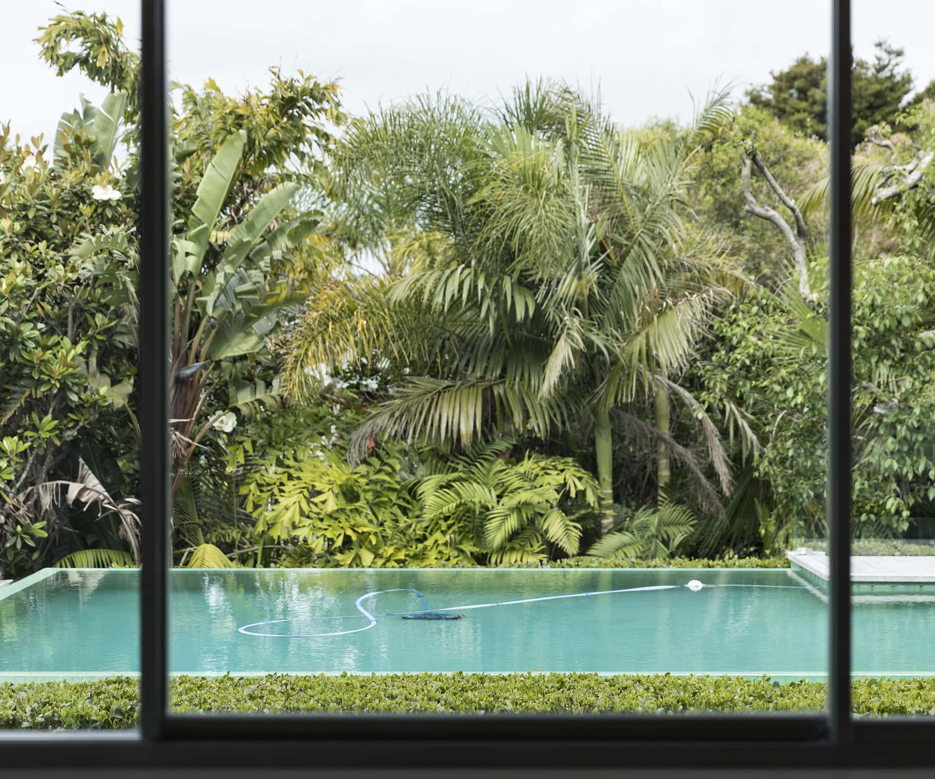
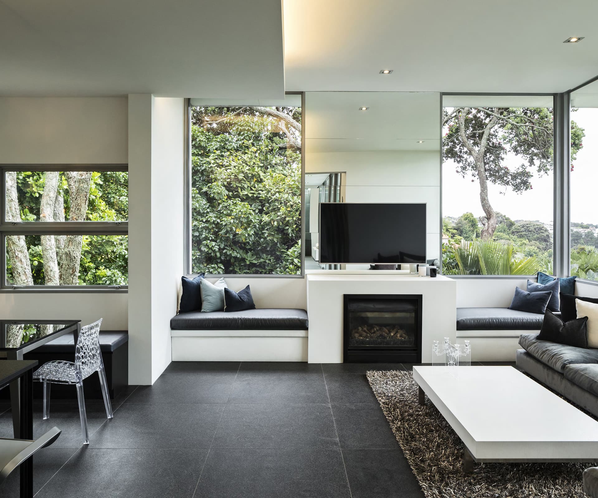
In renovating, Marshall was able to remedy aspects he didn’t feel worked the first time around, and apply new thinking. “I’m an old dog with a few new tricks,” he jokes. In the entry, tiles are now mitred and come up to sit above the window sill so the track isn’t visible; a set of small windows on a northern corner in the family room have been replaced with two large fixed panes that drink in the view. “The game’s changed a lot and there’s a little more sophistication of detail.”
[gallery_link num_photos=”15″ media=”http://www.homestolove.co.nz/wp-content/uploads/2019/10/GreenHouse_DanielMarshall_HOMEOct-Nov19_Pool2.jpg” link=”/real-homes/home-tours/architect-daniel-marshall-renovates-design-third-time” title=”See more of this home here”]
“Doing big houses like this is a bit like any luxury item, there are a lot of layers,” he says. “It’s a little funny coming back to something you did a long time ago – but I still really appreciate the spatiality of it.”
Words by: Simon Farrell-Green. Photography by: Simon Devitt.
[related_articles post1=”109427″ post2=”45173″]
