Two Christchurch architects transform a 1940s concrete bunker into a home of texture, light and comfort
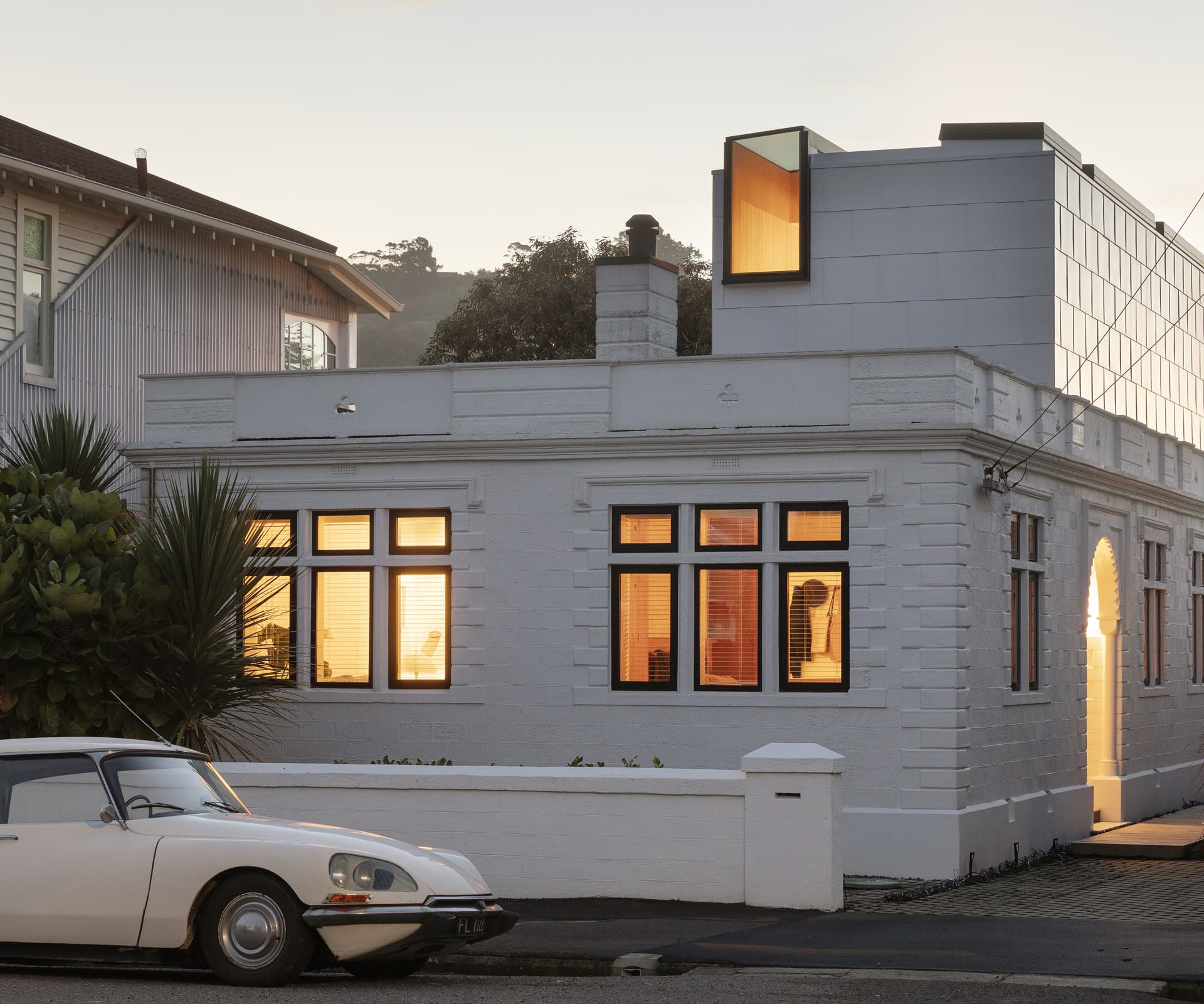
The home of architects Kate and Daniel Sullivan, a very convenient 50 metres from Sumner beach, is the first project they’ve worked on for themselves. The couple founded Architects’ Creative about eight years ago in Christchurch, where they’ve established their careers and work on a range of projects, including new residential and renovations. They keep their practice modest (three people) for its hands-on benefits. It’s an approach they extended to their home, right down to digging trenches for foundations. It was all a good learning experience as architects, they say.
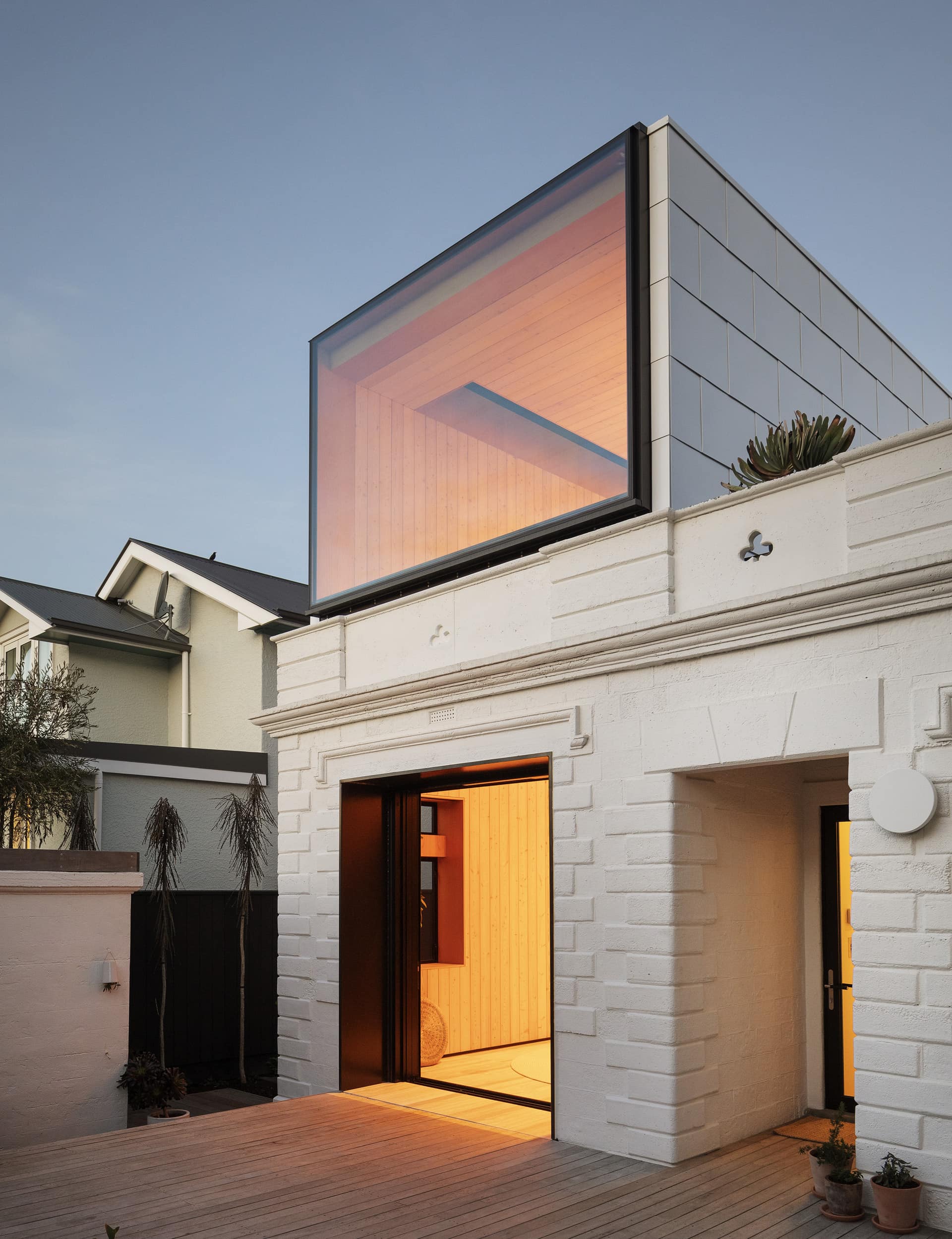
Eager as they were to create their own home, the Sullivans didn’t envisage such an extended undertaking, which evolved over two stages and two babies. But the “slow-architecture” approach has enriched the final result. Speaking of the opportunity as a “luxury” and the results as a “joy”, Kate and Daniel are not trotting out frippery and platitudes. They’ve carefully and exquisitely crafted a home to suit their needs. This is where they will raise their children – a modest home with “the biggest swimming pool in the city” just beyond the front door.
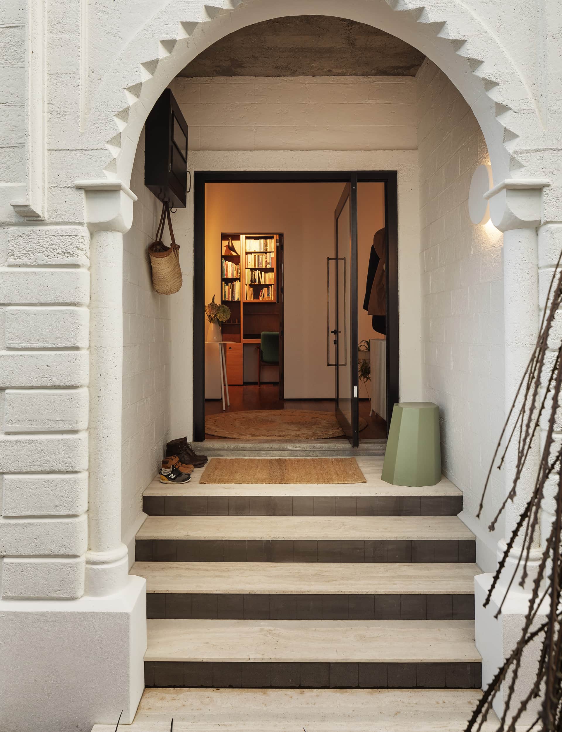
From the get-go, the house was an interesting proposition. When the Sullivans purchased it seven years ago, it had been vacant for some time. The roof leaked and ceilings were collapsing but, beyond the general deterioration, they immediately saw potential and were enchanted with the home’s character and quirks.
A quick planning exercise revealed they could achieve a modest first-floor extension, adding around 20 square metres to the 120 footprint. The house, which sits on a 300-square-metre site and is hemmed in on three sides by two-storey homes, is a bit of a neighbourhood personality. Locals call it the ‘The Bunker’ or ‘The Castle’ and curious passersby often ask after its provenance. Many think it might have been a bank.
“It was the party house when the pub closed,” says Daniel. “A member of Salmonella Dub flatted here and one of their EP release parties was held here. A lot of people tell us they’ve had a history with the house.”
“People remember the parties and how cold and damp the house was,” says Kate. A recent visitor and former resident – a judge on a design-awards panel – was keen to see what his old bedroom looked like. He found things changed – it’s now part of the kitchen. But there’s more to the house than notoriety. Since foundations were laid in the 1940s, the house has been a labour of love for both its owners.
Irish war veteran Gerald Box spent 12 years building the home, making the block work himself and pouring the cast in-situ concrete. “He had previously built an Arts and Crafts-style dwelling a couple of streets over,” says Daniel. Box left his mark in many ways, including the shamrocks embedded in the parapet, as cut-outs and imprints on all four sides of the house.
The first phase of the Sullivans’ redevelopment of the three-bedroom house was essentially a restoration project, which took two years. A few treasures were found along the way, including rimu floors and the cast in-situ ceiling that had been hiding behind plasterboard for decades. “You could say it has been a project since the 40s,” says Daniel.
Typical of its era, it was uninsulated and orientated slightly the wrong way, but it did have structural integrity. The couple tidied up the floorboards, re-ran wiring and services, fibreglassed the roof, installed new windows, strengthened, insulated, strapped and lined walls and installed central heating. The concrete exterior was sand-blasted and a high-performing paint applied for protection in the coastal environment. The single-car garage was converted to a studio and potting space. The Sullivans downed tools just in time for the arrival of their first baby, who is now four years old.
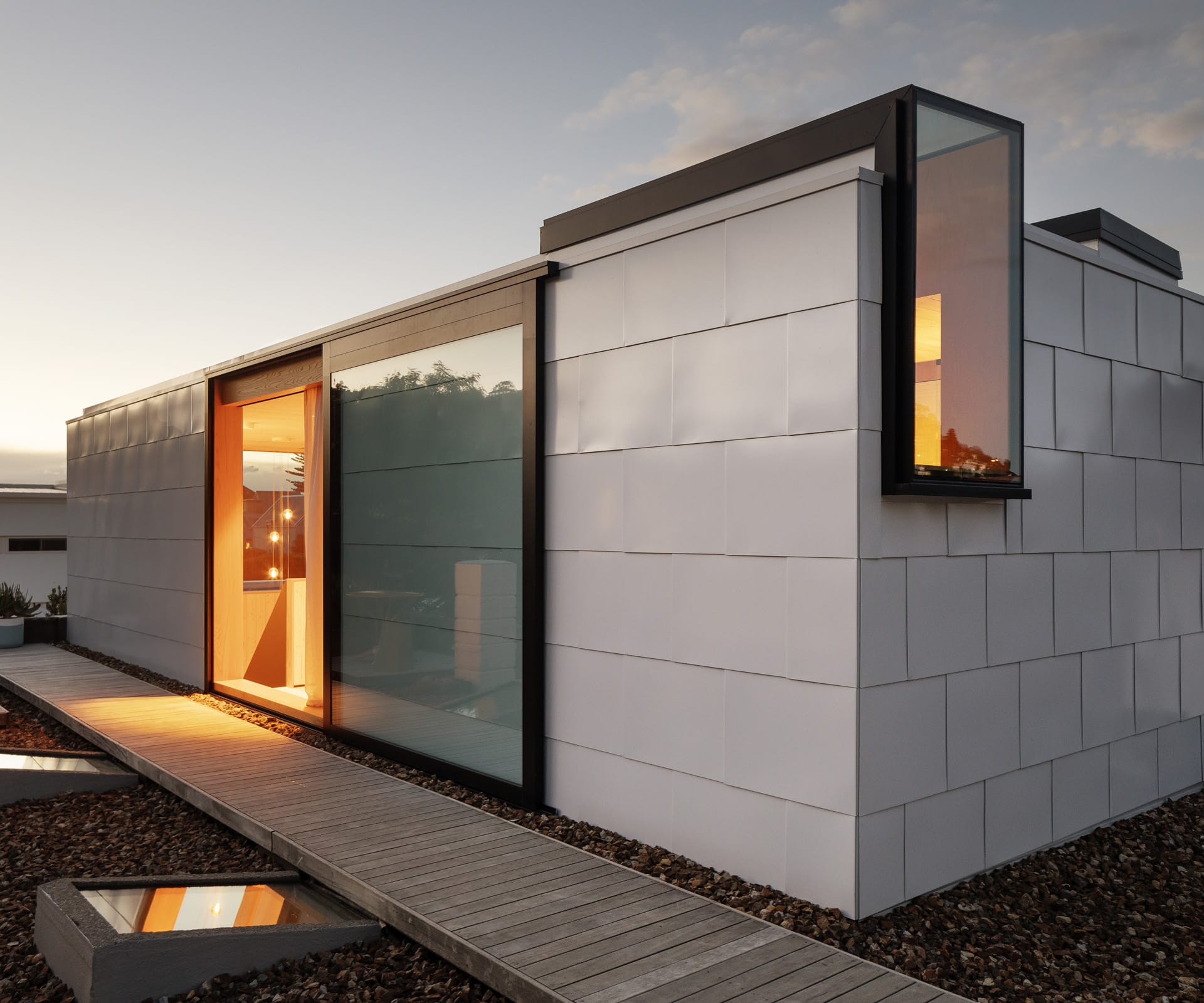
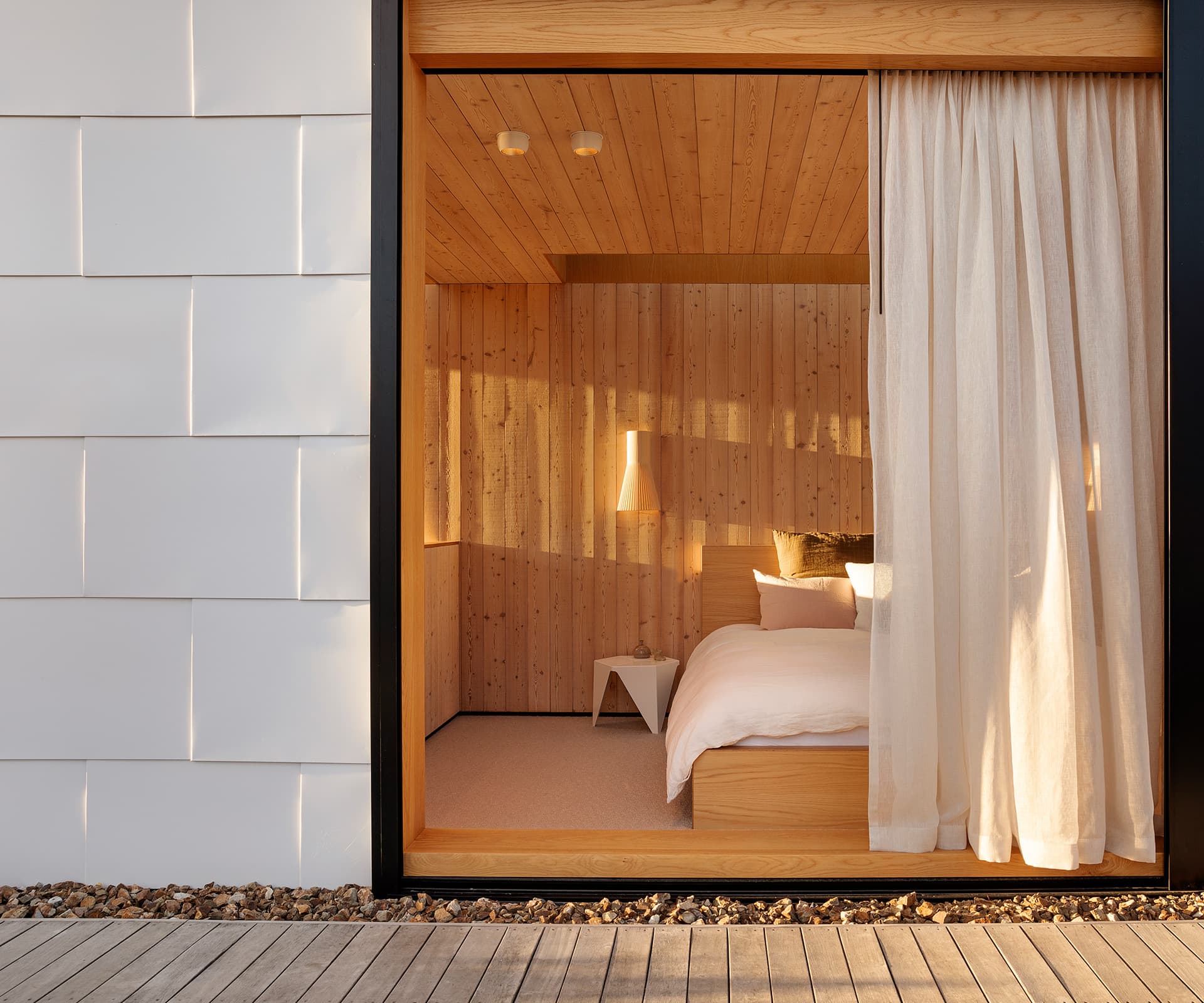
The second stage began in late 2017 and took just over a year. And this is where things get technical and interesting. The house has been popped up the top to contain the main bedroom, en suite and a roof terrace. This 20-square-metre addition is wrapped in pre-finished aluminium panels – elegantly folded like origami – chosen to work in with the brickwork beneath, both in proportion and pattern. The north-west facing end of the pop-up is a glass wall; the south-west facing slider offers views up the valley.
There’s an abundance of light, which streams into the bedroom and bathroom through skylights and glazing, yet there’s privacy from neighbouring homes. On a clear night, there’s an endless sky for star gazing. On the terrace, Teddington chip, a local stone, is laid between walkways and skylights, which drop light into the library and Beau’s bedroom (the former kitchen).
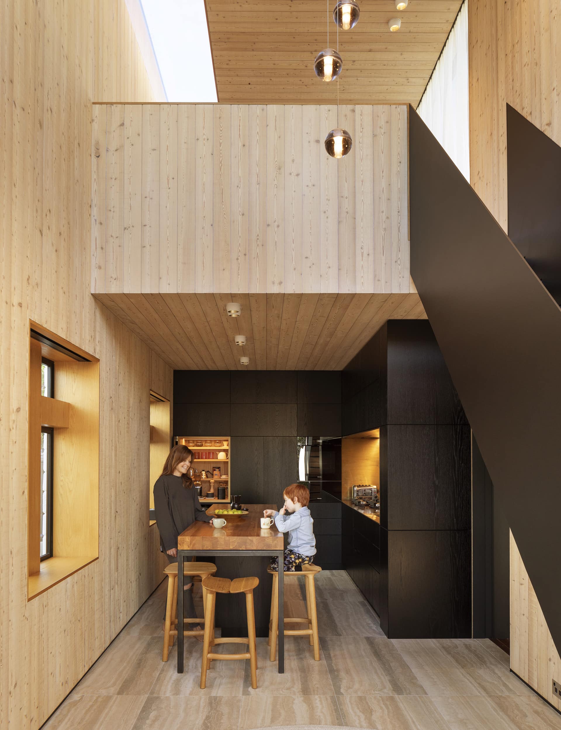
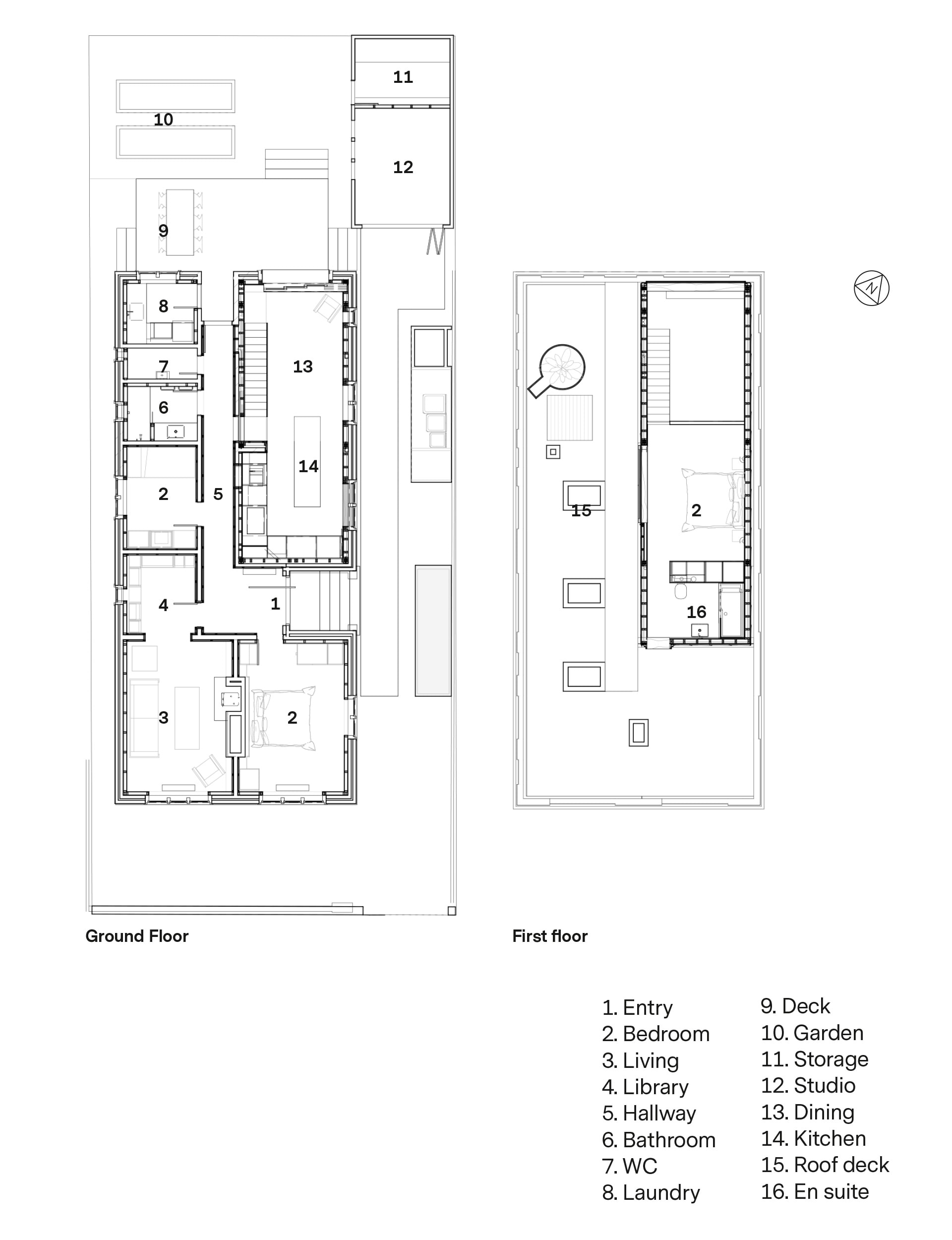
Planning the space beneath the pop-up was an exercise in intensity, tightly programmed to maximise every millimetre. The architects had to work magic from minimums, as they inserted a new kitchen and stairs within a three-metre wide space. To save space, the 8mm-steel staircase, which leads to the pop-up, was fabricated as one piece and craned into place. Daniel took the day off work for this event and, with an equally excited toddler by his side, watched it being manoeuvred into place. The staircase is supported on a cantilevered box section in the wall and floats off the ground. The light play in this area is a work of art.
[gallery_link num_photos=”20″ media=”https://www.homemagazine.nz/wp-content/uploads/2019/08/SumnerHome_ArchitectsCreative_HOMEAug-Sep19_Bedroom.jpg” link=”/real-homes/home-tours/historic-building-was-restored-and-turned-into-family-home” title=”See more of this home here”]
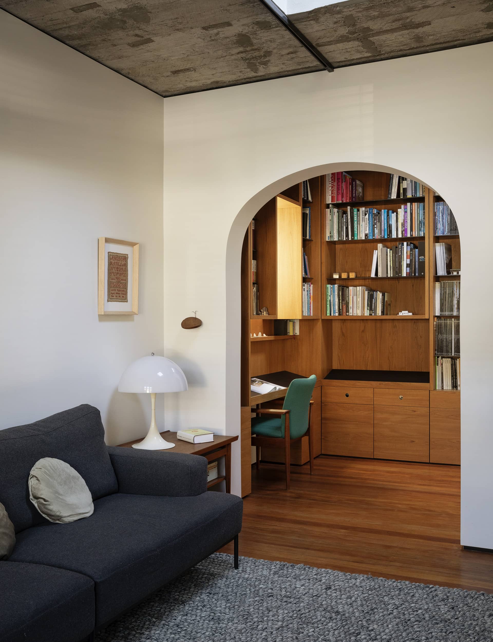
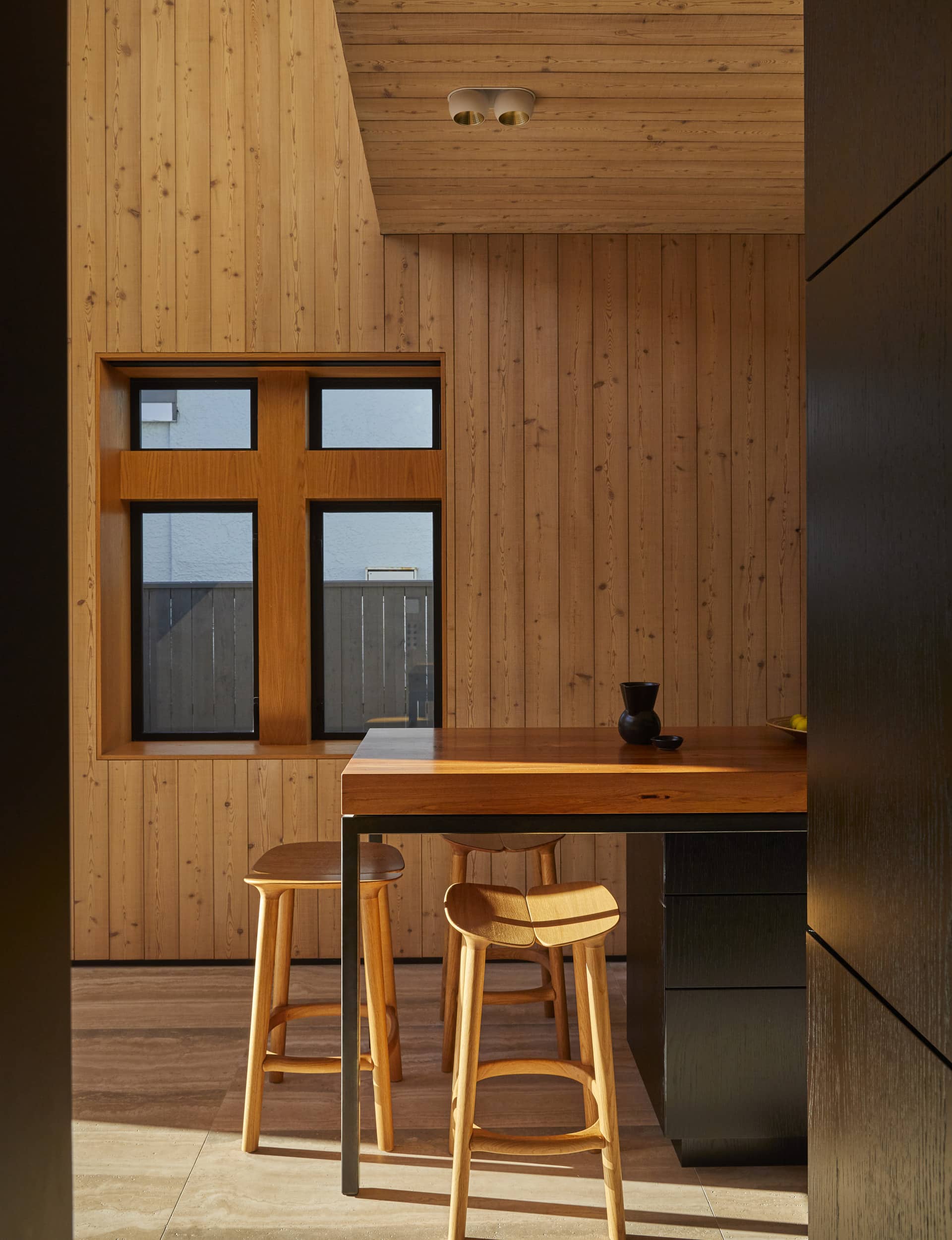
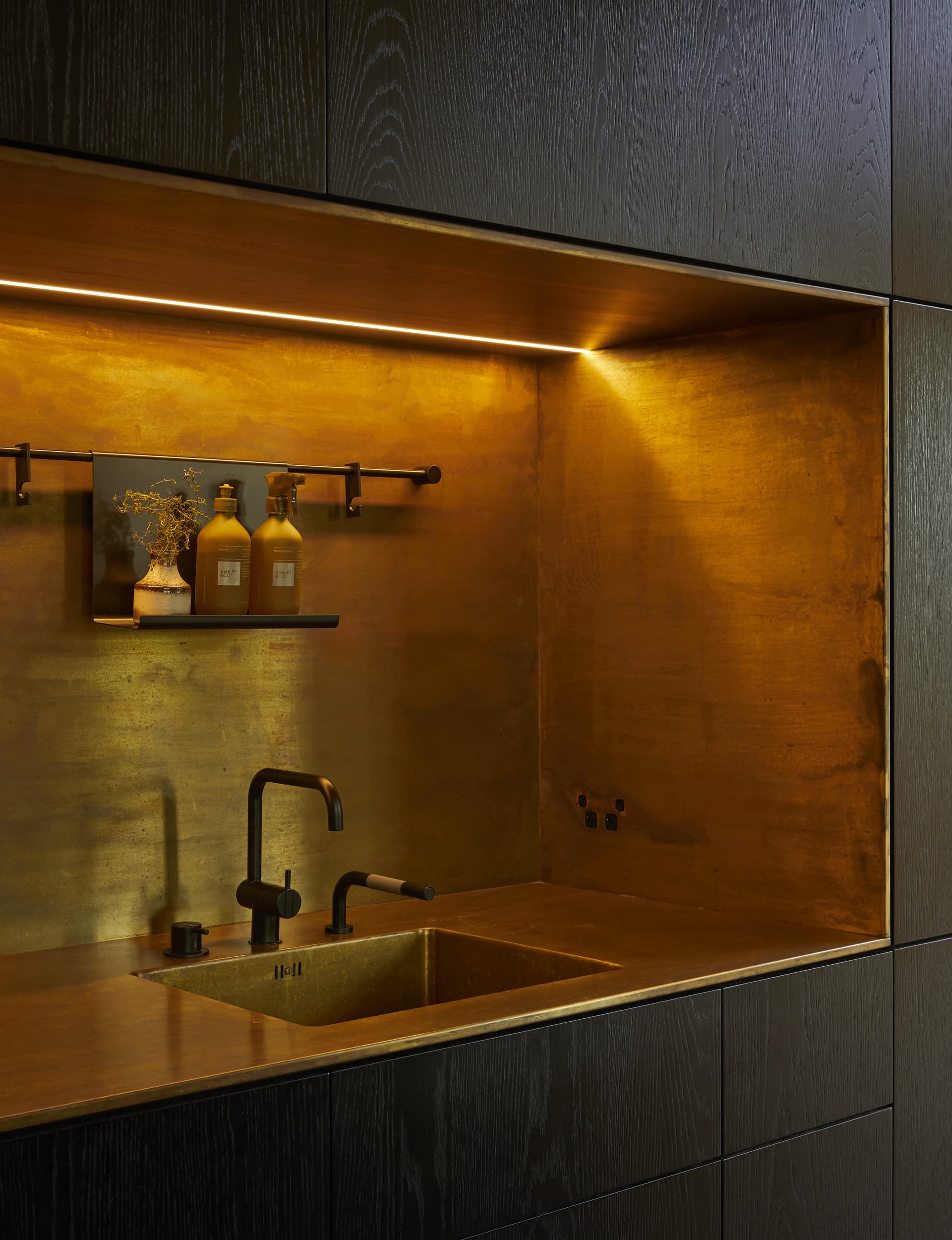
While spaces in the former programme functioned, they weren’t being used and didn’t relate to how the family lives. A key driver in their reworking was to capitalise on light. The old dining room is now a bespoke library that houses the couple’s collection of architecture books. The original kitchen is now their toddler’s bedroom. The new kitchen is the focus and where the family spends the majority of their time. They’ve installed robust materials suitable for two young boys, but that embrace patina.
“The joinery and detail of the interior fit-out is as important as the architecture,” says Kate. “The internal design adds that next layer of richness. We’ve invested where we think it’s important, which we think is a sustainable approach. We don’t envisage replacing anything – it will outlast us.”
Words by: Jo Bates. Photography by: Sam Hartnett.
[related_articles post1=”99291″ post2=”82646″]
