The International’s new take on Auckland apartment living

Anti-density NIMBYs would have you believe that you have to be a little desperate to want to live in an apartment, but a new Auckland development seems to be disproving that
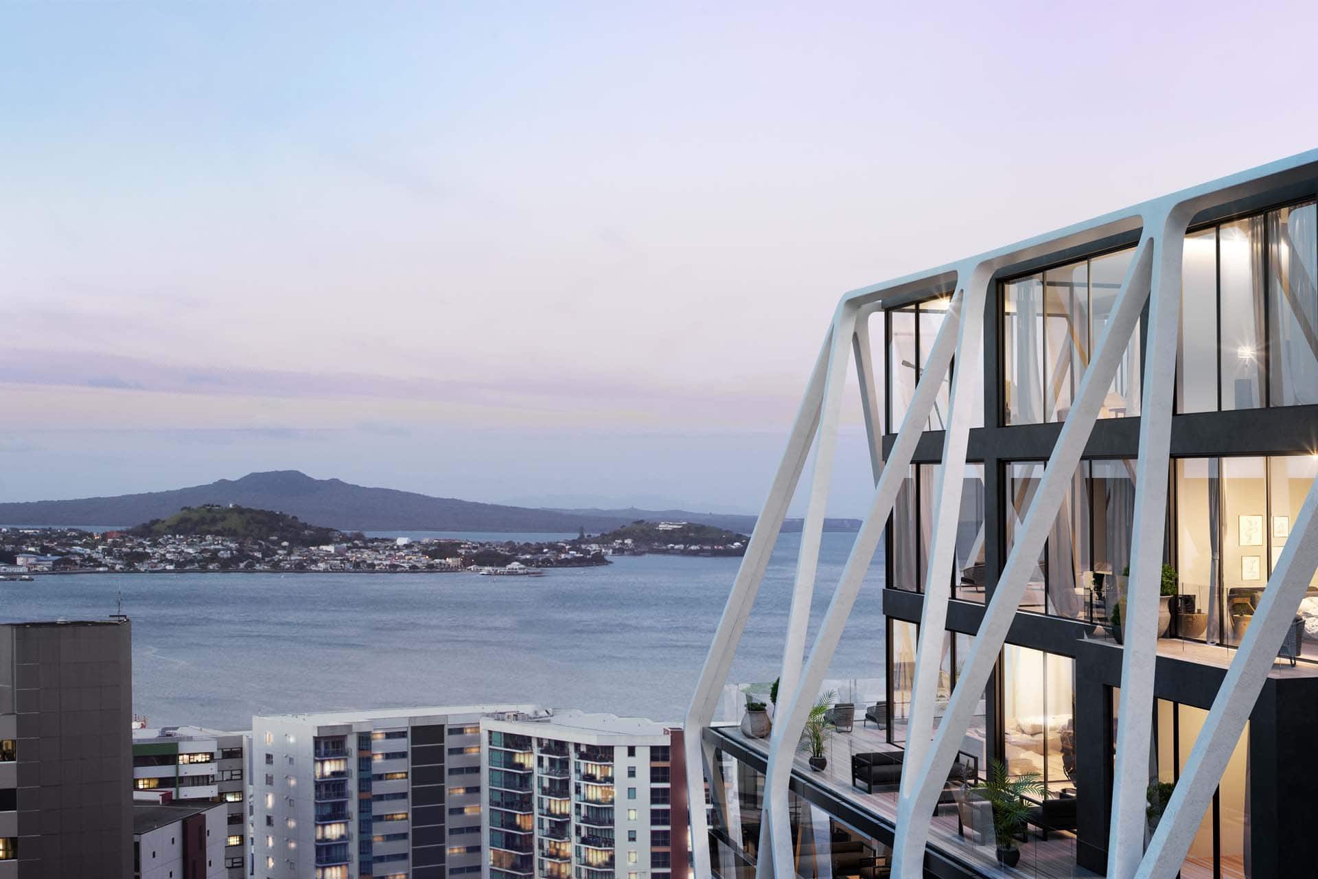
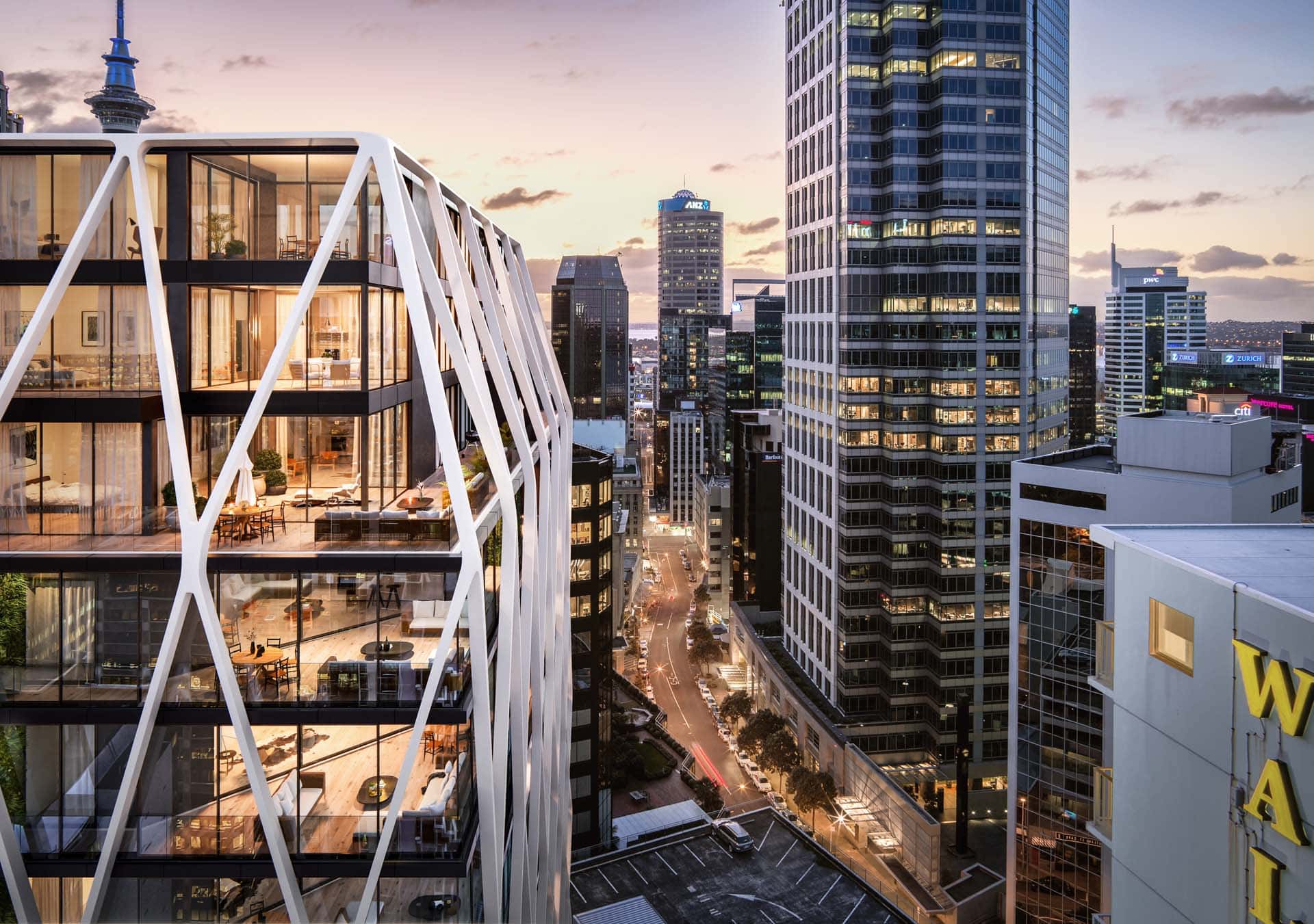
The International will have a dramatic white exoskeleton and views of Rangitoto.
The International will have a dramatic views of Rangitoto.


Apartment living in the country’s biggest city has, until now, mostly been associated with the word ‘shoebox’. But The International, a luxurious new apartment building being developed by Sanctuary Group that is due to be constructed near the University of Auckland campus on Princes Street, is aimed squarely at the upper end of the market.
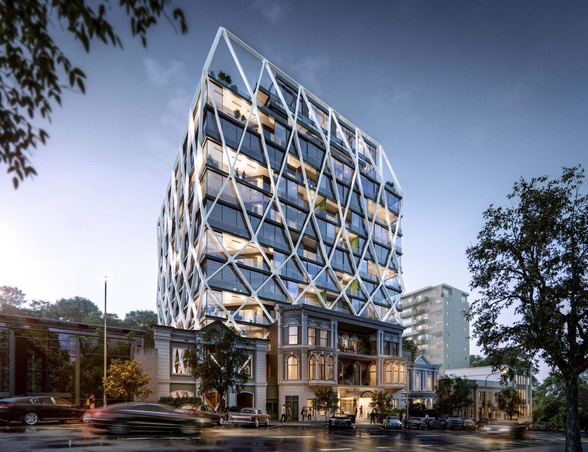
The International will be situated on Auckland's historic Princes Street, where the facade of the Grand Hotel still stands.
The International will be situated on Auckland’s historic Princes Street, where the facade of the Grand Hotel still stands.


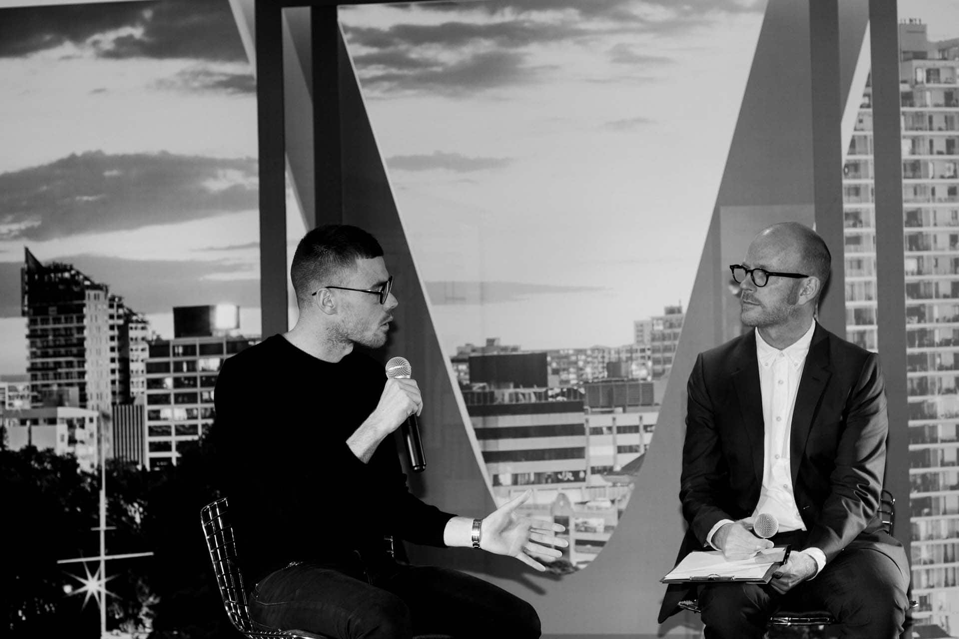
Last week HOME hosted a function in The International’s on-site where HOME editor Jeremy Hansen interviewed interior designer Rufus Knight about the building, providing a behind-the-scenes glimpse at the design process and the quality of the fitout of the apartments.
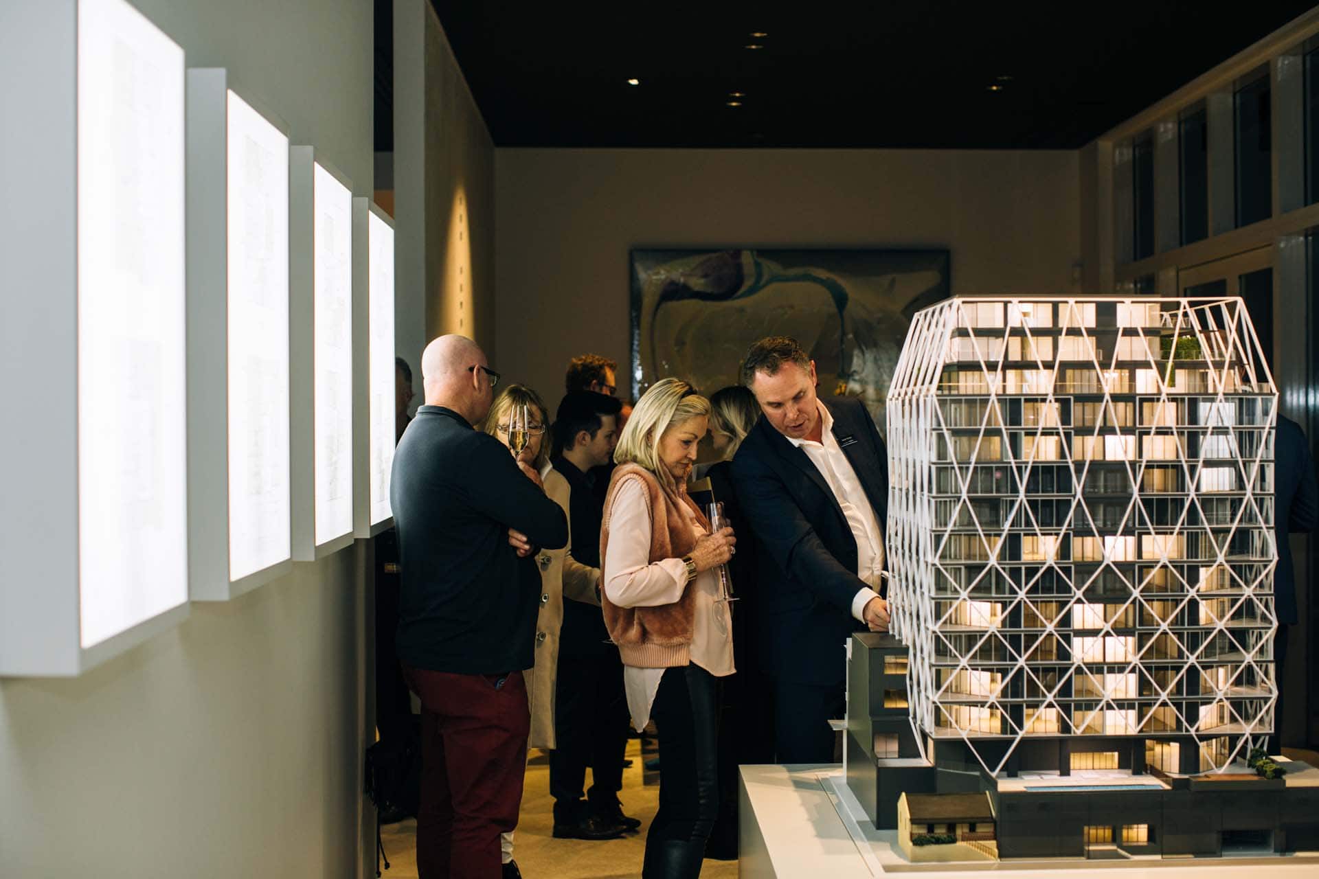
Guests with a model of the building in The International's show suite.
Guests with a model of the building in The International’s show suite.


Rufus Knight speaking to HOME editor Jeremy Hansen in The International's show suite.
Rufus Knight speaking to HOME editor Jeremy Hansen in The International’s show suite.


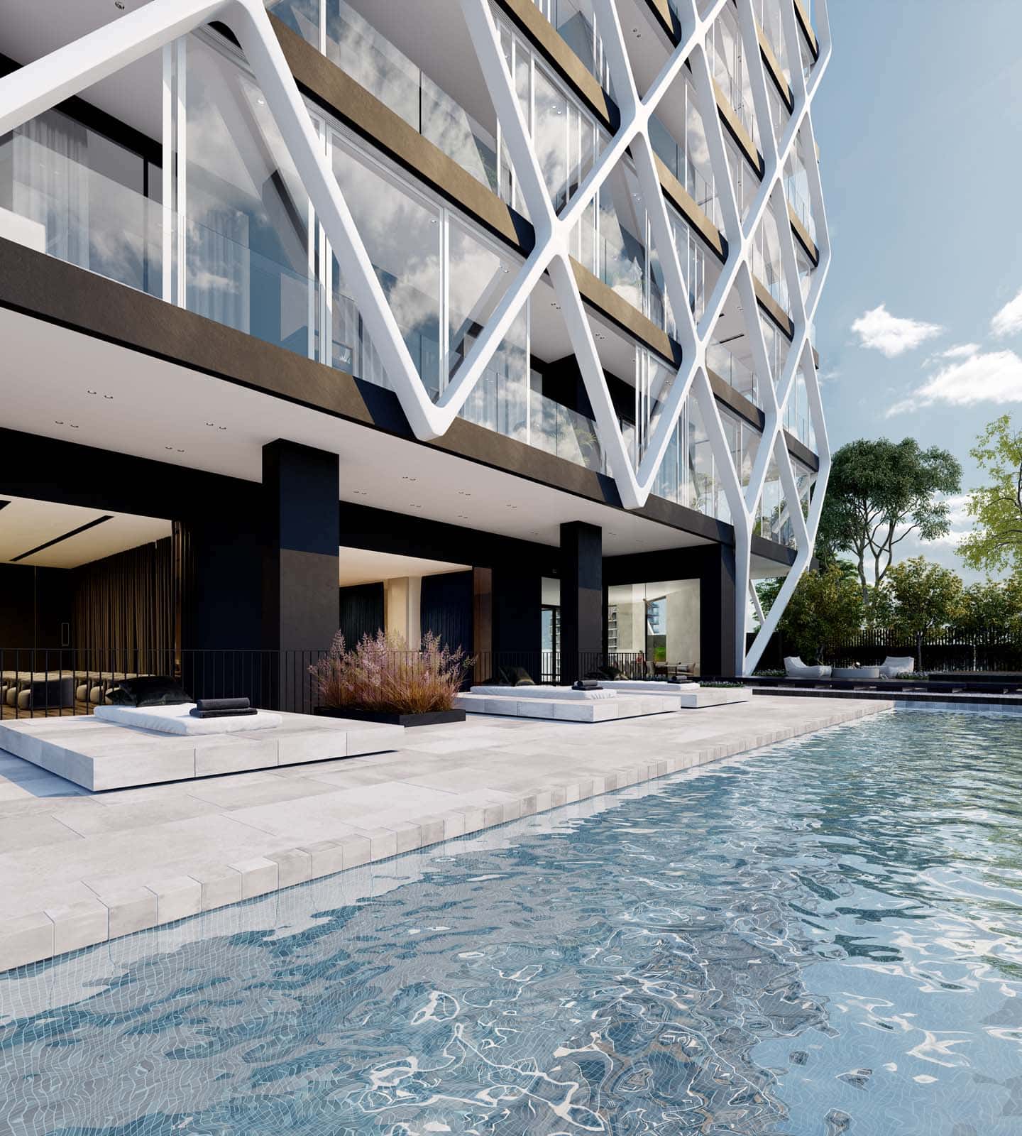
Apartments in the exclusive building are now for sale (click the link here to register your interest), and the show suite open for public or private viewing. Jasmax architects have come up with an ingenious and environmentally sensitive scheme to re-use the bones of the octagonal 1980s building – until recently, it served as Fonterra’s global headquarters – and apply a white lattice exoskeleton that squares up the building by creating generous, airy conservatories on its edges. The 88 apartments in the 17-floor building start from more than $800,000 for one-bedroom spaces and rise through two- and three-bedroom offerings to much higher prices for the penthouse suites.
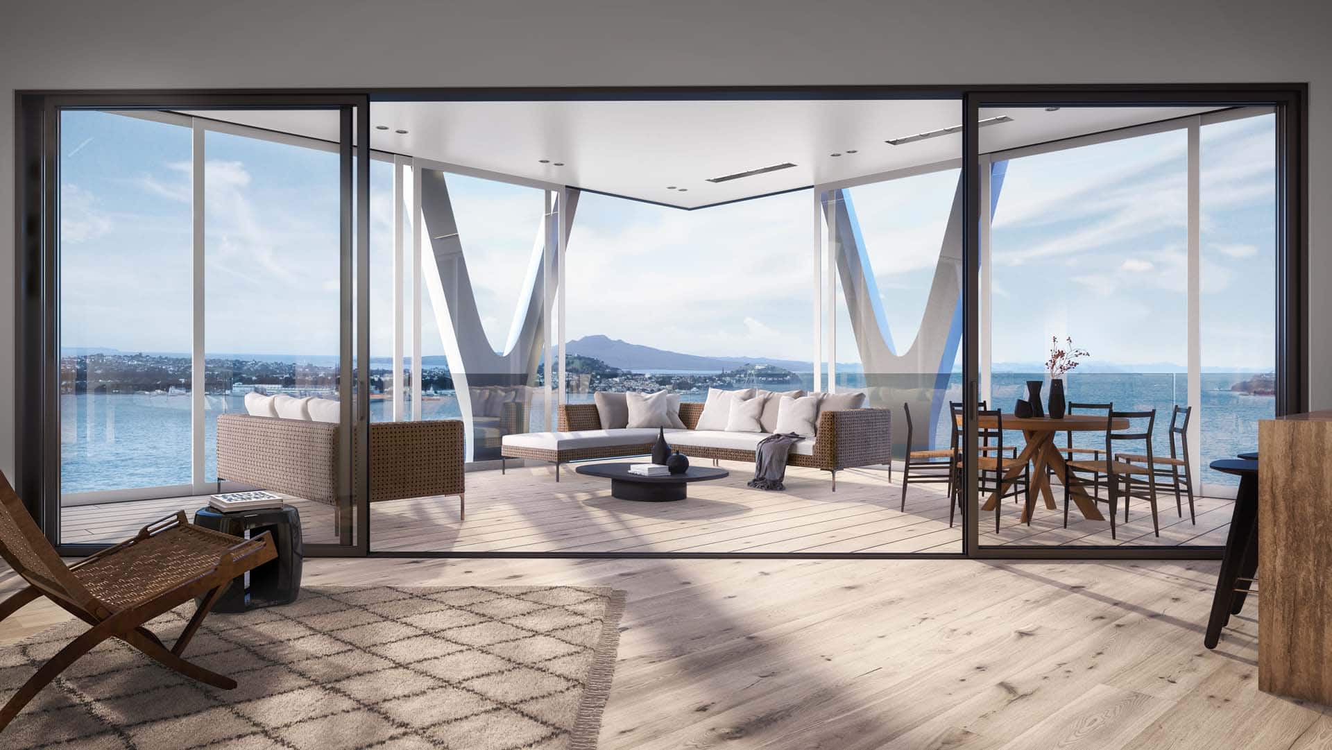
Many of the apartments in The International feature generous conservatories suitable for indoor-outdoor living year-round.


The ground-floor swimming pool is one of many amenities to be shared by The International's residents.
The ground-floor swimming pool is one of many amenities to be shared by The International’s residents.


As well as having the city on their doorsteps – the Britomart area is just down the hill – residents will also have access to shared amenities including a private wine cellar and tasting room, a private dining room, cinema and concierge service.
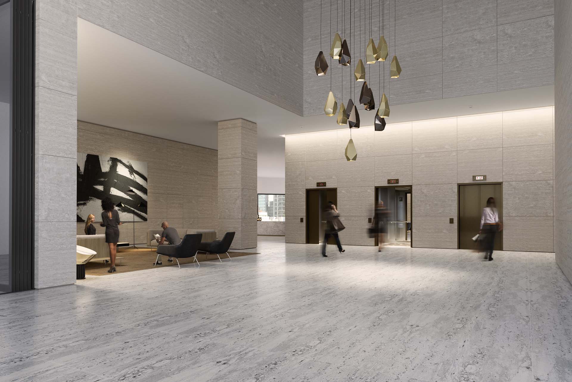
The International's lobby also connects to a private dining room, wine cellar and screening room to be shared by the building's residents.
The International’s lobby also connects to a private dining room, wine cellar and screening room to be shared by the building’s residents.


The central city and Britomart Quarter are both just a short walk from The International.


The International’s interiors are being designed by Rufus Knight, whose work on the Lonely lingerie stores has featured in HOME magazine. Knight will bring his pared-back sensibility to the building’s public spaces and to individual apartments on request.
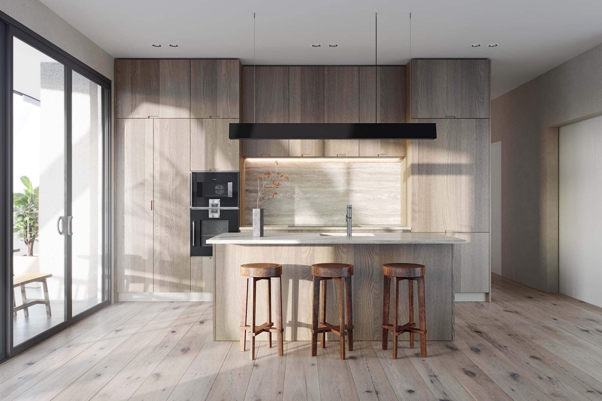
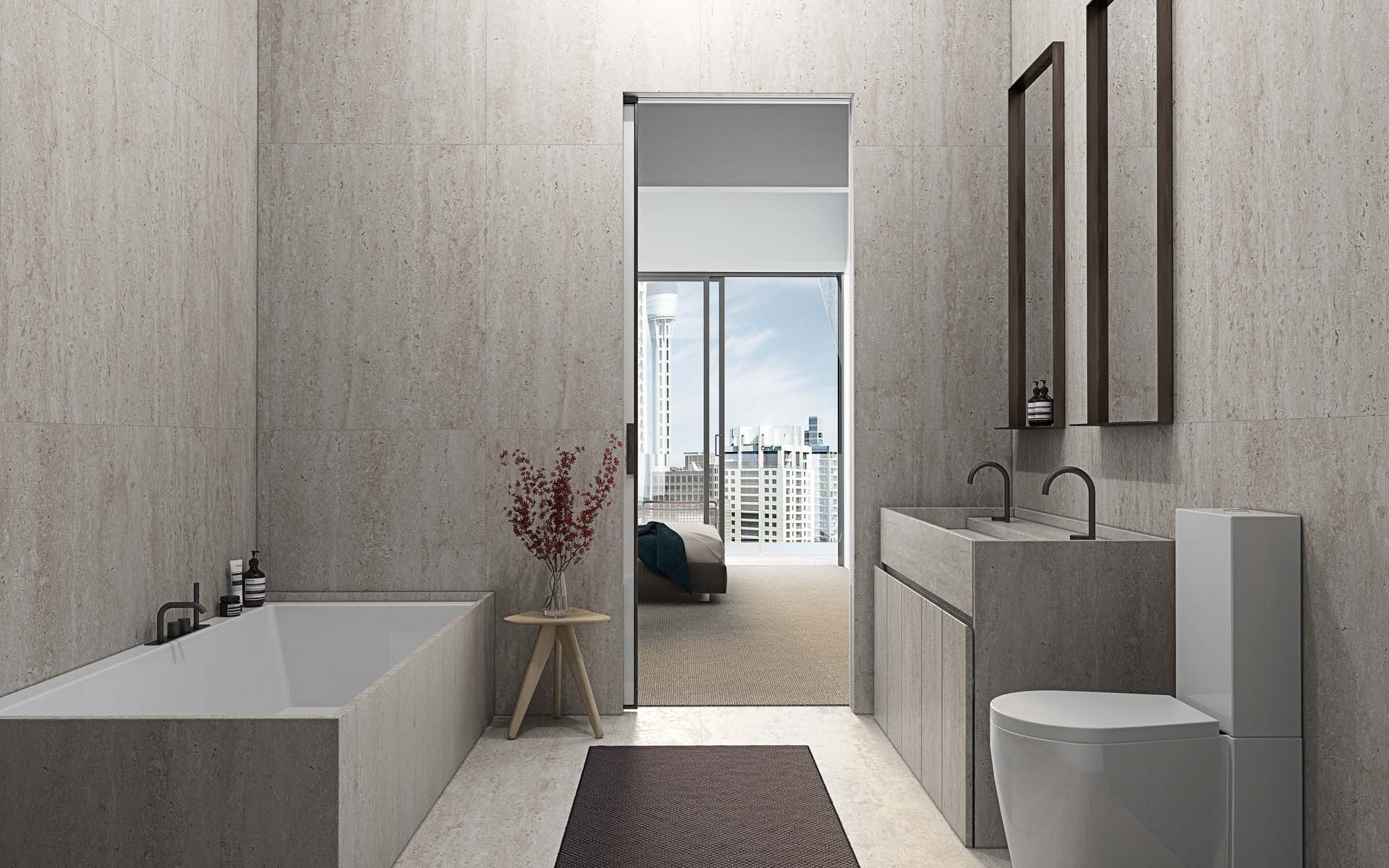
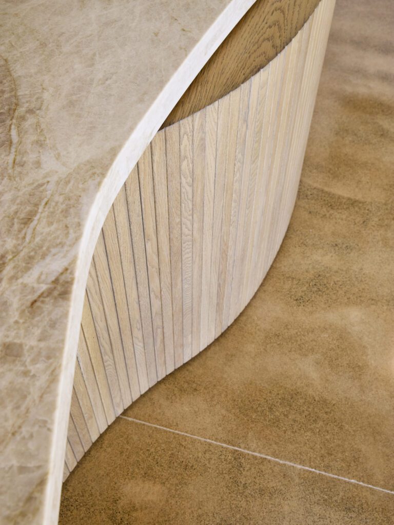
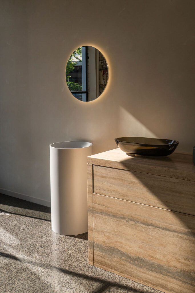
Interior designer Rufus Knight is bringing a neutral palette of luxurious natural materials, as well as premium kitchens and bathrooms by Italian specialists Boffi.
Interior designer Rufus Knight is bringing a neutral palette of luxurious natural materials to The International, as well as premium kitchens and bathrooms by Italian specialists Boffi.


A rendering of one of The International's beautiful bathrooms, designed by interior designer Rufus Knight.
A rendering of one of The International’s beautiful bathrooms, designed by interior designer Rufus Knight.


The rate at which the apartments are selling shows demand for quality city pads is escalating. “It certainly seems there is a significant appetite for high-quality apartments with connection to green space, water views, and indoor-outdoor living,” Knight says. “The building seems to appeal to people who understand that high-density living doesn’t have to mean compromising their expectations.” Let’s hope the density-done-well message spreads throughout the city – at all levels of the market.
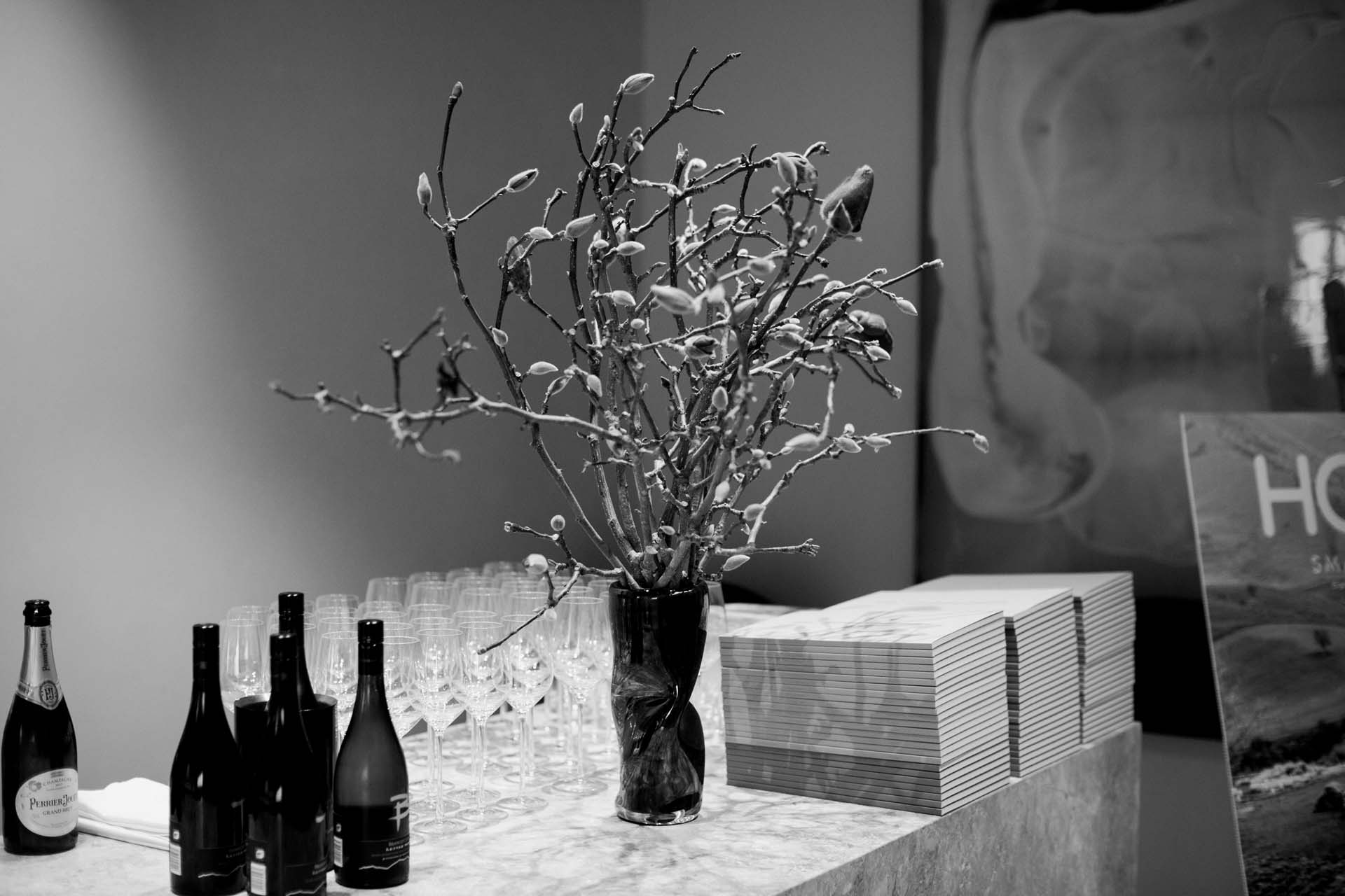

The entry of The International show suite at the function held by HOME.


Guests enjoy the presentation in the full-size mockup of one of The International's conservatory areas.
Guests enjoy the presentation in the full-size mockup of one of The International’s conservatory areas.

For more information on The International and to visit the building’s luxurious show suite, register your interest here

Latest video features

In the Coromandel, a home with a humble profile and a thoughtful design makes the most of a stunning location.

Built with awe-inspiring attention to detail, this Arrowtown home is a fresh interpretation of a familiar Otago rural vernacular.

This sculptural Northland bach is a perfect north arrow on a remote farm high above the sea.

With the sun on its bow and the community at its stern, this is a house in which the elements are always front of mind.

Trending articles

Design News

On Dorset Street

When interior designer, Campbell Johnson, returned to Christchurch from Europe, it was one of Sir Miles Warren’s Dorset Street Flats that caught his eye. It’s

Homes

City villa: A sleek Remuera renovation

Approach this 100-year-old villa in Auckland’s Remuera and there’s a beguiling sense of history and character, but there’s also a sense of something more.

Homes

Pavilion in the clouds

Five simple elements and the well-placed delivery of a stunning view define this minimalist, Hawke’s Bay home by Dorrington Atcheson Architects.