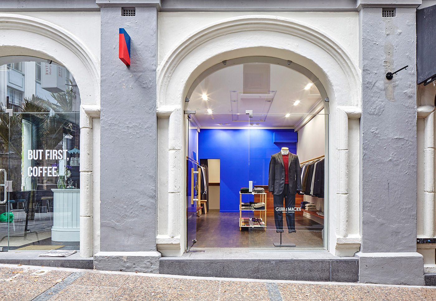
The clothing label Gubb & Mackie started life as a naval tailor in 1949. Now they’ve just opened a new store in Auckland’s Vulcan Lane designed by Jamie McLellan, a past winner of HOME’s Design Awards. Normally a product designer, this is McLellan’s first full interior project. Full of abstracted nautical cues and a forward-looking youthfulness, his design repositions mahogany in contemporary form, makes bold use of ‘ultramarine’ blue and warming touches of brass.
Here’s what McLellan and Gubb and Mackie creative director Jordan Gibson have to say about the space.
HOME You’re a furniture and product designer and you haven’t done an interior before. How did you know what to do?
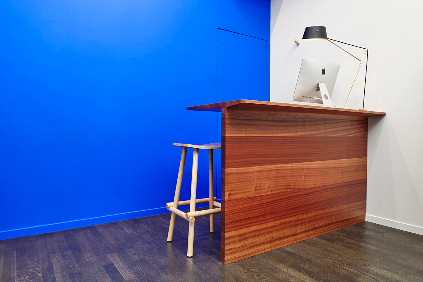
Jamie McLellan I decided to keep the space super-simple and clean, treating it more like a gallery than what one might typically expect of a retail store. Having worked closely with the paint company Drikolor for some time, I’ve been eager to use their ‘Ultramarine Blue’, or Yves Klein blue as most people know it. Murray Crane [Gubb and Mackie’s owner] and Jordan Gibson were brave enough and trusting enough be my first test subjects. I felt the intensity of this colour applied to the back wall would anchor the space and permeate out onto the street at the same time.
HOME How did you decide what to insert into the space?
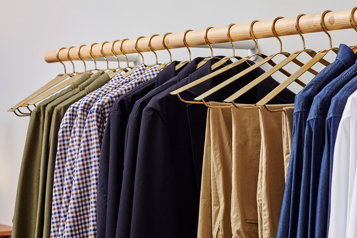
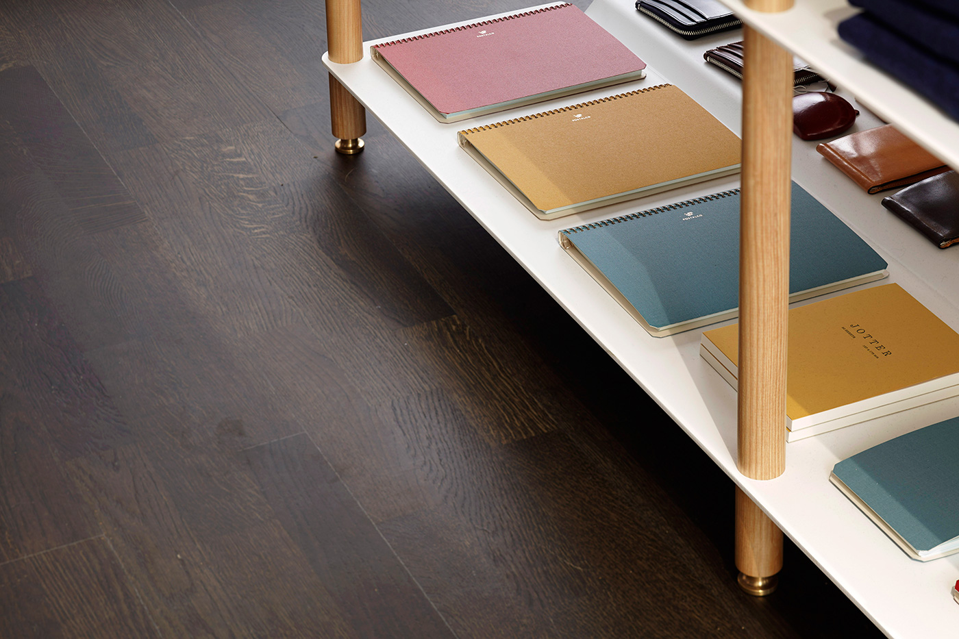
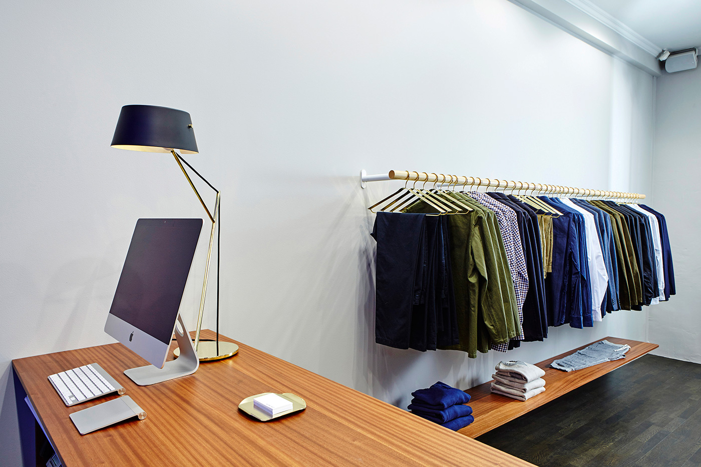
Jamie McLellan With the furniture pieces, the fixed shelves and the counter are all built from solid sapele mahogany. The mahogany is an interesting material as it has both mid-century and nautical connotations, but it is also a timber that has fallen out of favour, perhaps in part due to ’70s veneer furniture as well as today’s preference for lighter, whiter hardwoods. I like that it might challenge some people’s tastes. The rich redness of the mahogany is tempered with touches of ash dowel, including my ‘Lumber’ and ‘Baby Lumber’ stools, so as to keep the space a little lighter and youthful. The clothes racks and door handles, with their end-grain plugs, feel like a modern abstraction of tradition boat guard rails and hand holds. Custom-designed brass coat hangers and trays and a one of my ‘Spar Junior’ lights add an element of nautical warmth to the space. Over time, I look forward to the patina setting in on these.
HOME Jordan, what was your brief to Jamie?
Jordan Gibson We gave Jamie a pretty wide scope to interpret the space and trusted in his design aesthetic as a complement to ours. We wanted a contemporary environment that was captivating and inviting, in keeping with the brand’s direction.
HOME What does the new store say about Gubb and Mackie as a label?
Jordan Gibson It perfectly captures the current direction and outlook of the brand, touching on the heritage of the brand without over-playing this. We wanted to very clearly state that we are a contemporary brand that is looking forward. There is an artisanal quality to the fixtures whilst still maintaining a very slick finish – the solid materials including sapele mahogany and brass have a feeling of strength and utility which provides a natural environment for the garments to be showcased.
