On a leafy site in the Waikato, Tane Cox crafts a subtle home for three generations
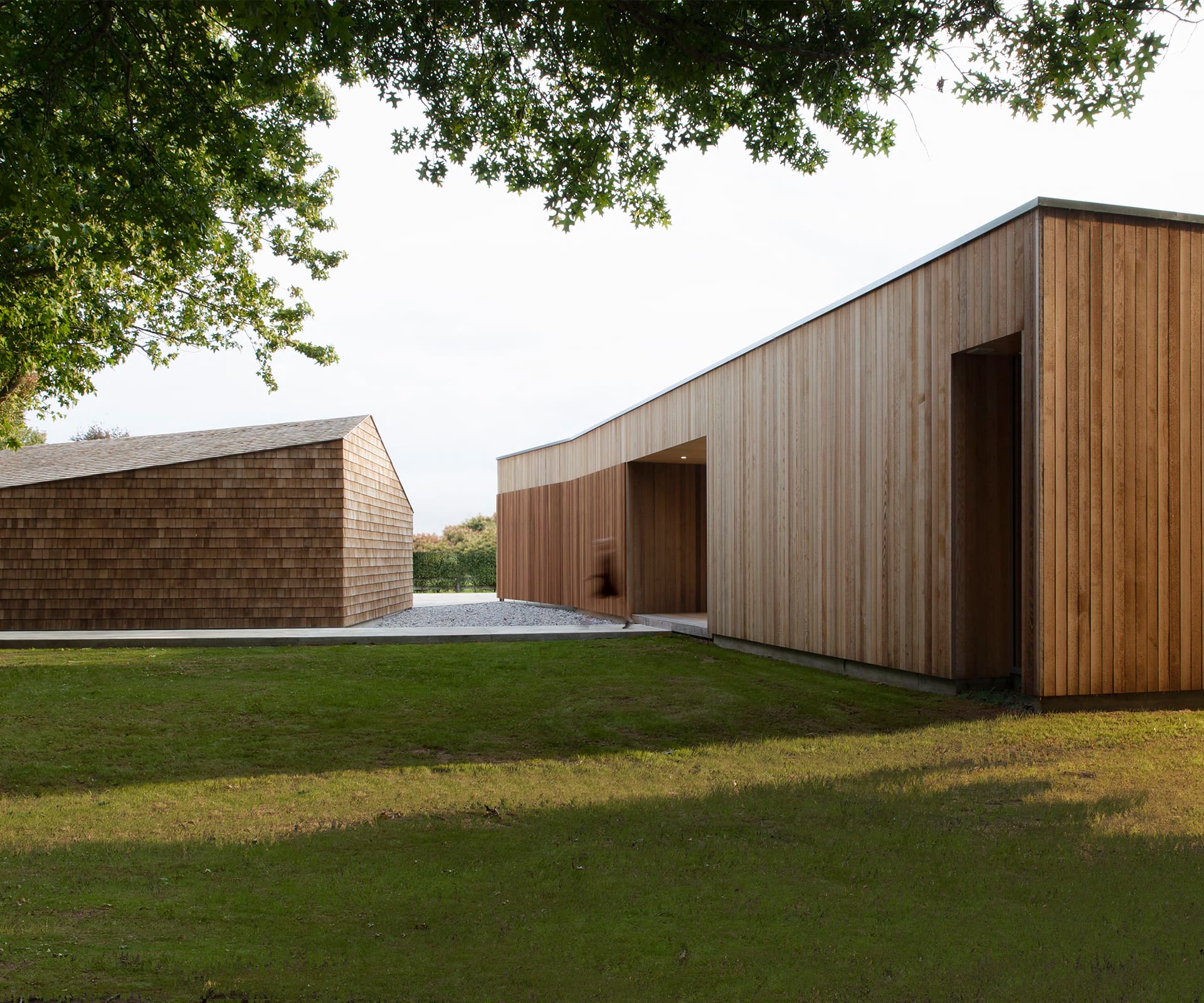 Ben Lee had just finished building four houses on Marine Parade in Mount Maunganui. He was tired. His wife Nicky discovered she was pregnant with the couple’s third child. Suddenly, the smell of grass and the thought of a large section and proximity to parents felt like the lifestyle change they needed. They began searching for a property that would both suit this shift from The Mount, and accommodate a second dwelling for Ben’s parents. They found it in rural-residential Tamahere, on the outskirts of Ben’s hometown of Hamilton.
The 5000-square-metre piece of land was dotted with established trees and surrounded by large residences. These two factors proved influential in the design response – the former taken into consideration with layout, while the latter impacted scale. This was to be a large multi-generational home – but not a sprawling mono mass. Restraint was key. Aptly, designer Tane Cox of Red Architecture, a Hamilton-based practice, named the project ‘Shibui’, a Japanese word that refers to the aesthetics of restrained beauty. The concept of Shibui was familiar to Cox and Ben, who had worked together before and applied it to previous projects.
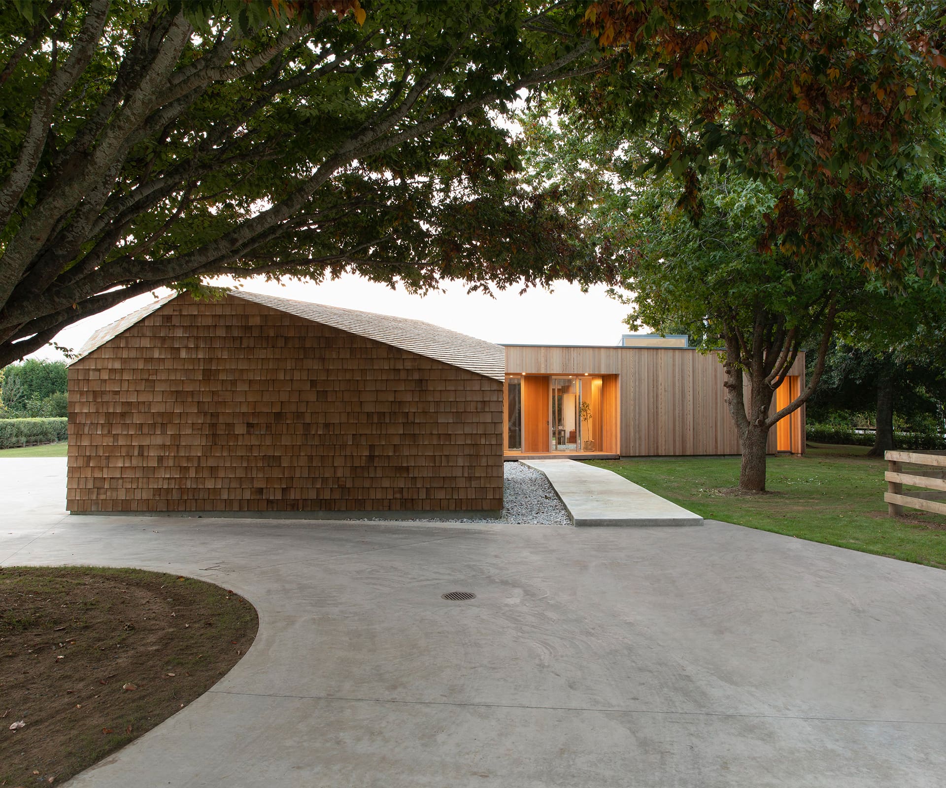 “I like the idea of restraint and achieving impact with subtle design cues, but it’s a fine line and especially difficult with large-scale, upmarket homes,” says Cox.
The large Tamahere park-like site could certainly handle scale and volume, but a carefully orchestrated programme elegantly manages Ben’s idea of a “sprawling oasis”. The site is composed of three dwellings, which unfold under the big, old trees. The ‘Cabin’, Ben’s parents’ home, is immersed within the trees and sits ahead of the main house. With its pitched roof and dark cedar wrap, the 93-square-metre home has its own personality and is a picture in autumn, when a rainbow of leaves dust the roof and grounds with seasonal colour.
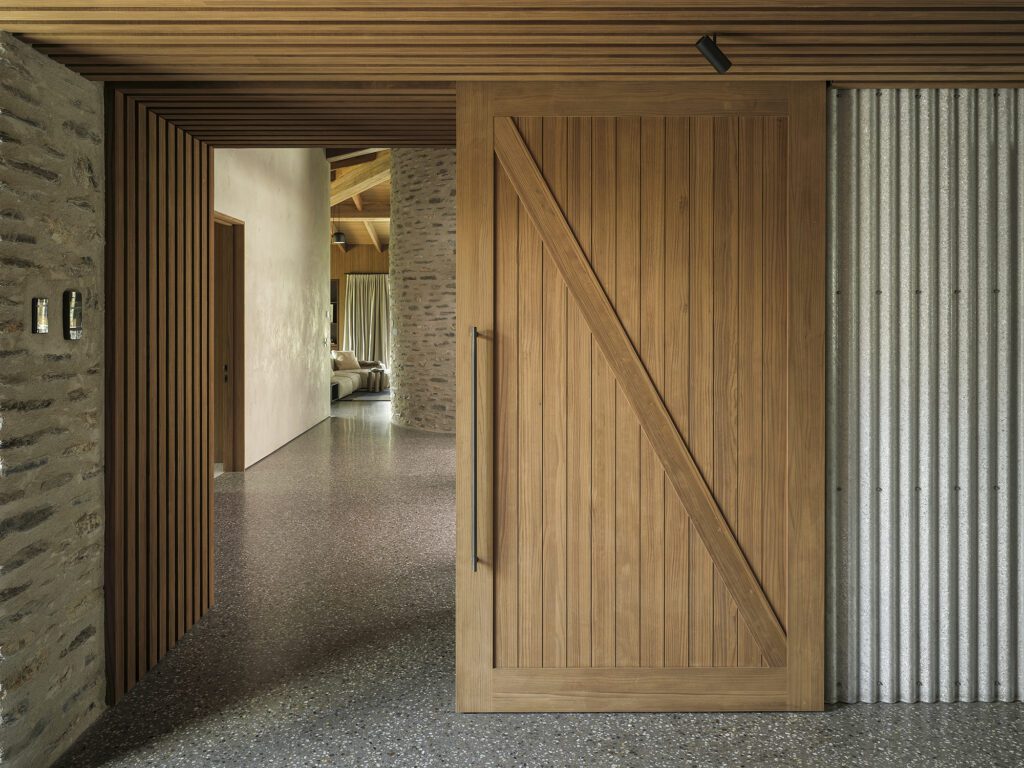
 On arrival to the main home, a detached cedar-shingle clad building reads as a sculptural feature. Its asymmetry and elegance belie its purpose as an ancillary building and add to the experience of arrival. The building also serves to balance the bulk of the 440-square-metre main home, which is a few steps along the concrete path. Internally, Cox has managed volume by breaking down the spatial arrangement, while supporting connectivity and a sense of journey throughout the home.
“The challenge with this design is a house that walks the line of what’s needed to make it visually appealing and comfortable to live in. I think we’ve tried to show you can have that, but achieve it in more subtle and unpretentious ways.”
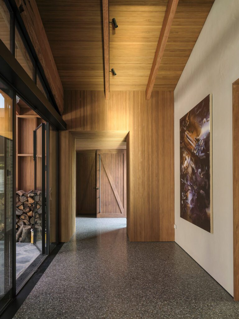
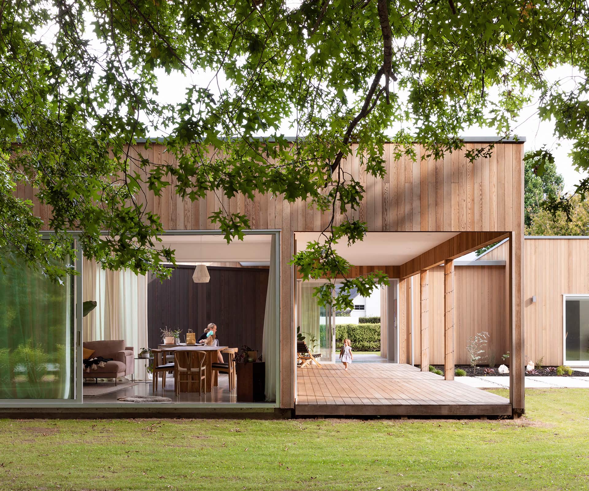
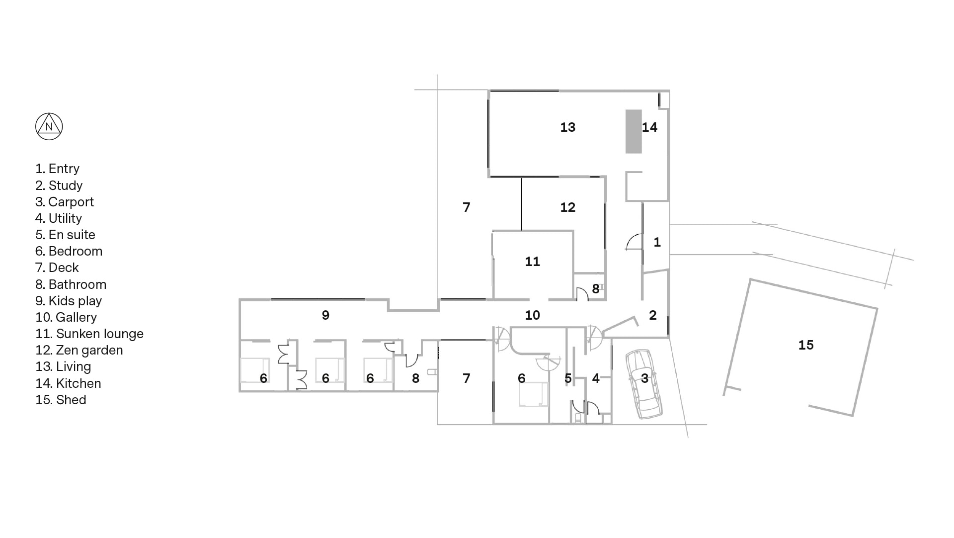
 Arranged in an L-shape from a central arrival point, the series of simple forms give a feeling of intimacy from within but are linked so that each area is visible and part of the whole. “The objective was to play with how you circulate and move around or across spaces, both inside and out,” says Cox. “The internal garden space and connecting decks help to achieve this.”
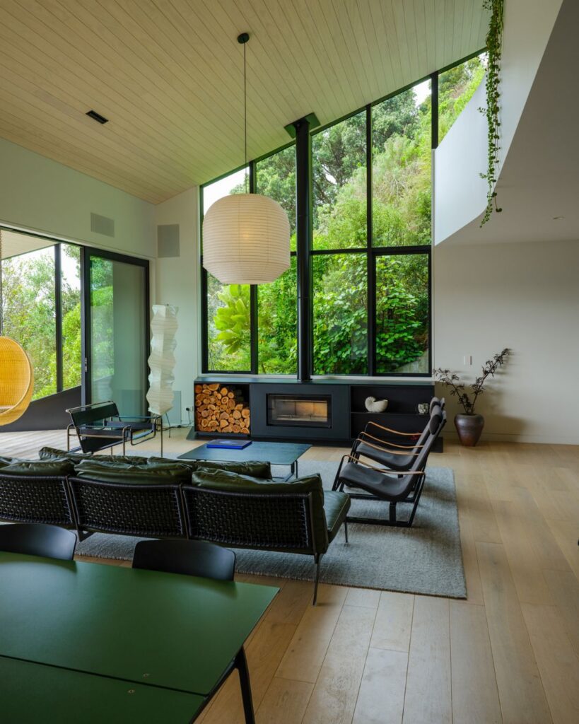
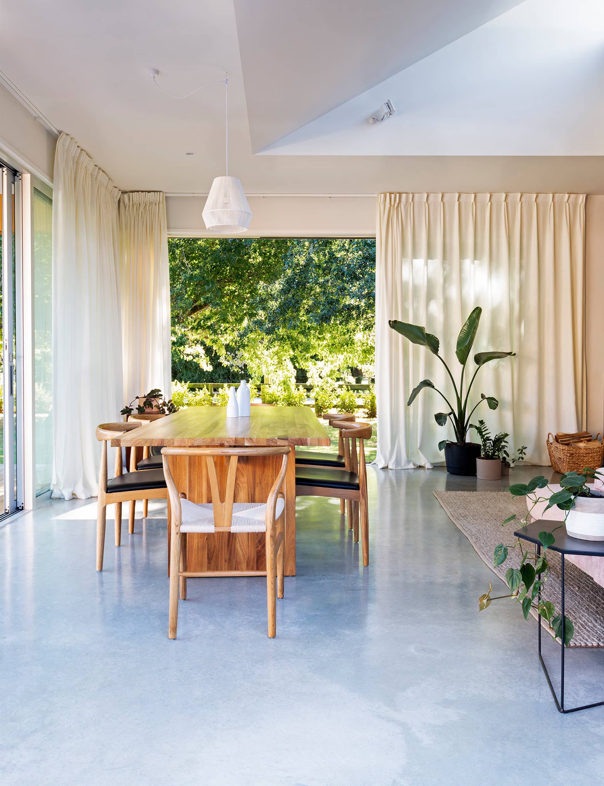
The internal garden and a sunken lounge are revealed on entry. At right is the kitchen and dining area, while at left are four bedrooms, the bathrooms and the deck off the main suite. There are acres of space for the kids to roam around in. Games of hide-and-seek could be an endless pursuit.
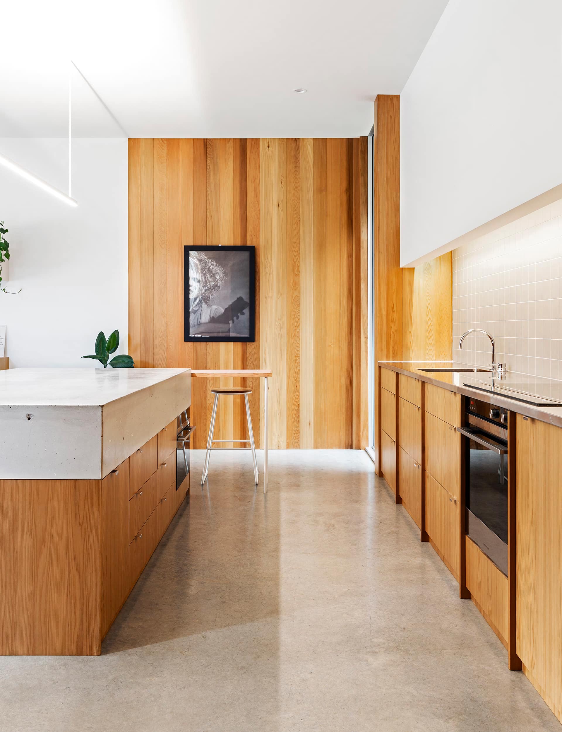 To manage costs on this comprehensive build, and to also lend a personal touch to his family home, Ben donned his tool belt and got to work, sending the builders home six months ahead of completion. He built all the cabinetry – an impressive custom cedar kitchen, bathroom vanities, timber panelling and the cedar-shingle utility building. It was an all-consuming project, not all of it enjoyable but, ultimately, satisfying. “When you’re trying to do a house that’s very pared back and minimal, it isn’t easy,” says Ben. “It’s about the whole process.”
 Words by: Aimie Cronin. Photography by: Jonny Davis and Larnie Nicolson
This article was first published in HOME New Zealand. Follow HOME on Instagram, Facebook and sign up to the monthly email for more great architecture.

