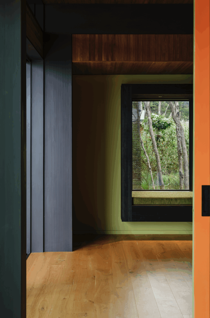
Cheshire Architects refit a small, modernist apartment in Freeman’s Bay for former HOME editor Jeremy Hansen and his husband
[jwp-video n=”1″]
Inside former HOME editor Jeremy Hansen’s modernist apartment
There was something about the 72-square-metre apartment that, when he moved in two years ago, was making Jeremy Hansen claustrophobic. The former editor of HOME magazine had bought an apartment in one of Freemans Bay’s ‘Star Flats’ – so named for the buildings’ star-shaped plans – with his husband, lawyer Cameron Law.
The couple was used to apartment living, having spent the previous 10 years renting in Courtville, a European-style apartment block built in 1915 in central Auckland. They were also used to small spaces, having lived in a 50-square-metre apartment before upsizing to 65 square metres.
They liked Freemans Park, which is often cited as one of the most innovative examples of urban development in New Zealand, a collection of apartment blocks, maisonettes and courtyard houses set in park-like grounds on the fringes of Auckland CBD. Built for the Auckland City Council in the 1960s and now largely privatised, they are highly sought after for their smart, compact planning and proximity to the city. And yet… Hansen’s response could be described as an existential crisis. (Well, that’s how Law describes it.) “I wanted to be a modernist, but worried I might have accidentally become a Victorian,” says Hansen, half jokingly.
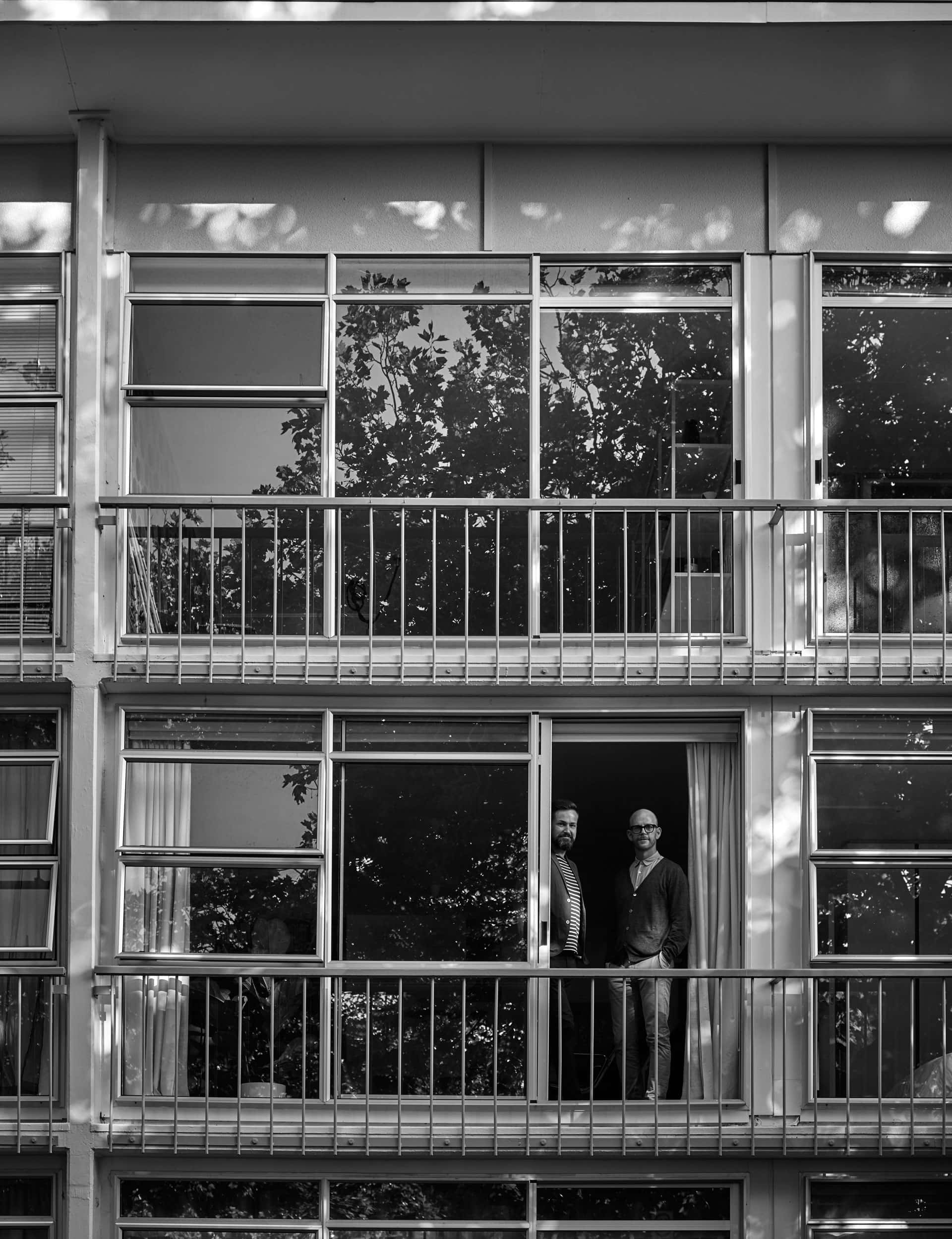
“We liked the thoughtful planning of the block and the Park as a whole – and the fact that it still contains social housing units – but some unsympathetic renovations had made the apartment harder to adore.”
The problem was that you walked through the front door and could see into every room – the hallway had been removed, as well as the walls and door that separated the kitchen from the living area. “I think this had the inadvertent result of making a small space feel smaller rather than larger,” says Hansen.
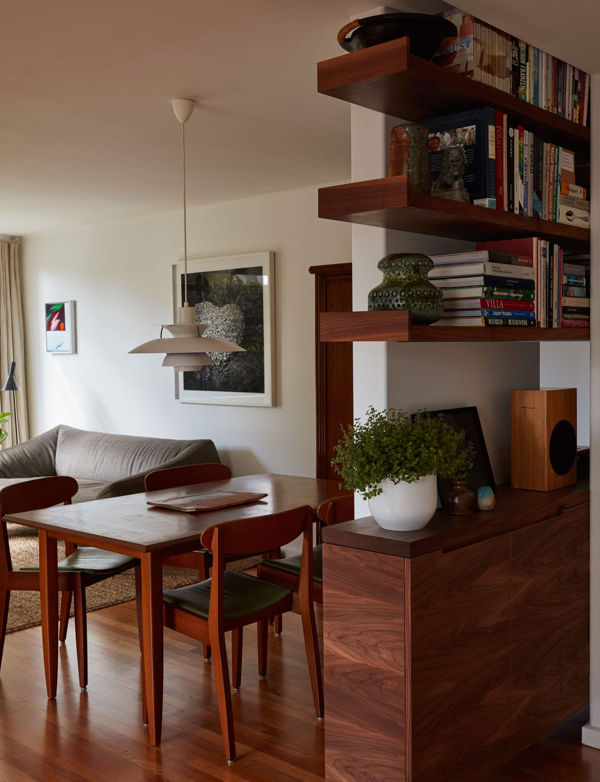
To cut a long story short, according to Law: “Jeremy was having so much difficulty with the place that I suggested he get a bookshelf designed. Which ended up with the entire apartment being renovated through some pretty spectacular mission creep on his part.”
The couple approached Nat Cheshire of Cheshire Architects, who won Home of the Year in 2014 for two cabins built in the Kaipara Harbour, each of which has a footprint of only 28 square metres. The initial brief was… brief. “I said we needed a place to keep books,” says Hansen. “But something to re-establish a sense of entry and some layering, so that we didn’t feel as if we were living in one space all the time.”
It was a small job, at least initially. For Cheshire, that was part of the appeal. “We love small, brave projects – they are the vital counterbalance to our big urban work, and at least as important,” he says. He brought in colleague Ian Scott, who has led most of the studio’s recent apartment work, creating unusual and carefully detailed spaces.
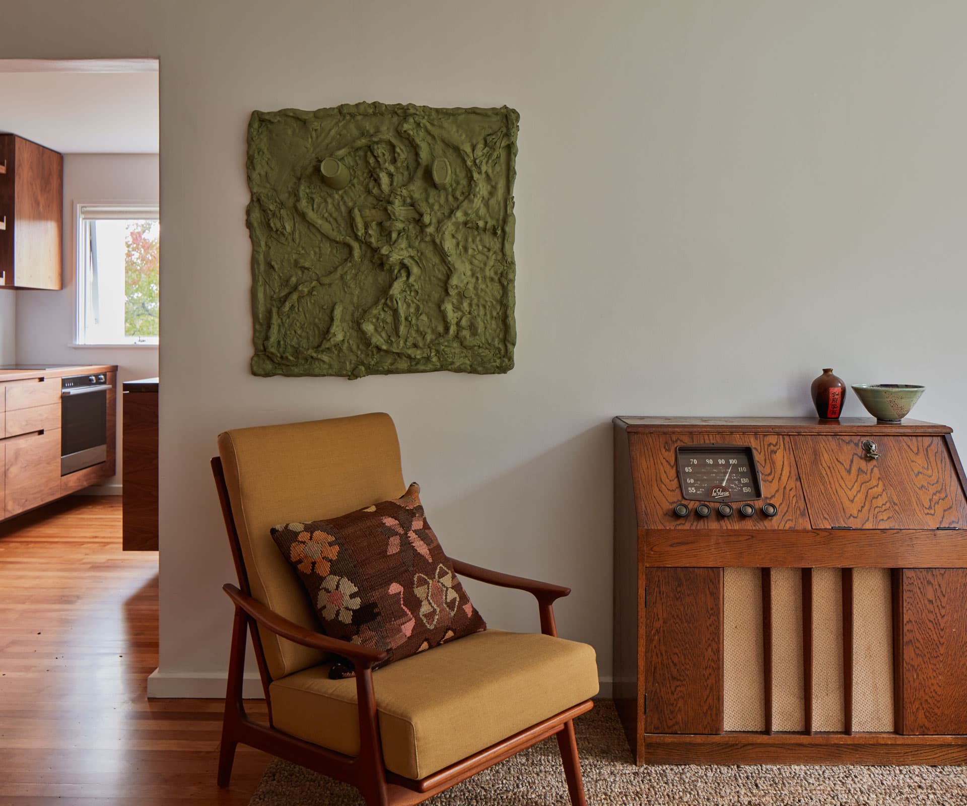
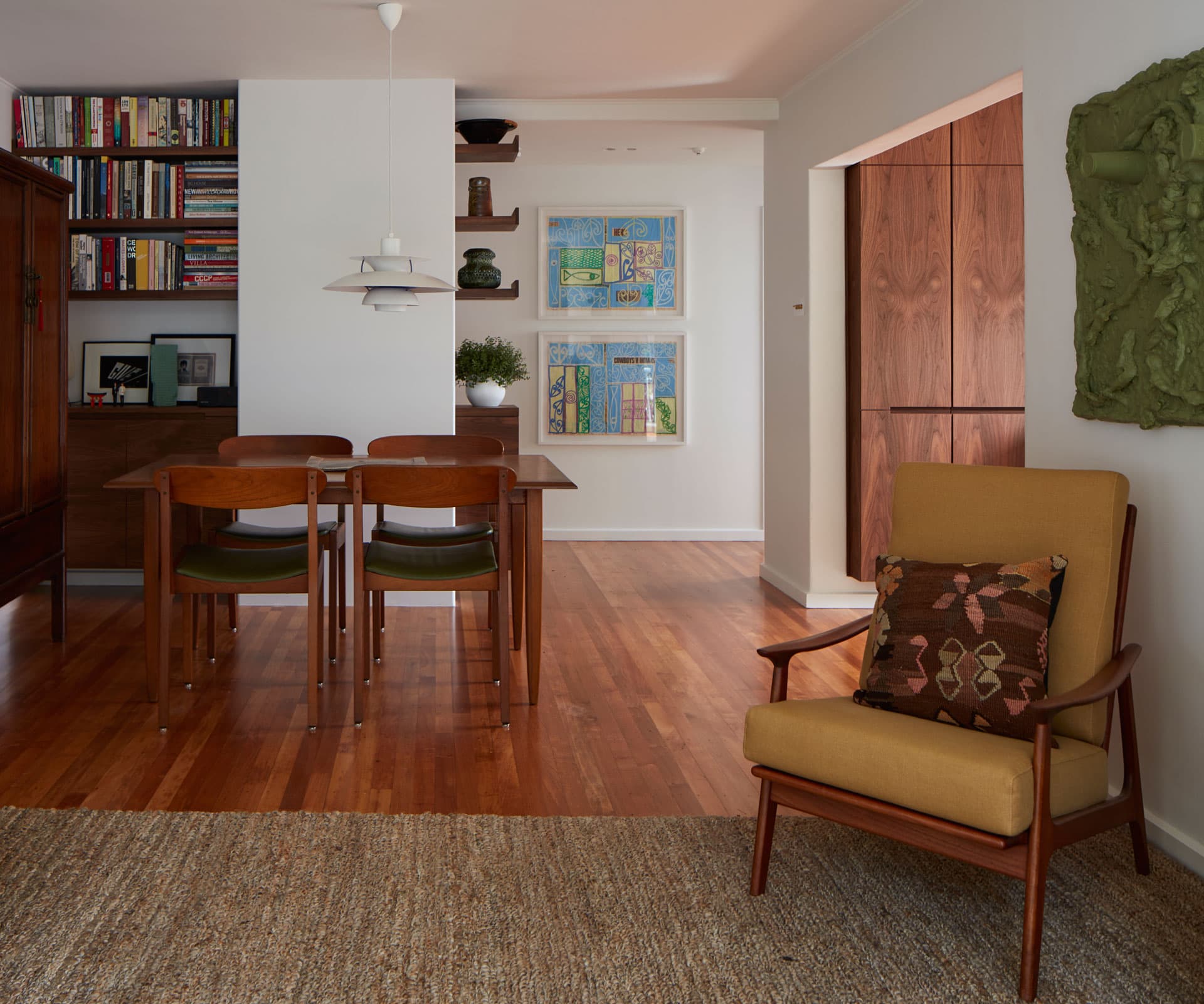
Cheshire and Scott took a cue from the couple’s furniture: the table and chairs that had belonged to Hansen’s grandparents, the radiogram that had belonged to Law’s grandparents, the vintage cabinet Hansen had bought when he was living in Hong Kong.
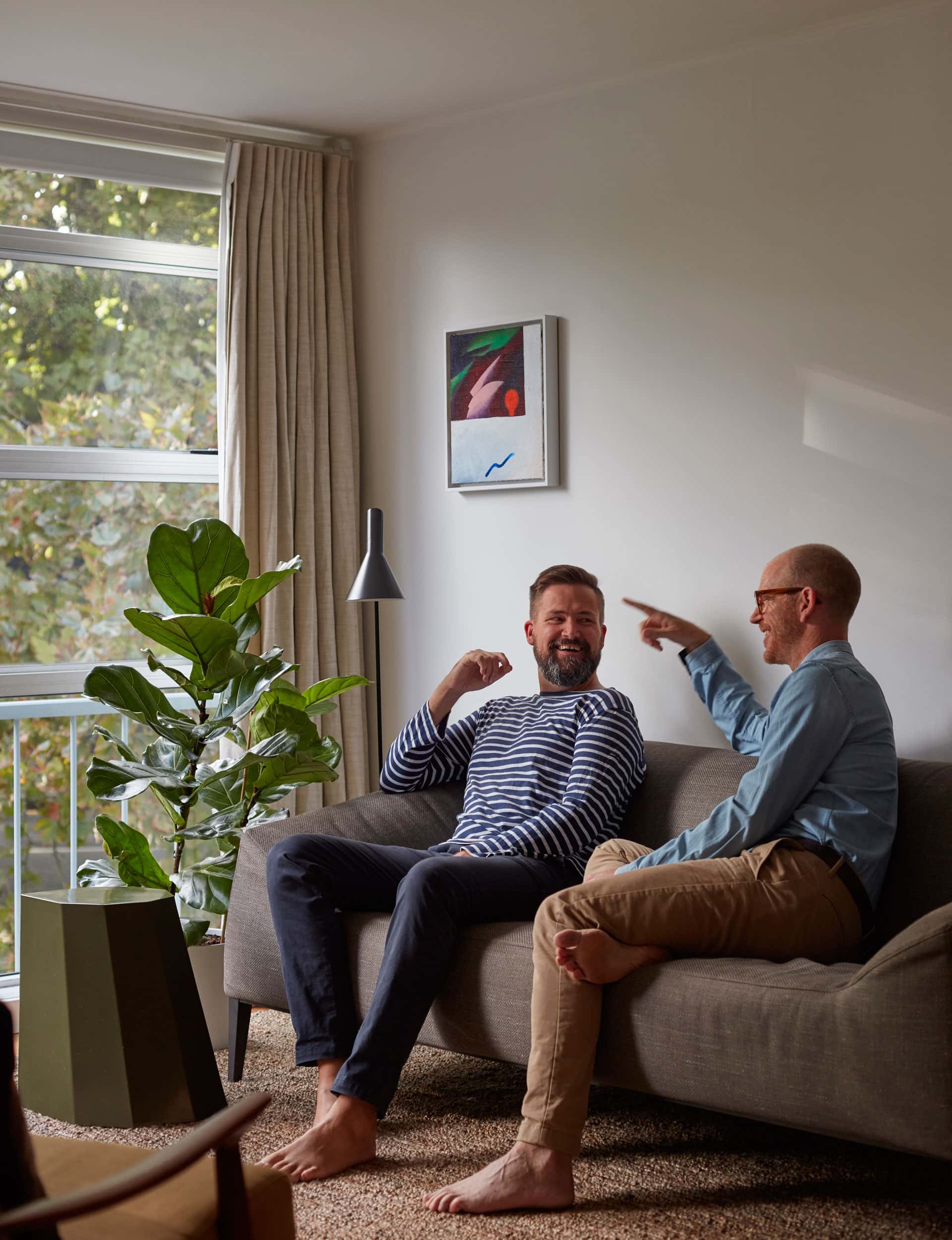
“We’re wanna-be minimalists but we hadn’t quite achieved it,” says Hansen. “Part of our brief was that we wanted a very still, calm space, but it was fairly obvious that we were going to keep these pieces of furniture, that they were a part of our lives – they were an unconscious part of the brief, I suppose. So Nat suggested creating a sense of place with a set of three cabinetry units that would resemble mid-century credenzas. We wanted an idea that felt like there was a rationale behind it, and one that was consistent with the modernist origins of the building.”
“For us that meant an inherited palette of rich timber veneers,” says Cheshire, “a reductive approach to detail, and the idea that a kitchen might be a collection of furniture rather than a homogenised bit of construction.”
[gallery_link num_photos=”14″ media=”https://www.homemagazine.nz/wp-content/uploads/2017/08/JeremyHansen8.jpg” link=”/real-homes/home-tours/cheshire-architects-small-apartment-design” title=”See more of the home here”]
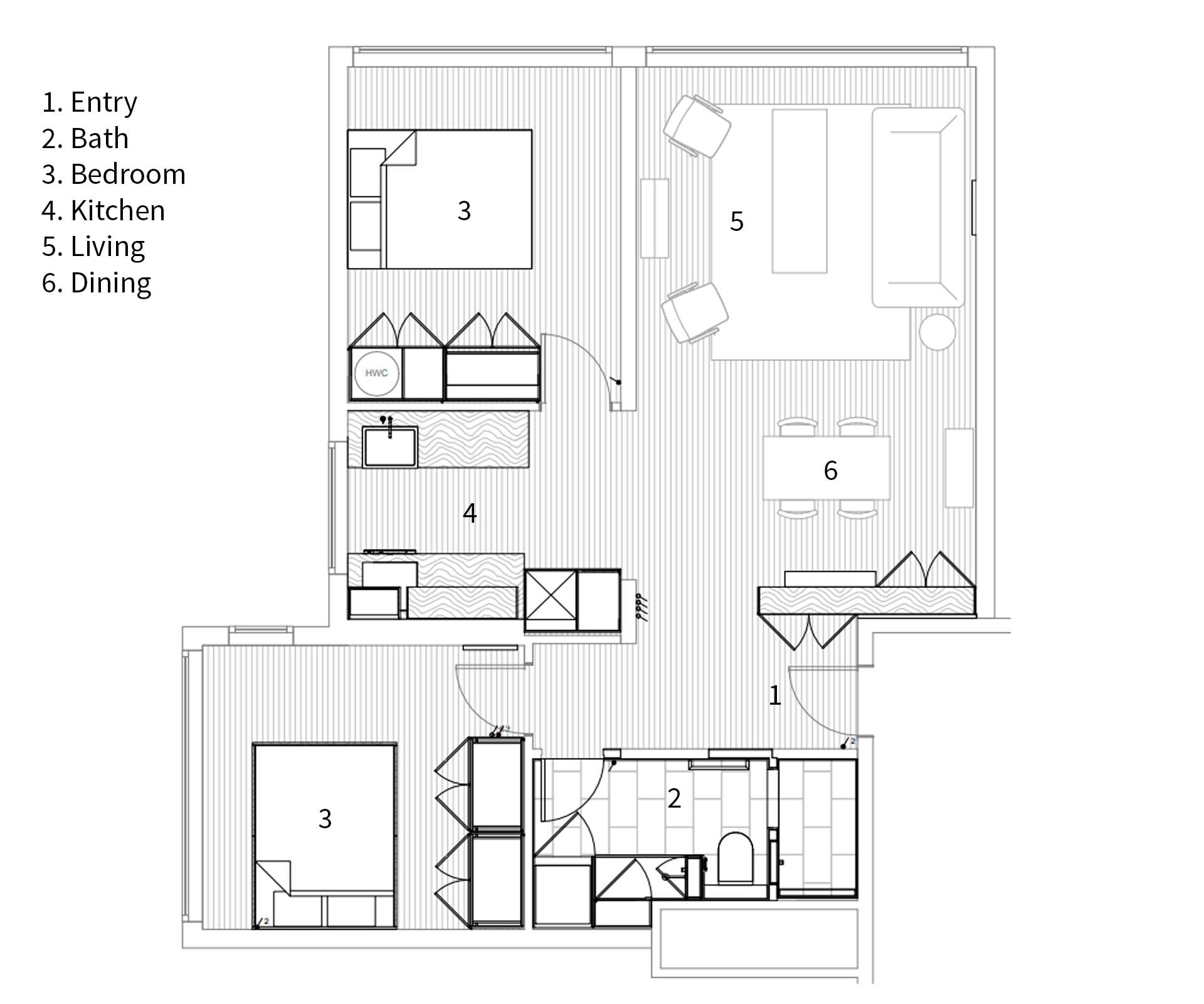
The u-shaped kitchen – a “not very cheerful early-2000s addition”, says Hansen – has been replaced with a galley-shaped kitchen, allowing Law and Hansen to be in the kitchen at the same time without crashing into each other. Everything – rangehood, dishwasher, fridge, appliances – is now tucked beneath and behind walnut benches and cabinetry. The cabinetry and shelving in the kitchen is a continuation of the bookcase and credenza in the living room, creating a sense of connection through the living spaces.
“We reintroduced a fragment of the lost hallway wall,” says Cheshire, “offset slightly from its original position and anchoring the dining table alongside. This allowed us to ‘thread’ the shelves between living room and front door, offering the library on one side and a civilised sense of arrival on the other.”
The bathroom, in a neglected state when the couple moved in, is now a world of its own. They thought Cheshire might find a way to bring light into the internal space, but he suggested they shut it out altogether, and use roasted-oak panelling on the walls and ceiling. The dark wood is complemented by marble tiles and brass fittings, including a custom-designed brass sink. “Nat pitched the idea of sanctuary that was completely different to the rest of the apartment, so you come in and close the door, and it’s like this lovely retreat,” says Hansen.
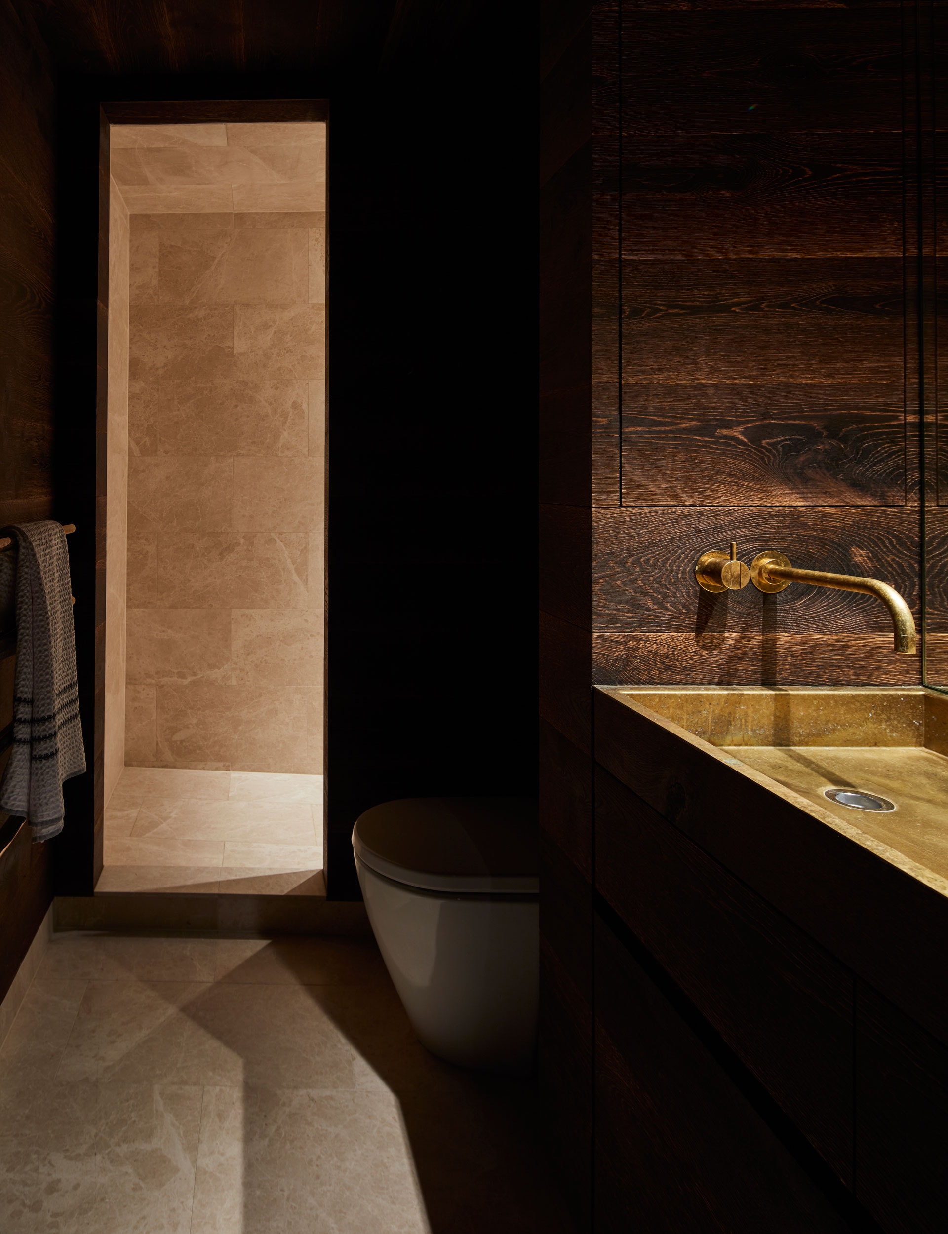
Law took some persuasion. “Yes, I was the last person over the line on that one. Now I think of it as this hidden jewel. You enter this austere modernist building, then you’re surprised that there’s an elegant apartment with its calm and beautiful living area inside, but then there’s this crazy surprise of one more layer, with a totally unexpected charred oak and brass bathroom.”
After 11 years editing HOME magazine, this was the first time Hansen has experienced architecture as “a client rather than a voyeur,” he says. “Many people said to me ‘you must know exactly what you want’ but, no, I didn’t. There are so many things that would never have occurred to us, that are joyful on a daily basis. It did remind me that there’s enormous value in finding a designer, or studio, who understands where you’re coming from and takes you to a place you didn’t envision.”
Law, a more recent convert, agrees: “Nat and Ian have completely transformed how this place feels. I love living in a small space – large houses often feel flabby to me now – but it does really help to have a well-thought-out space. For a small space you need to have one good big idea, one that organises the environment in a way that feels calm. I think that it’s probably more important to get architectural input in a small space, because you can’t afford mistakes or waste.”
Words by: Margo White. Photography by: Sam Hartnett. Styling by: Catherine Wilkinson
[related_articles post1=”71501″ post2=”71446″]
