Katie Lockhart’s interior worlds

Auckland-based interior designer and stylist Katie Lockhart contributes to magazines like World of Interiors and Italy’s much-missed Case da Abitare, as well as writing and shooting regularly for HOME. In this, our interiors issue, she’s created a shoot with photographer Harriet Were that envisions spaces with rich earth-toned walls and Arts and Crafts influences. Here, Katie talks about the inspiration for her shoot and what else she’s working on right now – and we take the opportunity to feature some of her work from previous issues of HOME. 

Katie Lockhart with her daugher Grey.
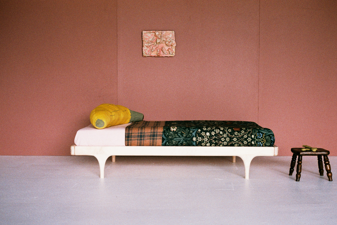
An image from Katie Lockhart's shoot in HOME's June July 2015 issue, featuring 'Clay' wall colour by Drikolor, artwork by Dan Arps from Michael Lett, a cot by Kalon from Nature Baby, 'Blackthorn' fabric by William Morris and an antique milking stool from Country Antiques. Photograph by Harriet Were.
An image from Katie Lockhart’s shoot in HOME’s June July 2015 issue, featuring ‘Clay’ wall colour by Drikolor, artwork by Dan Arps from Michael Lett, a cot by Kalon from Nature Baby, ‘Blackthorn’ fabric by William Morris, a cushion by Thing Industries from Douglas and Bec, and an antique milking stool from Country Antiques. Photograph by Harriet Were.


HOME You’ve created a beautiful interiors shoot for this issue. What was your inspiration for it?
KATIE LOCKHART I read an article that fashion designer JW Anderson wrote, entitled ‘Life through Objects’ (in Apartamento issue 14) that spoke of his love of Arts and Crafts furniture. He said the first pieces of Arts and Crafts furniture he bought were two Harry Napper chairs – Napper was primarily a textile artist, but also designed a series of tall-backed chairs around the same time as Charles Rennie Mackintosh. Anderson says he became obsessed with the way the arms were constructed and how something could be from a different period but still exude a strong modern force today.  This article, in combination with finding some amazing pieces of furniture and ceramics at Art & Industry, made me excited to create these still-lives for the magazine.

What does the shoot – its colour, and its Arts and Crafts influences – say about the direction you’d like interiors to head in now?
I like interiors to be inclusive, to invite people in and to make them feel comfortable. For me colour is a tool that I use to help make this happen. The paint colour in the feature is one that we’ve created for Drikolor which was matched to a paint chip that I picked off a fading building in New York, a few doors along from where the artists Robert Frank and June Leaf live. I am finding that I am gravitating to colours of this tone at the moment, which could be a seasonal thing, but for this shoot I think this particular colour anchors both the Arts and Crafts pieces as well as the modern pieces.

The Arts and Crafts movement was, in some ways, reacting against industrialised production. Do you feel that message is just as relevant today?
Absolutely. I am really interested in cottage-industry crafts and we try to support and develop this as much as possible through my shop, Everyday Needs. I can’t believe that New Zealand has managed to lose so many industries of makers – it breaks my heart that there is no one that can make flat weave rugs for me here when we have so much raw fibre to work with.
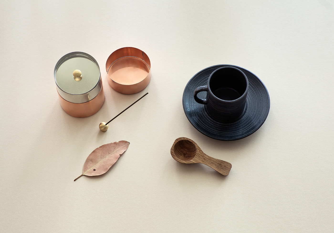
A shoot by Katie Lockart from our December 2011/January 2012 issue, featuring a Japanese copper tea canister from Everyday Needs, a mid-century Danish coffee cup and saucer, a wooden coffee scoop from Funkis in Sydney, a brass incense holder from Tortoise General Store in Los Angeles, and a leaf from the Eames House, Los Angeles. Photograph by Darryl Ward.


How has your own taste changed recently? What do you look for in an interior now that might not have caught your eye a few years ago?
That is a difficult question, but I guess I have more confidence in my own intuition now, which means that I am more experimental with colour and furniture design in my practice. Currently I am really focused on using New Zealand wool within my projects, whether it is in upholstery fabrics, carpets or working with weavers to create fabrics made of locally sourced yarn. My good friends Kirsty Cameron and Viv Stone are currently researching to make a documentary series on the story of New Zealand wool, and hearing about their process is just so inspiring I can’t help but feel it seep into my practice.
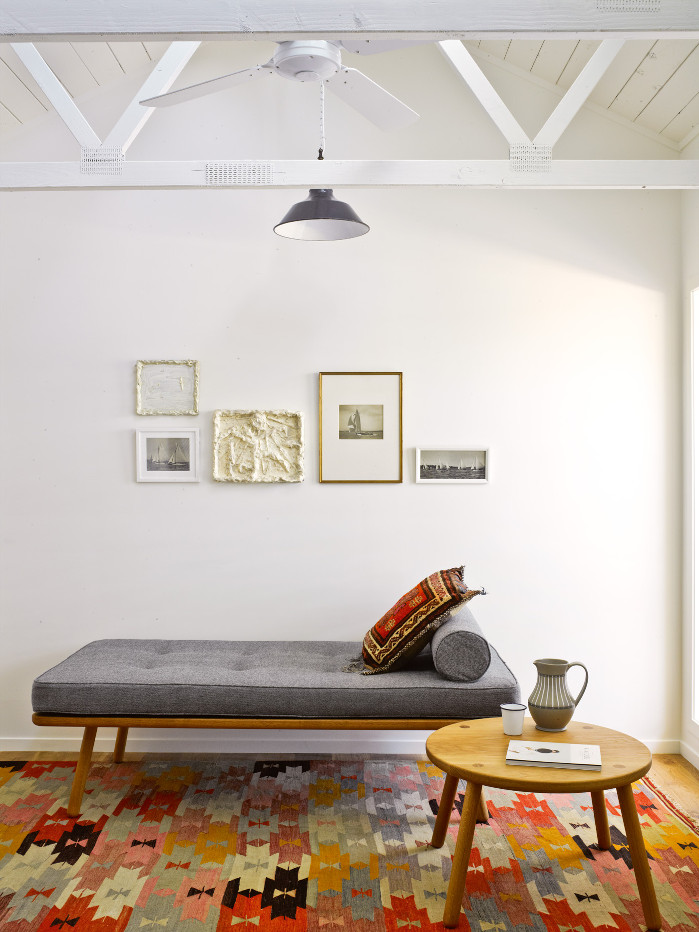
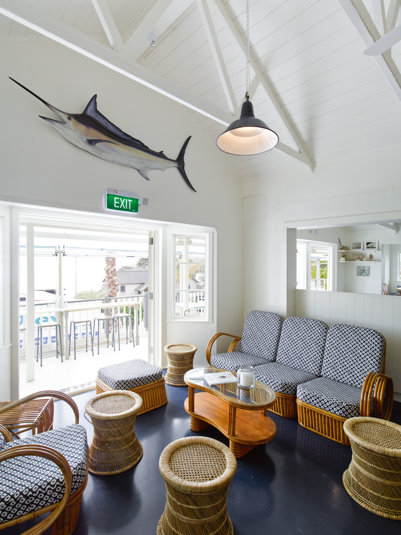
Katie Lockhart designed the interiors for Waiheke Island's Oyster Inn, featured in our December 2012/January 2013 issue. In one of the guest rooms, Lockhart chose a daybed from Another Country, mixed artwork by Dan Arps with vintage sailing photographs on the wall, and covered the floor with a kilim from Melbourne's Loom Rugs. Photograph by Mark Smith.
Katie Lockhart designed the interiors for Waiheke Island’s Oyster Inn, featured in our December 2012/January 2013 issue. In one of the guest rooms, Lockhart chose a daybed and table from Another Country, mixed artwork by Dan Arps with vintage sailing photographs on the wall, and covered the floor with a kilim from Melbourne’s Loom Rugs. Photograph by Mark Smith.
At Waiheke Island's Oyster Inn, Katie Lockhart re-covered a vintage cane settee in vintage Japanese fabric. Photograph by Mark Smith.
At Waiheke Island’s Oyster Inn, Katie Lockhart re-covered a vintage cane settee in vintage Japanese fabric. Photograph by Mark Smith.


What’s the last thing you purchased for your home, and why?
My husband and I recently had a day trip to New Plymouth and, among other things, visited Leslie Kreisler’s gallery, where I fell in love with a wooden piece that Eugene Kreisler had made. I bought it on the spot and carried it home on the plane. It makes me happy every time I see it.
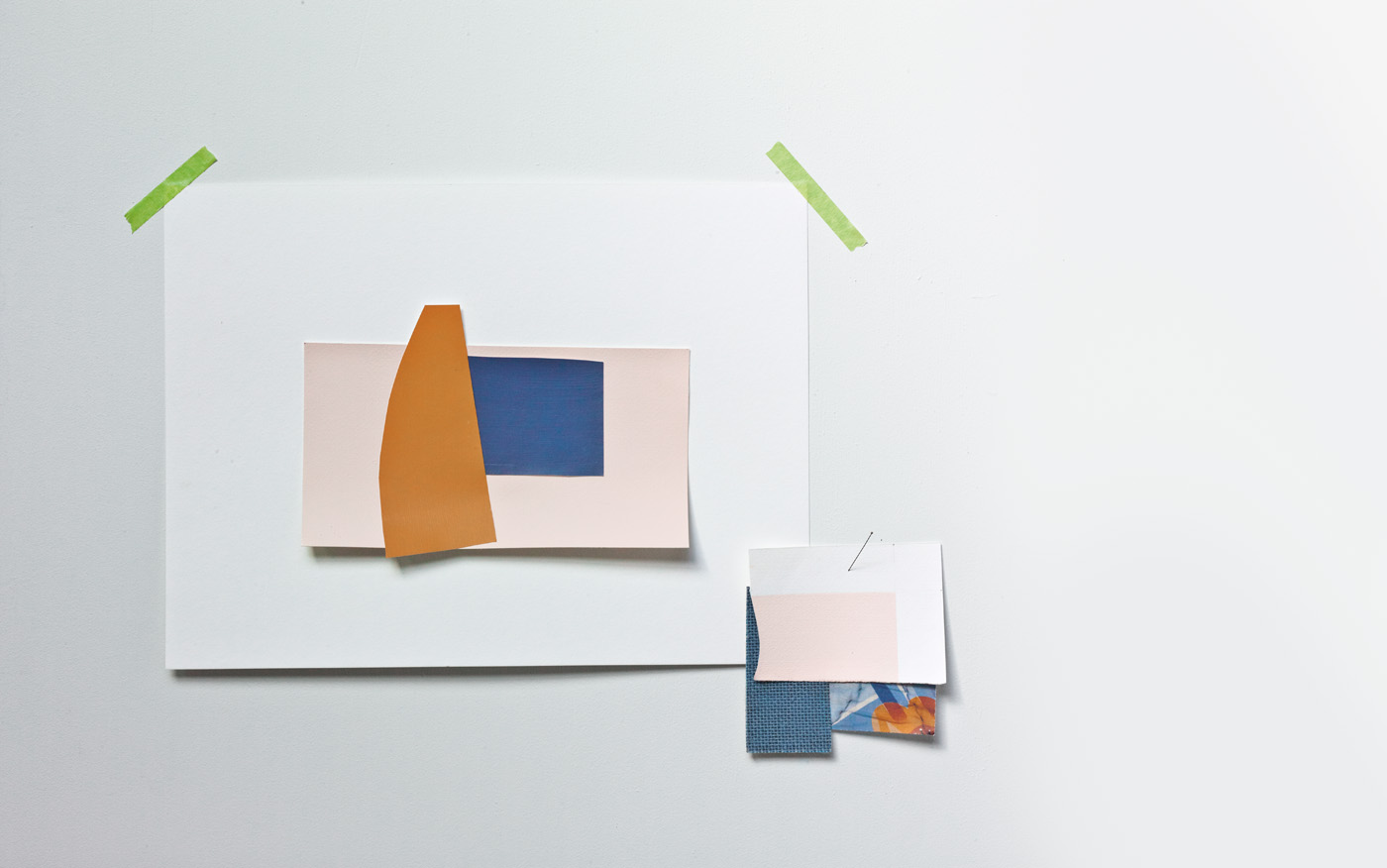
A shoot by Katie Lockhart from our October/November 2011 issue features a 'Golden Ochre' paint swatch from Porter's Paints, a ‘Nocturne’ hessian swatch by Murascpec from Swinson Wallcoverings, a paint swatch featuring Aalto ‘Barely’ from Aalto Colour, and a paint swatch featuring Resene ‘Astronaut’ (blue). The Vintage 1930s Art Deco fabric is from Victorian Gilt.
A shoot by Katie Lockhart from our October/November 2011 issue features a ‘Golden Ochre’ paint swatch from Porter’s Paints, a ‘Nocturne’ hessian swatch by Murascpec from Swinson Wallcoverings, a paint swatch featuring Aalto ‘Barely’ from Aalto Colour, and a paint swatch featuring Resene ‘Astronaut’ (blue). The Vintage 1930s Art Deco fabric is from Victorian Gilt. Photograph by Mark Smith.
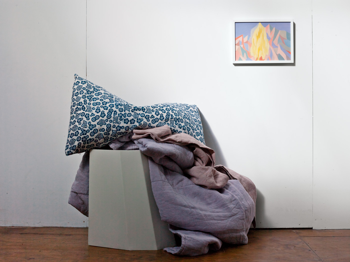
A shoot by Katie Lockhart for our October/November 2011 issue features a 'Circus' stool by Martino Gamper, a vintage Japanese art deco cushion from Victorian Gilt, a Society sheet and quilt from Siena, and an artwork by Saskia Leek from Hamish McKay Gallery. Photograph by Mark Smith.
A shoot by Katie Lockhart for our October/November 2011 issue features a ‘Circus’ stool by Martino Gamper, a vintage Japanese art deco cushion from Victorian Gilt, a Society sheet and quilt from Siena, and an artwork by Saskia Leek from Hamish McKay Gallery. Photograph by Mark Smith.


What else are you working on at the moment?
We have a lot on at the moment, including the interior of a Stevens Lawson house and a new project for The French Cafe. Both of these projects allow us to work with brilliant craftspeople, and for me this is really gratifying as I know that my clients will be able to enjoy these interiors for years to come.
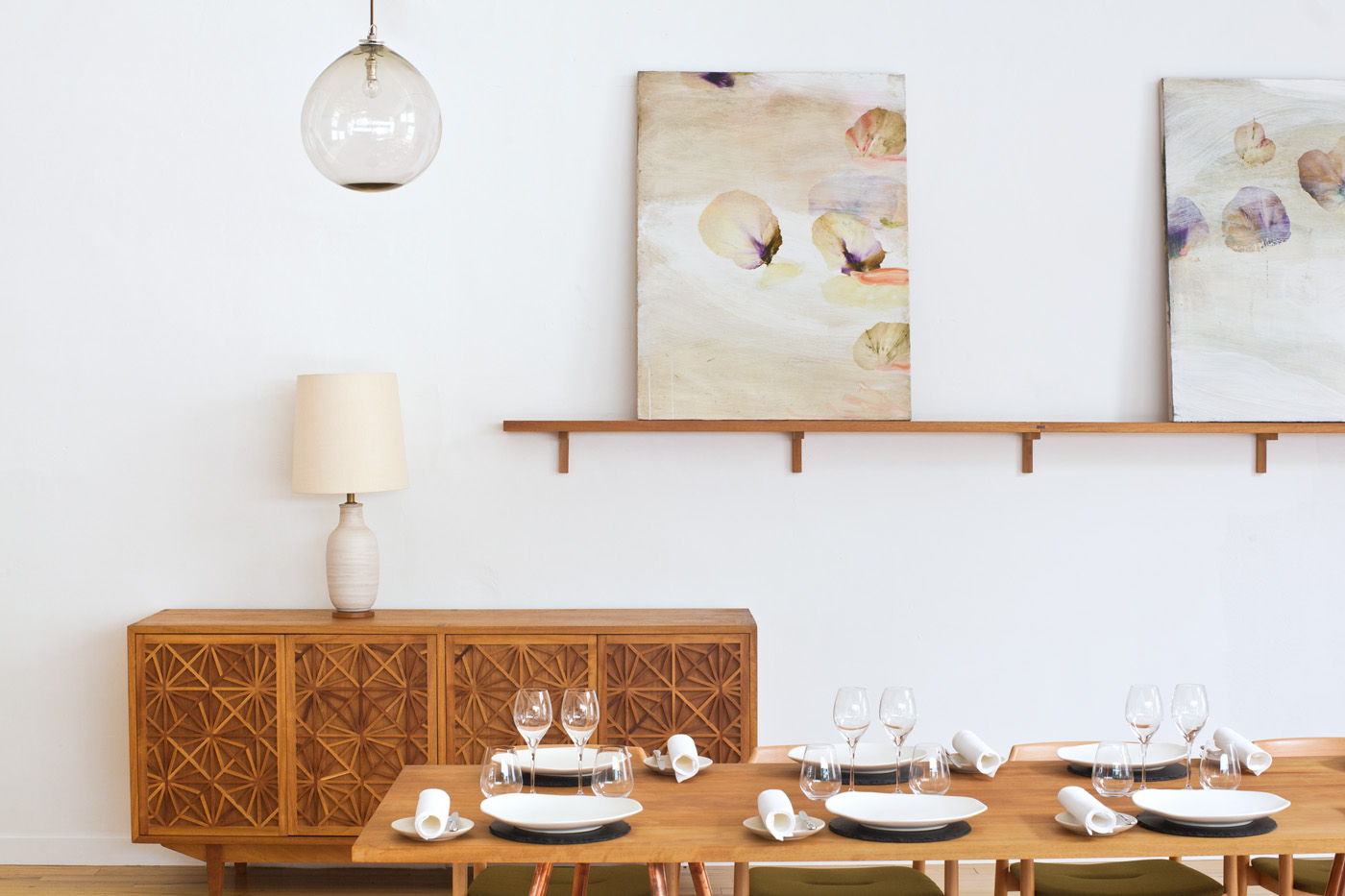
collaboration with Grant Bailey. The artwork is by Antonio Murado. The pendant light is by Katie Brown. Photograph by Darryl Ward.
Inside The French Kitchen at Auckland’s The French Cafe, where Katie Lockhart designed the interiors. Featured in HOME’s February/March 2013 issue. The furniture was designed by Katie Lockhart in collaboration with Grant Bailey. The artwork is by Antonio Murado. The pendant light is by Katie Brown. Photograph by Darryl Ward.

See more of Katie Lockhart’s latest shoot in the new June/July 2015 issue of HOME. 
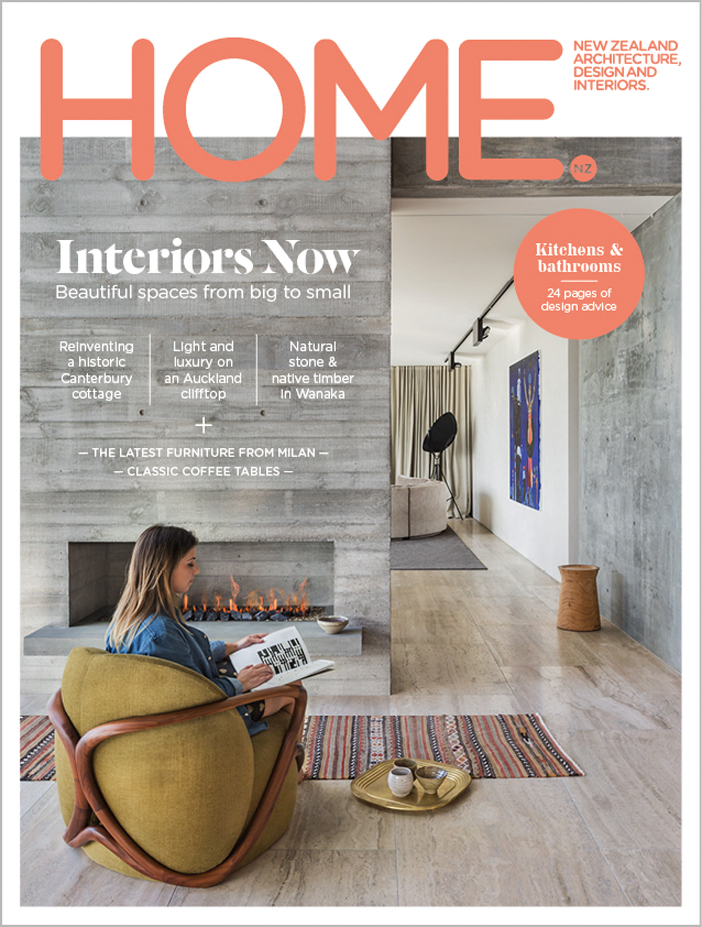
Our new cover was photographed at an Auckland home by Julian Guthrie, and features a chair by Rossanna Puglietti for Giorgetti from ECC, a rug from Siggada Kilims, a brass tray by Tom Dixon and ceramic accessories from Everyday Needs. The 'Dama' side-table is by CR&S Poliform from Studio Italia. Photograph by Patrick Reynolds.
Our new cover was photographed at an Auckland home by Julian Guthrie, and features a chair by Rossanna Puglietti for Giorgetti from ECC, a rug from Siggada Kilims, a brass tray by Tom Dixon and ceramic accessories from Everyday Needs. The ‘Dama’ side-table is by CR&S Poliform from Studio Italia. Styling by Sam Smith and Catherine Wilkinson. Photograph by Patrick Reynolds.

Latest video features

In the Coromandel, a home with a humble profile and a thoughtful design makes the most of a stunning location.

Built with awe-inspiring attention to detail, this Arrowtown home is a fresh interpretation of a familiar Otago rural vernacular.

This sculptural Northland bach is a perfect north arrow on a remote farm high above the sea.

With the sun on its bow and the community at its stern, this is a house in which the elements are always front of mind.

Trending articles

Design News

On Dorset Street

When interior designer, Campbell Johnson, returned to Christchurch from Europe, it was one of Sir Miles Warren’s Dorset Street Flats that caught his eye. It’s

Homes

City villa: A sleek Remuera renovation

Approach this 100-year-old villa in Auckland’s Remuera and there’s a beguiling sense of history and character, but there’s also a sense of something more.

Homes

Pavilion in the clouds

Five simple elements and the well-placed delivery of a stunning view define this minimalist, Hawke’s Bay home by Dorrington Atcheson Architects.