Thoughtful design and a showstopping choice of steel-grey stone makes this Auckland kitchen a hard wearing yet stylish space
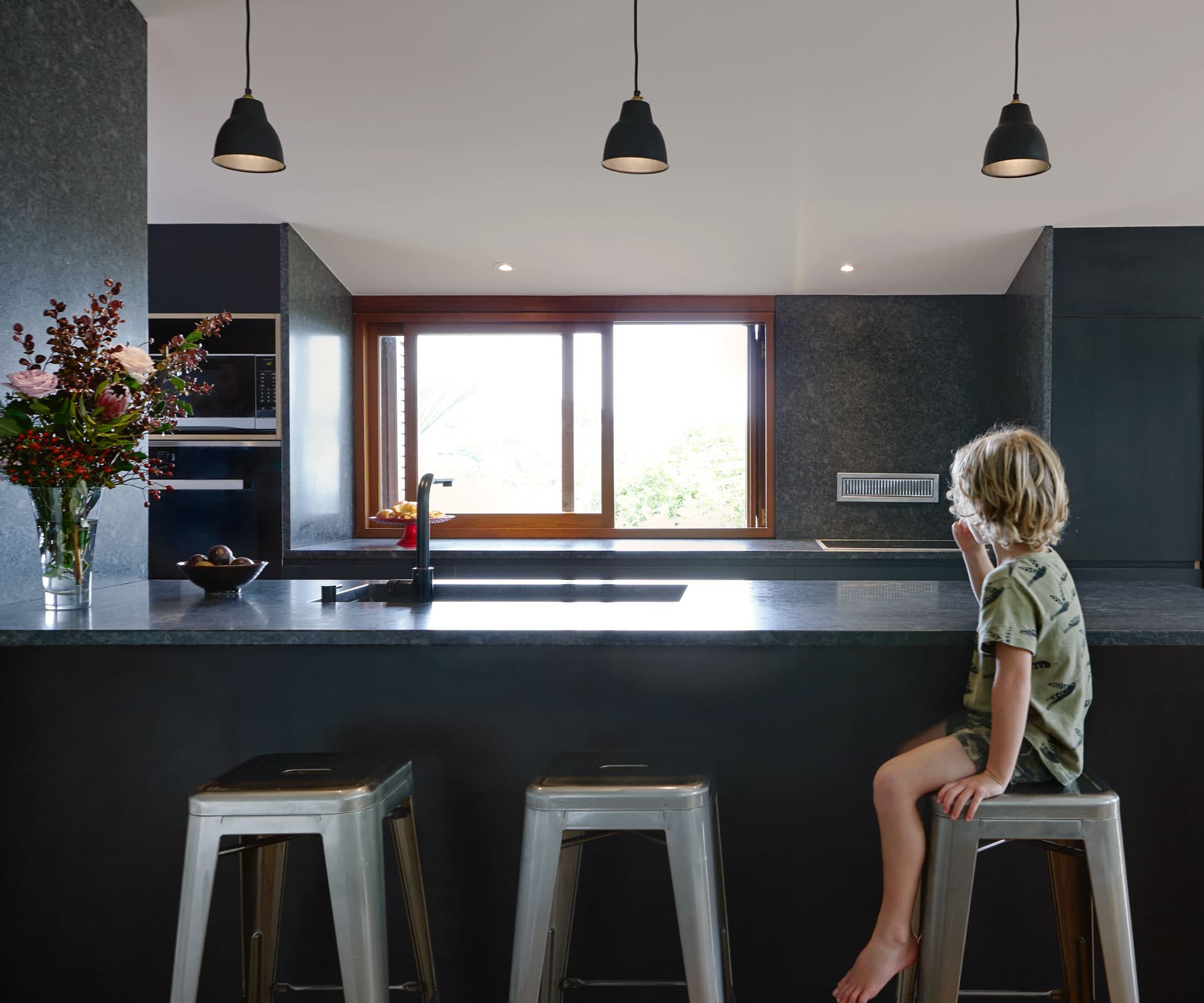
This kitchen designed by Mike Hartley is an open-plan dream
Project
Castor Bay kitchen
Architect
Mike Hartley, 13
Location
Castor Bay, Auckland
Brief
To create an open-plan, light-filled living, dining and kitchen area for a young family.
Mike Hartley was asked to create an open-plan, light-filled living, dining and kitchen area, upgrade its flow to an outdoor deck, and also create welcoming access to the home. All this for clients who are family, which brought “all the satisfaction and drama it possibly could to the project”, says the architect. Despite the area’s open-plan nature, Hartley’s use of steel-grey stone creates an intimate space that owns its territory in the scheme. It’s stylish yet robust, designed to serve the demands of family life with three young children.
How would you describe the design and mood it creates?
Mike Hartley: Part of the brief was to engage with the dense native bush that populates the road bank margin of the site, and to provide a resonance with the depth and tones of the bush through materiality in the kitchen. With the view to the bush, the whole area offers a feeling of peace and relaxation.
Talk us through the context of the kitchen in the home and how it works in terms of flow and practicality.
The kitchen was designed as a sort of command centre. While preparing food, it was a must for Brad and Diane to be able to engage with the children in their various areas and states of play. By placing the long line of cabinetry against the southern wall, we were able to disguise just how low the ceiling gets in this location (less than two metres) while providing a solid, functional and comforting backdrop to the main space.
The stone sets the scene – how did it come to be an important part of the equation?
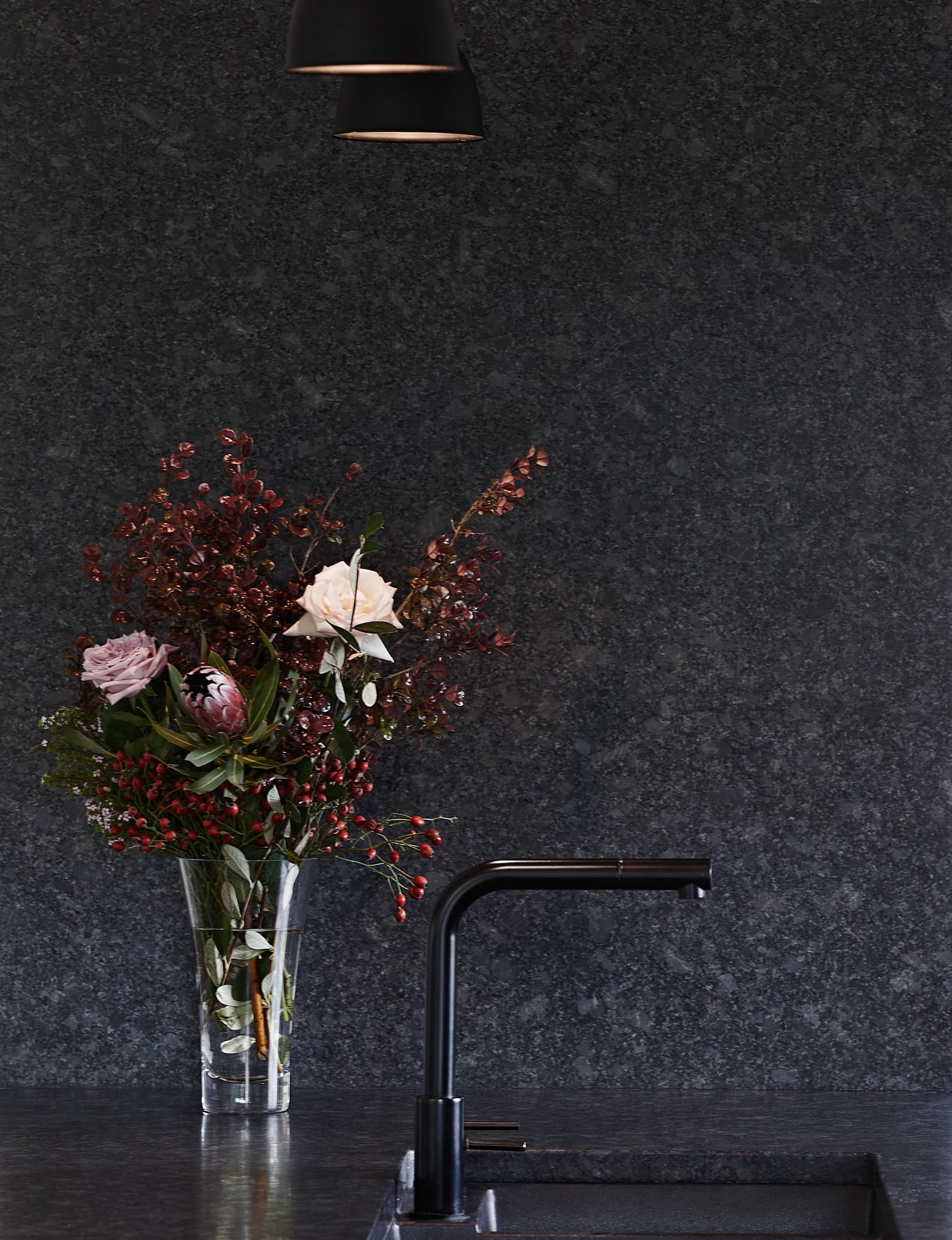
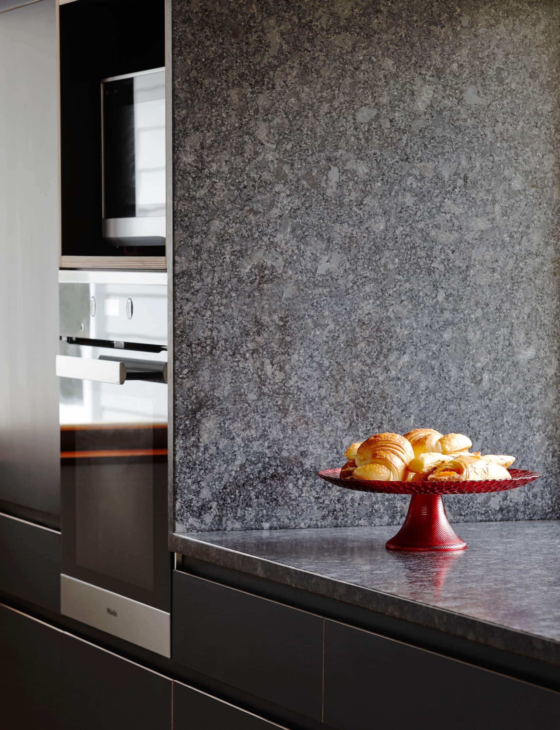
We really liked the stone right from the outset; the steely grey with large graphite flecks had the right level of depth and luxury. I feel that a stone benchtop in a kitchen like this not only needs to work in with other materials – in this case the black ply and existing timber floors – but it also needs to work in with the people occupying the space. In this case, I knew Diane (my wife Sarah’s twin sister) owned a silvery-steel grey dress, so I was pretty confident it would be a winner. We continued the waterfall edge at the end of the bench up the wall to provide consistency and an engaging material backdrop. This strategy was also used in the cooktop area.
What did you use for the cabinetry?
The cabinetry fronts are made from a black high-pressure laminate on birch plywood; a robust material. By chamfering the top edges of the drawer front we created a discreet pull handle. The exposed plywood edges were finished with Osmo oil and we love the way that these golden edges provide depth and relief to the panel faces.
Words by: Jo Bates. Photography by: Jackie Meiring.
[related_articles post1=”79145″ post2=”79345″]
