1. Chefs at home
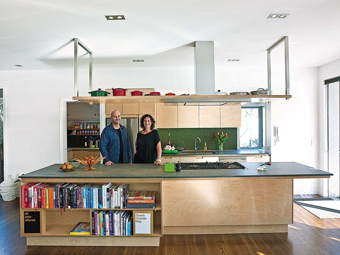
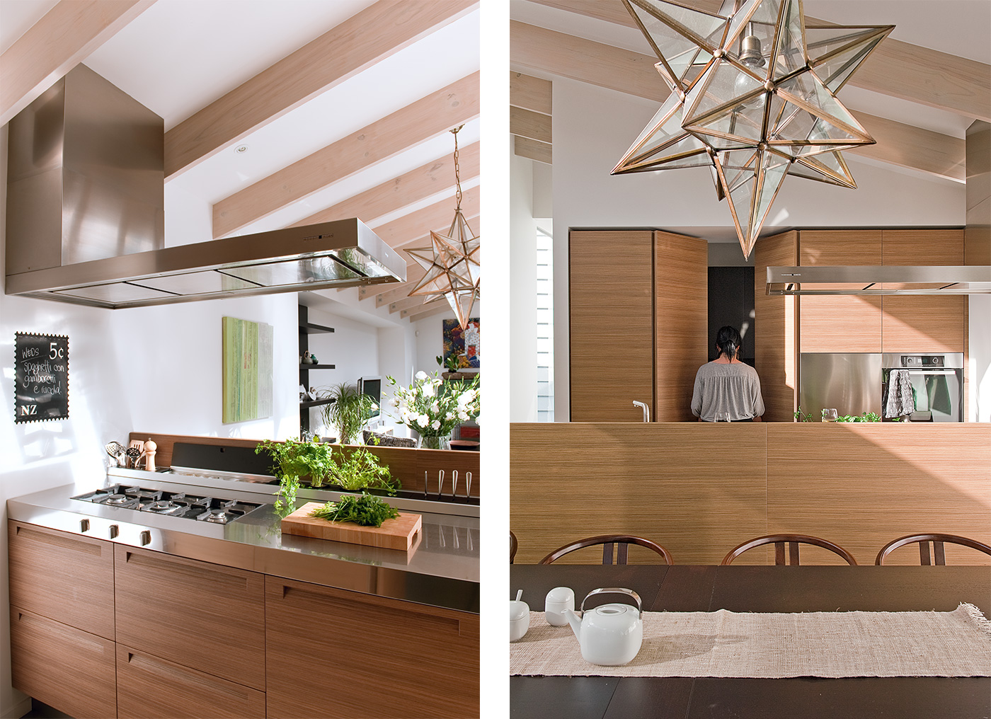
For chefs Natalia Schamroth and Carl Koppenhagen, their new kitchen is the culmination of four years spent “desperate” to get out of the cramped, closed-off kitchen at the back of their house. Working with kitchen designer Natalie Du Bois, Carl and Natalia have created their dream kitchen, a bright, open, generously sized space characterised by simplicity of form and intelligent configuration of cabinetry and appliances.
As owners and chefs of The Engine Room restaurant in Northcote Point, Auckland, Natalia and Carl spend their lives thinking about food. So when it came to designing their own kitchen, they had very specific ideas about how the space would look and function. “We definitely wanted good work spaces so at least a couple of us could cook at once,” says Natalia. Adds Carl: “It had to be functional but really basic – when you’re working in professional kitchens, everything is so simple.”
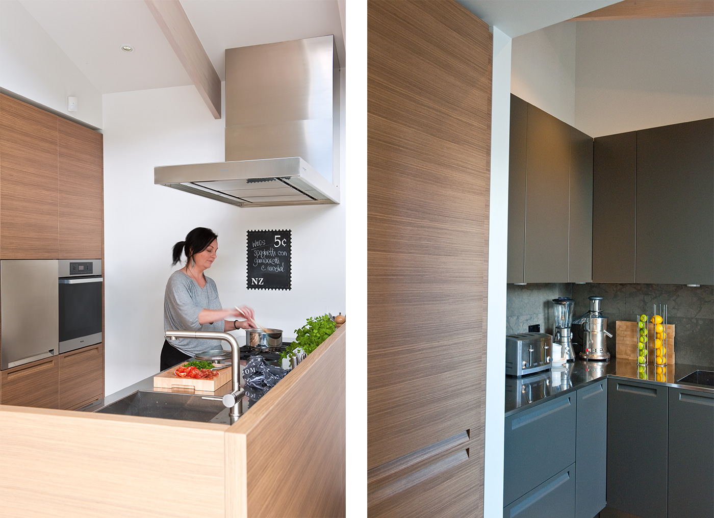
“Plus, we’re both used to gas and robust appliances, which is why we chose a semi-professional cooker,” says Natalia. “Also at work we’re used to just cleaning everything at the end of the night. Our kitchen had to be streamlined and easy to keep clean.”
The material palette instantly brings to mind the Japanese concept of ‘wabi sabi’ – the idea of finding beauty in imperfection. The honed and sealed 20mm Italian sandstone benchtop has seams running through it that another buyer might have rejected, and the birch ply cabinetry bears the natural marks of the milling process. A secondary-grade oak floor retains all its knots and crevices, and the green tiles on the splashback are rough-hewn and almost look chipped. “We just wanted everything natural and raw,” says Natalia. “Nothing polished and fussy,” agrees Carl. “We didn’t want a glossy, fancy kitchen.”
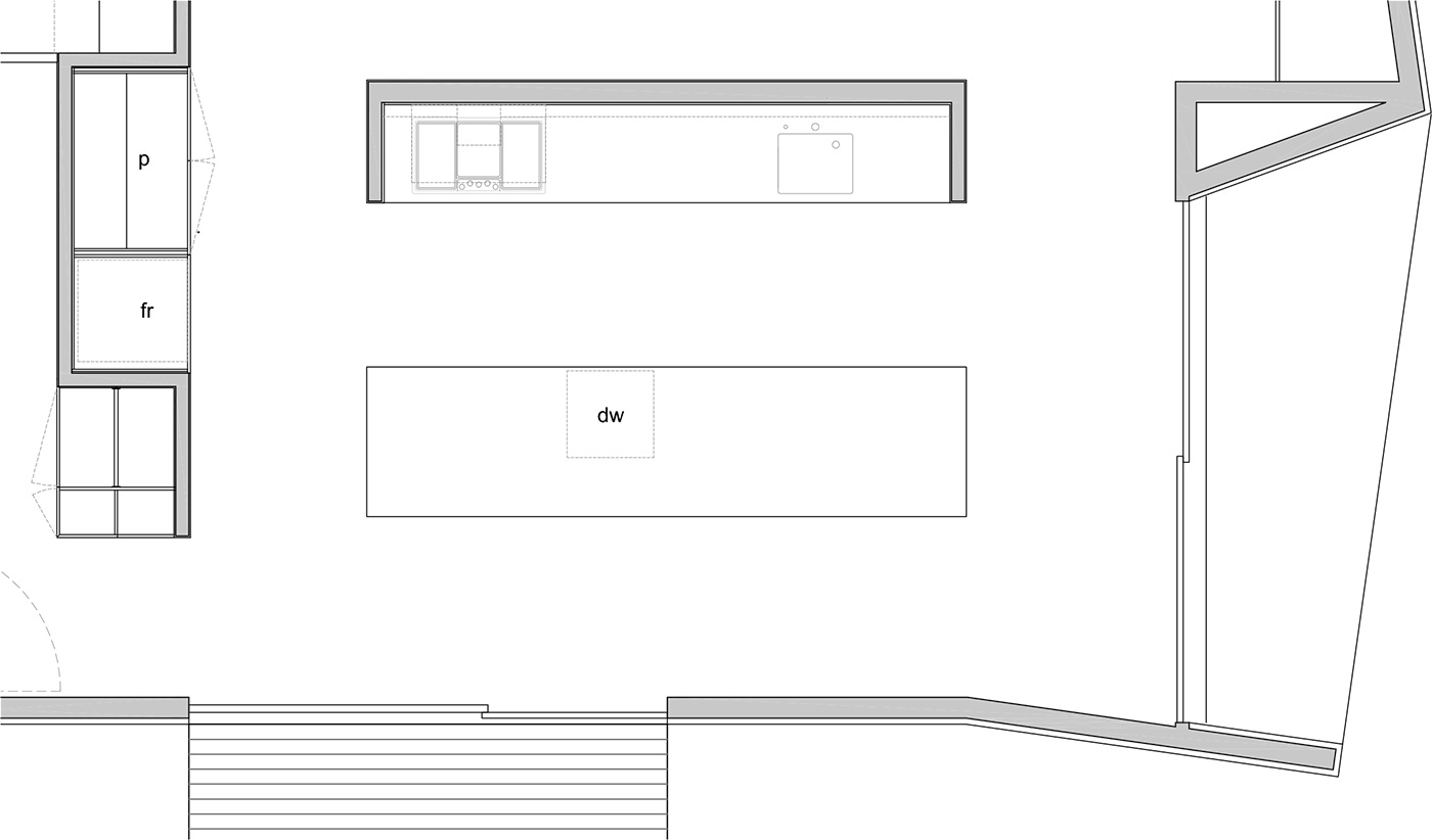
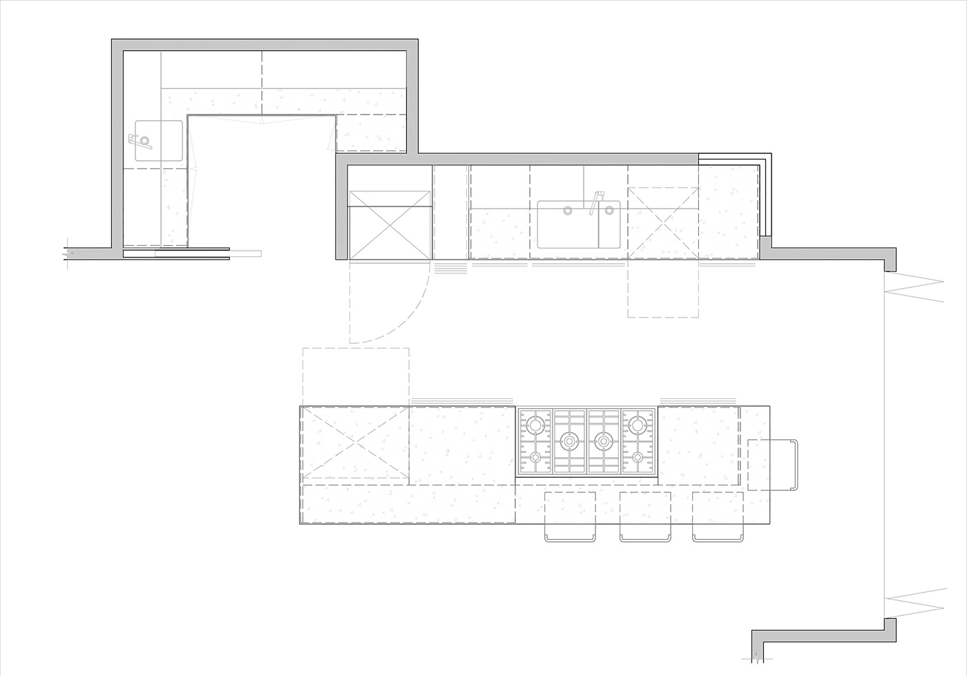
A small scullery situated off the kitchen has its own specific function. Small appliances are set out on the benchtop ready to be used, and shelves above hold cans and baking ingredients. While Carl and Natalia do all their food preparation and cooking on the island bench, baking is mixed in the scullery where ingredients are close to hand. The coffee machine is tucked away: “We drink so much coffee that the bench is always messy!” says Natalia.
As chefs, wasn’t it tempting to recreate a professional kitchen in their home? “For a long time we thought we would do that,” says Carl. “We could have had white butcher’s tiles and stainless steel, but we have that at work.” A few elements are reminiscent of a professional kitchen, especially the deep square sinks and a suspended shelf that incorporates the extractor over the island. This holds cast-iron cookware, its slim profile belying its strength.
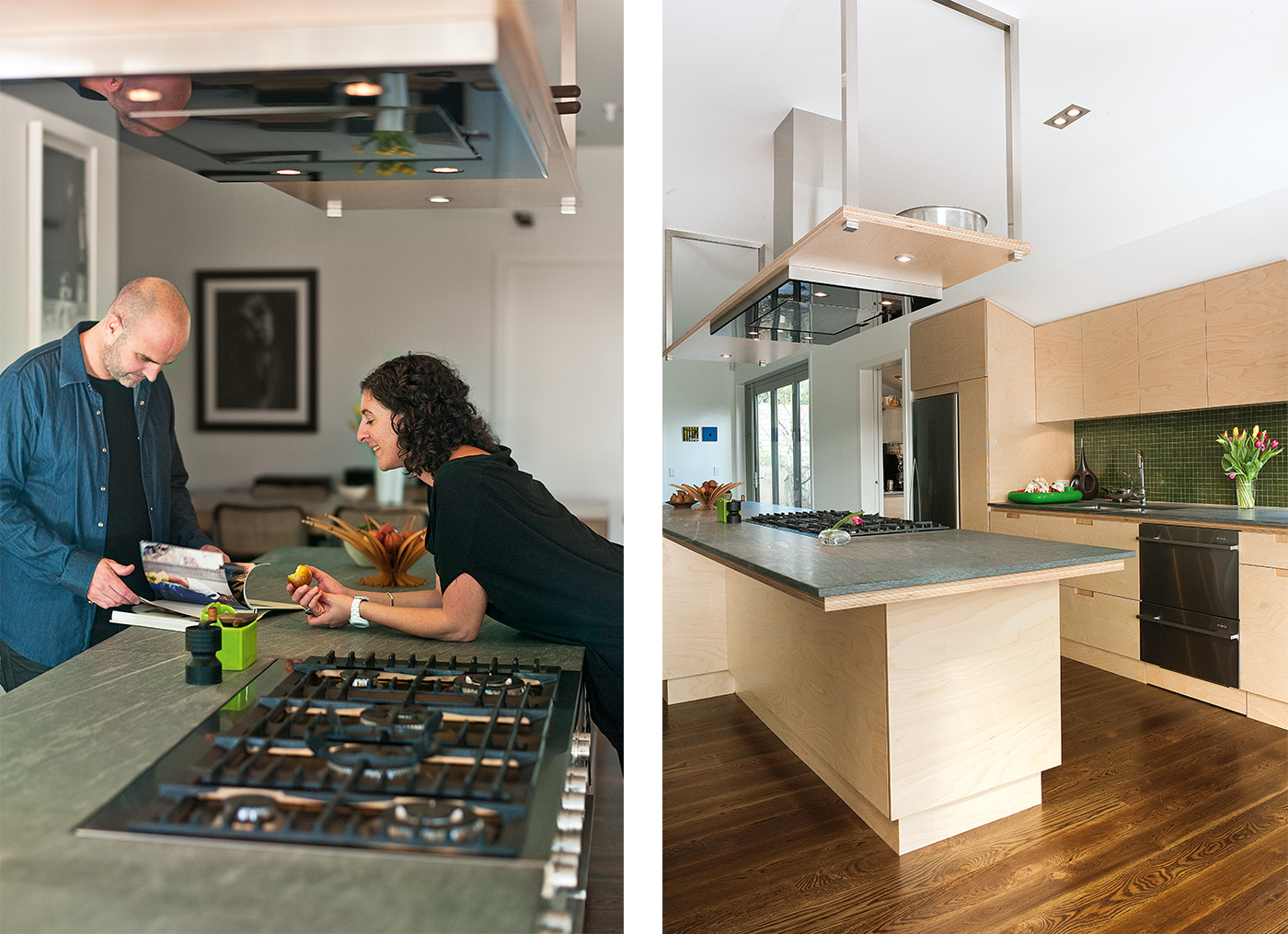
Thanks to Fisher & Paykel, the couple’s kitchen was designed with functionality and sociability in mind. A freestanding double Fisher & Paykel oven with integrated gas cooktop in the island can accommodate multiple cooks. The couple also have a new Fisher & Paykel CoolDrawer, which also sits in the island and allows them to store fruit and veges conveniently at bench height, and to chill wine for dinner parties. A Fisher & Paykel Double DishDrawer takes care of everything from dinner-party-sized loads of dishes to half-loads when the couple is home alone.
“What we love about our kitchen is the sense of space, the understated materials, and that we have loads of storage,” says Natalia. “Also that we have New Zealand-designed appliances that are timeless as well as robust and highly functional. The kitchen has become the hub of the house, as it should be.”–Christine McBride
2. Little secrets
The designer’s hand is revealed in this kitchen’s clever details.
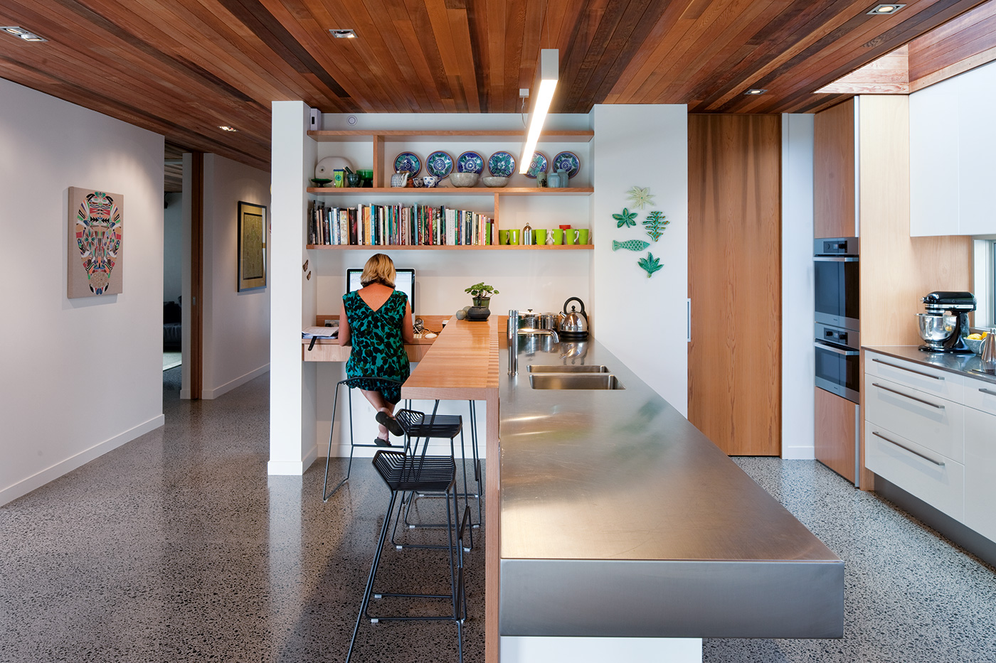
You could say that the kitchen in Joanna Hoeft’s Arch Hill home has been more than a decade in the making. That’s how long Joanna has been working as a kitchen designer (she is also a part-owner of Auckland’s Studio Italia), and dreaming of her perfect space. While one kitchen couldn’t possibly encompass all the ideas she has had over the years, this one manages to incorporate quite a few.
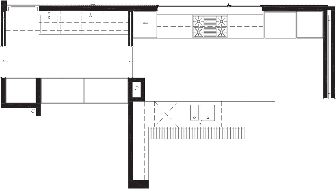
The Poliform Varenna kitchen is compact, only three metres long, but every inch of space is thoughtfully occupied.
“The galley style suits the footprint of the extension better than an open-plan kitchen, and it also eliminates corners,” says Joanna. “I’d recommend anyone designing a kitchen to avoid corner cabinetry. There are some good mechanisms available, but the equipment needed to negotiate the corners tends to complicate the design. The space just isn’t as accessible; you get much more usable space by keeping cabinetry in a straight line.”
The kitchen is characterised not only by its efficient planning, but its streamlined features. The pull-out pantry and Miele fridge and freezer are integrated for a perfectly clean line, and the 600mm-wide drawers are divided into every configuration possible for ease of access. Behind another cupboard door in the island bench resides a Liebherr bar fridge, conveniently positioned near the dining table. Along the back of the stainless-steel benchtop, behind a small upstand, is an ingenious feature that Joanna calls a “secret compartment”. It’s a series of slim pop-up covers that reveal small cavities built into the benchtop. These cavities hold, variously, a series of power points, a collection of dried and fresh herbs, the mail, and kitchen cleaning equipment. Also built in are a utensil holder and a knife block so that knives are literally pulled out of the bench surface.
And just when you’re wondering where Joanna stores anything beyond the basics, cabinetry doors beside the fridge opens to reveal a scullery. As well as an extra sink, dishwasher, washing machine and dryer, on-bench appliances are kept plugged in for easy access, and shelves of glassware and crockery are hidden away. A simple palette of charcoal-grey limestone tiles and embossed lacquer cabinetry visually separates the scullery from the kitchen, which is clad in warm walnut veneer from Varenna.
“I wanted the scullery to be darker than the kitchen,” Joanna explains, “so if the doors are open the scullery just recedes, it doesn’t jump out at you.”
This space comes into its own when Joanna and her husband Nick are entertaining, as food prep can be done in the scullery, keeping the visible kitchen area clear. And at the end of the evening, dishes can be cleared away without having unsightly piles of dishes dominating the kitchen bench.
“I’m designing more and more sculleries for clients,” comments Joanna. “The thing is that people need to give the scullery enough space so it’s actually functional, rather than just being a walk-in pantry. You need to be able to get in there and work comfortably.”
So overall, what makes a great kitchen? “It’s a mix of functional storage and aesthetic beauty,” says Joanna. “It can’t be just one or the other.” –Christine McBride
3. Family friendly
This new kitchen accommodates a young family while retaining its sense of style.
The kitchen in Rachel Luisetti’s home, designed by architect Andrew Meiring, was planned with a growing family in mind. This sleek space manages to be simultaneously a place where the children can cook or do their homework and Rachel and her husband can entertain. Although a new-build, Rachel resisted the temptation to create a large open-plan kitchen, instead opting for a galley-style space extending into a laundry. “The proximity of the two is important,” she says, “because with a young family I spend a lot of time going back and forth between them.”
All the materials in the kitchen are hard-wearing yet stylish, geared towards children and adults using the same space. A chunky cantilevered benchtop clad in stainless steel is durable and easy to keep clean, while the timber-clad bench opposite can take some hard knocks. Safety is paramount, so Rachel chose a five-burner De Dietrich induction hob. “I think the induction system is great for cooking, but it’s also so much safer for the children to use than gas,” she says.

Two Miele wall ovens have been placed so that the lower one, a combination microwave and oven, can be easily accessed by the children.
Given the kitchen’s proximity to the living and dining areas, an upstand on the island bench comes into its own for hiding food preparation and dishes. Barstools placed along the outside of the island provide space for the children to eat or work while being supervised.
One of Rachel’s favourite points about the kitchen was added at the last minute: the skylight – which provides so much light to the space – was never on the original plan. “We were at the cladding stage when we realised we needed more light in the kitchen,” says Rachel. “So we threw a tarpaulin over it while we worked out how to do it.” Light is also drawn in via the window over the hob, which looks out onto an area of planting. The deep windowsill doubles as storage for herbs, fruit and vegetables. All in all, this family kitchen never sacrifices style to practicality. –Christine McBride
4. Material difference
The pared-back kitchen of Bergendy Cooke and Guy Fisher makes cooking the star.
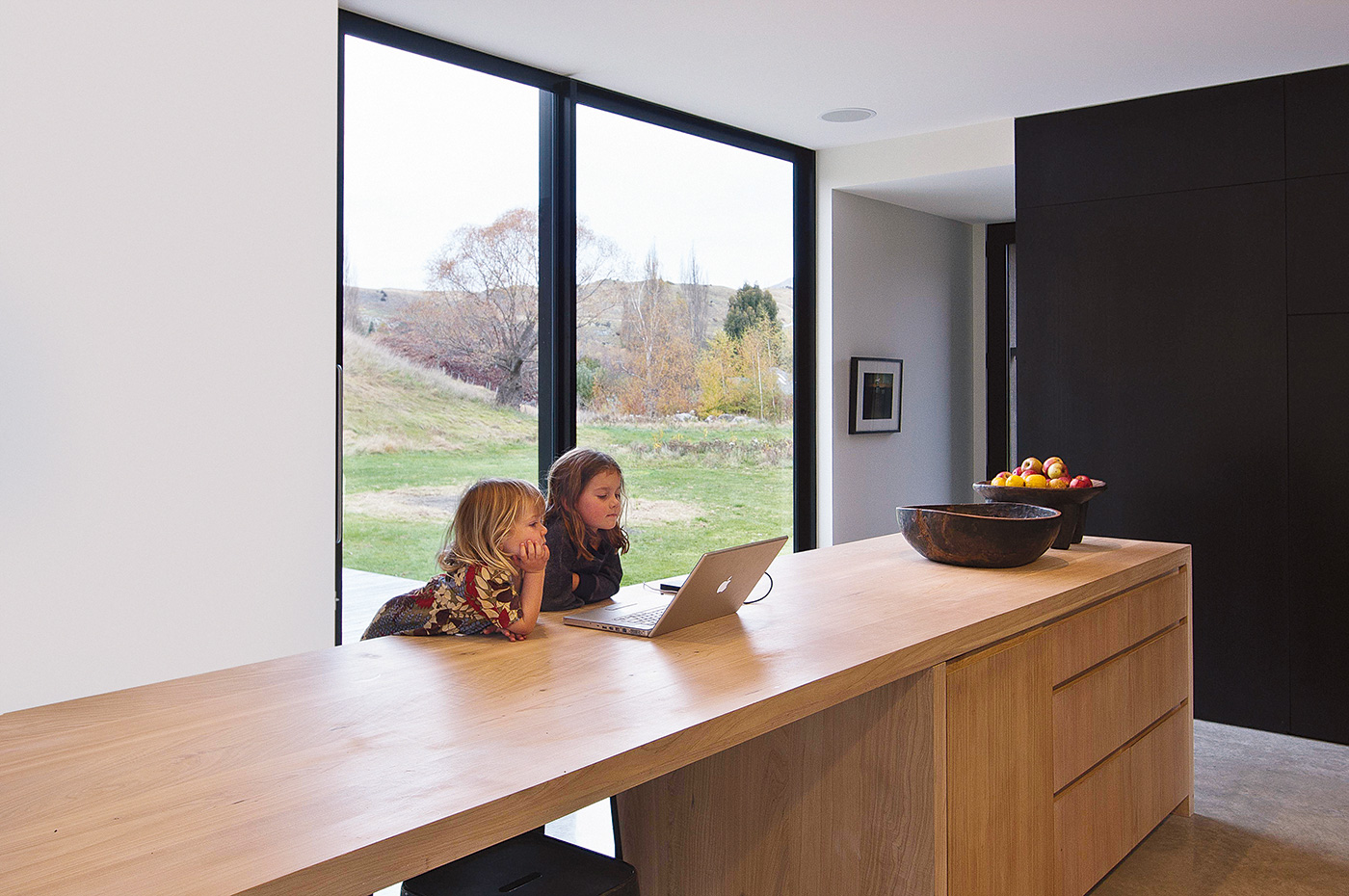
Before they moved into their house near Arrowtown, Bergendy Cooke and Guy Fisher had lived in a series of houses and apartments in London and New York in which each kitchen appeared tinier than its predecessor. That meant space was a top priority when Bergendy designed this vital area in their home. “All of the time we were away, our kitchens seemed to get smaller and smaller,” Bergendy says. “So it’s now really enjoyable to be able to spread out and cook.” Adds Guy: “Primarily, the kitchen was always going to be a social hub”.
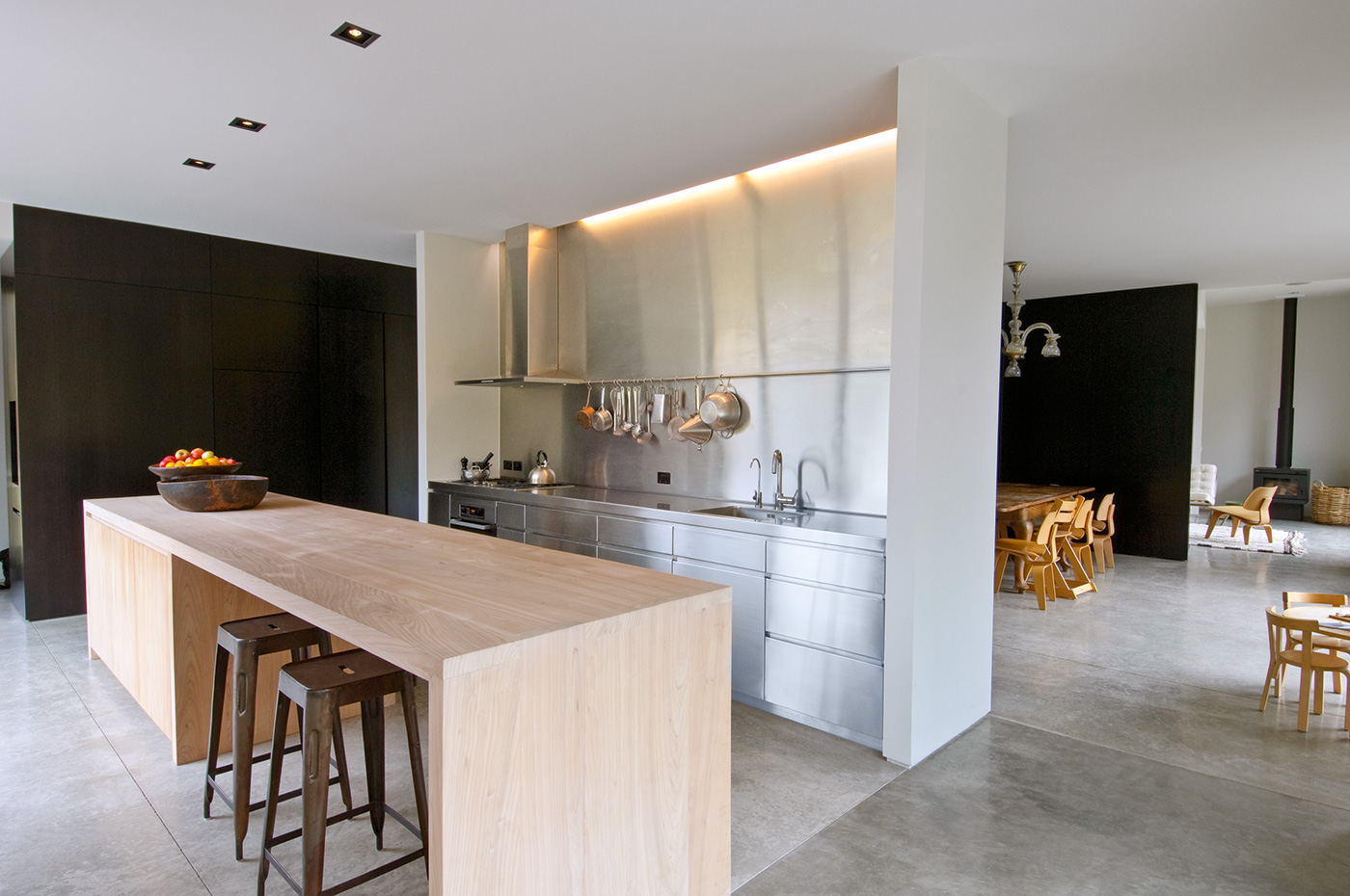
Their new kitchen is a simple affair whose generous proportions allow it to function in a number of ways. Guy and Bergendy can prepare food while Anouk (6) and Kiki (3) do homework at the kitchen island. The family eats around the island most nights and sometimes, even guests never make it to the dining table, preferring to hang out in the kitchen where the cooking is going on. Best of all, the “acres of bench space” mean there’s plenty of room for Guy to indulge in one of his many culinary enthusiasms, making pasta.
The central feature of the kitchen is a large macrocarpa island which houses a Miele dishwasher as well as drawers to store crockery and cutlery. The timber surface is not varnished – a treatment Bergendy feared would show wear and tear too easily – but oiled with a product that produces a bleached tone. The oiled surface has been useful at repelling stains, and the most serious spills can be sanded away before the surface is restored with another coat of oil.
The other side of the kitchen is predominantly stainless steel, a deliberate contrast to the warmth and tactility of the island and a reference, Bergendy says, to hard-wearing industrial kitchens. The deep single sink, five-burner hob and oven are located here, illuminated by a fluorescent slot blade that spills light down the stainless steel splashback (the island is lit by recessed spotlights in the ceiling).
A rail covers the join in the stainless steel sheets and is used for hanging pots, pans and utensils. The drawers here, like their timber counterparts on the island, have 45-degree recesses in place of handles.
Like much of the rest of the living spaces, a side wall in the kitchen features deep cabinets clad in dark-stained Tasmanian oak veneer. One of these contains the pantry, which has a stainless-steel bench for the coffee machine and toaster, meaning the main benches are never cluttered with appliances. Beside the pantry, the fridge is concealed behind another almost-seamless dark panel. –Jeremy Hansen