This kitchen renovation by Neil McLachlan of Neil McLachlan Design aimed to modernise the functionality of the space, and also bring it into alignment with the Arts and Crafts details of the rest of the house. Below, McLachlan explains how they opened up the design to better suit a modern family, while retaining a classic look.
HOME What was your brief for this space, and how did you go about fulfilling it?
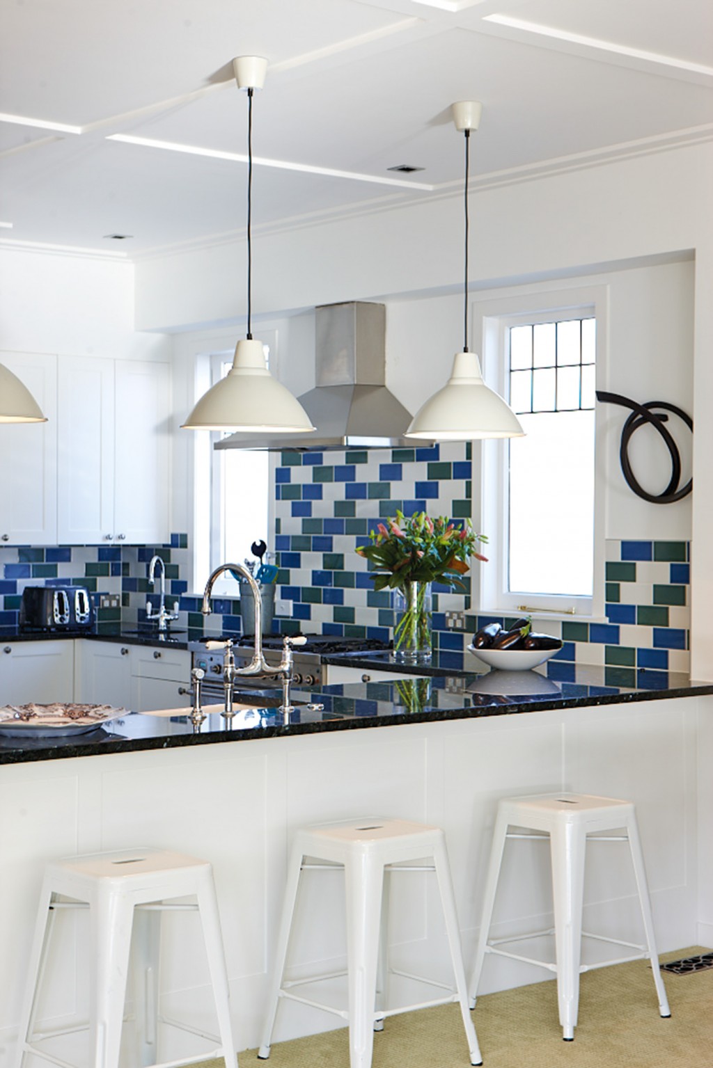
Neil McLachlan, Neil McLachlan Design The brief was to create a more family-friendly space with good storage and flow. We gave the existing kitchen a facelift: we removed tall pull-out pantries which divided and blocked the kitchen from the hall and projected the new bench past cabinetry to provide an overhang for barstools. We kept most cabinetry carcasses and changed the doors to a simple framed profile more in keeping with the house’s Arts and Crafts architectural features and panelling. We changed taps to a more classic look, too.
HOME What was the inspiration for the coloured tiles and the white insets?
Neil McLachlan The renovation of this house involved controlled use of strong colour. The random laying of blue, green and white crackle-glaze brick tiles was a way to add colour and continuity to the décor while being a definite nod to the Arts and Crafts period.
HOME What do you think makes a good kitchen generally?
Neil McLachlan The kitchen is so often the heart and gathering place of a house these days and needs to be a practical, functional space – while looking good and being able to accommodate guests nearby who can converse and interact with the cook without being in the way!
Design details
Tapware Perrin & Rowe tapware.
Tiles ‘Crackle’ glaze brick tiles from Heritage Tiles.
Benchtop Emerald Pearl granite benchtop from Granite Workshop.
Appliance Ilve cooker and rangehood.
Lampshades Lampshades from Ikea, Sydney.
Barstools Replica barstools from Recollections.
