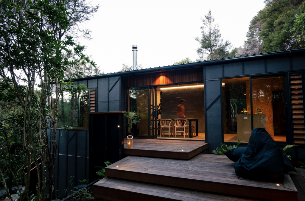
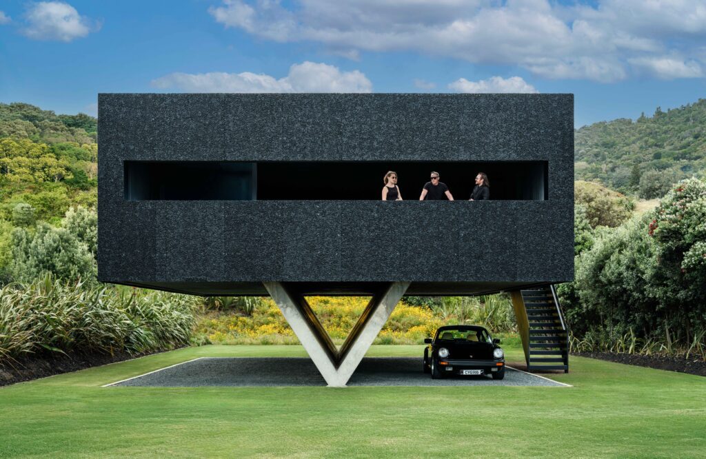
The brief for this Whangarei Heads kitchen was to meld the indoor and outdoor spaces. Lance Herbst of Herbst Architects created two covered decks, offering flexible protection against the elements. The successful design allowed the clients to entertain 36 guests during the holiday season.
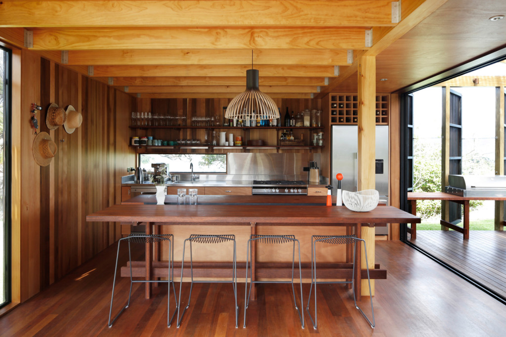
HOME How did you achieve the openness of this kitchen?
Lance Herbst, Herbst Architects The kitchen is the pivotal point around which two covered decks rotate, positioned at the opposite side to the two prevailing wind conditions so as to always have one of the decks in a wind shadow. The kitchen relates to the south-facing deck (which also has the primary view) by essentially extending into it. We achieved this by extending the back bench of the kitchen into it and incorporating the gas barbecue. This bench will be used for food preparation and layout when the building is in full swing. The doors onto both decks are outrigged and slide onto protruding frames which project from the building so as to render them invisible when rigged to open position. The building has been designed with a series of layers of defence against the weather so it can be used as an open pavilion in all but the worst weather conditions. And the kitchen bench has been designed to double as a dining table when the weather is bad.
HOME It’s located in a holiday home, but does this kitchen also contain lessons that you think can be applied in urban contexts?
Lance Herbst We (unfashionably) are great believers in crafting buildings so as to have a close and seamless relationship with the land in which they sit. We can push this thinking to its limits in a bach context, but it also informs our thinking in an urban context. The idea of a space that is neither in nor out that is something that we have brought across into our urban buildings, albeit articulated in a more refined way.
HOME The owners spent last summer at the house. How did the kitchen function for them?
Lance Herbst The brief for the bach included a desire for it accommodate large numbers of their extended family over summer, and I understand they had 36 people staying over in tents. The open pavilion nature of the building, and its ability to be articulated into smaller spaces was, I understand from the clients, very successful.
Design details
Benchtops FSC certified kwila designed by Herbst Architects and made by Geoff Locke Cabinetmakers Ltd.
Flooring FSC certified Kwila, finished with Osmo Polyx by Natural Oils Ltd.
Appliances Fridge and oven by Fisher & Paykel.
Lighting ‘Victo’ pendant by Seppo Koho for Secto from Simon James Design, with T5 fluorescent task-lighting strips concealed behind a timber strip.
Stools ‘Pedro’ stools by Craig Bond for Candywhistle from Simon James Design.
