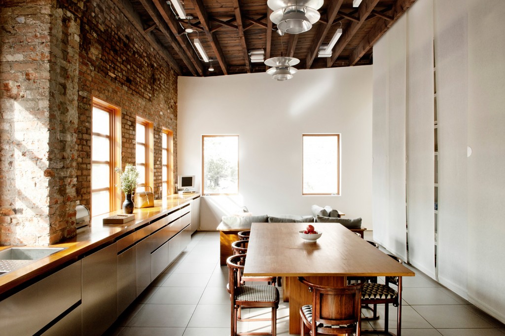
When Berridge and his client Jennifer Bartlett decided they wanted the kitchen upstairs where the light was best, the result was a space with an 11-metre-long counter overlooking the street outside. The sheer size of it drove the layout and aesthetic with Berridge opting for open pull cupboards instead of a forest of handles and knobs.
Kitchens: modern refinement in an old Brooklyn building
HOME In this living, dining and kitchen space, you’ve run the kitchen along one wall. What made you choose this strategy?
David Berridge The overall “parti” of the studio drove the kitchen layout. [My client] Jennifer Bartlett wanted and already lived and worked in a space that broke down barriers between daily activities. We wanted the kitchen to be upstairs in the light, so by default we had this 11-metre-long room. So who wouldn’t want an 11-metre-long counter looking out to the church across the street? The wall that defined the studio space was 7m x 3.6m high, and this was ideal for all the tall bulky storage she needed – behind the light fibreglass screens at right are all the plates, bowls and so on. It’s a really open, airy, free-flowing space.
HOME How did you refine the details, such as the drawer pulls on the cabinetry and the single timber bench?
David Berridge The walnut plywood furniture in the space came from Jennifer’s studio so we matched the counter with solid walnut. The Louis Poulsen lights also came from her studio, so the brushed aluminium shades made me explore the possibility of stainless-steel cabinets. The dishwashers and oven are concealed by a cabinet chassis of standard plywood with custom-made stainless steel draw and cupboard door fronts. Because the counter was so long I didn’t want a forest of handles and knobs so I developed the open pull.
HOME The kitchen is in an existing building. How did this affect your approach?
David Berridge The old building materials are really seductive and one wants to preserve them. So it was an opportunity to go off the reservation a little. The brick is an ideal splashback and even though the existing windows were below the counter height, we thought we’d just build a little box back there to put things, like in a bar.
HOME You’re a keen cook yourself. What makes an ideal kitchen for you?
David Berridge Long, uninterrupted counter space and long, uninterrupted counter space plus uninterrupted counter space. And I do hate splashbacks, so this kitchen got me off the hook.
Design details
Benchtops Solid walnut planks.
Flooring Porcelain 550 x 550 grey tiles.
Cabinetry Standard prefinished maple plywood cabinets with stainless-steel custom fronts.
Lighting Louis Poulsen pendants, plus wall washers for art at each end wall, combined with long fluorescents and specific task lights with par lamps.
Photography by: Emily Andrews.
