Mimicking the pared-back materiality of the architecture, a simple plant palette creates a sense of calm in this modern urban garden.
Inspired in form by Richard Neutra’s iconic Kaufmann House in Palm Springs, this home in Remuera, Auckland, was designed for a couple who wanted to spend a significant amount of time working from home and enjoying the expansive garden area. Although dissimilar in layout to the Kaufmann House, the ethos for the design comes from the intentions of mid-century modernism, architect Darren Jessop explains.
In this case, the house came before the landscape so landscape architect Jared Lockhart was presented with a finished build to work around; the only part of the former garden that remained was perimeter hedging.
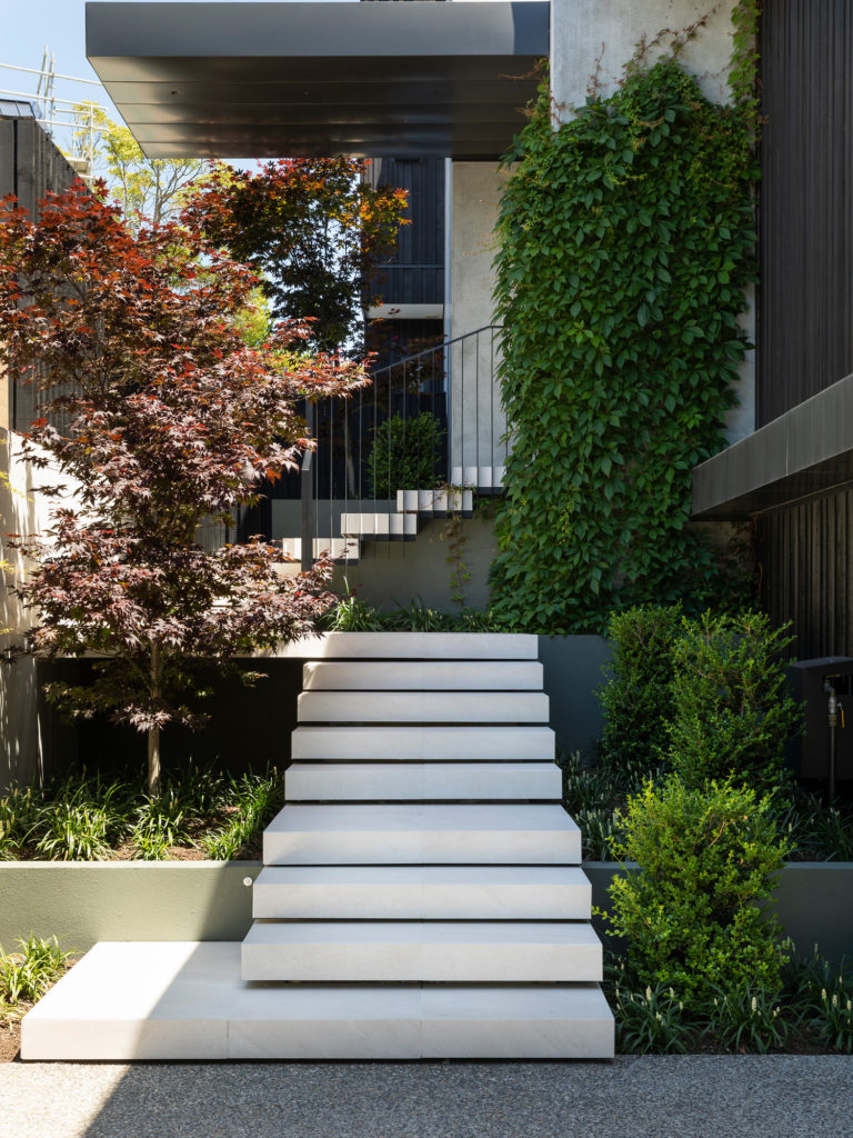
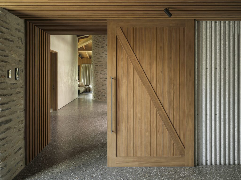
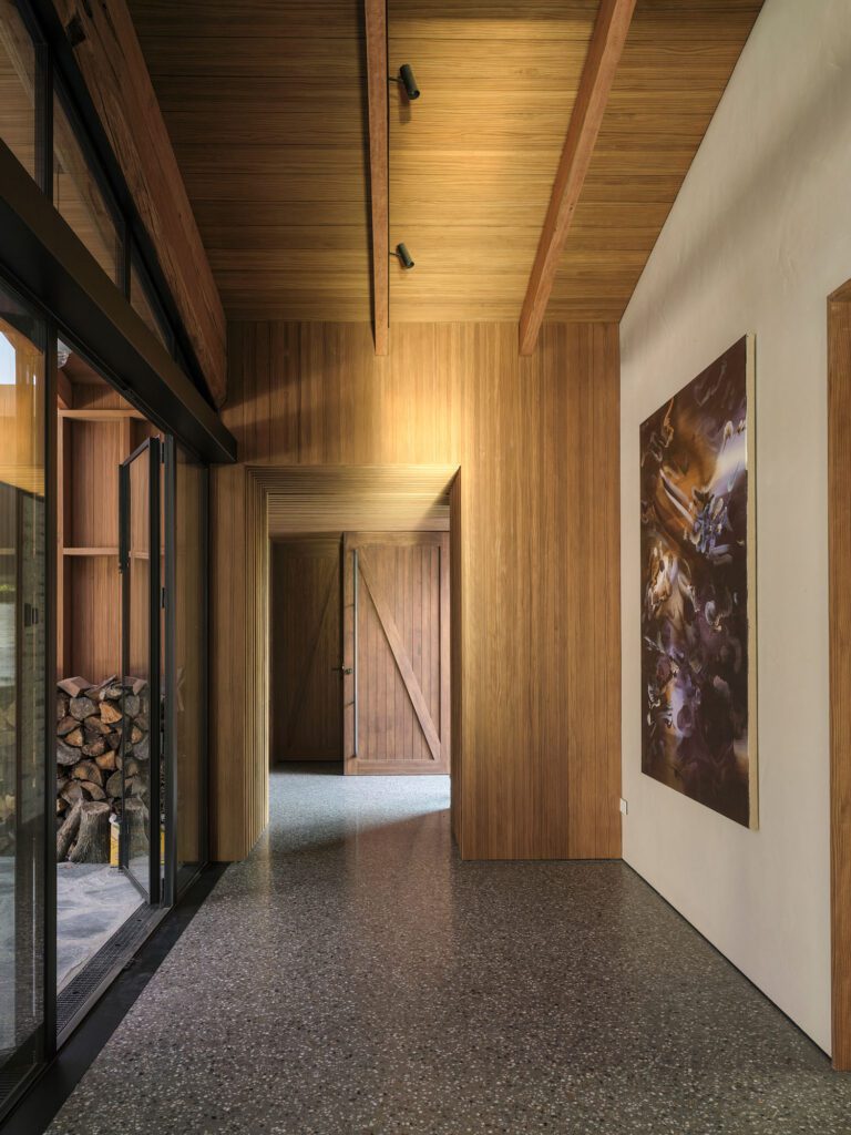
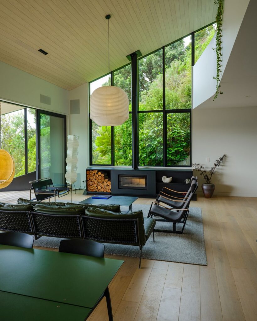
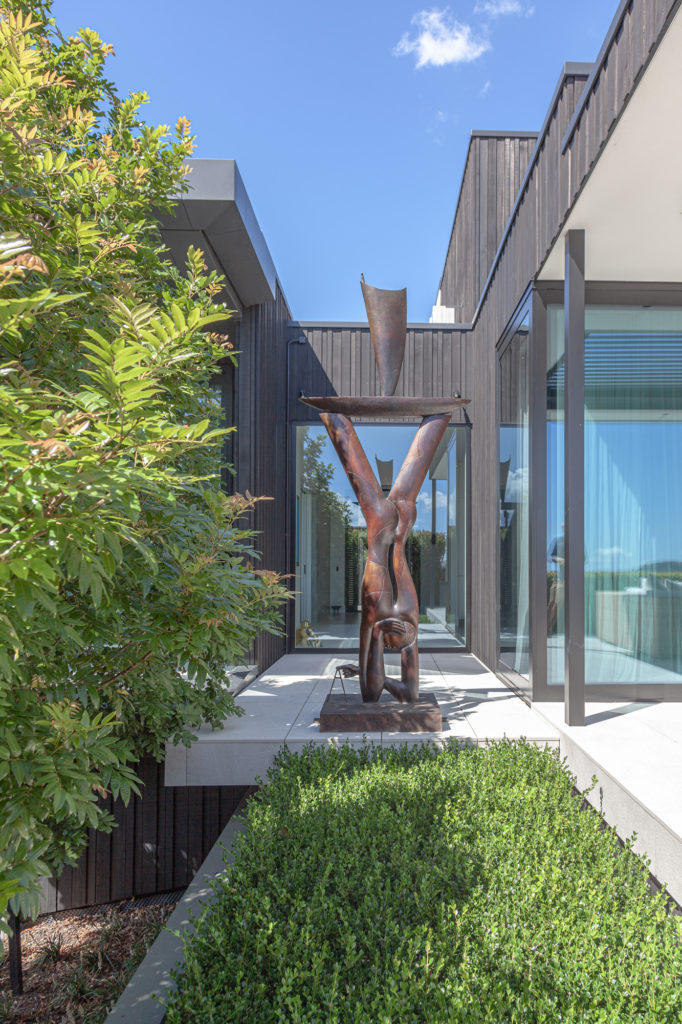
This is a house of pared-back materiality, overhanging eaves, and a sleek composition of glass, zinc, concrete, and vertical cedar. The entrance is to the south and receives little sun, but it is a dramatic entry thanks to the floating concrete stairs that take the visitor into a gallery, which provides the axis and views out to the garden and sea beyond —intentionally broken in this case by a Paul Dibble sculpture.
“The architecture is modern and pared back,” Jared says. “I wanted the garden to reflect that.”
Presented with a poolscape, and a house designed to capture the garden with extensive glazing, the obvious basis for the landscape design was to mimic the simplicity of the materials used on the built form in the organic make-up of the garden.
“Because the entrance to the house is south facing and the majority of the garden north facing at the rear of the property, this limited plant choices. I didn’t want to create two gardens that felt different, and separate from one another.”
To ameliorate any issues with a feeling of disjointedness between the two areas, a simple plant selection was made consisting of three main varieties; each is commonly used but in this case Jared has created interest by using them in uncommon ways.
“The narrow plant palette meant plants were chosen that had to cope with both full sun and shade, and it lent itself quite well to the form of the architecture, which is crisp, clean, and pared back.”
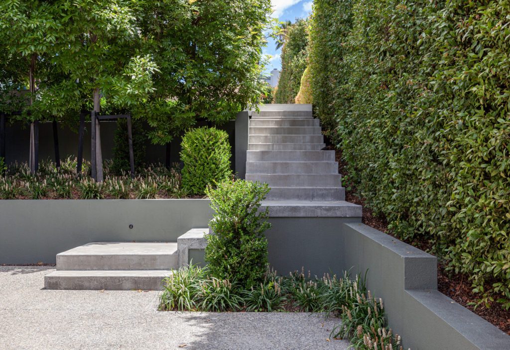
Buxus is used to create geometric forms and delineation between areas, and will eventually be pruned to different heights, reflecting the split geometry of the building’s plan. Around that, liriope was used to introduce an evergreen component in the garden.
“In summer, it flowers in a beautiful bright white,” Jared explains.
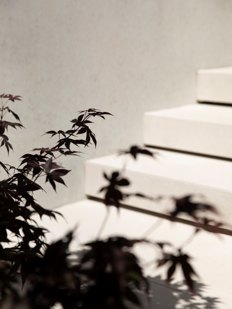
Within this duality of plants are several tree species, each with red or amber leaves. At the entrance is a shade-tolerant Japanese maple while in the northern rear garden is a cercis forest pansy — another tree whose leaves offer a striking red tone.
At the entrance, an additional plant is introduced: a Virginia creeper. But it’s not without its link – in autumn its leaves, too, turn a deep crimson.
“I think what’s worked best about this landscape is the pared-back simplicity. By creating an orderly planting scheme, the aesthetic is simple and elegant. The spaces feel calm. This is a garden that isn’t trying to do too much, and that’s why it works.”
