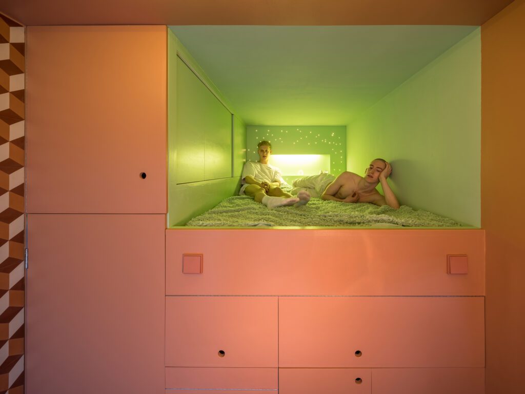
Perhaps the smallest apartment in the world, this space is a fully equipped residence that includes two infrared saunas and a whirlpool bath. Organised into four spaces, extravagantly different in materials, the spa is the most enclosed: a room within a room. The others include a 3m-high living room, a 1.14m-high bedroom and storage area, and a toilet and bathroom with a rain-shower.
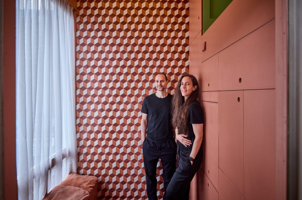
Located on the top floor of a 1950s residential building in the centre of Rotterdam, The Cabanon takes its name from the eponymous cabin of Le Corbusier at the Côte d’Azur. Like the Le Corbusier cabin, The Cabanon of Rotterdam has been conceived by the architects who will use it. It is 6.89 square metres — half the size of Le Corbusier’s unit, and, unlike his Cabanon, fully autonomous and designed for a couple.
The Cabanon is an experiment in space for its owners, architects Beatriz Ramo López de Angulo and Bernd Upmeyer, founders of Rotterdam-based firms STAR strategies + architecture and BOARD (Bureau of Architecture, Research and Design) respectively, who increasingly saw personal growth in voluntary reduction.
However, this reduction was never understood as austerity. The Cabanon articulates the luxury of small; an “epicurean reduction”. It is a fascinating manifestation of the specific desires of the architects for their second home. They wanted a small bed to sleep close, and a bench along the window. They didn’t need a large kitchen as they love to eat out, but they wanted to have the possibility of cooking nonetheless.
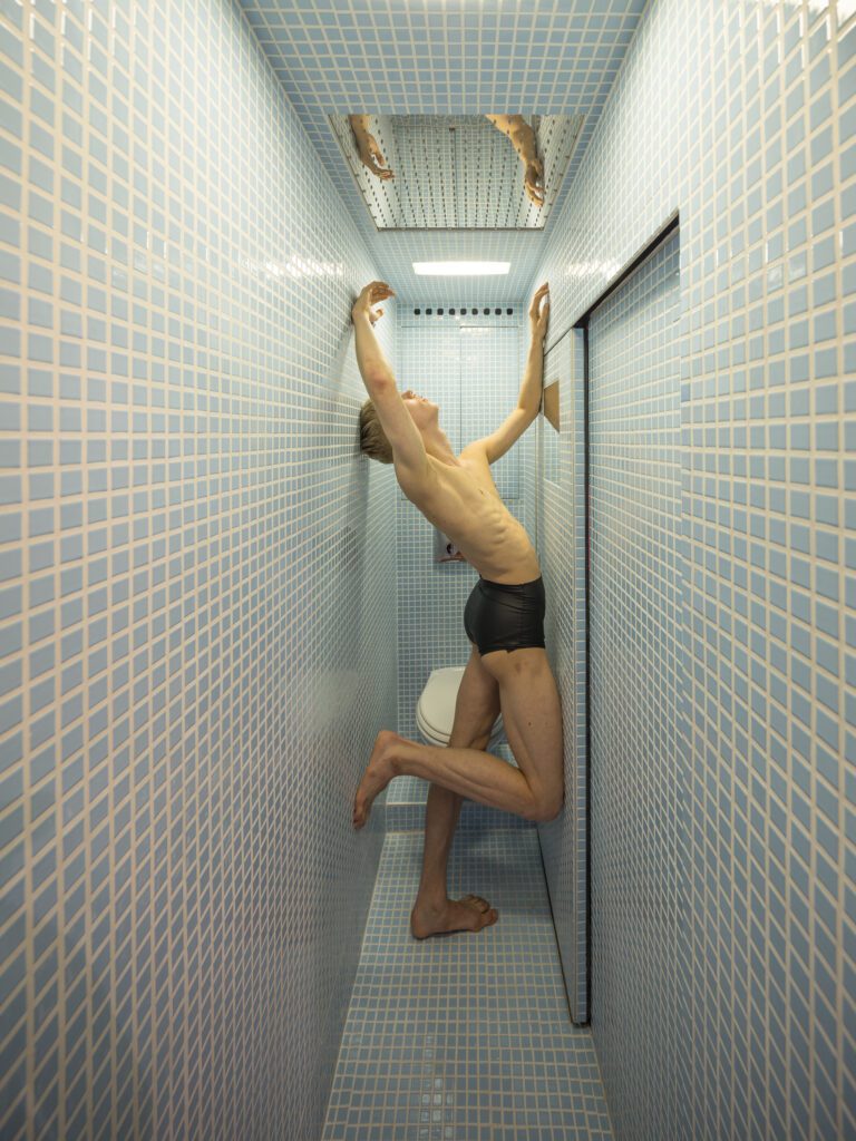
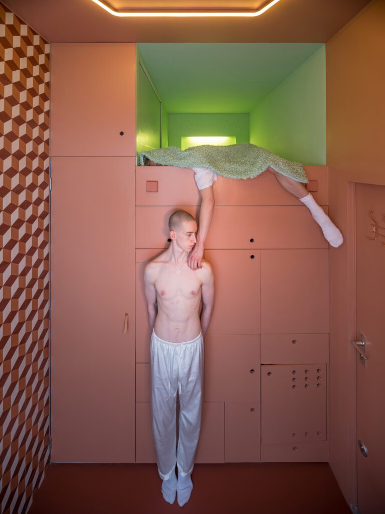
The Cabanon is a temple in the proportions of its owners, who became the modulors of their Cabanon. Beatriz’s and Bernd’s heights are 1.72 metres and 1.78 metres respectively. The spaces at the Cabanon are arranged according to the height and width that they need to perform their functions: When they shower they need a space of 2.13 metres in height and a width of 62cm; when they take a bath or use the saunas they need a height of 1.80 metres; and when they sleep or sit on their bed they need a height of 1.14 metres and a width of 1.35 metres. For the living area they wanted to keep the generous height of three metres.
The four spaces have been shaped based on standard products: the bedroom was designed with a specific mattress in mind; the spa according to the bathtub length; and the kitchen based on the mini-fridge depth, which avoided the need for customised objects. Rather, the Cabanon would adapt to standard and affordable products.
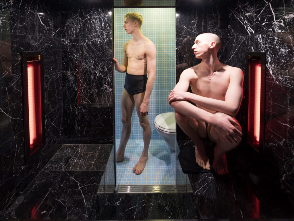
As Beatriz describes the project: “… initially, it was not meant to be an autonomous unit. When we bought it, we saw it as an ‘extra room’ to our apartment, which is in the same building some floors below. It became the ‘placeholder’ of what we desired to have; in my case, an infrared sauna, and for Bernd a whirlpool bathtub. However, from a pragmatic point of view we actually needed a proper guest room to host our family when they visit us.
“For us then, the priority was to design a “spa” where we could also add a guest room. The infrared saunas and the whirlpool bath were our main aim for the Cabanon and everything else would need to adapt to it.”
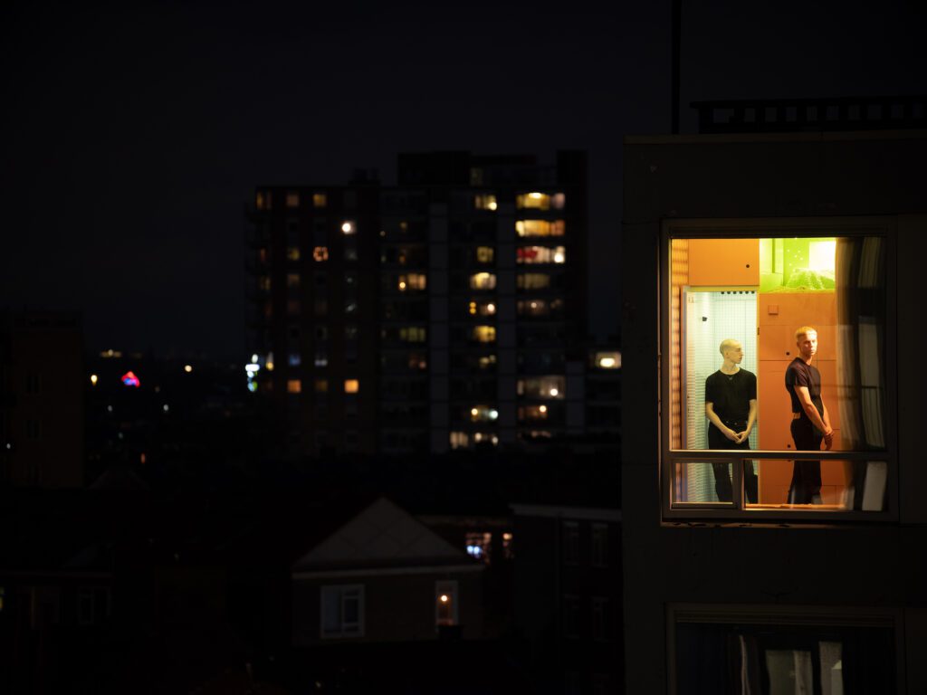
“We have been using the Cabanon especially in autumn and winter for the infrared sauna and the whirlpool. We also like to use the Cabanon as a sort of one-day retreat. It is very calm up there and there is no clutter or distractions. It is interesting how such a small space can free up your mind…
“It was not difficult for me to adapt to its scale; in fact, I think designing the Cabanon initiated a changed of habits for me when it comes to attachment to objects. Bernd did not have so much attachment to objects anyhow and he has always got rid of things (clothes, objects, etc.) when he did not use them much anymore -even if he had liked them very much. In that case he would take a picture to remember it.
“Me, I had to learn this detachment towards things. While designing and using the Cabanon I started fantasising with the idea of living with very little…. I actually would love to have only a couple of outfits and two pairs of shoes. I looked to our main apartment and I started having an urge to simplify it, to reorganise it more efficiently and to get rid of superfluous stuff and keep what we value. It brings clarity and peace to our minds and space.
“Now I think twice before buying something and adding a new object to the house, to my wardrobe. The pleasure that I could get before by buying something, now I get it by getting rid of something I don’t need.”
