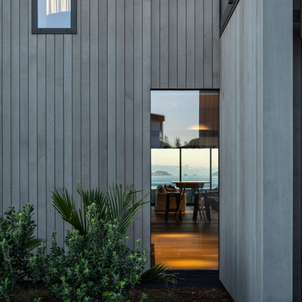
Designed for a couple who are avid surfers, this clever addition on a compact coastal site is both overtly contemporary and entirely sympathetic to its context.

In one of Wellington’s most well-known destinations, the salty air and the waves draw surfers from far and wide. Protected by the hills, Lyall Bay feels distinctly separate from central Wellington despite its close proximity to the city centre.
As a residential enclave, it is a mix of single-storeyed state houses and tiny workers’ cottages, most on small slivers of land stacked in a grid-like formation next to and behind each other.
“Most of Lyall Bay is flat and has this tightly knit mix of gabled houses that continue up the hillside. It is Wellington’s best surf beach, and there’s still a really prominent surf club building,” Alain Bruner of Etch Architecture tells us.
It was fitting, then, that Alain’s latest clients were a couple of surfers, who wanted not only to see the ocean from an addition to their cottage on the lower slopes of Lyall Bay’s hillside, but also to be able to see the waves and the condition of the surf clearly.
Their section, at just 308m², is typical of the area in its narrow width — 7m on the street side and 5.5m at the rear.
“The way the sections are sliced in this sort of longitudinal way has the sense of a Melbourne laneway typology,” says Alain.
Alain’s clients had lofty aims. They envisioned a palette referencing a New York–style brownstone of raw and tactile materiality with a mezzanine bedroom floating in a voluminous space. The addition would also house a new kitchen, a bathroom, and a snug/media room, and provide space for outdoor decking.
In order to mitigate the constraints of the small, narrow site, a separate structure was conceived, connected to the existing cottage by a covered stairwell — or ‘linkway’ as Alain describes it.
“What we wanted to do was create separation between the two structures so as not to block light from entering the original house, as well as ensuring the original did not block views from the addition.”
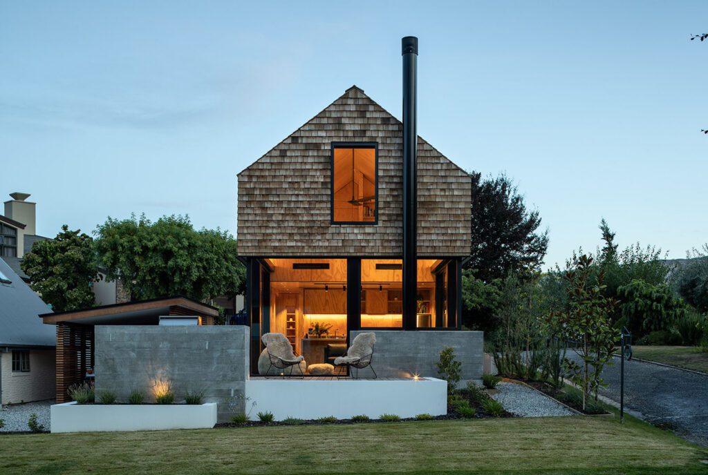
The result is an addition that in section towers above the old, but is entirely in keeping with the gabled rooflines Lyall Bay is known for; in fact, it mirrors the elevation of its northern neighbour, and the width in relation to boundary of the cottages below.
“It is contemporary but referencing the scope and scale of the neighbourhood,” Alain tells us.
The main entrance to the house is now at the intersection of old and new. At the entrance, a concrete floor, subtly coloured with Peter Fell 609 meets in situ board-formed concrete that continues up the linkway to the addition — a vestibule of sorts, sculptural and alluring. To the right, the original house stretches out towards the sea.
Upstairs, the board-formed concrete meets intricately laid birch-ply walls. In between, skirting lighting from Moth Light creates an illumination not dissimilar to emergency plane lighting.
As Alain puts it: “It was carefully designed. We wanted to create lighting that wouldn’t be too bright at night — delivering just enough soft light to guide circulation.”
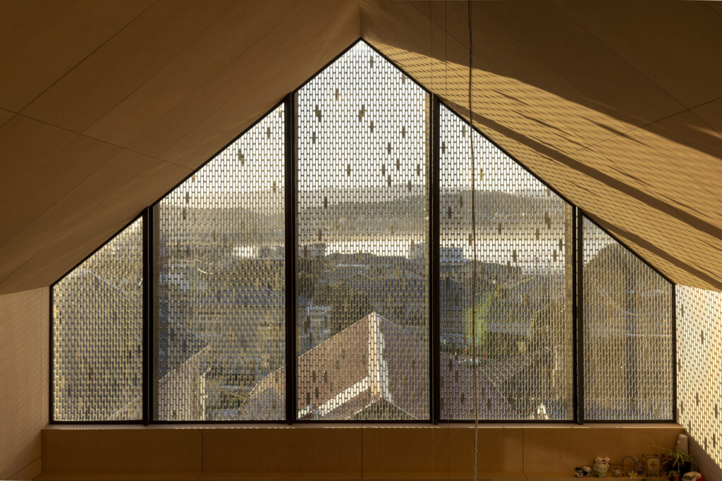
Light was a key part of the entire project, and a factor that drove almost every design decision. With the plan running east to west, and the need to capture and make the most of the views, a tension arose. A large cathedral window to the eastern elevation meant the light in the morning would be extremely harsh.
“We wanted to create a diffused light from the east, so as to avoid the need to wear sunglasses inside in the mornings!” Alain comments.
He’s achieved that in a perfectly executed way: a perforated screen he designed based on trying to emulate the way light falls through a huge pohutukawa tree on the northern boundary of the property.
“By designing this perforated screen, we were able to create a bleeding of light from the east in this lovely dappled pattern. It was a balance because we wanted to allow the view through the screen, but also to create the appearance of a solid and volumetric form from the outside. It’s interesting, because when the light isn’t hitting it, it becomes much more transparent.”
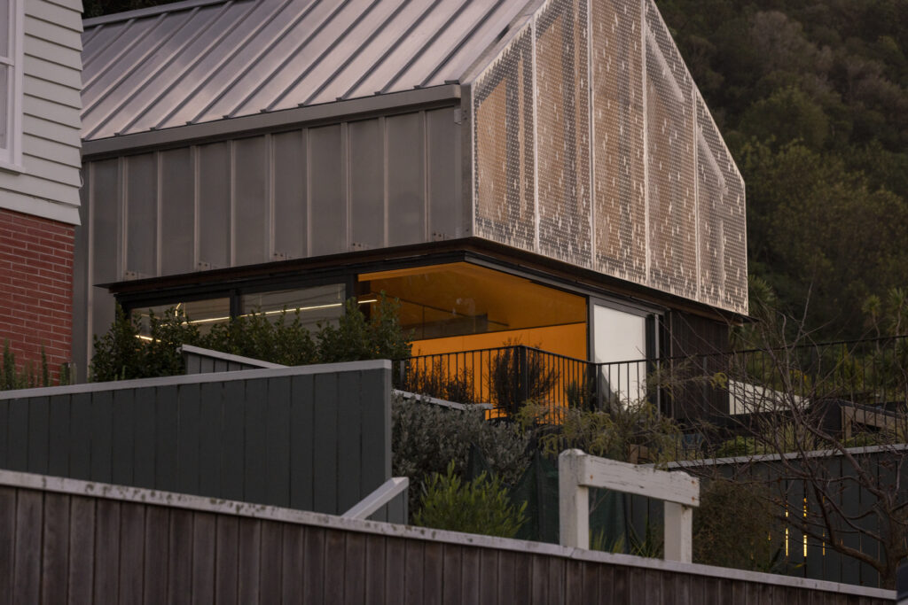
The addition is wrapped in aluminium, with a vertical timber element at the lower level oiled in Dryden WoodOil Dark so as to allow the upper level to float.
“I see it as a silver gable with a ‘chop out’,” Alain explains.
“The screen is a fun device, while below it there were some structural gymnastics we had to entertain. There is no post at the junction between the sliding doors that open up so you have this open corner that delivers unobstructed views right out to the end of the runway at Wellington Airport.”
Skylights at the western end of the addition draw light into the mezzanine bedroom; one of them frames views through the pohutukawa so “you can sit in bed and look up to the sky through the tree”. Here, Alain says, the expressed lines of the birch ply wrap up and around the ceiling, but also horizontally, to meet the skylights.
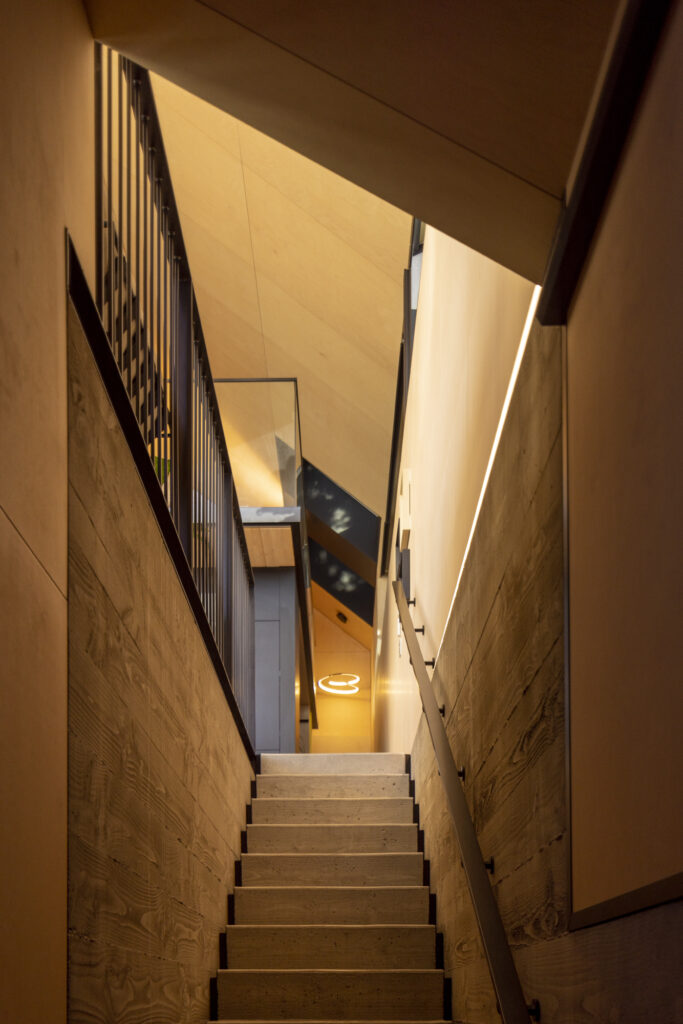
“A strip window to the north snakes up to the skylights at the rear of the building and feeds into the black skylight reveals. You can also see one of the skylights from the bottom of the linkway stair, so you’re really drawn up and into the space from the entrance.”
The mezzanine floor is crafted from solid timber, 100mm-thick glulam tongue and groove boards that allowed for the mezzanine to cantilever out and become the kitchen ceiling. The kitchen itself is dark and recessed — a contrast to the beautifully mottled concrete floor and lighter toned birch-ply walls. Here, a black soft-touch Melteca was selected for the cabinetry while a blacked steel splashback continues the moody allure of the space. A large island was designed with custom cabinetry and a slot at its front, into which the dining table fits — one of many space-saving techniques utilised in this project. Overhead, a blade light from Moth Light is both an uplight and a downlight, which means the raked ceiling can be illuminated for a softer light, or the downlight used for task lighting when required.
The main bathroom employs large-format stone tiles, while the patterned ply panels are cut into one wall to create triangular under-stair shelving. Here, another uplight — Dado Dave from Moth Light — is utilised to deliver high-output illumination and highlight the natural grains of the timber ceiling.
The exterior is a different story, with its smooth, contemporary cladding.
“The site is obviously in a high-exposure zone, less than 100 metres away from breaking waves, so we really wanted to explore mill-finish aluminium on the exterior. It’s a raw aluminium that will patina slightly over time. That subtle patina will be mimicked in the steel of the kitchen as it ages.”
The mill finish also allows for the cladding to become more than simply functional; it reflects the surroundings, too.
“What I love about it is that you are looking at cladding but you are seeing the context. If you look at it at the right angle, you can see the green hues of the pohutukawa or the pastels of the coast — colours that you can see inside at different times of day, especially in that diffused morning light from the east on the ply.”
As Alain puts it: “It pops in a way that is quite pure”.
We agree — this is an addition that delivers a hint of fun, and an ever-changing manipulation of light, diffusing or enhancing depending on the time of day. Look up from the beach at dusk and this floating surfers’ hideaway is an intricate mesh of patterns and geometries completely at home in its setting.
