Wellington architects Bonnifait + Giesen explore their long-standing fascination with prefab and show how this Gisborne home fits snugly within that evolution.
Portability, prefabrication, and cost reduction; throw in there some notions of sustainability and wrap it in the idea that comfort and uniqueness are some of the most important goals of small-house architecture and you’ll start to understand the best aspects of this Gisborne abode.
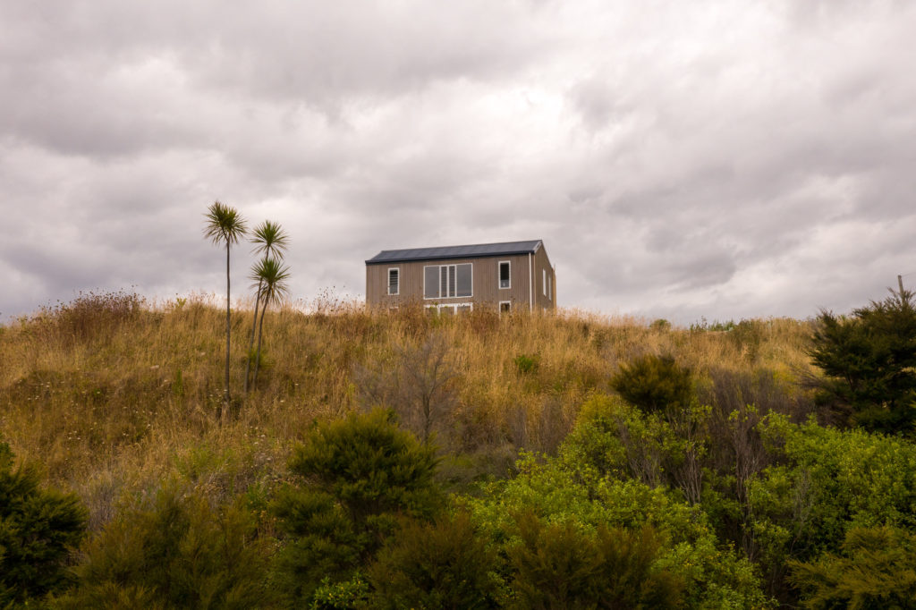
The design is a continuation of work that its Wellington-based architects, Bonnifait + Giesen, Atelierworkshop Architects (B+G), have been doing for some years now.
According to co-director Cecile Bonnifait, it began in 2006 with Port-a-Bach, a tiny prototype made from a shipping container, which, when shut, had a fully enclosed exterior shell and opened up to reveal a versatile array of rooms. The structure also had six concrete footings, allowing it to be placed on a relatively wide range of ground conditions. Although the project went somewhat viral, the pair never developed it for production. Cecile points out the structural limitations and some of the early lessons gained from that process.
“We realised quickly that containers were very restrictive,” she says. “They were very expensive and technically challenging, and we started thinking about how to do this using more traditional materials.”
In 2016, with the help of Chinese firm Jimu — which also collaborated on Port-a-Bach — the pair completed another prototype: the highly photogenic Mini-Fab. At a miniscule 36m², this prefabricated, mostly cross laminated timber (CLT) structure was devised for a competition and for exhibition in mainland China. Much like the Port-a-Bach, the dwelling’s components were designed for ease of transport and made the most of CLT, a technology readily available and with a modest price tag in the Asian country.
The project’s pared-back simplicity, rawness of internal materials, double height interiors and an attractive, skewed, pitched roofline gained the pair yet more attention and they decided to bring the project back to Aotearoa.
CLT, however, “did not make sense in New Zealand,” says Atelierworkshop’s co-director William Giesen, citing the lack of mass production here as a reason for its high cost.
“Here we needed to make something really accessible and take it back to basic, more traditional skills,” he continues.
The idea was to devise a prefabricated structure that was inexpensive due to its materiality, easy to transport to site, and could potentially be assembled by one or two builders.
The result is a series of three house types that the pair have titled ‘Fab’, and that take some of the learnings from both Port-a-Bach and the Chinese prototype.
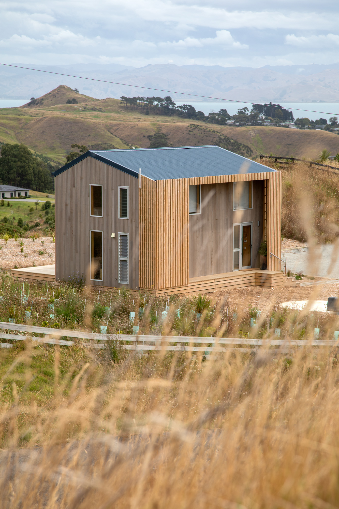
The first local Mini-Fab is currently under construction in Wellington. The Double-Fab sits at 64m² and technically puts two of the smaller ones together. Finally, there is this Gisborne abode (Fab One), which measures 89m² and expands the modular idea into two bedrooms and a study.
The Fab series, and this Gisborne place in particular, takes much of what was learnt from B+G’s prefabrication history and seems to give it oomph and a touch more sustainable intent.
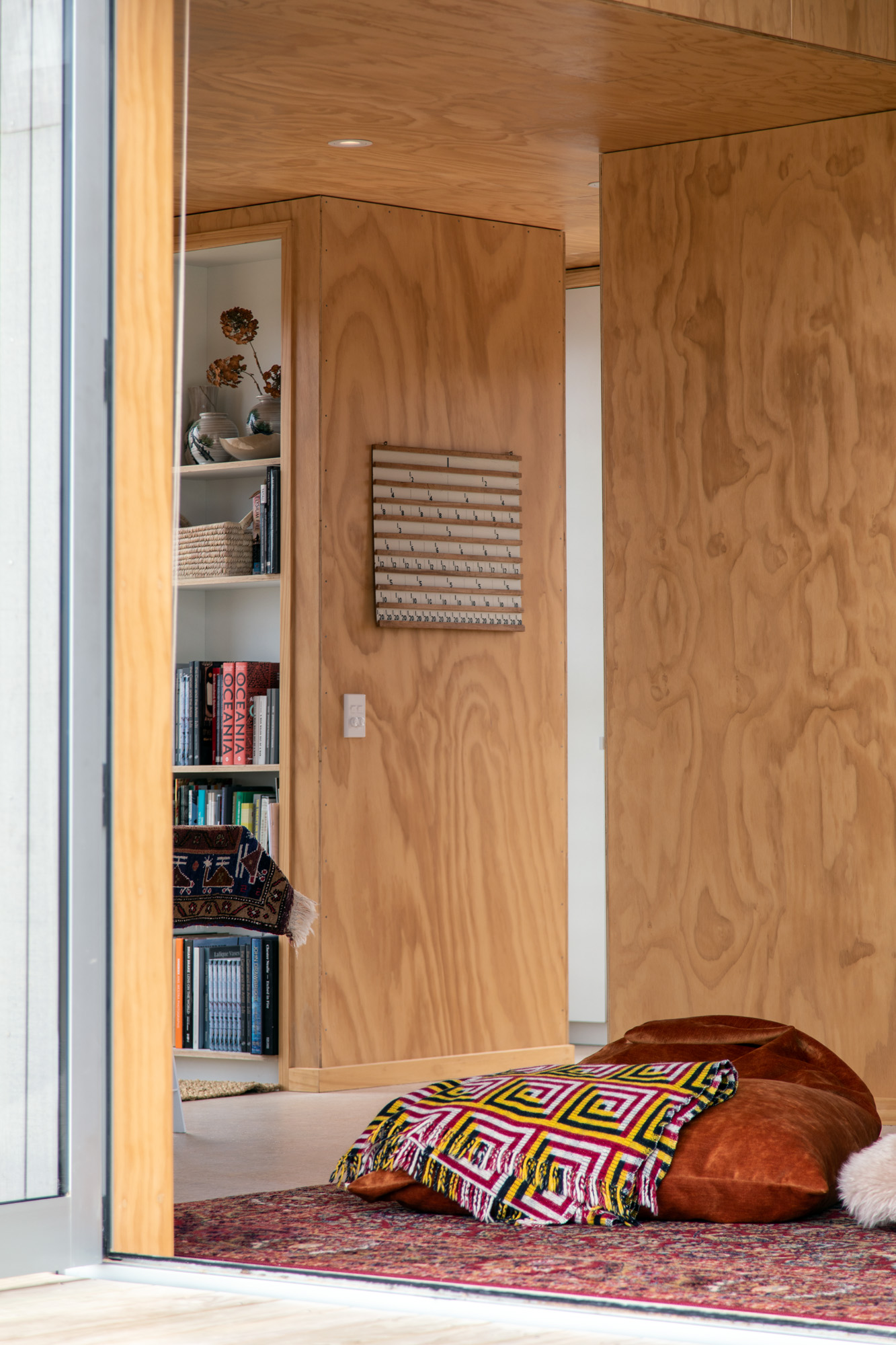
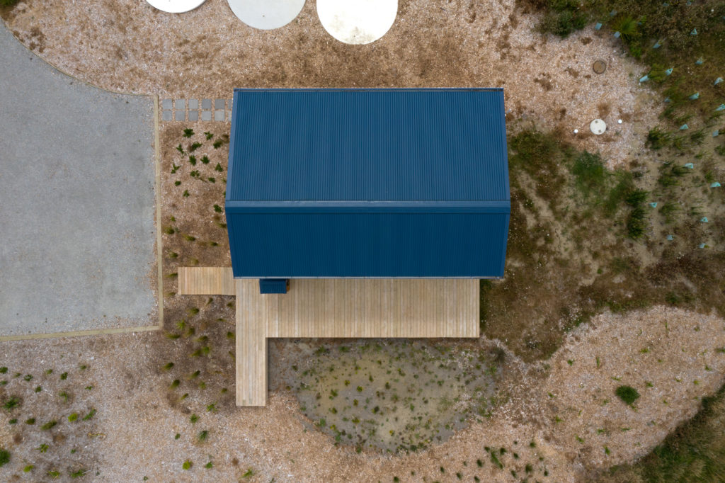
Insulation is at 140m — well above requirement. The roof’s angle is such that solar panelling can be retrofitted. The structure was easy enough to erect, so minimal construction and a minimal number of workmen were needed on site. Materials were also kept to a minimum.
“We are trying to show that design is not exclusively the domain of the wealthy,” says Cecile, “although we do [also] make large houses — we like the idea of being able to mix and match between the two.”
The homeowner, author Damian Skinner, concurs. “I was looking for something modestly priced but with flair. I like that [B+G] hasn’t compromised on a sense of drama or the architectural flourish that makes you feel special when you are in the space. It goes up the full two storeys in the lounge; in a more pedestrian design, that void would have been a third bedroom. [B+G] resisted that inclination and allowed the architecture to be special.”
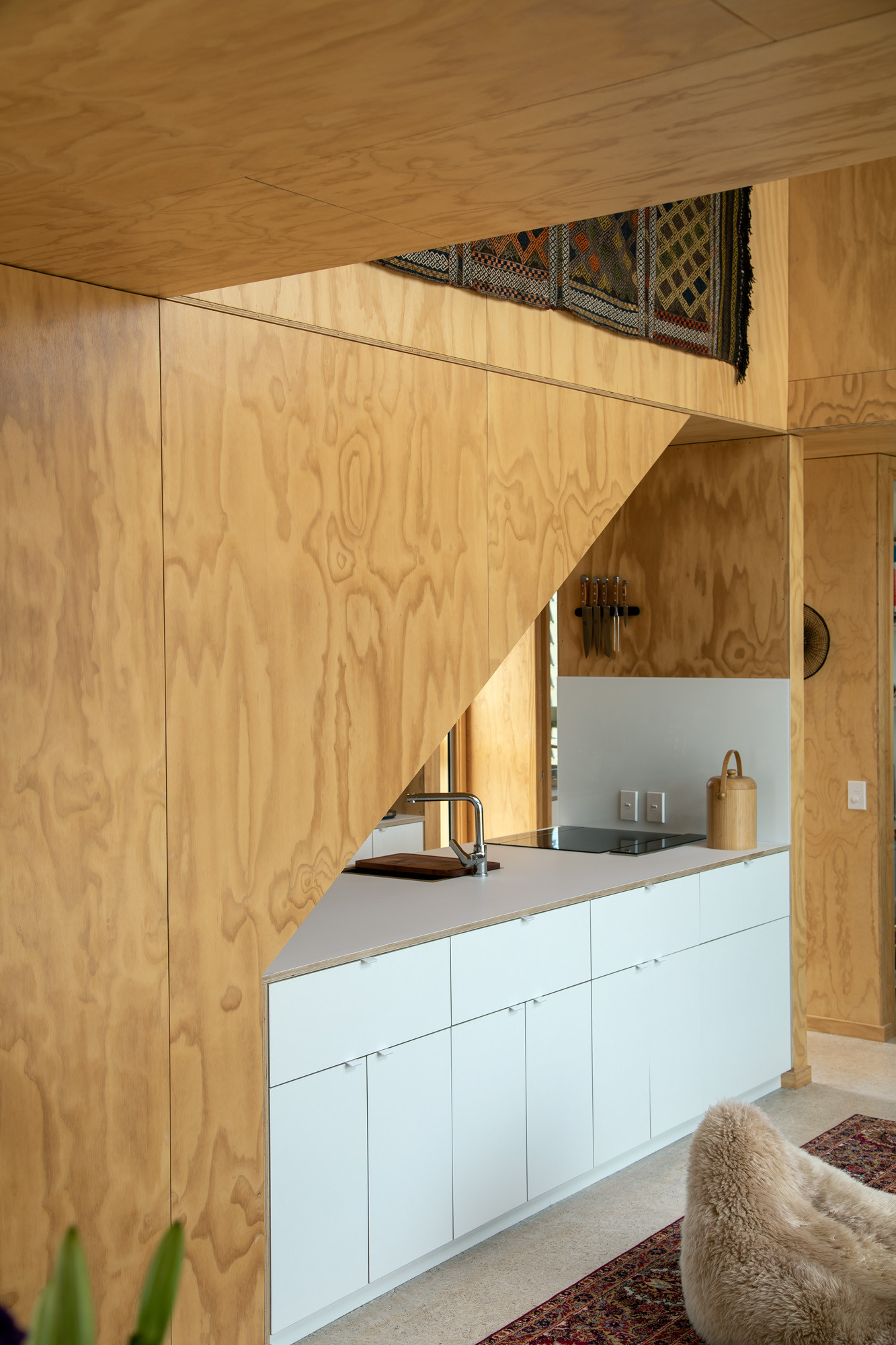
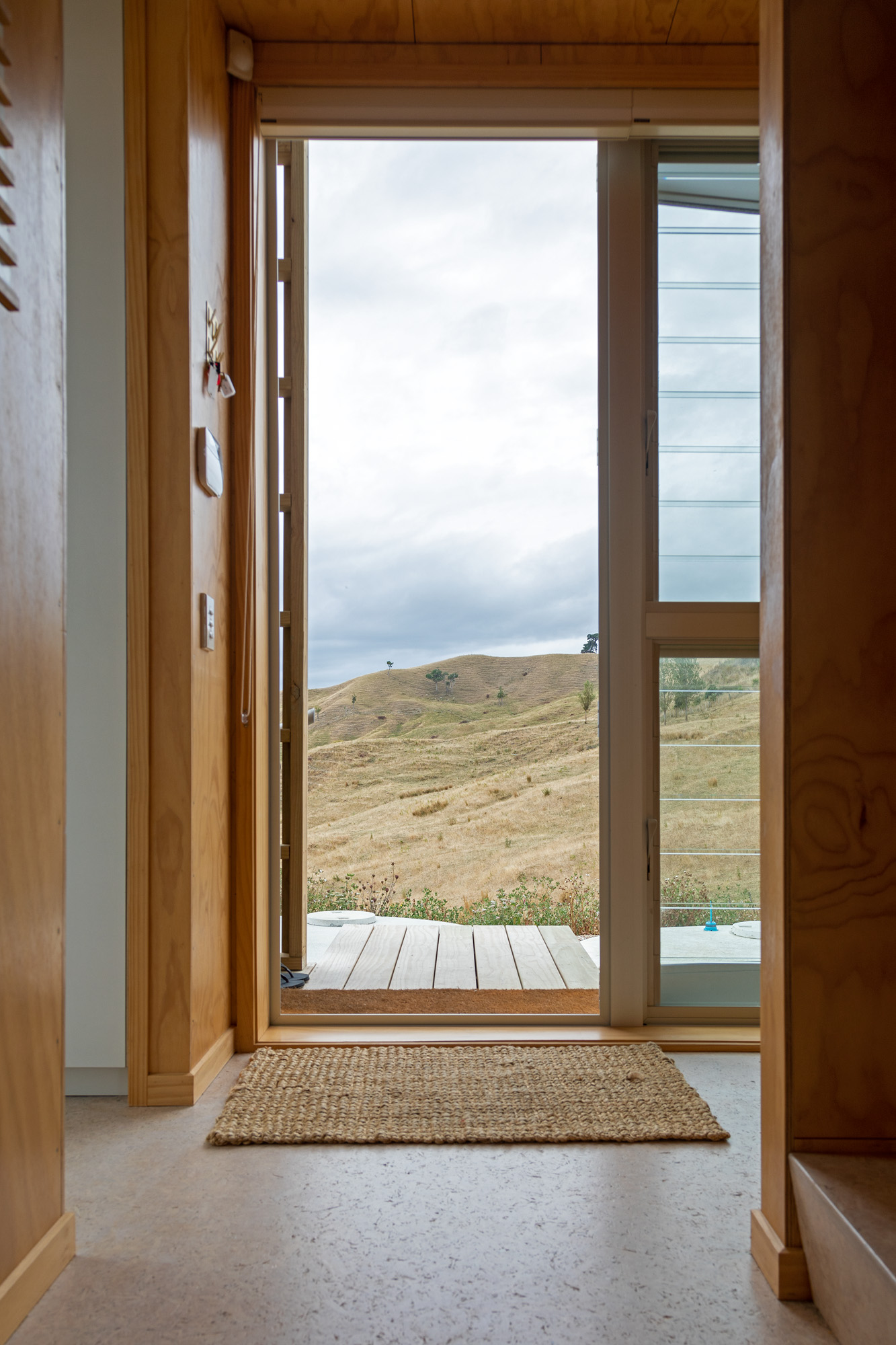
Verticality is key — especially in the small living room — to counteract any feeling of compression. Generous sliding doors allow the social areas to spill relatively seamlessly onto the deck and towards the expansive views. A small kitchen fits snugly in the sharp angle created under the stairs.
To counteract the monochromatic nature of the interior, Damian drew on his art collection and opted for a palette of eclecticism.
“I wanted the interior to be interesting,” he says. “Humble materials allowed me the space to do something decorative, and I wanted every object to be unexpected.”
And that, they are. A Manatunga souvenir blanket shares space with a Meiji-era Japanese screen. Ruth Castle’s Ngauruhoe Basket rests atop a Philippe Starck, gnome-shaped stool. There are gold accents and unapologetic patterns; there is a blend of colonial and pre-European viewpoints running through the art selection; and there is a simple, yet generous house, atop a Gisborne hill, to do them justice.

