Extending out around a Zen garden, this reinterpreted Freemans Bay villa is at once a gallery and urban family home.
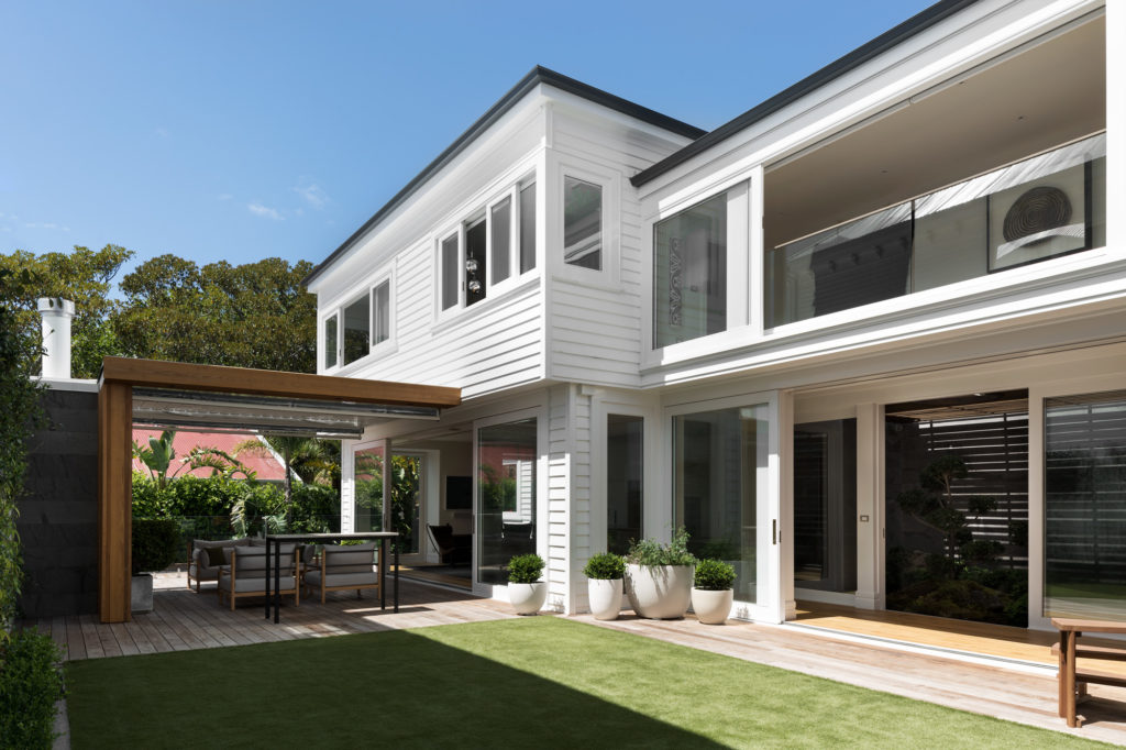
From the street, this elegant white house looks like a close cousin of its neighbours. Two peaked gables and a verandah with a bull-nosed roof give a shout-out to the surrounding villas. But all is not as it seems. Not only is this home in Freemans Bay, Auckland, brand new but, like an iceberg, only a small proportion can be seen.
When owner Simon Dunlop bought this corner site, he knew the rambling 1880s house that stood on it was a local icon.
“We couldn’t have bowled it, and I didn’t want to,” he says.
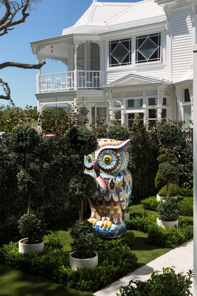
Instead, his idea was to shift the existing tumbledown mansion to the north of the section, restore it, and then subdivide the property and build. Say it quickly and it sounds easy.
Architect Jason Bailey of Hoxha Bailey puts it more plainly. He describes the project as a mammoth task.
“There were challenging parameters, with heritage constraints and a protected pohutukawa; also, having a substantially massed building on the northern boundary meant that the new house had to work around it in terms of light and amenity,” he explains.
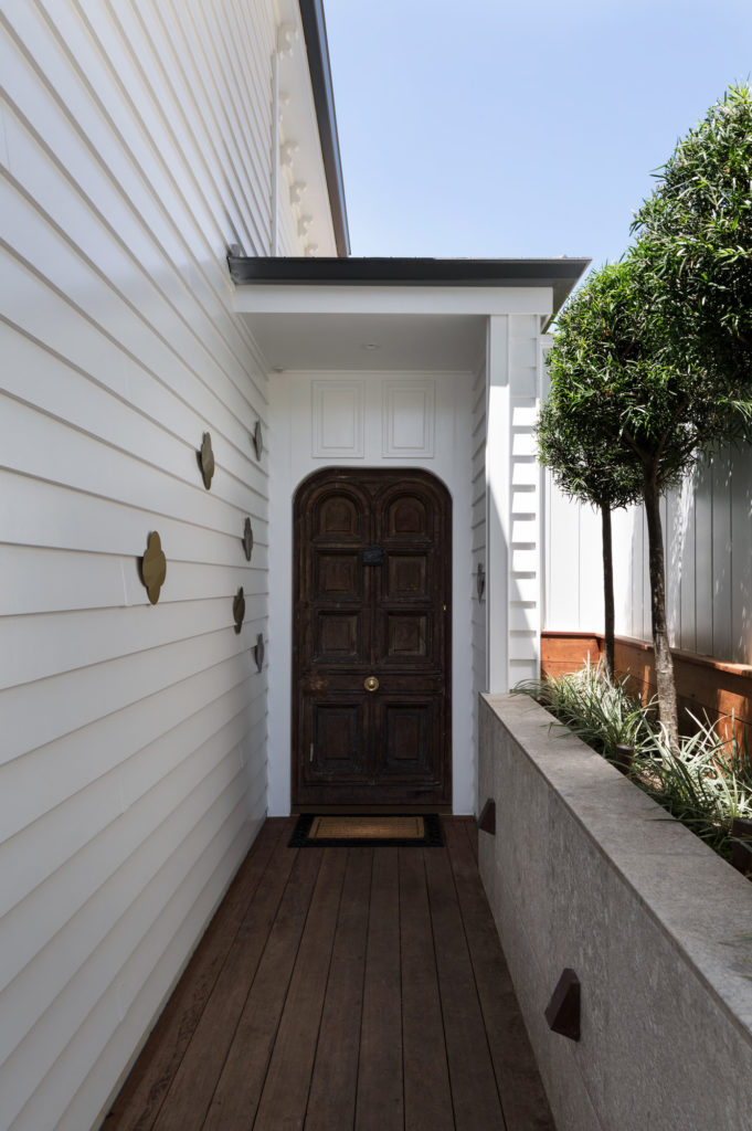
Jason configured the plans to capture the evening light — cue the west-facing verandah — and views from the main suite over Western Park to the city on the eastern elevation. Then he reinterpreted the villa language to comply with council requirements. Look closely, though, and you’ll notice an aberration: there’s a double garage that Victorians could only dream of and a front door missing from the street-front picture.
For a 600-square-metre dwelling, the house appears relatively modest. That’s because an extensive basement and light-on-its-feet pavilion are secreted away.
“A cube volume at the front of the home contains guest bedrooms and bathrooms, then there’s a two-storey linking element, and what could be thought of as a modern ‘extension’ to the rear,” explains Jason.
It was also decided to do away with a conventional central hallway, which would feel dark and enclosed. Instead, the entrance feeds into the middle volume of the home and the circulation is vertical, up a stairway.
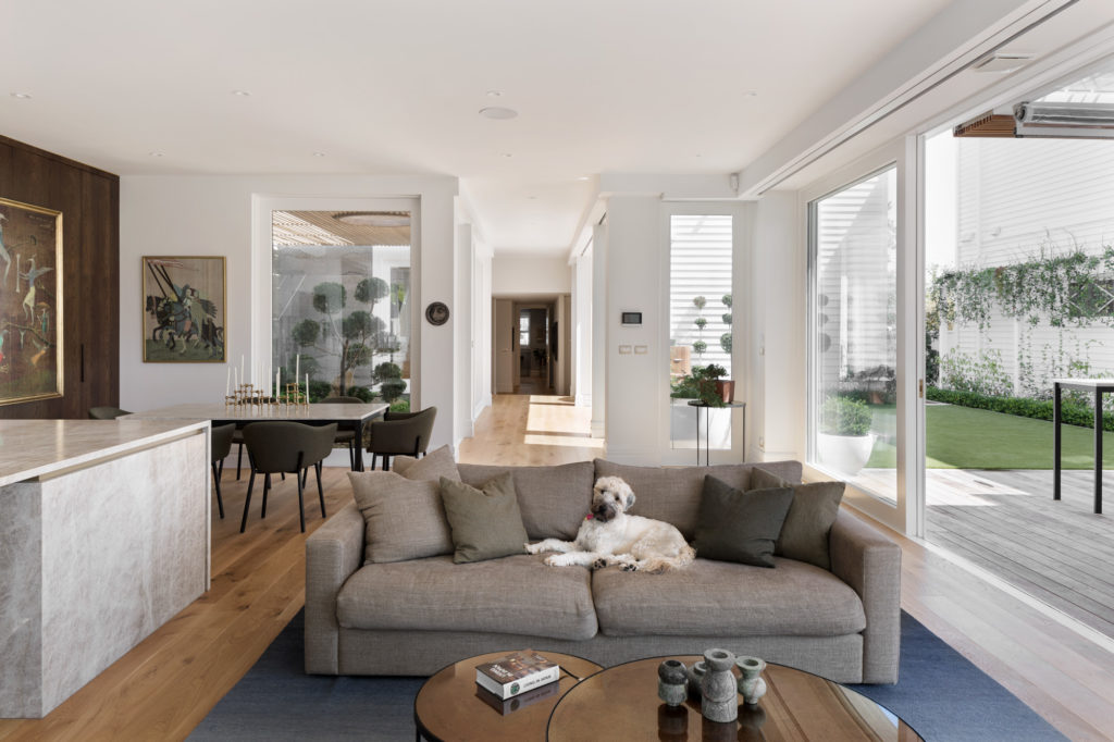
A golden spray of Max Gimblett quatrefoils on approach to the front door, down a side walkway, hints at something special. The lobby is a revelation: the house expands immediately to a rectilinear landscape that defies the sheer wall of that northern neighbour. A lawn, a deck, a covered outdoor room, and a pool put the accent on alfresco in the everyday. However, it’s another insertion of green that really elevates the experience. A Japanese Zen garden, beneath a battened canopy, is to the rear of the walkway link. Here topiary buxus, its branches stretched out Dr Zeuss–like in a rock and gravel garden, brings art and sunlight into the centre.
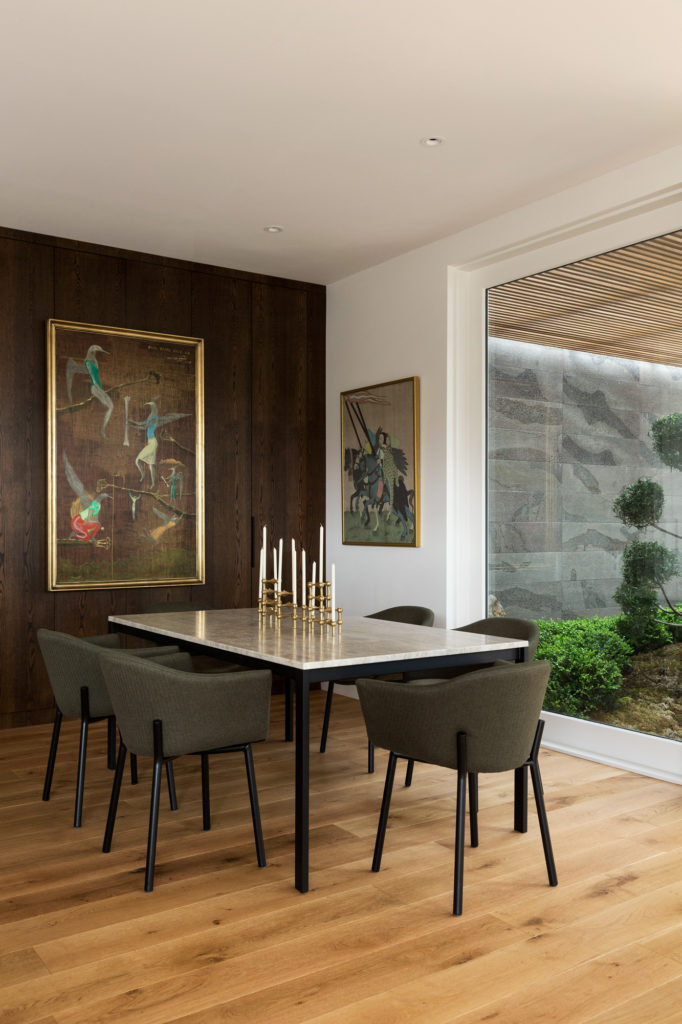
This living sculpture keys into Simon’s brief for a city sanctuary that was also a place for art. Jason was careful to achieve a balance between glass and space and light — and walls for hanging. He also included a gallery walkway above the link to absorb some more of the extensive collection.
Art is how Simon Dunlop met Chantelle Smith, a gallery dealer with whom he worked closely on the interiors. “I’ve always thought she had a great eye,” he says.
And he was right. Still, fitting out two kitchens and six bathrooms — not to mention the rest — must have been somewhat daunting as her first interior design job. Chantelle fell back on what she knew.
“When you curate art it is displayed so nothing jars, and I think it’s the same with design,” says the fine arts graduate.
For this project, she was influenced by the Edo period.
“Japanese prints inspired me in terms of the palette; I tried to avoid black and to use earthy tones that work in with one another.”
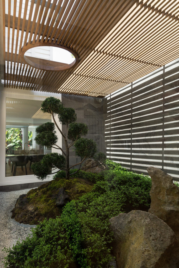
Chantelle tackled the Zen garden first.
“I see it as the heart of the home, as you can enjoy it from most of the main living areas,” she says.
Bluestone tiles on the walls in a bird-peck finish have a dynamic grain that “feels like clouds” and, for continuity, this is repeated behind the fireplace in the outdoor living room.
In fact, stone provided a stimulus for much of the design. Taj Mahal, an incredibly dense quartzite, in a colourway that felt very earthy, became another catalyst. It makes a serene statement on the island bench and elsewhere throughout the home. Up close, it has tones of chocolate brown, which Chantelle picked up in some kitchen cabinetry. The brass-painted surfaces on the splashback and front of the island also key into its striations.
“We were conscious that we wanted the materials to have longevity and we tried to reduce waste,” says Chantelle. Leftover pieces of Taj Mahal were used to top the dining table and bedside tables.
In a bespoke powder room, another slab of stone, rescued from an offcuts bin, is equally attention grabbing.
“When I found it, I thought, ‘Whoa this is amazing’,” she says.
Its yellow-brown swirly grain is distinctive and dynamic, and black flaws in the stone were the cue for the dark hexagonal wall tiles used as a contrasting backdrop to make this small space sing.
Tapware in warm metallics, wool carpets, and oak flooring are a natural base that allows the material to be celebrated, but this is punctuated by furniture upholstered in shades of forest green, navy blue, and red wine. Then, of course, there’s the art. It speaks volumes from every corner of the generous abode. Simon is an art aficionado — some might say addict — and admits that, in his previous house, the walls became a little cramped.
Not here, though — there is more than enough room to breathe, whether he’s entertaining a crowd, waking to a distant view of the Sky Tower, or homeschooling his six-year-old son during lockdown. What started out as an ambitious plan has, three years down the track, culminated in a laid-back urban lifestyle.
“We’ve lived here for two years now, and I love it. It’s just so easy,” he says.
