Michael O’Sullivan folds the sun into an arc — a beautifully curved pavilion that responds to a mature garden on a site just north of Christchurch’s central city.
In one of Christchurch’s most traditional suburbs, post-earthquake development has been varied. Merivale remains an area steeped in history, but is now home to both intensive residential developments and the large homes of old, surrounded by the gardens that defined the suburb pre-quakes.
In the case of this house, the site became the real inspiration after a damaged Californian bungalow was demolished leaving just the splendour of a garden that had been delicately manicured over the last quarter-century.
“The garden the owners had created over the last 25 years was just incredible,” architect Michael O’Sullivan of Bull O’Sullivan Architects says. “The earthquakes have provided a unique opportunity to put homes on properties that have well established and really thoughtful gardens, and this site was extraordinary in that regard.”
Perhaps appropriately, the concept for this design began with watercolours. Originally, the clients floated ideas about building up to capture views back over Hagley Park, but ultimately those were shelved in favour of a simpler, single-storey dwelling.
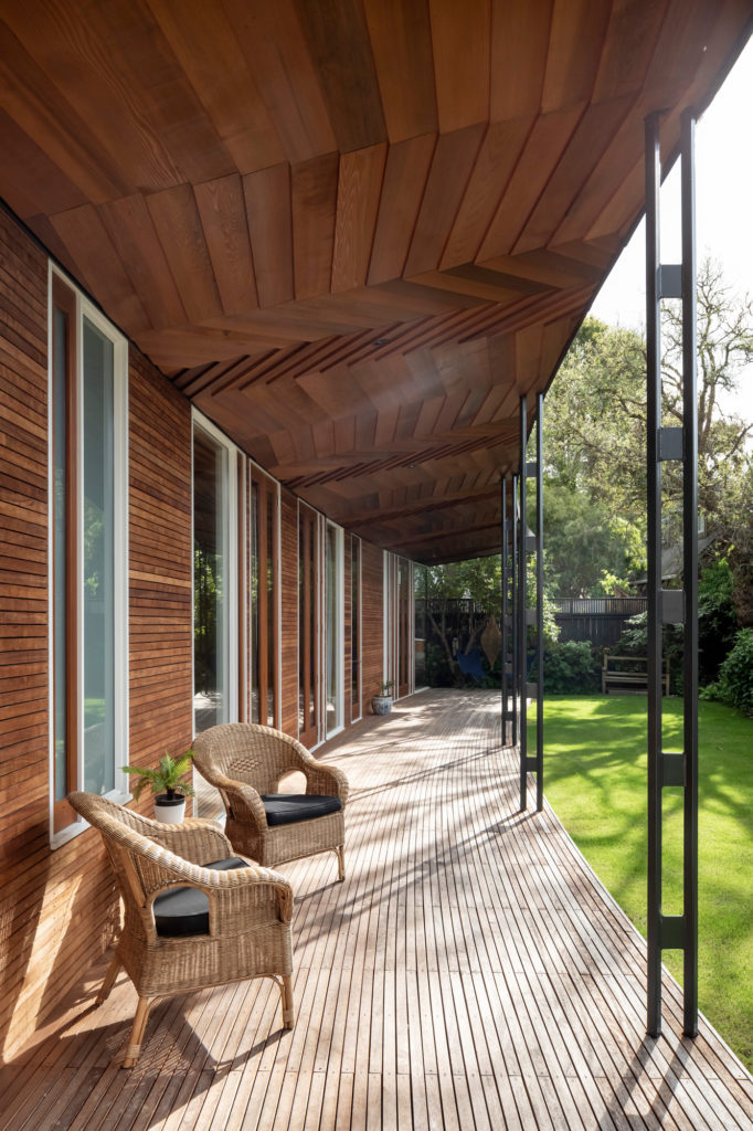
“The house is a singular, strong idea — important in a smaller building like this,” Michael explains. “It’s a garden pavilion that canvasses the sun across the sky whether it’s autumn, winter, spring, or summer. Given that the site runs east to west we had a wonderful opportunity to create a shallow arc into which we could fold the sun.”
A 2.5m-deep eave means the house remains cool in summer, while 220mm-wide opening shutters cut from the southern facade combined with large sliding doors on the northern allow for cross-ventilation.
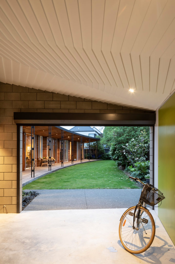
Laid out over a 165m² footprint, the house comprises three bedrooms and two bathrooms. From the street, the elevation is deceptive — a concrete block form sympathetic to the celebrated Christchurch architects of the ’50s and ’60s.
“We wanted to fit the modules of the home in and around the beautiful gardens … and to find the common ground between architecture and garden, not allowing one to be subservient to the other,” Michael says.
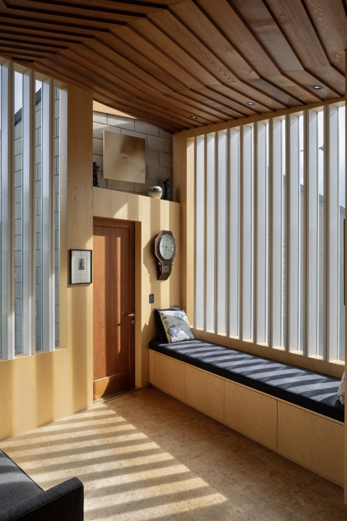
That aim resonates through every part of this intricately crafted home, with the beauty of its detail not visible from the street — and a direct contrast to the concrete block of that elevation. At the eastern end, morning sun falls into the kitchen and an adjacent, vertically glazed sunroom — the point where the geometry of the garage and curved house meet — leaving a triangular space into which light is drawn. Built-in seating makes the most of this light-filled room.
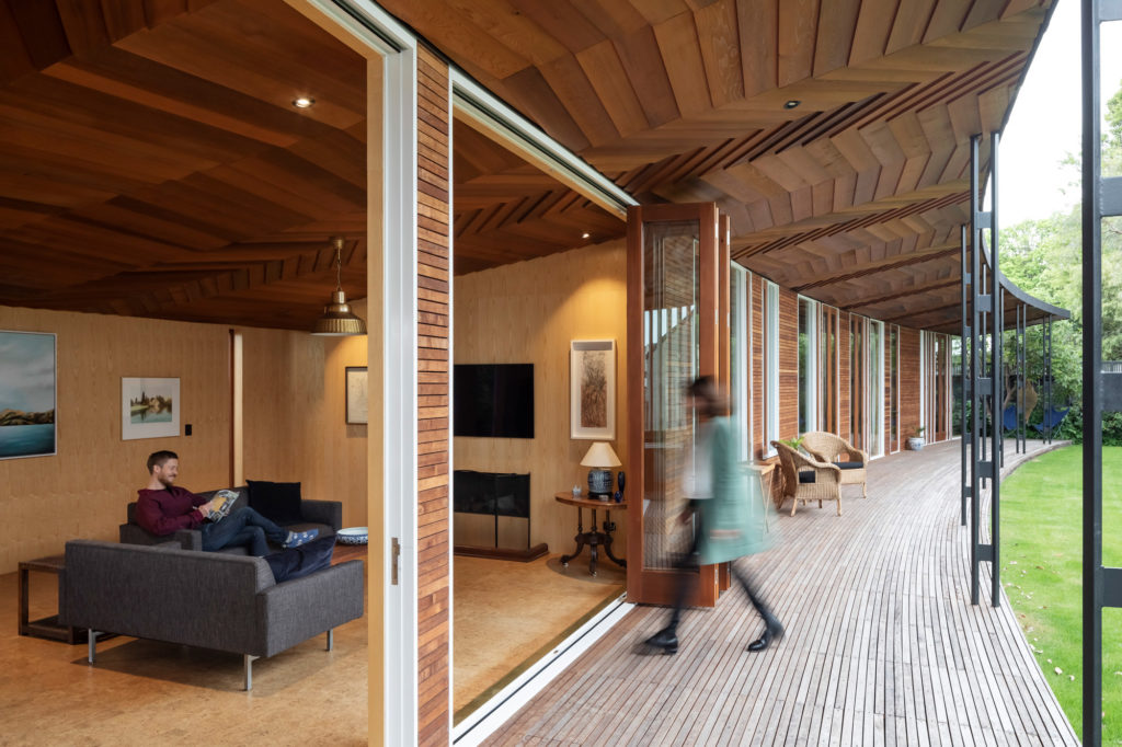
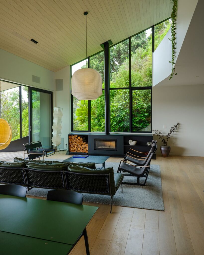
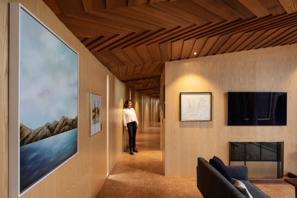
The rooms lead off from here, first the public areas of the house — living and dining spaces — and then bedrooms and bathrooms, culminating with the master at the western end of the property.
“The master bedroom also gets the morning sun, part of the beauty of the arc form.”
The master sits adjacent to one of the most spectacular mature trees on the site — an old pepper tree — that informed the extensive glazing to this room, and it is from the boughs of this tree that the ceiling took shape.
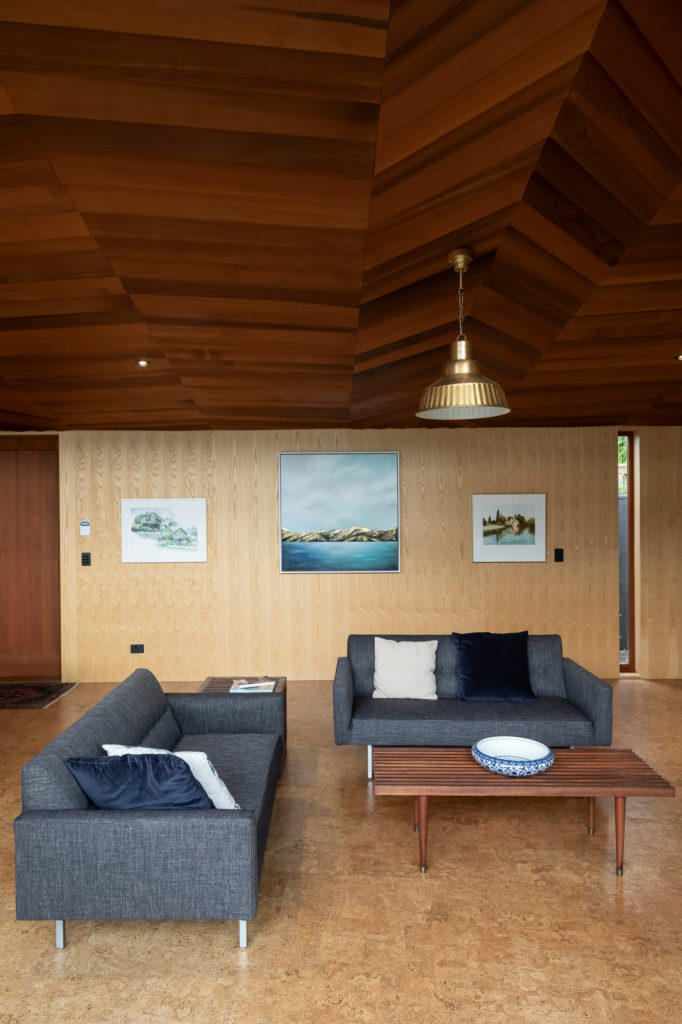
“It has a bark on it which is like nothing you’ve ever seen before,” Michael tells us. “It’s extraordinary. To use something like that to generate thinking is powerful … when you have textures that sit up like that in front of you, it would have been remiss not to.”
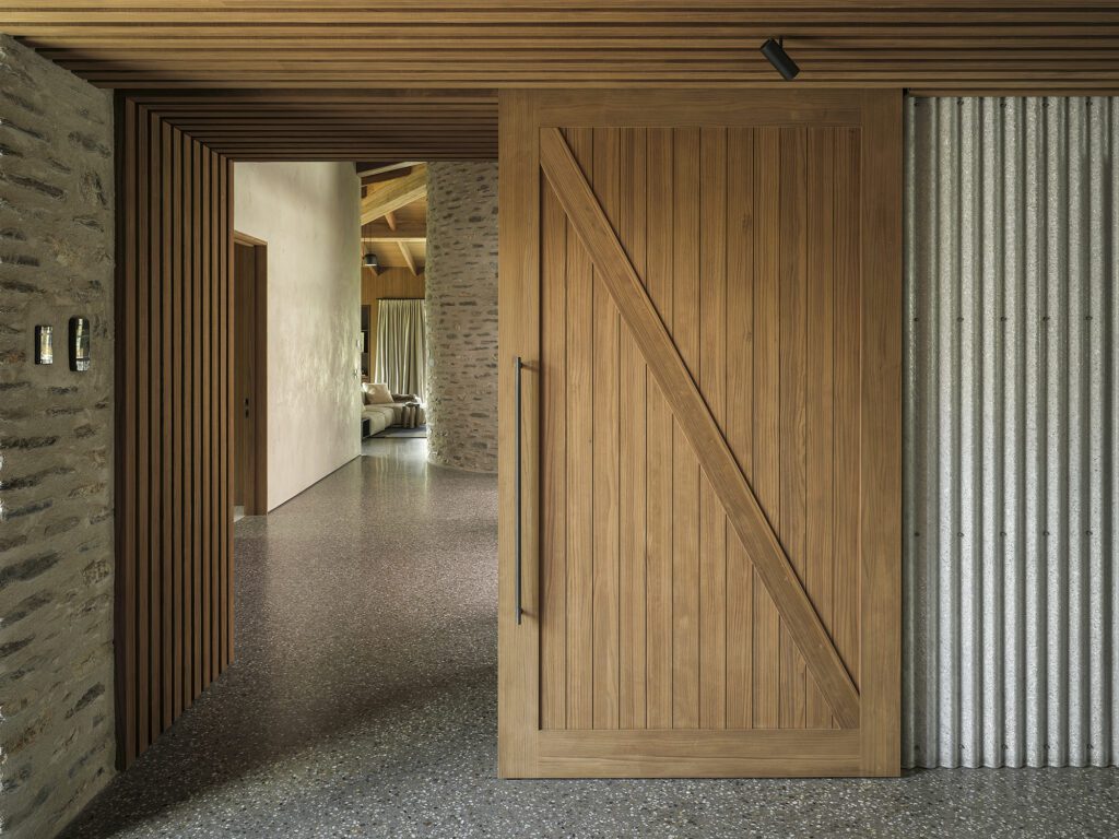
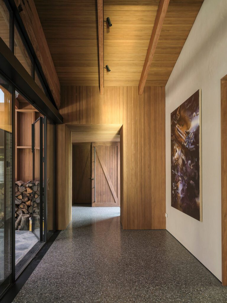
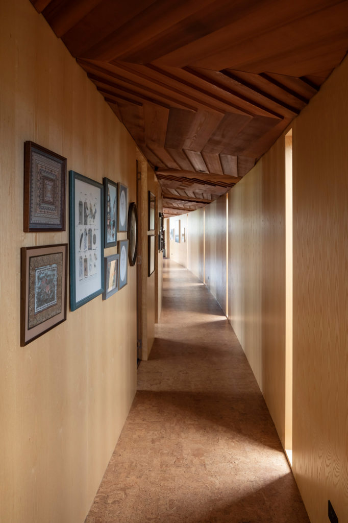
The result is an intricately crafted western red cedar ceiling whose striking irregularity runs throughout, a meaningful link between pavilion and garden.
“In small homes, I believe you need an idea that unifies the building, and in this case the ceiling was a central part of that.”
In contrast to the rest of the spaces, the bathrooms offer moments of moodiness with their dark slate walls. This is the only nod to what once stood on the site. The original bungalow had English slate and, to incorporate that element into the new, Michael sourced a similar slate and used it to line the bathrooms and the kitchen.
“When you shut the door to the bathrooms, it’s like you’re in a black hole, and when you reopen them, you’re immediately faced with the beauty of the gardens and the light.”
It’s beauty that makes this house what it is, and it is evident in every detail. The curvature of the deck on the northern side of the house is testament to this. In order to follow the arc form, boards of kwila were cut down to 40mm in width and curved in the fashion a boatbuilder would, each line aligning at the end of the deck to pop up vertically and clad the sunroom.
“While this required a lengthy process, the result, I believe, is worth it,” Michael says.
Sitting beneath the captivating irregularity of the ceiling, which extends out over the large eave, and against the natural colour and texture of the garden, it is a sight to behold — one of intricacy, detail, and beauty.
It’s a house that goes against the grain in the context of Christchurch, where solid buildings are generally favoured, not pavilion-style homes such as this.
“That is not what we wanted to do here; we wanted to create a lighter building, responsive to the garden,” Michael explains.
This a home you walk into and feel fantastic, compelled to relax within the beautiful arc that encircles the natural surrounds.
Words Clare Chapman
Photography Patrick Reynolds

