Architect Gerrad Hall designs a subtle group of farm-inspired structures that expertly balances complex combinations of materials and style
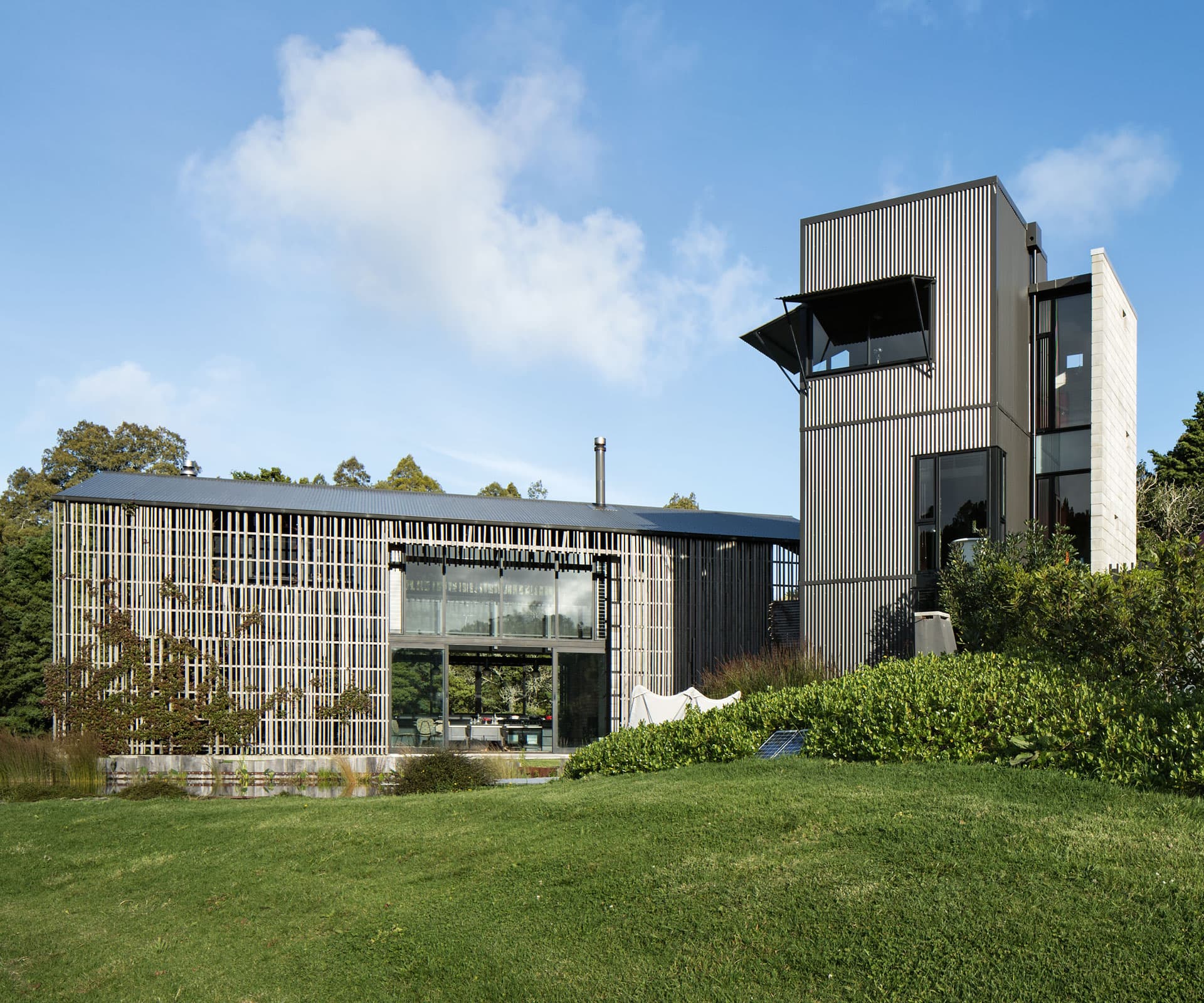
This modern Mangawhai home puts a unique spin on farmhouse style
Mangawhai is one of those pretty east coast spots within striking distance of Auckland: inevitably, this has led to a lot of new subdivisions. But out the back of town, there’s still a secluded, private spot the locals simply call ‘Tara’: a long, winding stretch of road that leads to Tara Peak. So far, it hasn’t been chopped up into anything smaller than a few acres. It’s also an orchardists’ and gardeners’ paradise, with some of the best volcanic soil in the North Island.
Several years ago, Auckland clients of architect Gerrad Hall bought a couple of hectares on Tara Road that back onto protected native bush. Hall had previously designed a celebrated courtyard home for the couple in Freemans Bay, Auckland. But this presented a different challenge – one he was well prepared for, having spent his childhood on a dairy farm in Orewa, north of Auckland. One of the clients had also grown up on a farm. The answer became clear: a series of homages to Northland farm buildings.
The project was also shaped by the clients’ desire for a hands-on role in the build. Ordinarily, Hall would have been cautious, but this was different. “It’s a special project,” he says. “Their sensibilities are different from the mainstream.” He points out the terraced landscaping that falls down the hill from the house like an amphitheatre. “There’s almost a bit of Capability Brown in some of the ambition,” he says, laughing.
It was a similar process in Freemans Bay. The clients had shown confidence in Hall to try things out, and he’d realised their eye for detail. The Mangawhai collaboration is a result of this mutual trust: a subtle group of farm-inspired structures, a relief from the monopitch monoliths and sea-facing glass boxes on the coastal strip between Matakana and Waipu.`
The main house is a two-storey barn building, which seems to pop up out of nowhere as you come up the long driveway. Its most striking feature is a partial screen of vertical slats of hardwood decking off-cuts, which both obscures the living spaces tucked behind it and breaks up the sun as it hits the building. The screen is a nod to hay storage sheds, which are often partially open for airflow and to reduce construction costs.
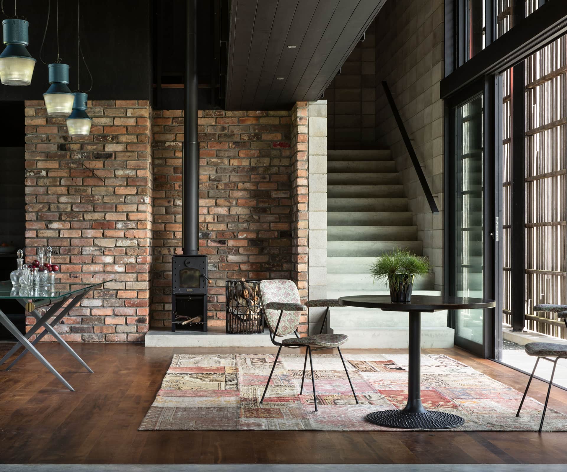
The entrance to the house itself is simple and practical, opening to a walkway that leads to bedrooms and an office. But it’s downstairs that the home really earns its ‘farmhouse’ credentials. The kitchen, with its big dining table, two-storey windows that look out to the vegetable garden and Aga-esque stove is a focus, both of the building and the way the couple lives within it. They’re avid cooks and the pav cooling in the oven when I showed up was the perfect homestead cliché.
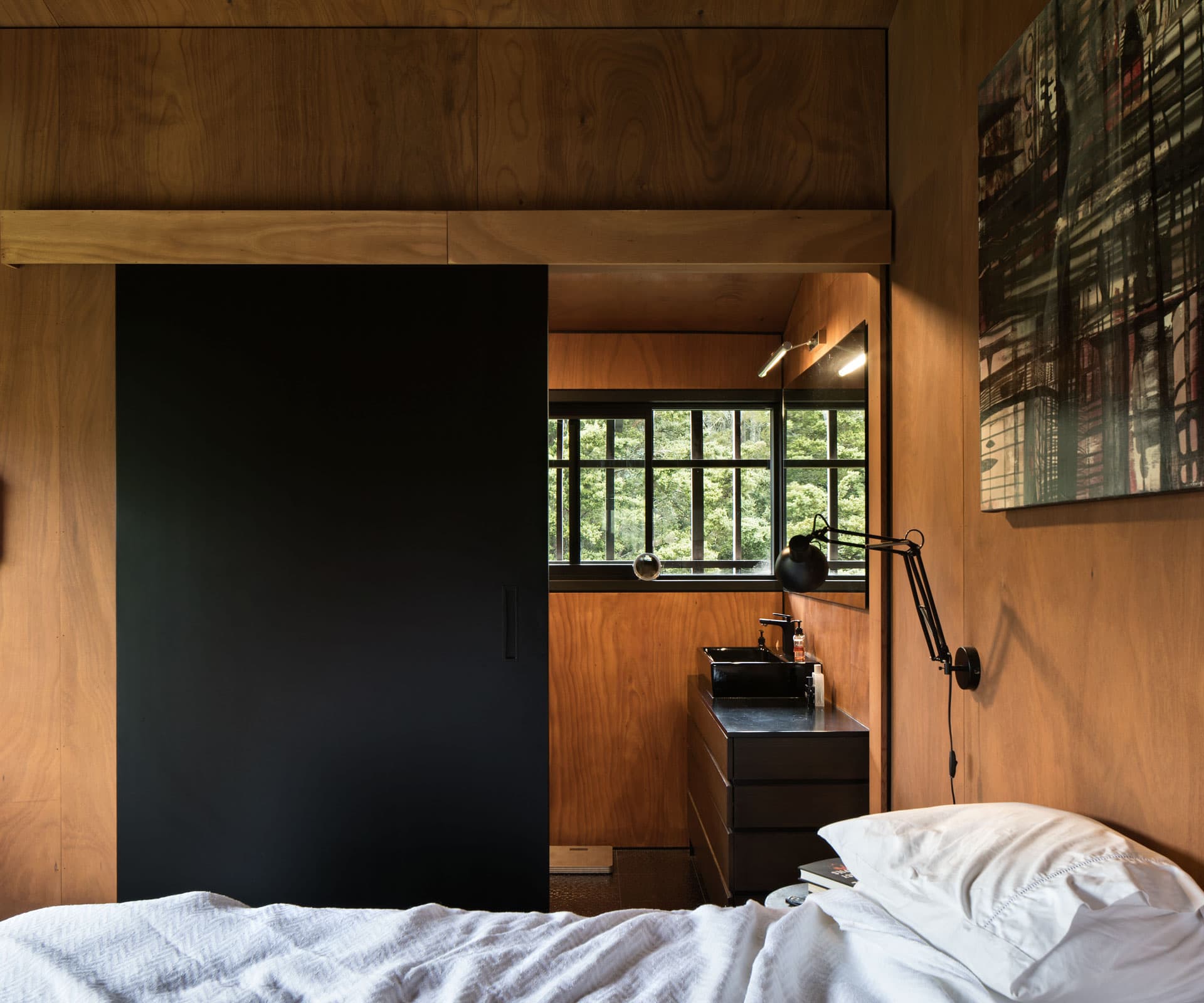
The kitchen gives the first clues about the home’s interior evolution. The owners committed to not using plasterboard anywhere, instead mixing ply with found and natural materials. The brick wall between the pantry and kitchen uses bricks from the couple’s first home (long since demolished) in Ponsonby. They’ve been lugging them around for decades.
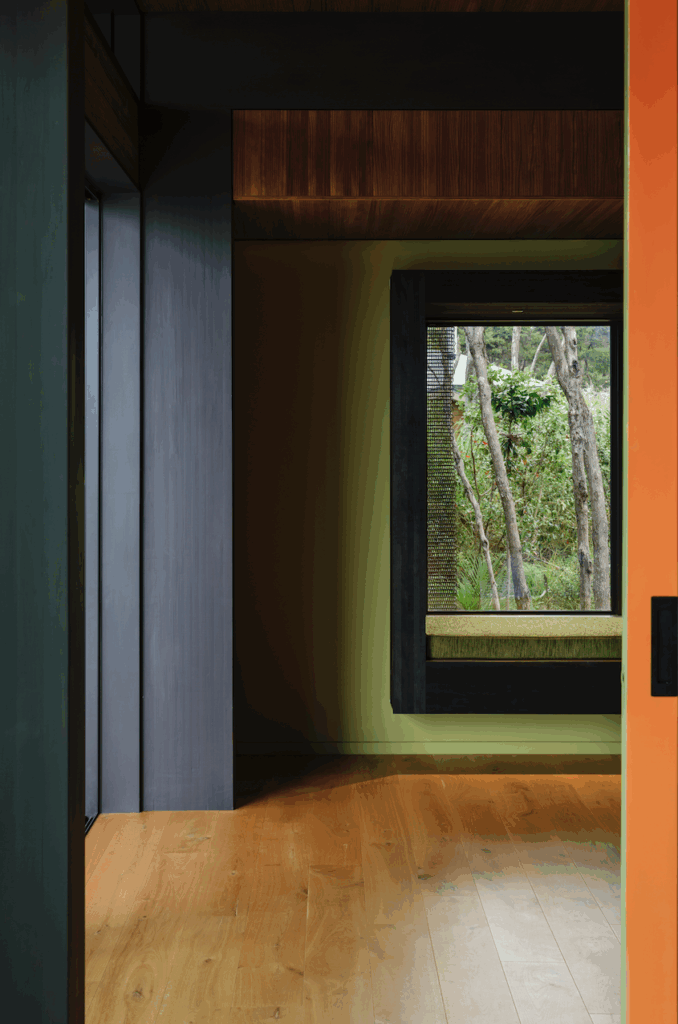
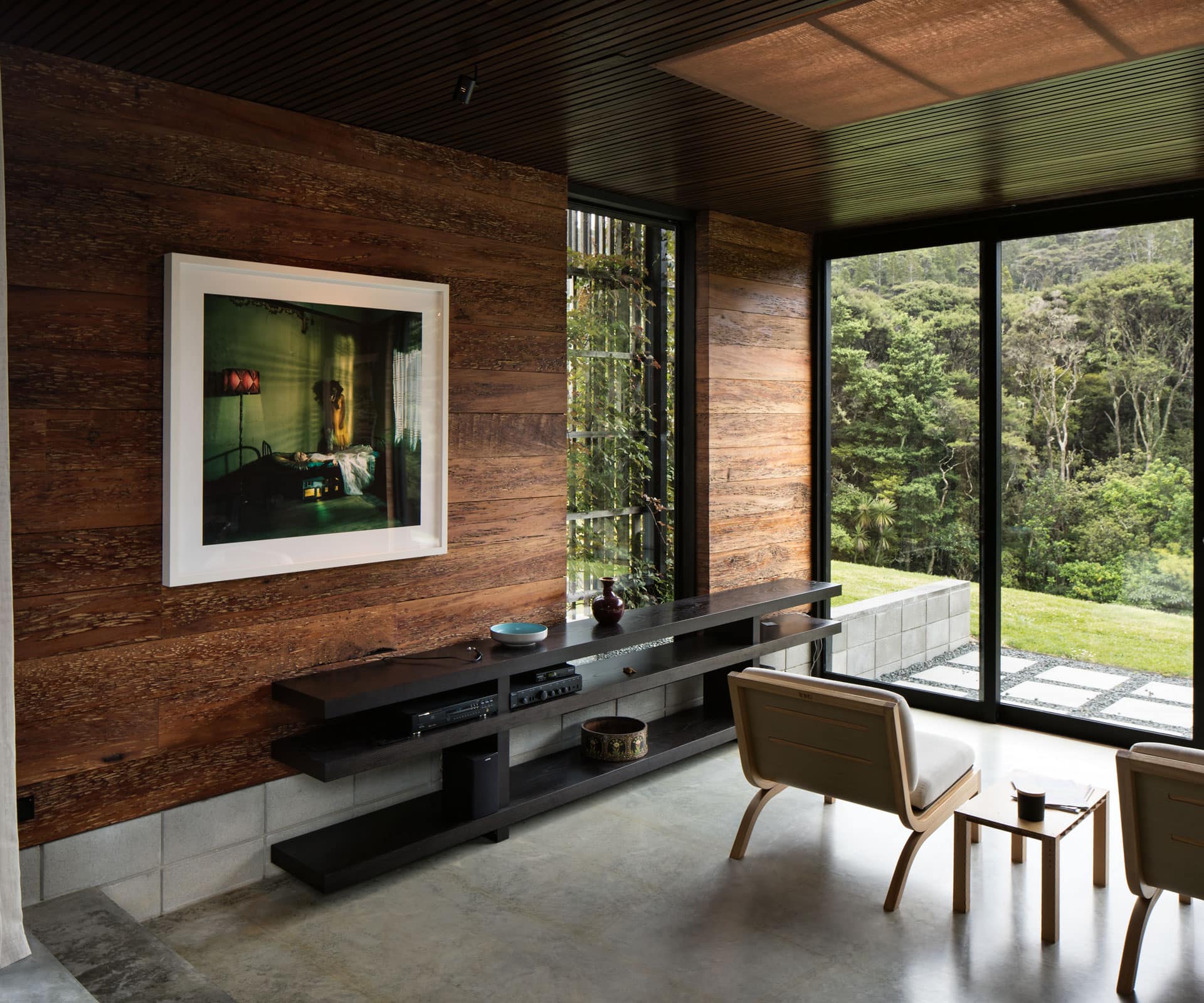
The living room is a space for talking and being, rather than sofa-slouching and staring at a TV. It also has the most distinctive material choice in the house: wide totara boards line the walls and were milled by cabinetmakers who live up the road. “I almost appreciate the house more for being a bit looser,” says Hall, of some of these features. “I might have hermetically sealed everything and made it too perfect.
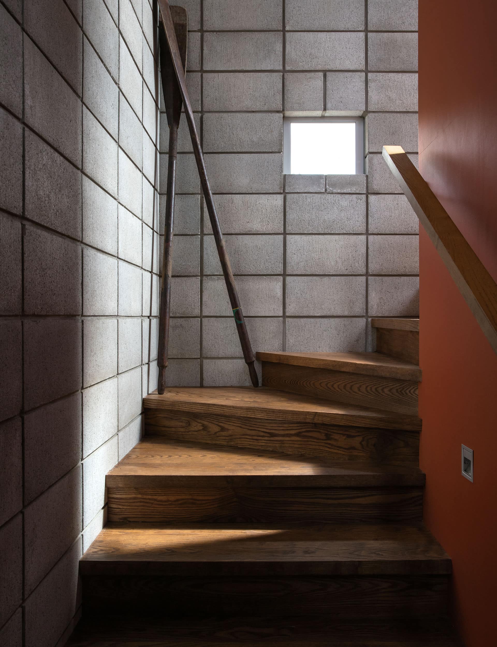
Next to the house is what Hall jokingly calls the “watchtower”: a tall, narrow structure with a bedroom, bathroom and living area for guests. Like the main building, there are twists and turns, nooks and complex material juxtapositions. As Hall walks me through, I can almost see his brain still hurting from all the detail required to make it work. But the payoff comes at the top: a clear view across the trees and all the way down the drive, making it impossible for someone to sneak up unannounced. As Hall points out, it’s also a riff on the grain silo form – an agricultural accompaniment to the “hay barn” next door.
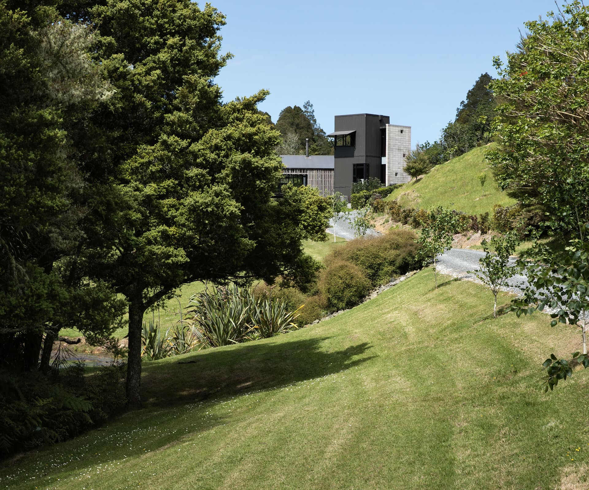
“I think the pervading feeling of the project is nostalgia,” he says, “and almost in a childlike sense, like the tower and the simple shapes of the buildings.” The danger was that the collaborative process and mix of materials would make it a mishmash. But there’s a sense of contingency, pragmatism and intimacy about the way the house is finished. The view is absolutely essential to this, too. The totara on the walls connects the inside to the outside, speaking to the promise that, over time, the house will become even more a part of where it is. It’s the perfect view for a home that asks not to be looked at, but lived in.
Words by: Anthony Byrt. Photography by: Simon Devitt.
[related_articles post1=”73997″ post2=”54143″]


