Rising up to seek the light, discover how this bold home brings a dynamic presence to an otherwise ordinary Auckland street
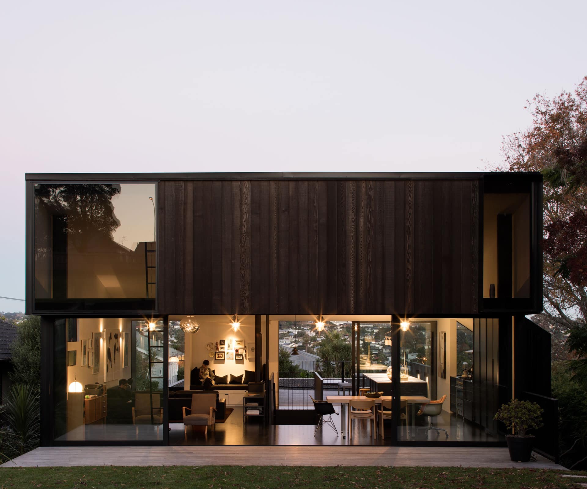
Bold design and crisp style combine in this solid Grey Lynn home
Phil Ivey and Michelle Dowd had lived on their Grey Lynn street for a decade in a renovated 1940s house that was just on the small side of not quite big enough for them and their three children Then, the dunger next door came up for sale and they jumped: a run-down rental for years, it was an inter-war bungalow possessing neither Victorian frill nor bungalow elegance, nor mid-century lines.
It faced the wrong way on a south-facing site and, during their time, had become known for loud parties and a general lack of neighbourliness. Within weeks of settling, the Ivey-Dowds demolished the place, wiping the site clean. Then they moved Phil’s office, a sleek black shipping container with glass on two sides, over the back fence and set about building a house.
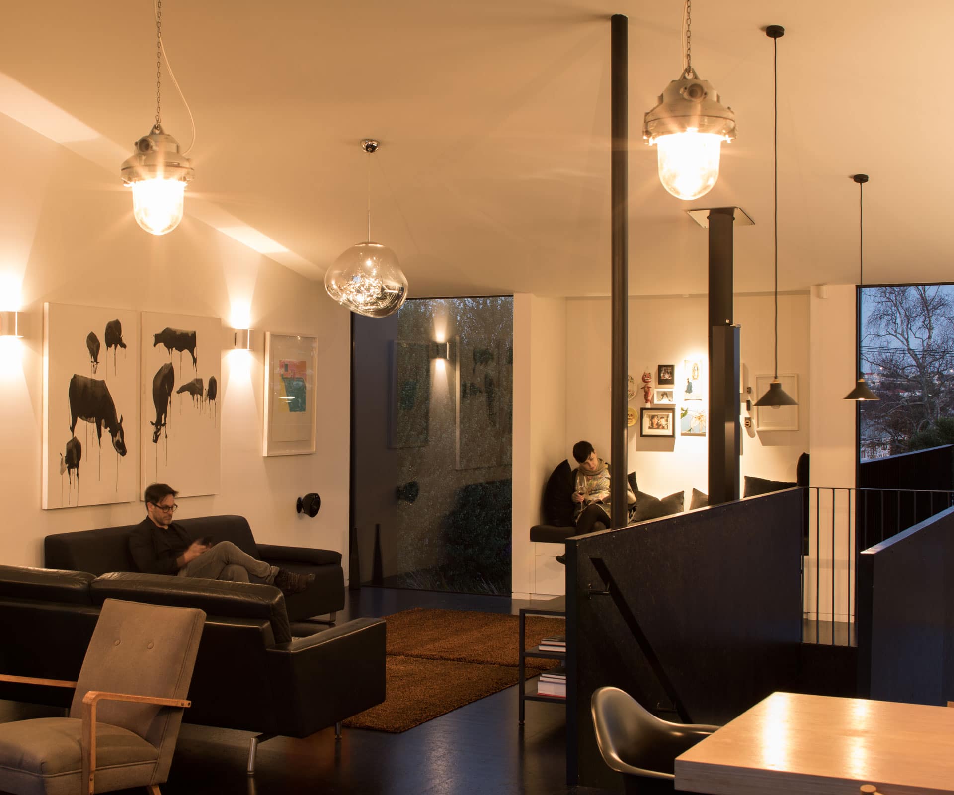
Ivey is a production designer on sci-fi films – he spends long periods away from his family and then long periods working at home – and Dowd is a graphic designer. Together, they have a crisp design sensibility which is neatly encapsulated in the container: it wasn’t the starting point for the project, but it could have been.
In fact, architect Aaron Paterson of Paterson Architecture Collective found a starting point in Ivey’s film sets: black and white, often with hints of the dystopian. Not a bad place to start when working on a new family home on a south-facing section on a street jammed between the north-western motorway and the church of the Latter Day Saints. The suburb’s bijou streets of pretty Victorian villas might have gentrified in recent years, but there are still raffish pockets like this one that stubbornly refuse to change.
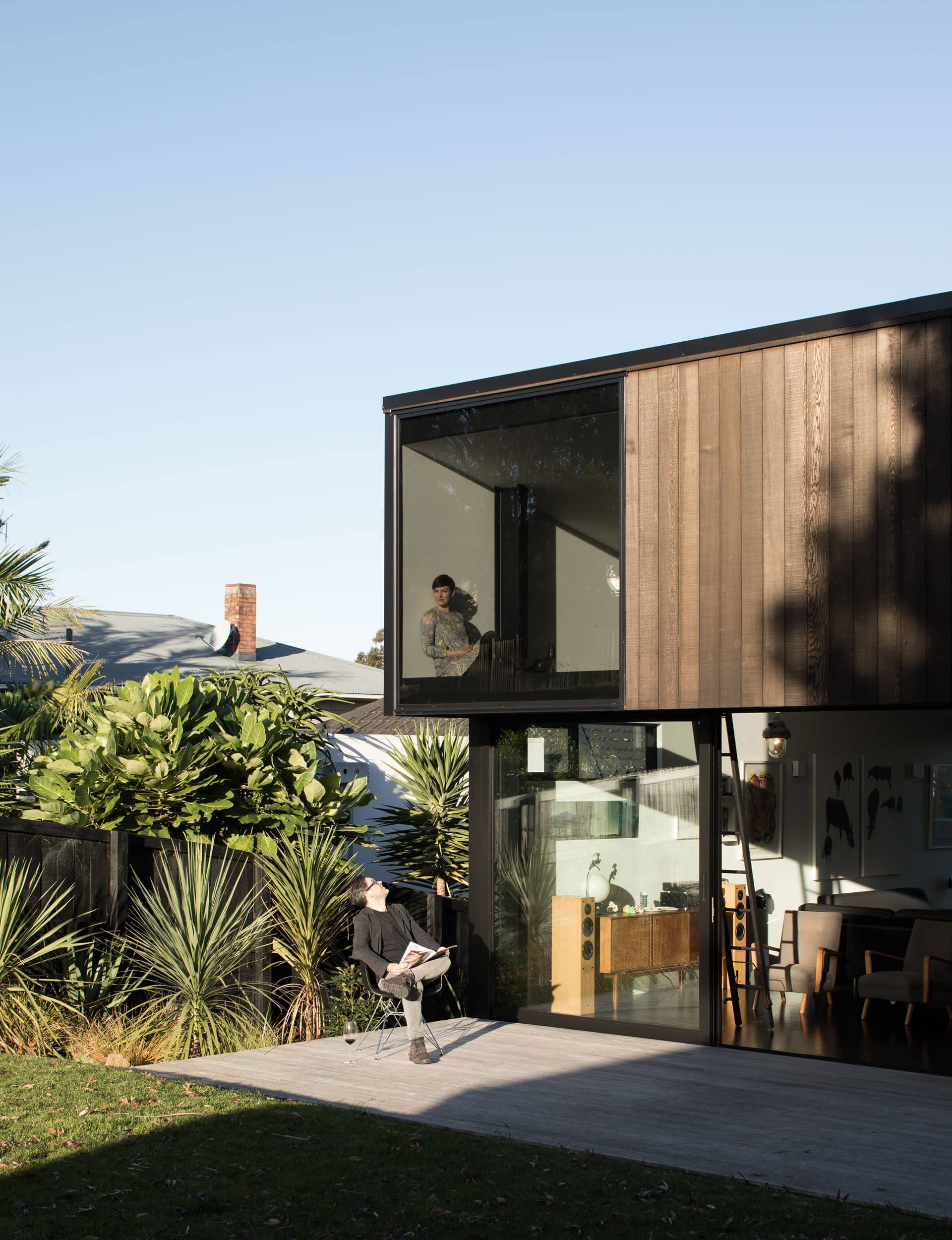
Paterson and Dominic Glamuzina – of Glamuzina Architects, with whom he was in partnership at the time – quickly overlooked the site’s drawbacks and considered the sun in one direction and an underutilised view of Auckland’s volcanoes in the other. “I had this hunch that the higher you got,” says Paterson, “you’d have a great view out over to the cones. It’s quite an interesting view that you wouldn’t really expect, so the whole thing was about getting up higher.”
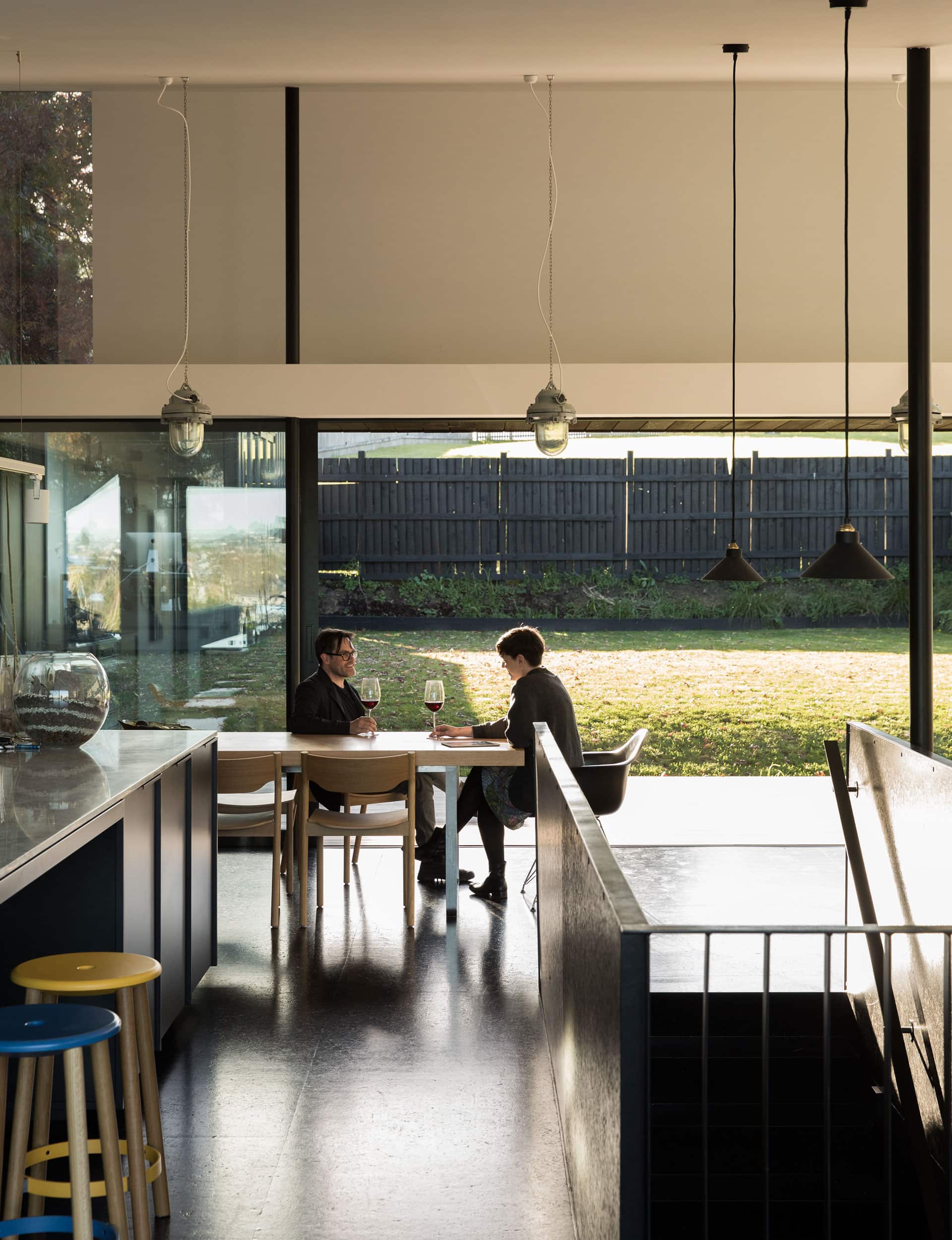
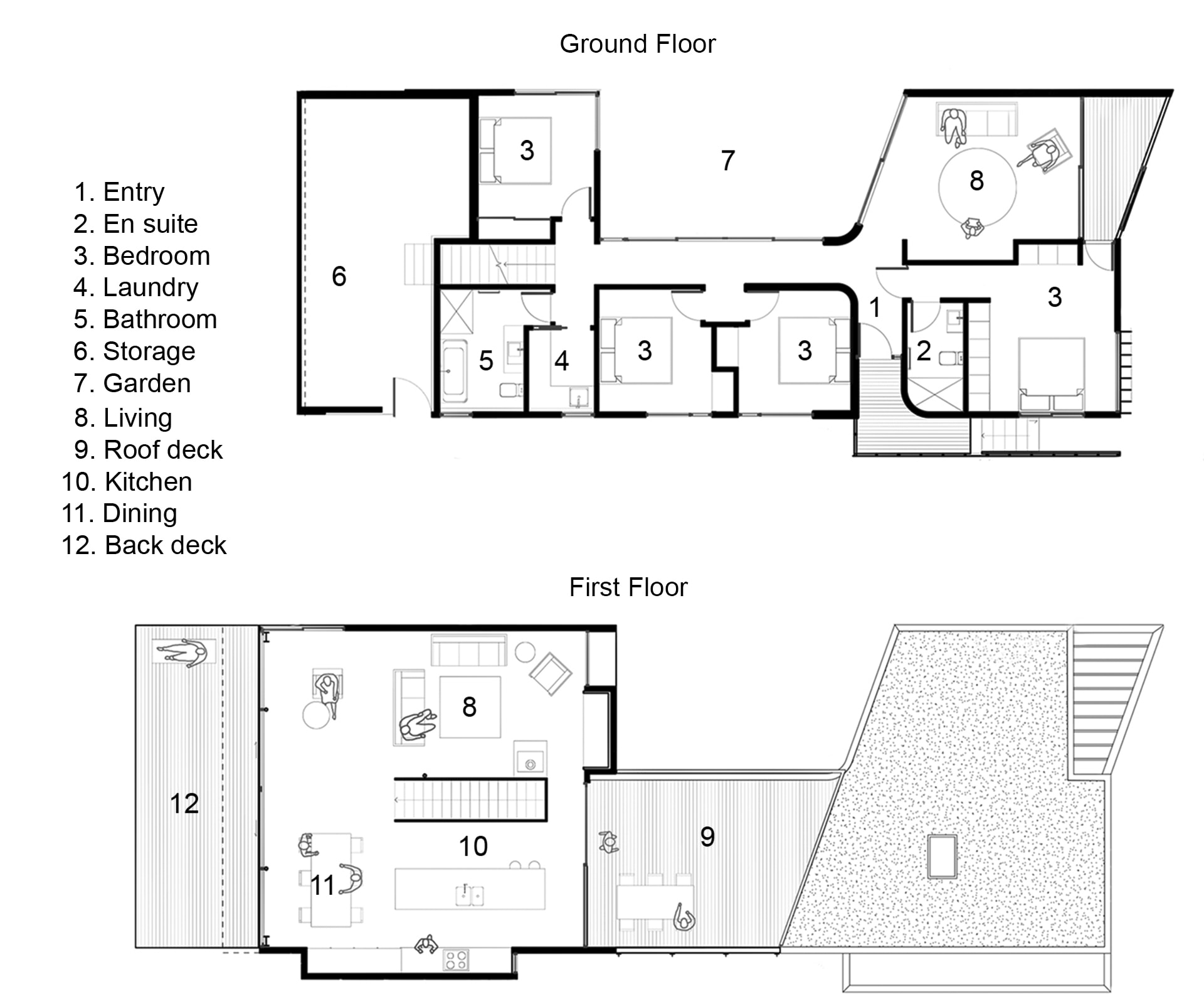
To achieve this, Paterson designed a house in two parts, digging out a chunk of the sloping section to create two terraces. At street level – pushed as far forward as possible – the house hunkers into the ground, containing bedrooms and bathrooms and a snug den, wrapped around a courtyard filled with lush native planting.
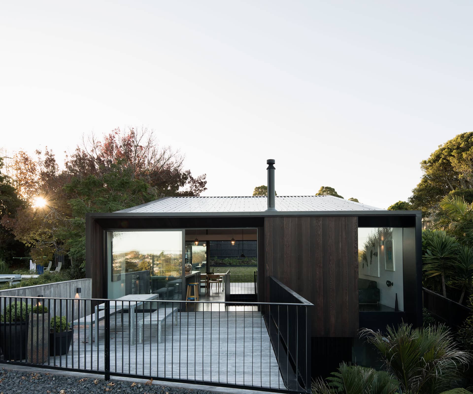
Above that, linked by a black stair that rises up into the light, is what Paterson describes as a “programmatic tent, more like a factory up top” – an open-plan box, glassed at both ends, connecting to a back lawn on the north side and a roof deck on the south side, making the space feel voluminous and extending out in both directions. “We made architecture that hugs the earth, then we have a continuous backyard upstairs,” says Paterson.
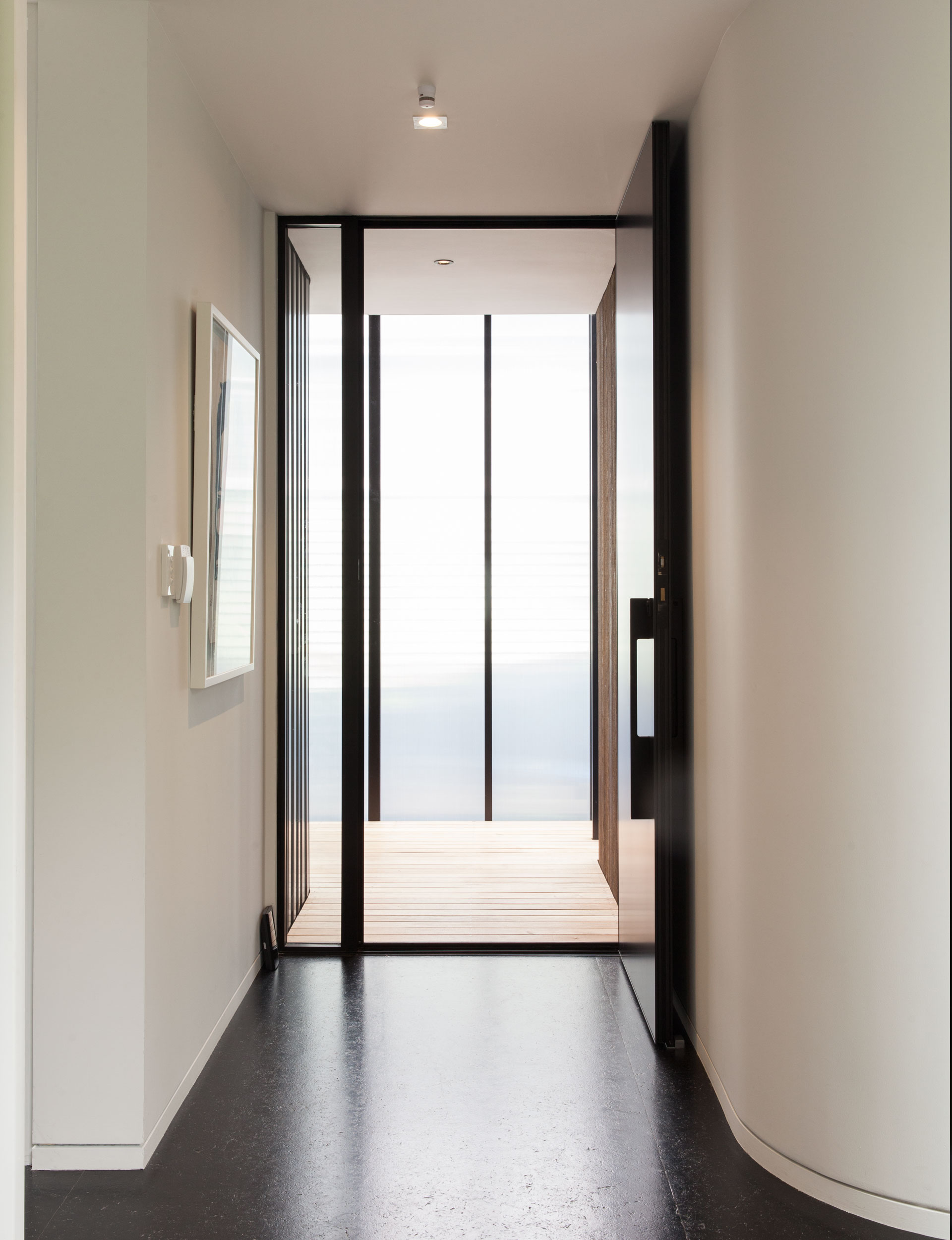
The project came with sensible budget constraints, so while the design initially included a poured and partly cantilevered concrete floor downstairs, Paterson later specified Strandboard. Usually used as a sub floor and covered up, here it’s stained black and polyurethaned.
It’s hard wearing and bulletproof – essential for a family with three young boys – and it works beautifully with other materials, which include black steel in the stairwell and in the kitchen by IMO. On the outside, the house is wrapped with black steel corrugate, softened at either end with cedar cladding.
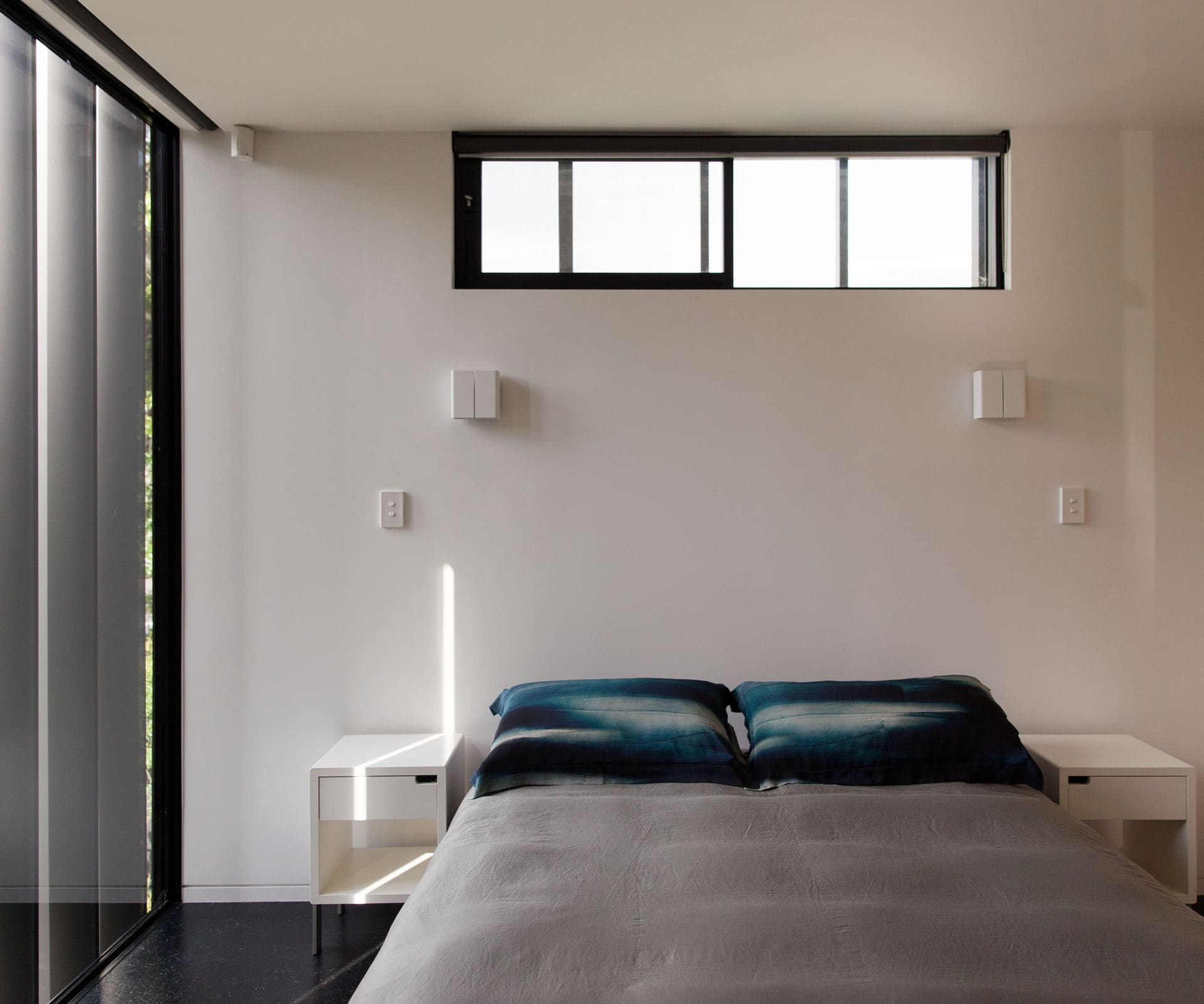
“The detailing is so clean,” says Ivey. “The glass runs into the floor and ceiling, and the blinds go into the ceiling. It’s dead simple, but it’s also bomb proof at the same time.”
The strength of the place is in the clear-eyed idea – the architects were helped, no doubt, by having designers as clients. At their first meeting, Paterson and Glamuzina turned up with a 3D model and nailed it. “And we thought, ‘Well, communication’s not going to be a problem,’” says Ivey. “Then we freaked out and said we can’t have got it right first time, so we went round in a big circle and came back to where we started.” From there, the design really didn’t change.
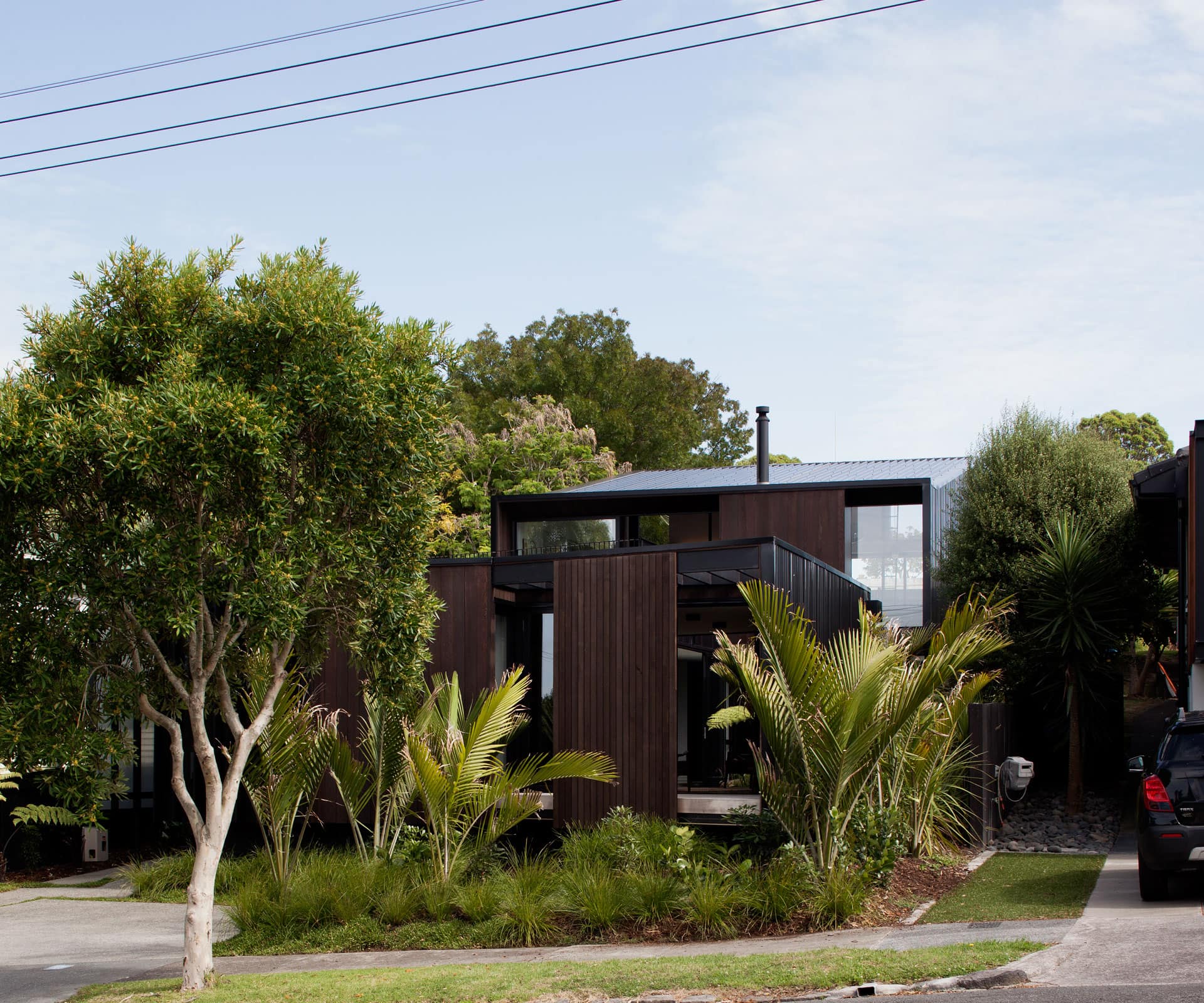
From the street, it’s an intriguing presence surrounded by lush native landscaping and hints of the main bedroom and downstairs snug through metal fins and sliding timber screens – rooms that operate almost like a front verandah.
In a gentle nod to the surrounding bungalows, the entry is around to one side, reached through a porch-like area of polycarbonate sheeting and black steel, which makes a satisfying ‘bong’ underfoot. “It’s quite nice to walk through the house to end up in the middle of the site,” says Paterson of the dog-leg entry. “You enter into quite a luscious sort of jungle area, then this tent sits on top.”
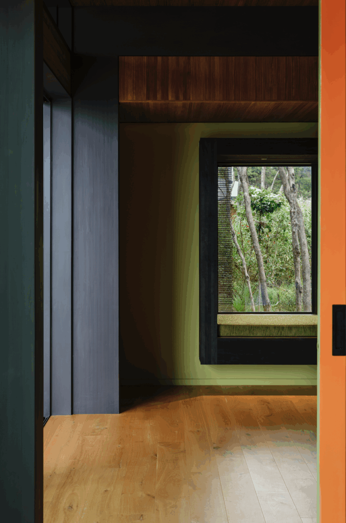
The key is that the landscape runs around and across the house. Downstairs, a courtyard brings in light throughout the day – the hall, a bedroom and the den all look into it through floor-to-ceiling windows. Shafts of light track in here at different times of the day, lighting spaces that would otherwise have been dark and cold.
Alongside the house is a ‘swale’ – a planted overland flood path that’s been built instead of a culvert, which directs water down the side of the property, well away from the house. In big downpours, it almost creates a waterfall effect. Eventually, there will be more planting in big pots on the gravel roof of the ground level.
[gallery_link num_photos=”18″ media=”https://www.homemagazine.nz/wp-content/uploads/2017/06/img3-12.jpg” link=”/real-homes/home-tours/architect-aaron-paterson-discusses-his-dynamic-courtyard-home” title=”See more of the Grey Lynn home here”]
“Downstairs feels buried into the ground,” says Paterson. “It’s passagey, it’s the workhorse of the house really. But you’re always walking along the line of the building, with your eyes drawn into the bush.” As a result, you’re always looking across and through things, from the upstairs living area down to the den, from the hall out to the courtyard, from the back to the front and the front to the back. “There are connections between spaces,” says Paterson, “lots of paths around and through the house.”
Now, from his black-steel container, Ivey has a view from the top of the backyard, through the living area and out to the volcanic cones in the distance – the carpeted suburban landscape of Auckland rolling out to the horizon.
Words by: Simon Farrell-Green. Photography by: David Straight.
[related_articles post1=”71432″ post2=”71531″]
