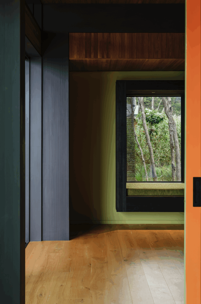
Michelle Backhouse discusses how she balanced modern and contemporary pieces inside her Arts and Crafts Chapman-Taylor home
Q&A with Michelle Backhouse
Chapman-Taylor’s details are beautiful. What were your favourite parts of the house?
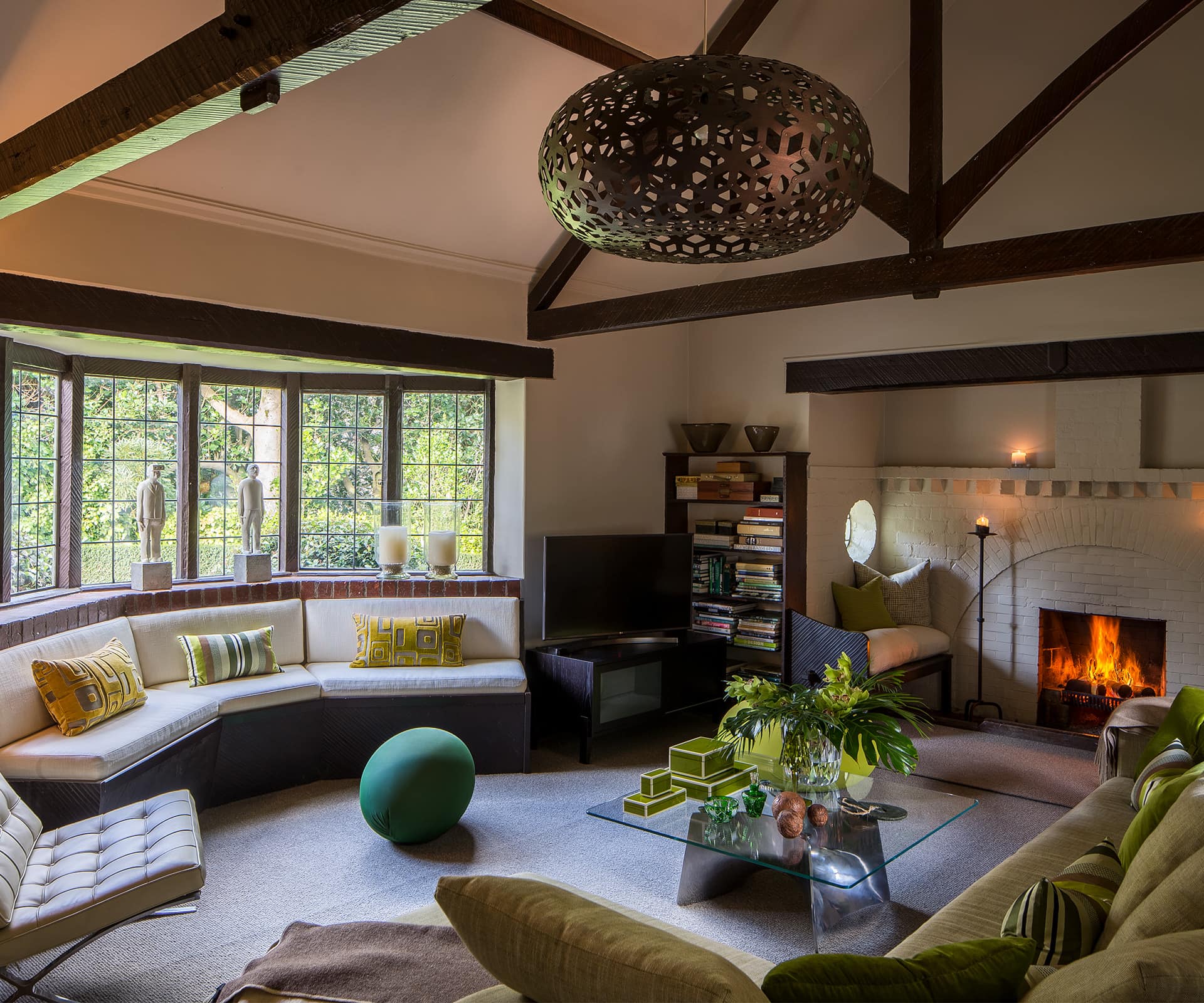
The large sitting room with its inglenook fireplace. It was a favourite spot in both winter and summer. Every detail in the room, from the solid and perfectly formed adzed jarrah beams, to the hand-hewn bookshelves and the steel casement windows, created a character-filled sanctuary. Even when the room was emptied it had an almost ecclesiastic ambience.
What did you come to appreciate about the design in the time you lived there?
The strength, character and layout of the house. It has stood proudly in this north-facing position for more than 100 years without flinching. The use of honest materials and solid and unyielding double-cavity walls. It was built to last and even though it was a large house, each room had an intimacy and a function. Every aspect of the house, and indeed its site, had been considered by the architect. It felt connected to the garden and to the sun but also protected from the prevailing northerly winds.
[gallery_link num_photos=”8″ media=”http://homestolove.co.nz/wp-content/uploads/2019/02/Backhousehome_Wellington_HOME_5.jpg” link=”/real-homes/home-tours/chapman-taylor-house-modern-pieces” title=”Read more about this home here”]
You were obviously quite comfortable putting contemporary pieces into the place. How did you approach that?
Honest, simple architectural design is a perfect canvas for modern furniture and lighting. We added authentic pieces that we loved and found to be both beautiful and useful. We’ve collected modern, mid-century and antique pieces and they all worked wonderfully together in this Arts and Crafts home.
You made changes over the years – how did you negotiate the heritage and the modern?
We didn’t change the structural design. We considered the heritage value in every aspect of the renovations. We had to change some of the windows because they didn’t open but we had new steel casement windows made. When we designed the bathrooms and kitchen, we used natural materials such as marble, stone and wood. We worked with a bespoke joiner to design kitchen and bathroom fittings that looked like Chapman-Taylor may have designed them. Paying respect to heritage and appreciating the value of original materials and details helped us curate a home filled with unique, authentic designs.
You’ve moved out since these photos were taken – where have you wound up?
We are in an apartment in a heritage Wellington waterfront building. And our furniture, lighting and art has travelled with us, so we hold onto the memories.
See more of the Chapman-Taylor home below
