Sleek design offset by original features has created a stylish workable kitchen in this Freeman’s Bay home. See how 70s charm was given a contemporary twist
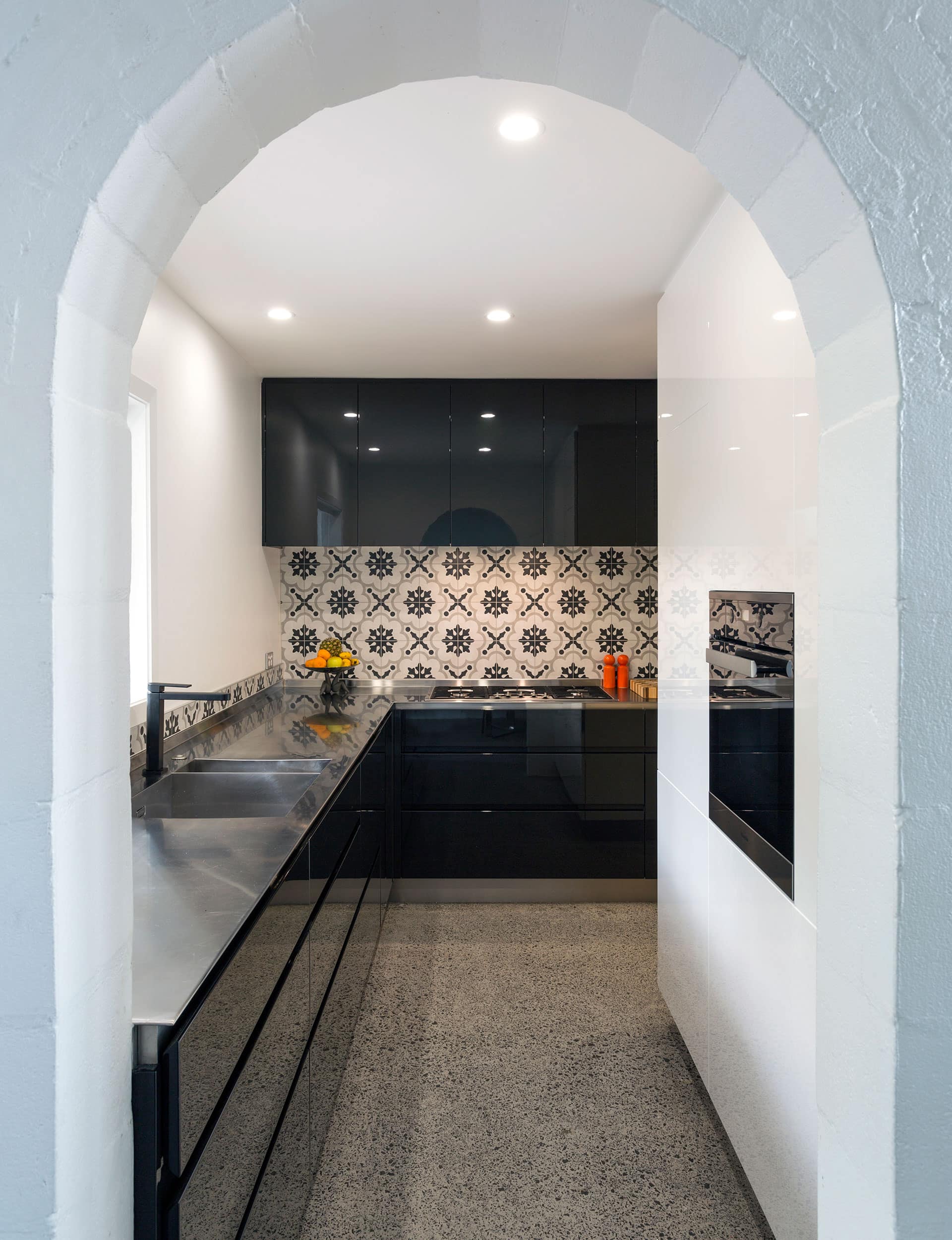
A modern take on 70s style gives this kitchen makeover a cool twist
Designer: Shane George, Kitchens by Design
Location: Freemans Bay, Auckland
Brief: Sleek design to suit a 1972 townhouse. Improved workflow and stainless-steel benchtops
What was the starting point for this design?
Client: I’ve lived here for eight years. The previous kitchen was from the early 90s. It was functional, but tired and had no charm. Shane George The compact townhouse has a 1970s vibe and we wanted to work with that, but with a more contemporary twist.
So we kept the main kitchen very simple and sleek, offset by original archways and stainless steel in the pantry. To complete the look, we added the Fioranese tiles as a splashback and a feature wall in the dining room. Client Shane brought the tiles around and I initially dismissed them, but then I decided I loved them.
Could you tell us about the archways?
Shane George: felt they were part of the charm and flavour of the original architecture. The client and I agreed not just to retain to them, but give them room to stand out.
Were there any particular challenges or parameters that affected the new design?
The majority of the walls are concrete block, so extra planning and thought was required to relocate or re-route the electrical and plumbing requirements.
How does the kitchen flow with the surrounding spaces?
You walk into the kitchen from the dining room through an archway. The dining room has a door opening onto a courtyard. Above the sink in the kitchen there’s a bifold window that opens onto the courtyard with a new bar/servery.
Describe changes made to the layout
We moved the oven and fridge into tall white cabinets opposite the sink. The hob and sink each occupy one arm of the L-shape stainless steel benchtop, which flows through into the pantry.
We enhanced the pantry storage and worktop area with under-bench storage and matching stainless-steel open shelving. The workflow and balance of the kitchen are much improved and suit the client’s needs perfectly. The result is a super-functional and inviting place to be.
Images by: Jamie Cobel.
[related_articles post1=”50302″ post2=”60588″]
