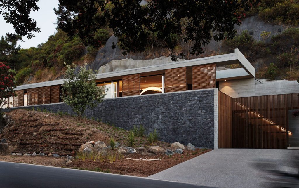
Modernist and elemental, this house in a Marlborough vineyard by Stuart Gardyne proves that country living need not be rustic
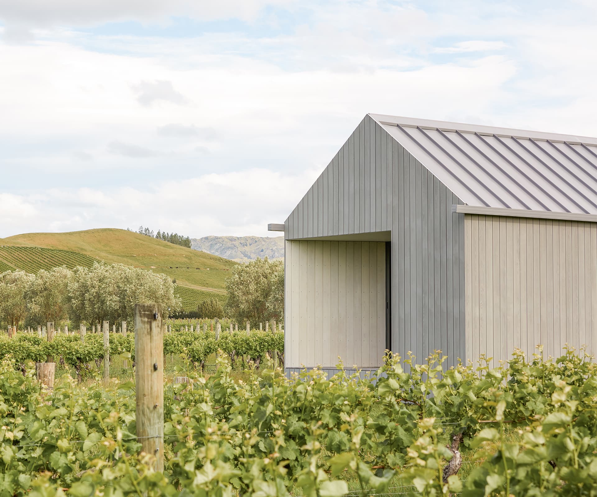
“A paddock with grapevines on it” is Stuart Gardyne’s description of the site in Marlborough’s Omaka Valley, in which this refined yet unpretentious house is found. There are views of the mountains, and neat, regular rows of vines.
A few olive trees dot the site, as if to emphasise the many subtle shades of green and grey. For an architect, the choices would have been almost limitless: the house could be placed anywhere on the site, and without close neighbours, there are no immediate buildings or forms to respond to. Modernist glasshouse, or a sprawling estate? Both have been done before on New Zealand vineyards. Many now sit uncomfortably and feel out of place. What works on the coast doesn’t work on the farm.
When asked about the freedom that a site like this affords, Gardyne – who was approached by the owners of the land seven years ago – recounts a comment he once heard attributed to Mark Mack, a postmodern American architect: “Sometimes you can have too much freedom.” And in many ways, the house that now stands is a subtle, careful musing on that idea, for architect and client alike. What should you really do, when you can do anything? And what’s most important, when the choices are limitless?
Gardyne is perhaps the only architect to have a letterbox featured in architectural publications in this country. Known for his meticulous attention to detail and a love for materiality and tactility, he speaks with fondness for David Chipperfield’s work – specifically of the way that for all its marbles and patinated bronzes, his work still manages to get out of the way, pushing to centre stage the objects in a museum or the lives within a house. And in this house in Marlborough, that’s exactly what has been achieved, and without making any kind of fuss.
“If you’re striving for simplicity,” says Gardyne, “then the architecture has to have a level of perfection in the way it’s composed and in the spatial qualities of the rooms.”
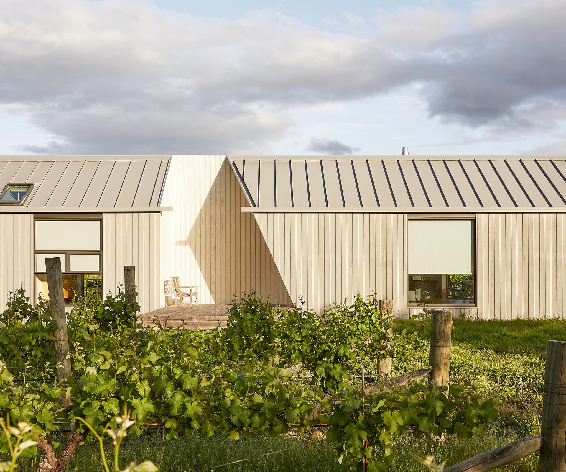
This is a simple house in its basic form, looking to the barns and sheds of the rural New Zealand vernacular, and to the long, repeated rows of vines of its immediate environment. At 41 metres, the house is an elongated, extruded shed broken only by cut-outs that form decks. From this perspective, it mimics the length of the vines. Yet the house is only five metres wide, so that from the other angle it sits small and modestly, reminiscent of the idealised house forms of Stephen Bambury’s small sculptures and prints, or the cubist barns of Rita Angus’ paintings.
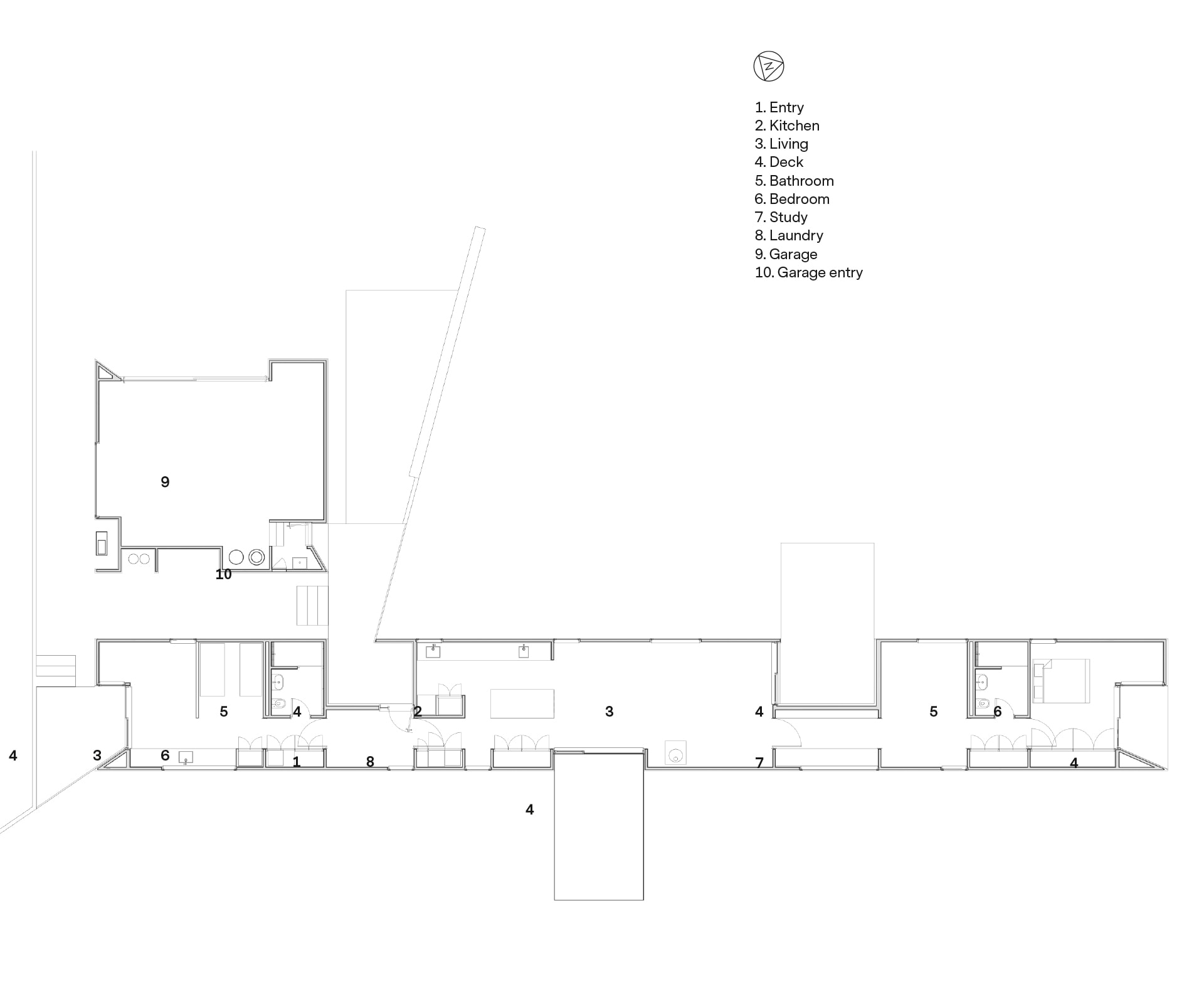
Located at the end of a driveway, you first drive past the vines and down the length of the house before arriving. Enter the front door and turn right, and you’re in a self-contained bedsit intended for use by one of the owners’ parents. Turn left and you are in the main space of the house, a large living-dining-kitchen area with two decks. The main bedroom is located at the very end of the house, and to get there you walk through other rooms: a study, a multi-purpose room (or spare bedroom), past the bathroom and wardrobe. This arrangement of spaces, with a central corridor connecting the entire house, is economical despite the house being located on an expansive site. It implies a more thoughtful, time-honoured way of inhabiting space.
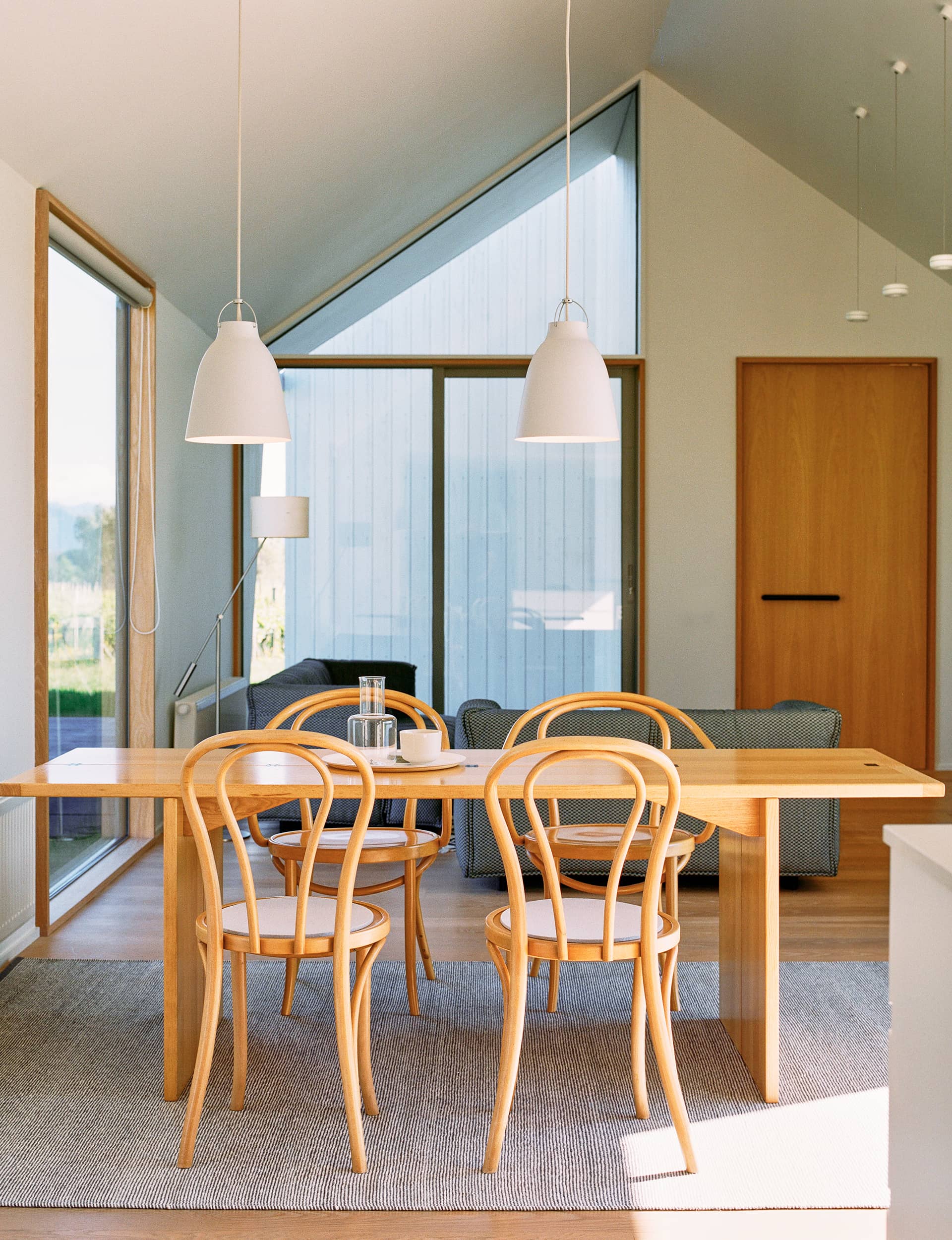
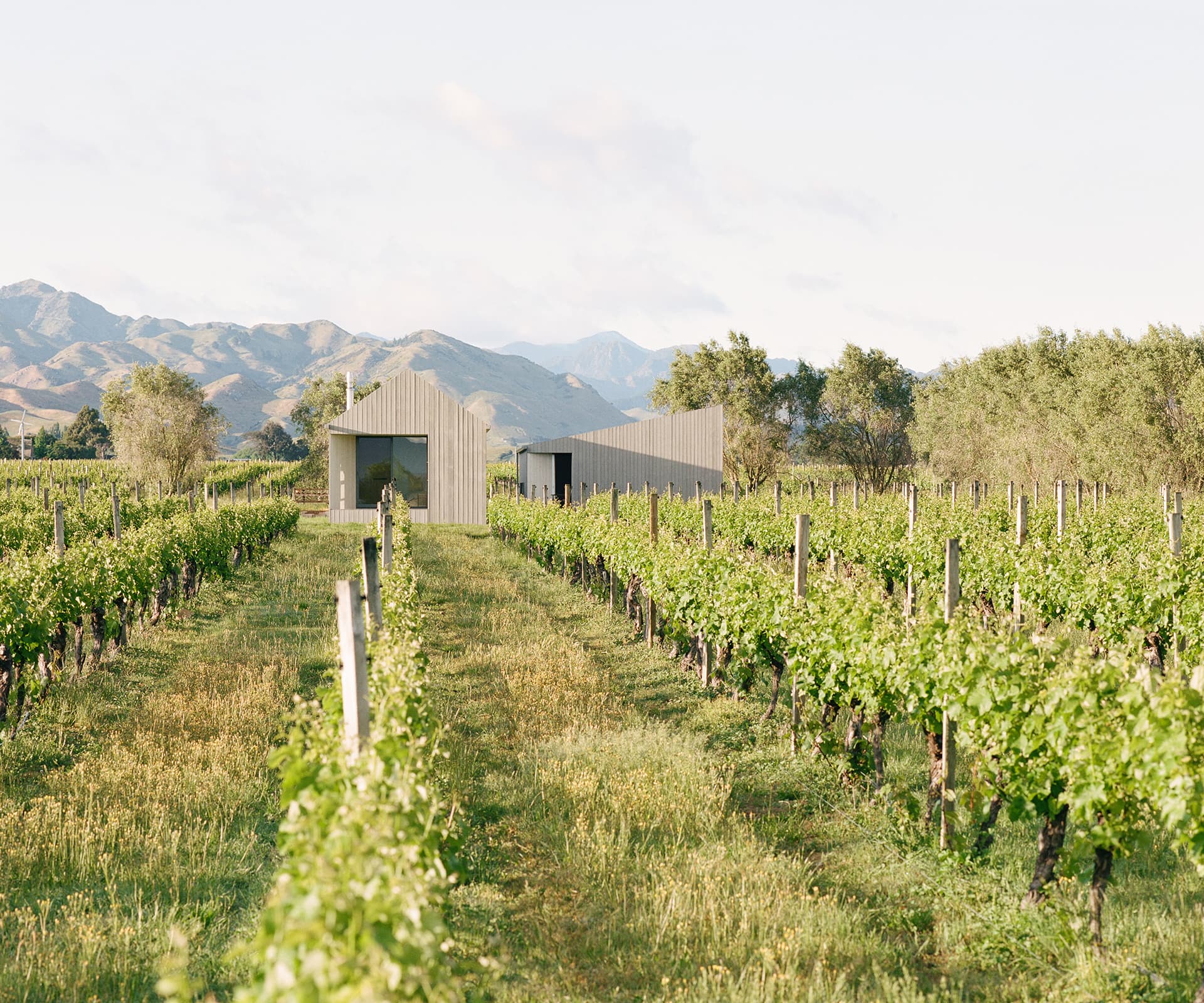
Gardyne says that one of the critical design decisions was the pitch of the gable. Too steep and it could be evocative of a cathedral rather than a vernacular shed, looking foreign in the landscape. Yet too low and it could look squat or stout, as though pushed too firmly from the top into the ground. The 35 degrees finally settled on feels right in an inexplicable way, to the extent that there’s almost nothing to comment on. It’s ‘super normal’, in Naoto Fukasawa and Jasper Morrison’s formulation: design that distils and refines everyday objects to produce a new version that is instantly familiar, correct and comforting.
When a house is to be inhabited lightly, as this one is, filled with very few but very beautiful possessions, the architecture has to do extra work – it can’t hide behind paintings or bookshelves or rugs, and must provide texture and personality that those furnishings usually offer. “I think it does place a larger demand on the architecture to actually be part of that aesthetic,” says Gardyne, “because it’s not going to be shrouded or masked by the normal clothes of life, the things and objects of inhabitation that people bring.”
Looking at this house in our age of easy Instagram minimalism it becomes necessary to think a little harder about what complex and simple, more and less, really mean. For many, moving away from urban life and to the countryside is itself a response to those thoughts. Yet in the considered, refined interior, and with its beautiful realisation of the most basic shapes and forms, this house says that a simple life in the country doesn’t at all mean a life with less thought.
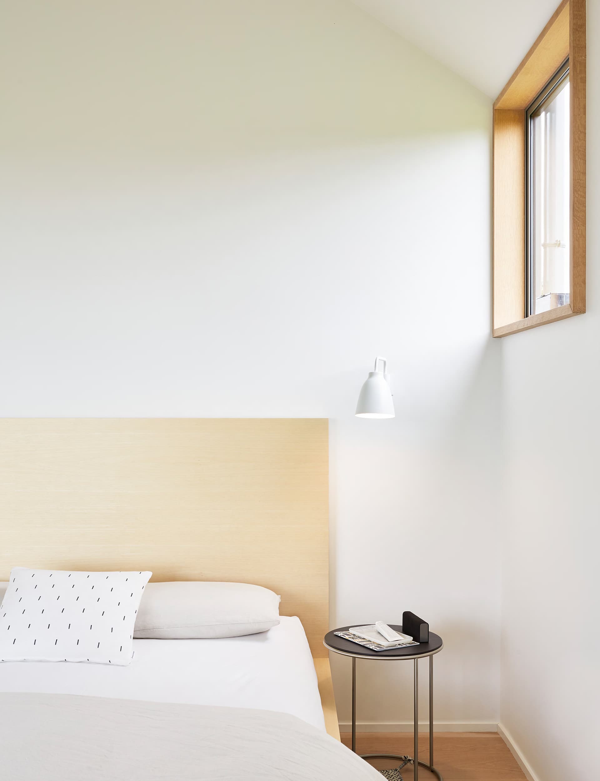
Raised half a metre above the grass and vines, the vistas out through the windows and from the decks are connected to the landscape, but from an architectural vantage point. There’s a play of connection and disconnection, closeness and distance, as you look out across the top of the vines to the hills beyond.
But the real pleasures of this home are probably a treat only the owners will ever know: the serenity of moving through passages and spaces in which every door jamb has been laboured over; the ease of pushing on the large black D-door handles, rather than turning a handle to enter another space; following the day’s light around the grapevines on each of the decks. This house has none of the pretension of an urban dwelling, but it didn’t get rid of refinement along with it. It might be minimalist in aesthetic, yes, but it’s a house emphatically maximalist in thought.
Words by: Michael Moore-Jones. Photography by: Thomas Seear-Budd
[related_articles post1=”2039″ post2=”117941″]
