This Mt Eden kitchen by at.space design is part of a larger renovation of a classic villa (for a family of five) which included modernising it, improving some of its internal flow, adding much needed insulation, light and storage.
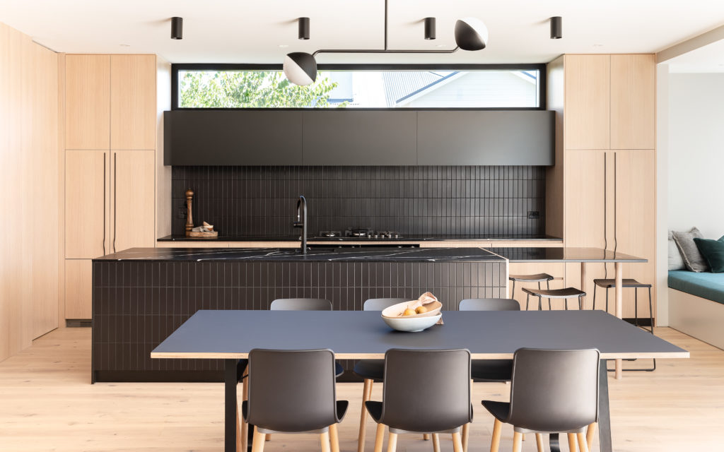
The pièce de résistance, however, is a large, open plan space at the rear of this home. The idea here was to stitch together the kitchen, living and dining areas and visually connecting them to the garden with its inviting swimming pool and adjacent pool house. T he first indication that something quite different lurks at the end of the traditional villa hallway is an American Oak ceiling that seems to spill from above a playful, glass and black steel grid door.
This overhead transition hints at a change in compression and materiality. Cohesiveness between the modernised common areas and the front of the slightly more traditional villa was paramount and the designers achieved this, in part, via elegantly subtle series of motifs. Lighting choices are composed of small (approximately 15cm in diameter) round sconces and a similarly rotund pendant (by Rich Brilliant Willing and Coco Flip respectively). They use black steel as either backings or in solid-coloured rods and shades to replicate some of the darker tones of the kitchen’s backsplash, island bench, and the delightful pantry handles (Brave handle by Katalog).
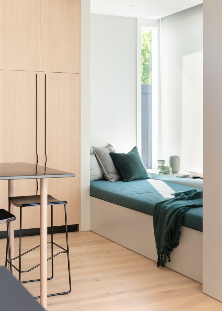
The kitchen island – a monolithic piece wrapped in black, Minimal Nero tiles from Artedomus and topped by a Silestone Eternal Marquina benchtop – anchors this vast space, its black volume is imposing, yet the shattering lines of quartz-like veins on the top are dramatic and vibrant. “[We] like designing kitchens that feel more like you are in a restaurant rather than in a house. Here, the island becomes an object of design rather than purely practical,” says Tomi Williams. One end of the island bench, however, has been customised to act as a small, black steel table extension.
The joint is a feature created by the timber veneer end panel which comes through to join the steel and the stone. To accentuate this, the timber legs were designed to come up and through the top of the powder coated steel table. T here is drama and repetition of motifs here and, most importantly, there is also a freshness. The combination of light coloured timber veneers and pitch black tiles are tamed thanks to the usage of white and… believe it or not, the owner’s favourite light blue. We are impressed.

