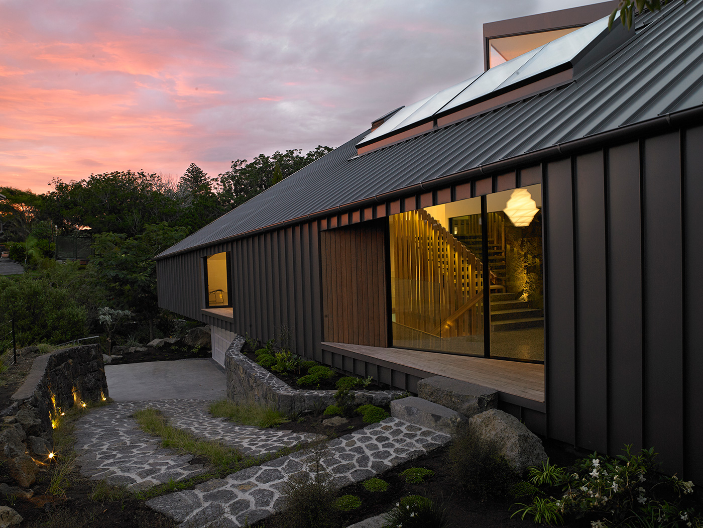
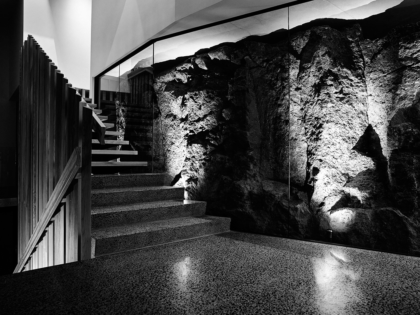
Rather than hide the impossibly impenetrable lava rock that covers most of the land on this on Mt Eden section architect Nicholas Stevens encased it glass and put it on display
A Mt Eden home embraces its volcanic landscape by putting it on display
The owners of this home in the Auckland suburb of Epsom may have initially offended their architects by describing the design as “modern baroque”. Nicholas Stevens of Stevens Lawson Architects, perhaps unused to his firm’s work being likened to the theatrical forms of 16th-century Italy, had to ponder a while before accepting this description as a compliment.
Eventually, he decided to do so, but suggested a new spelling: “baroque, spelt b-a-r-o-c-k”. Baroque architecture was about new explorations of light and shadow that created moments of dramatic intensity. This house, though in a vastly different and much more contemporary language, could, in a way, be described as investigating the same themes.
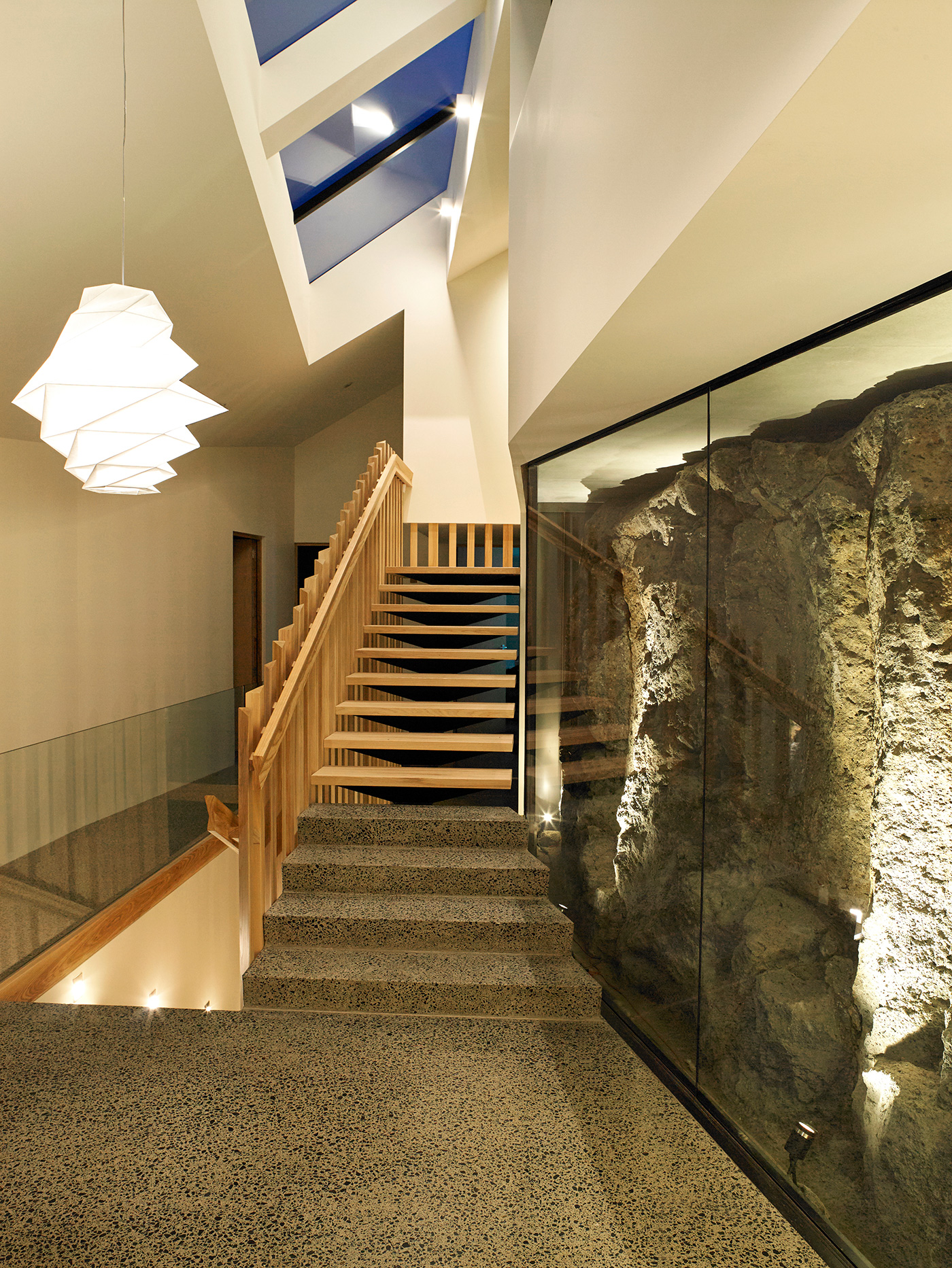
The r-o-c-k is an undeniable presence. Located on a seemingly unbuildable plug of land in the Auckland suburb of Epsom – where the ancient lava flows of Mt Eden once petered out – the rock literally forms the centrepiece of the house. Protruding from the improbable site was a gigantic crag, so large and immovable that the architects thought rather than hiding it, they should make a feature of it. Which is what they did, sheathing the stone in glass like a museum exhibit and building the house around and on top of the natural formation.
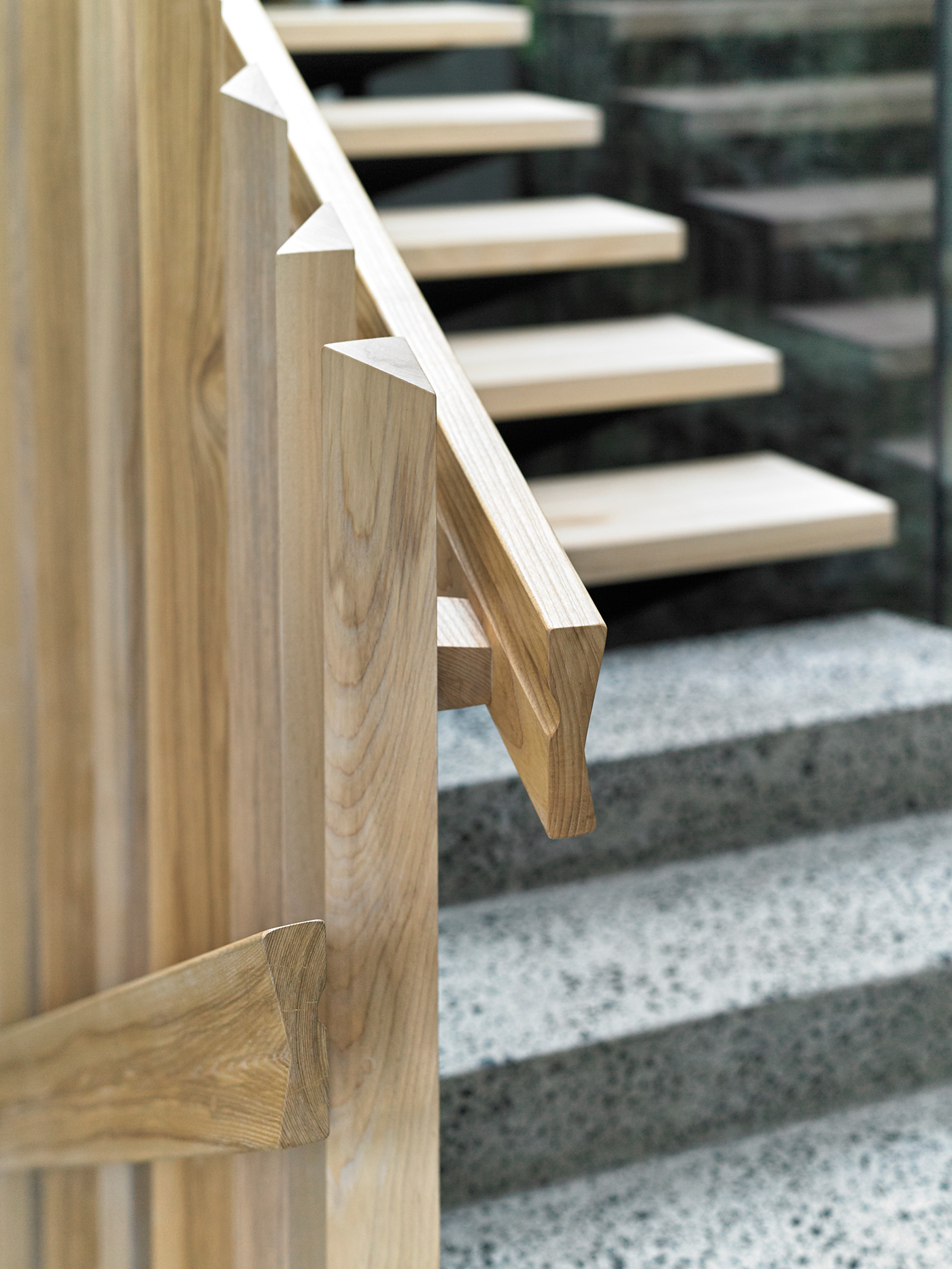
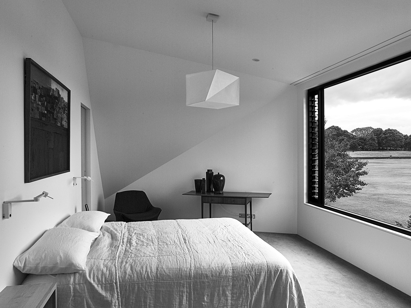
For all that, one might assume entering the house would be like venturing into a cave, but the light and bright space created in the double-height entrance rapidly upsets any notions of dark containment. The surprise is amplified when, in walking up and around the rock to the first floor, you are struck by the view opening up to a perfect plain of immaculate grass and, in the distance, Mt Eden.
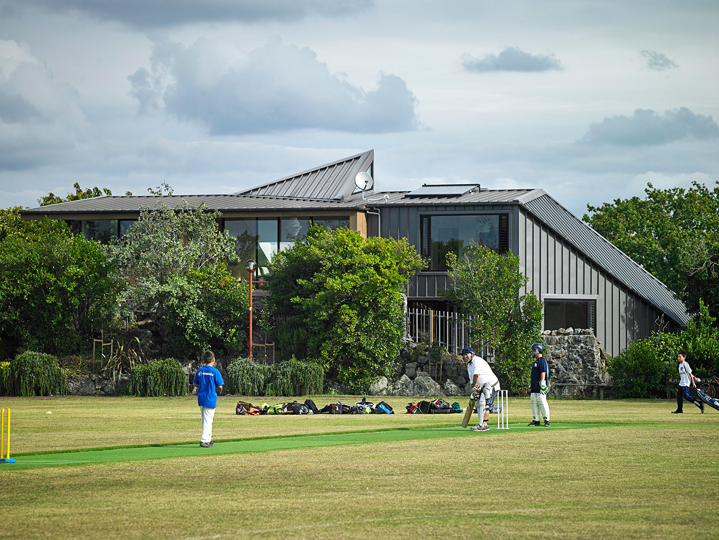
The ‘lawn’ is the playing fields of Melville Park, a green expanse which, conveniently, the owners never need to mow. When cricketers in white dot the grounds, the stadium-style view makes the match seem almost theatrical.
The connection seems apt: the owner, in explaining the great surprise of this house – the unexpected opening up of the view at the top of the stairs – likens it to London’s Festival Hall, where the vast hall is dramatically revealed all at once as you emerge from a walkway tunnel.
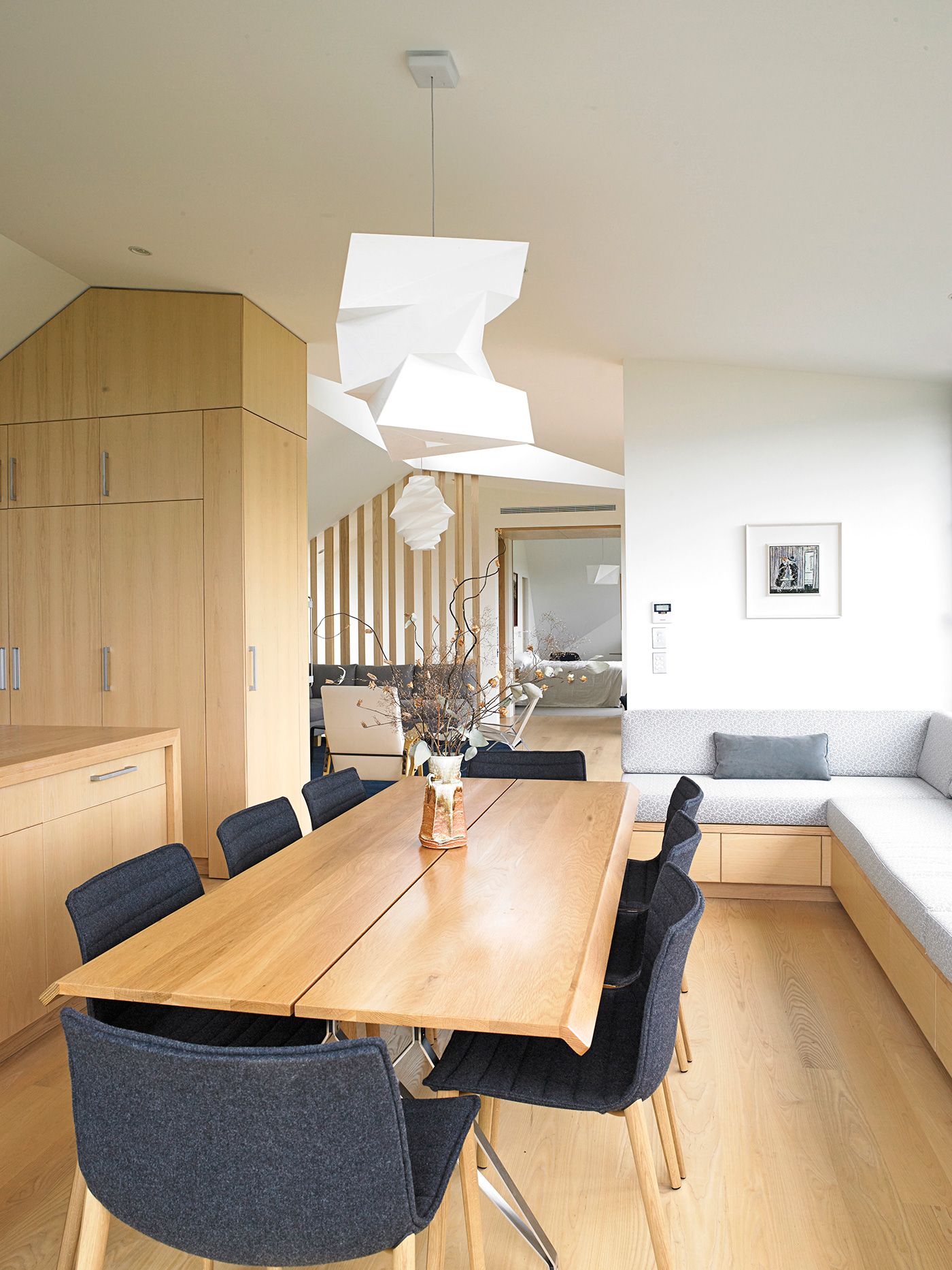
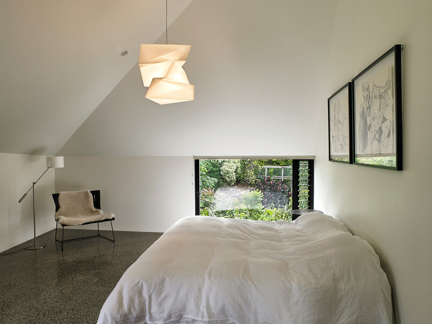
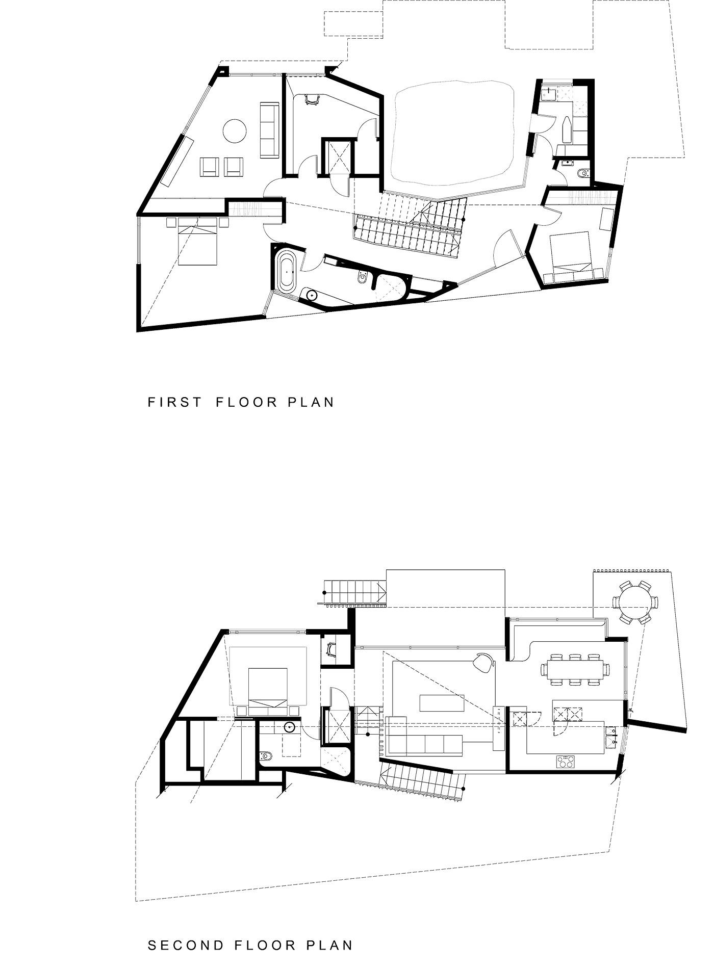
Perched atop the rock, the home’s upper floor is where the majority of living takes place. It is accessible by lift and was designed, in a way, as an apartment: the kitchen and dining are located at one end, with a bedroom at the other and a sitting room in between.
The clients had previously owned a large villa and found, as their children had left home, that there was an awful lot of house they weren’t using. The design for their present lifestyle contains all they need on the one level. This ease, combined with a lift that connects all three levels of the home, provides all the future-proofing they require.
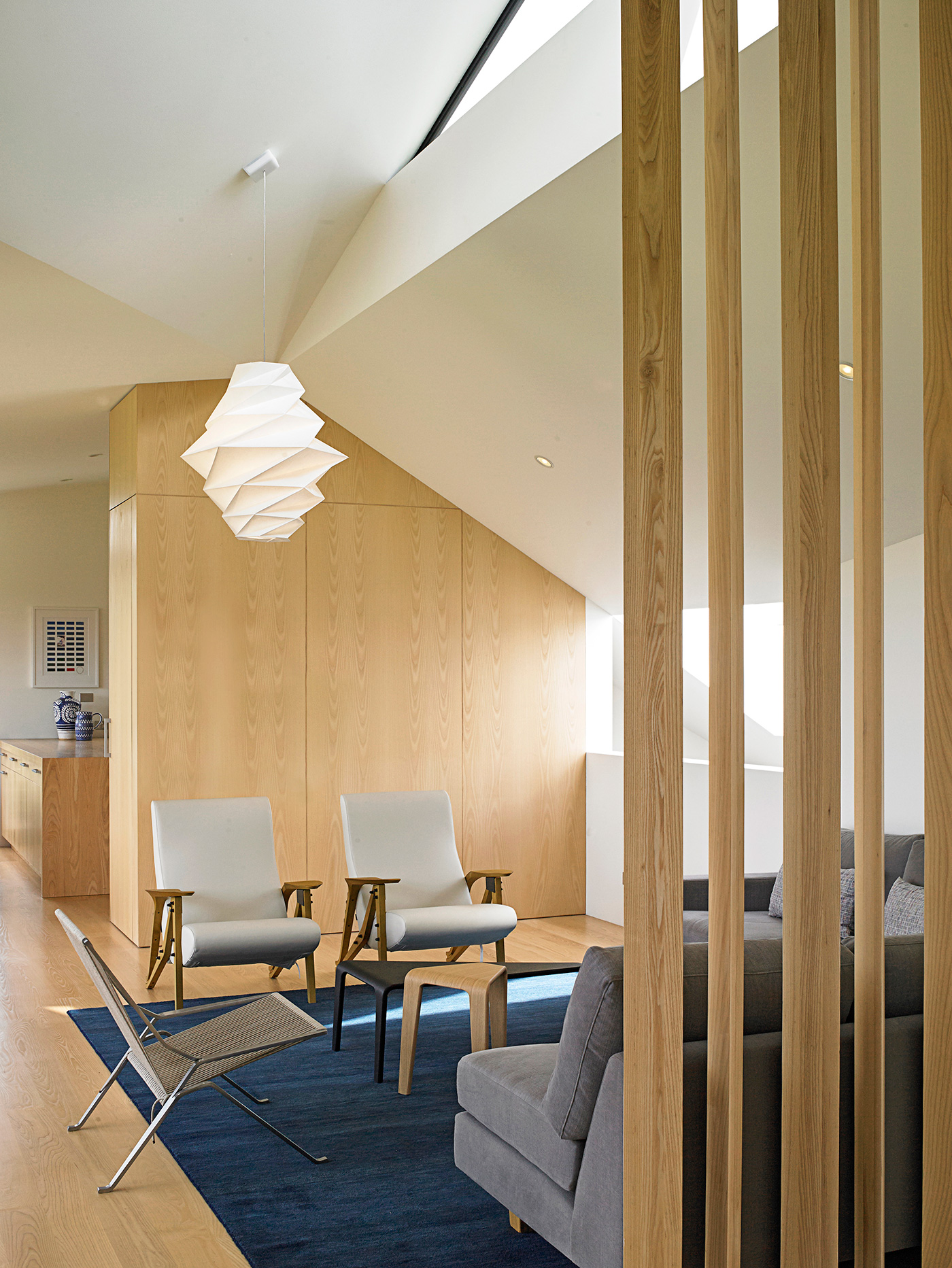
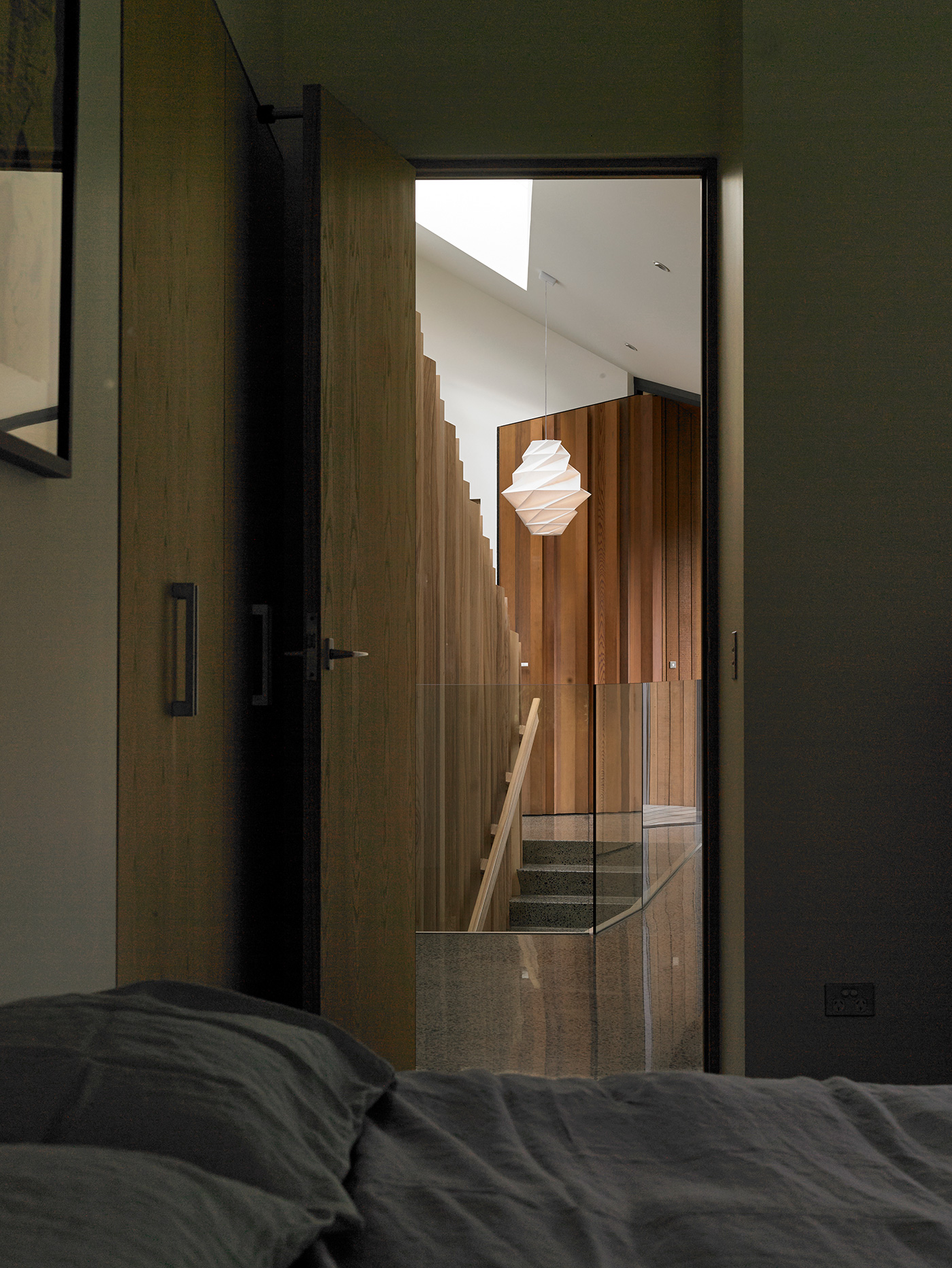
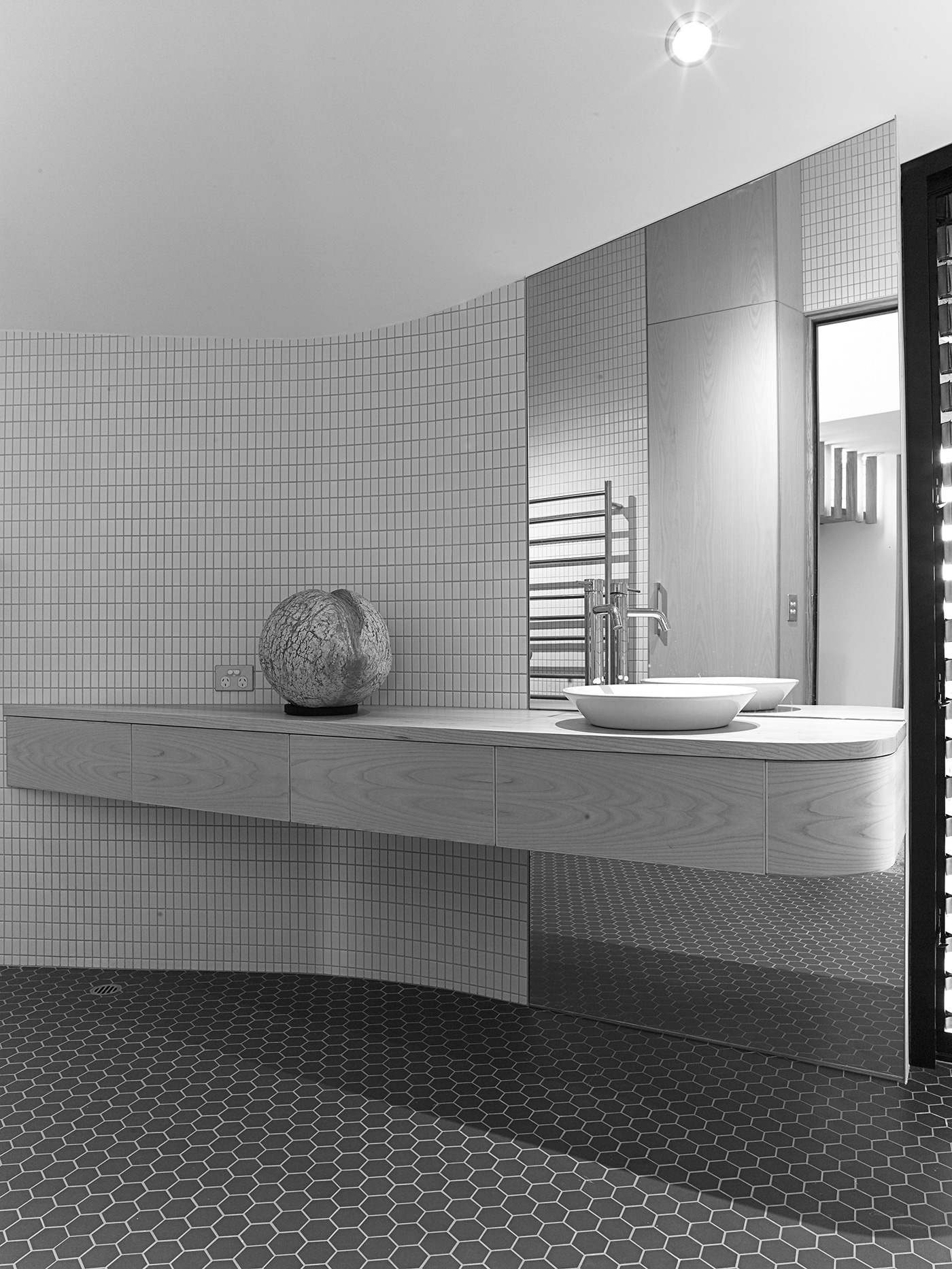
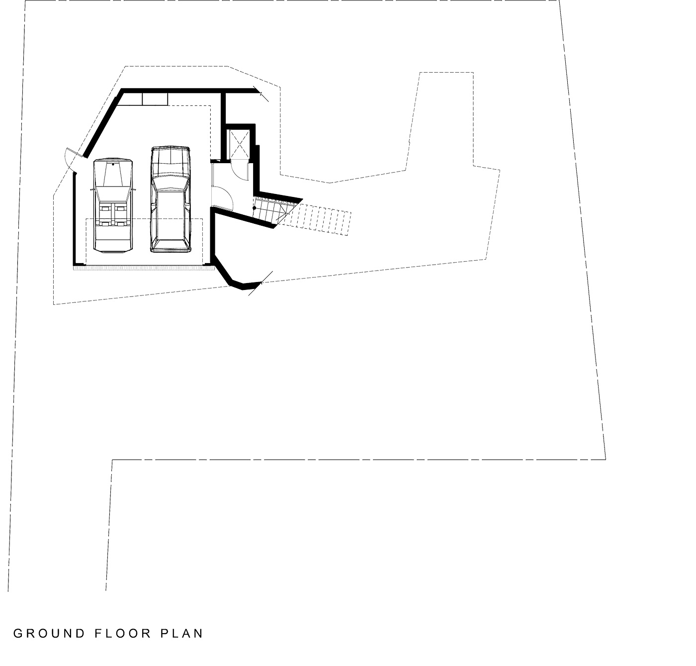
Amplifying the light-filled space, the architects chose blonded-ash timber floors and cabinetry with white walls. Not only does this brighten the interior, but it serves as a contrast to the dark metal exterior. Below the living space, wrapped around the rock, is the home’s entry, guest bedrooms, bathroom, an office and a second sitting room that transforms into a cinema with a retractable screen.
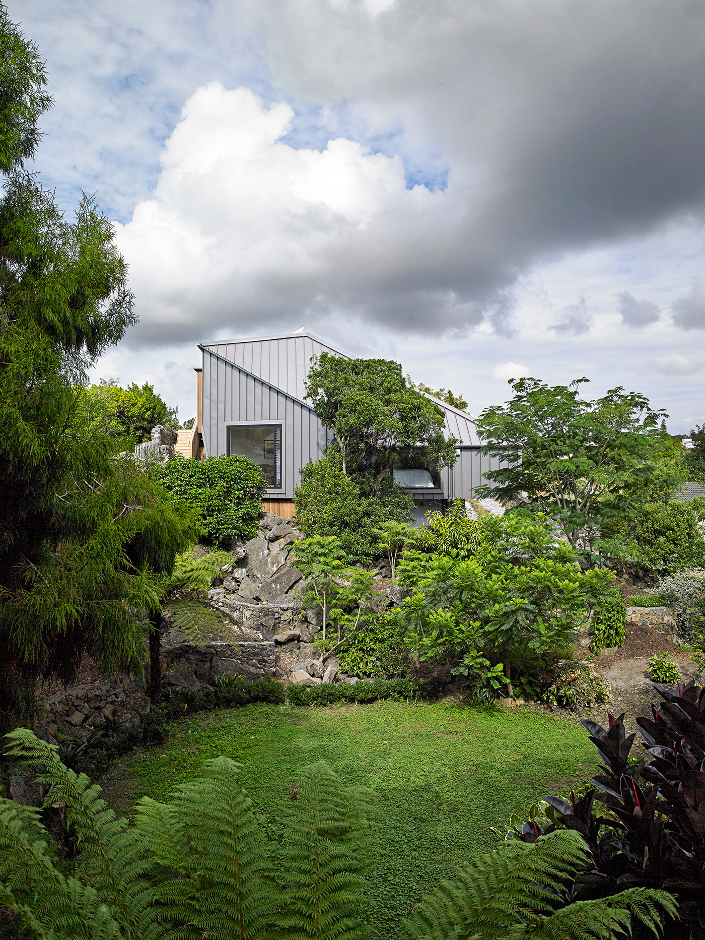
The geometry of the home’s angular exterior was shaped in large part by the site constraints. As Gary Lawson explains, “This is the most difficult site we’ve ever built a house on: access is difficult, coverage is tight, height-to-boundary restrictions hamstrung us everywhere.”
The architects’ response to these difficulties site was to create something incredibly sculptural. In the early stages of design, they modelled the height-to-boundary constraints to understand the limitations of the envelope they were able to build within.
They created a home that never seems awkward or contorted, almost miraculously wrestling a sense of calm from this complex site. There is a confident cohesion to its twists and folds, the composition leavened by an angular skylight that pops up to welcome warm westerly light into the entry and living room.
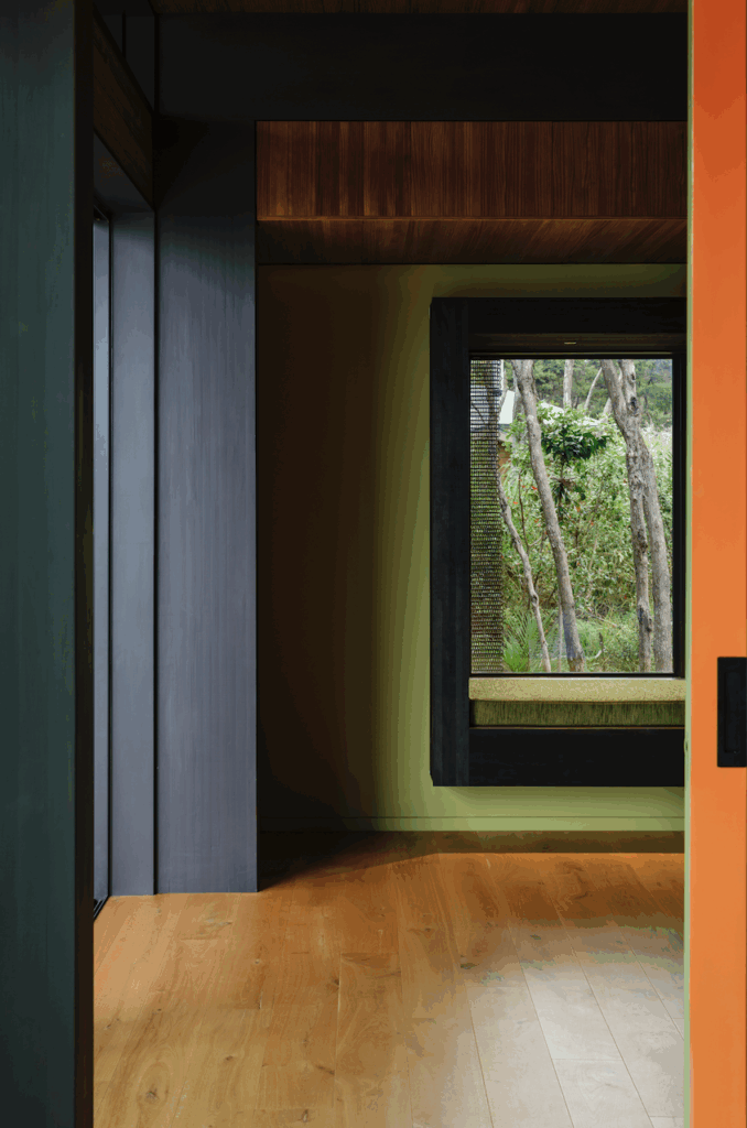
The folds and perforations of the home’s exterior open to offer cleverly constructed views of the park and carefully edited glimpses of greenery outside. One of the best views is also the most unexpected: a low, square window in the west-facing guest bedroom that perfectly frames a neighbour’s exquisite sunken fernery, offering a view of nature so very different to the manicured expanse upstairs.
One of the owners describes the house as a “sculptural answer to a sculptured problem”. Anchored by the heaviness of the exposed volcanic rock, the home then feels liberated to fold, dip and stretch over its site. Full of light, shadow and moments of intensity, it may even be enough to say to Bernini, the baroque master: eat your heart out. – Nicole Stock
Q&A with Nicholas Stevens and Gary Lawson of Stevens Lawson Architects
HOME What was the site like when you saw it for the first time?
Nicholas Stevens It looked more like a quarry than a building site. It was barren and rocky. It barely looked like a site you could build on, in some ways. But we loved that – it’s catnip for us.
HOME Did you consider different approaches to moving around the rock?
Gary Lawson We definitely looked at lots of options. It was quite difficult getting the planning working perfectly. We looked at options where we had to attack the rock a bit to create circulation, but in the end it fell into place. It’s like a Rubik’s Cube: finally you get all sides the same colour. It just takes a lot of work and trial and error and testing.
Nicholas Stevens The rock is right in the centre of the site, so we couldn’t ignore it. We’ve tried to use its centrality as a circulation system, so we climb up a stair that wraps around it, and it makes the whole event more theatrical.
HOME This is a home for an older couple. Did this have any effect on the way you went about designing it?
Gary Lawson One of the clients joked to us when we met them that they were looking for an architect to design his ‘departure lounge’ – we said “well, let’s make it first-class!” Our design response to this was to arrange the planning so they could live 90 percent of their time on the top level, consisting of living areas and main bedroom, and to connect to the rest of the house with a lift. We also did some subtle things such as make the stair risers quite low, and the treads wide, and gave good consideration to accessibility inside with regard to door widths and bathroom layouts.
Photograph by: Mark Smith.
