Kiwi-bach living inspired the design of this new house on the waterfront at Mount Maunganui, which honours the 1940s cottage it replaced
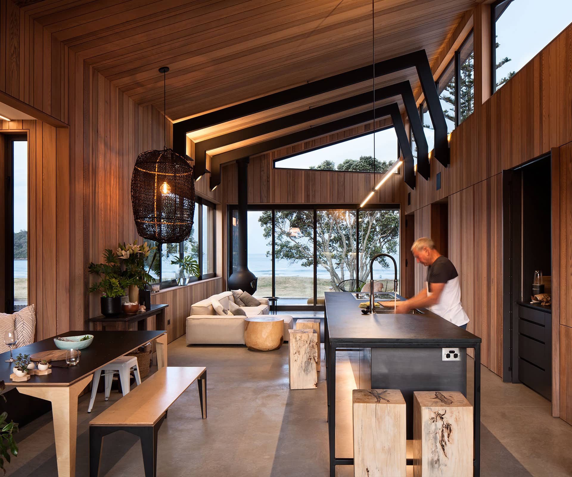
A modern Mount Maunganui cottage honours the 1940s bach it replaced
There is something about Mount Maunganui that pulls you away from the sea to rubberneck at the mansions: on family holidays we always drive along Marine Parade and pick a favourite. But it’s not beauty that distracts us – more likely, it might be the diversity of architecture, a trajectory further and further away from the Kiwi bach.
I always pick the baches: I get a thrill out of the visual protest of these shabby structures that remain despite being overshadowed by neighbouring palatial holiday homes. Yes, I would own a bach and tend to it and, despite all offers from multimillion-dollar property investors, I would leave it exactly as is.
When Heather Coyne and Mark Winter bought a piece of land right in the middle of Marine Parade in 2008, they embraced the 1940s cottage that occupied the front of the section. The couple had plans to build on the back half and use the front dwelling both as an office space and accommodation for overflow visitors in peak holiday season.
[gallery_link num_photos=”14″ media=”https://homemagazine.nz/wp-content/uploads/2016/12/img10-4.jpg” link=”/inside-homes/home-features/mount-maunganui-home-shares-spirit-kiwi-bach” title=”See inside this stunning space”]
The cottage and large pohutukawa tree on the site were well known to Mount locals and the decision to build a well-designed, modern dwelling at the back of the section was widely discussed: locals were relieved that the cottage would remain centre-stage (the new building featured in the December 2012/January 2013 issue of HOME).
The new house was designed to be open, simple, spacious and extremely private. In effect, it used the cottage to block its view. “I think the philosophy has always been that if the land is worth X amount, you have to maximise every cent of it because you pay so much for the land,” says Winter. “But we were sort of the other way around. Just because you pay a lot for a section, doesn’t mean you have to build a mansion on it.”
But the newly built dwelling didn’t become the holiday home it was intended to be: Winter and Coyne moved in for a summer and never moved out. The couple had sold a large chunk of their business and Coyne was able to retire early. Family had migrated to the Bay of Plenty.
They returned briefly to their home in Hamilton and found there was no real reason to stay. “They occupied the site and they said, ‘This is us,’” says architect Evan Mayo of his clients. “They completely simplified their lives.”
Winter and Coyne spent a year living in the back house and in that time they grew to understand the nuances of their setup. They observed where the sun landed at certain times throughout the day, that in the afternoon at the beach you get a sea breeze, and at other times there is a prevailing westerly. They spent a summer listening to the Mount’s influx of people and found their noise to be joyful, not the irritant they expected.
They also realised the sunniest spot was right where the cottage was – and the romance of the shack, as they call it, began to dwindle after spending a winter using it as an office with the fire and the heater on, still needing to wear gloves.
They decided that to maximise their use and enjoyment of the land, the pohutukawa tree would stay, but the cottage had to go. “It was really hard to get rid of it,” says Coyne, who gifted the much-loved cottage to family friends.
When they first met to discuss designing the back house, Coyne and Winter took a picture to Mayo at Architecture Bureau (he had already worked for them on a Hamilton property). This time, they had less idea about what they wanted the front dwelling to be.
They took 18 months to come up with plans that centred around making the back house a place for friends, family and visitors, while the front dwelling would be more about them. “We just wanted a nice place to live and to not have to do too much cleaning,” says Coyne. “And we have tried not to build a Mt Maunganui palace,” says Winter.
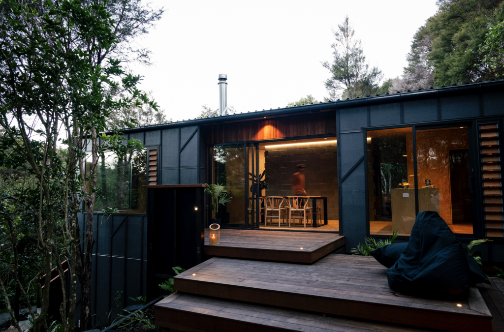
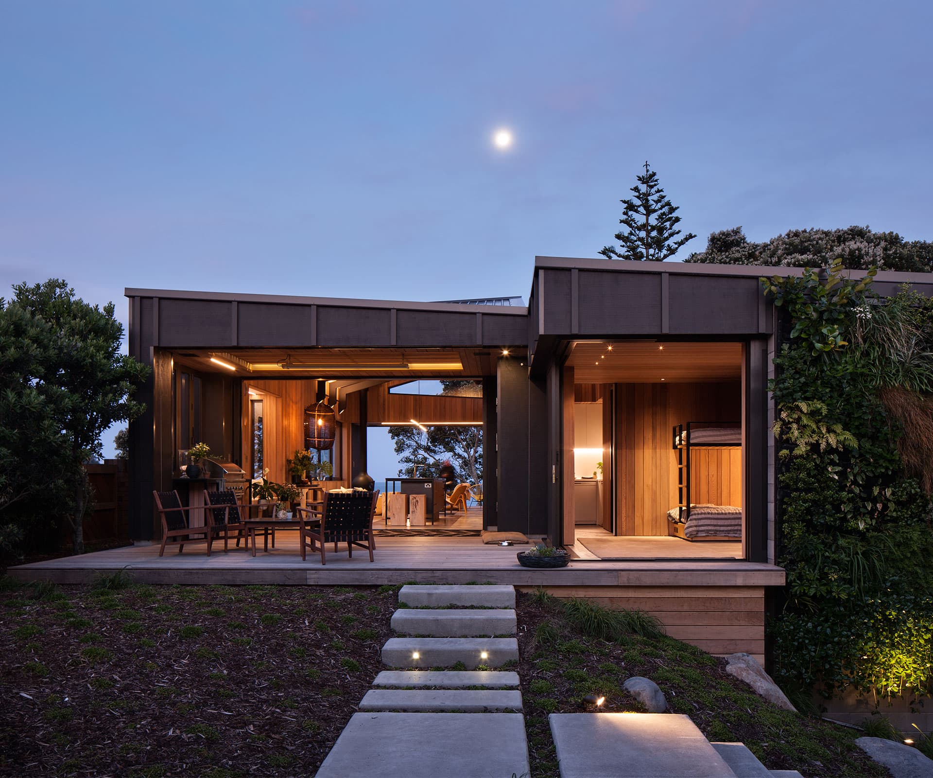
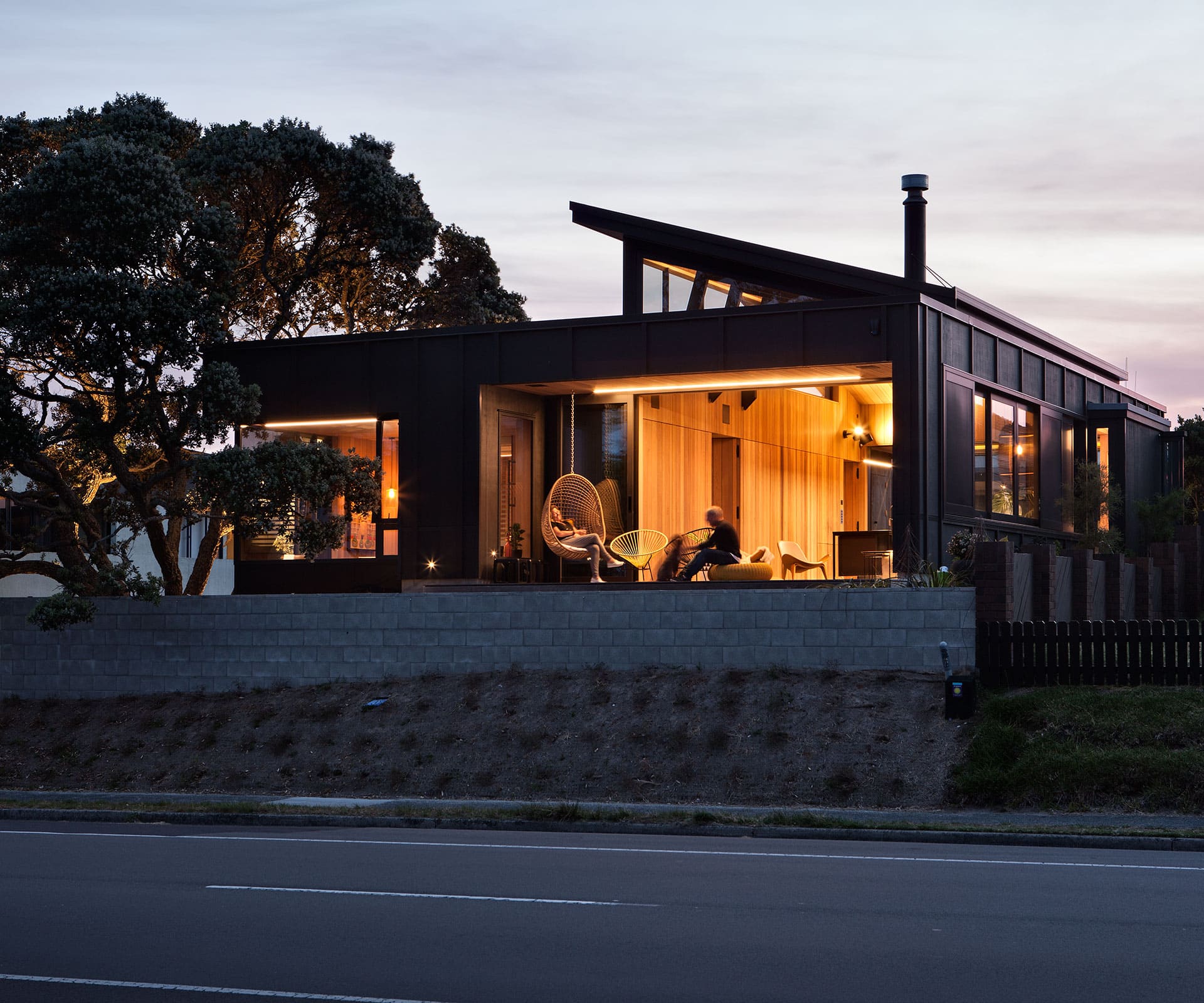
What’s most surprising about the new house, perhaps, is how it captures the feel of the old one. “The cottage was sort of a starting point,” says Coyne. “We wanted to make a modern version of what was there.” The charcoal Shadowclad exterior is a direct nod to the old, as is the cedar-panelled interior (there’s no plaster board in the house, and no skirting).
Although it is roughly twice the size of the cottage, it still looks intricate and bachy at a comparatively modest 155 square metres.
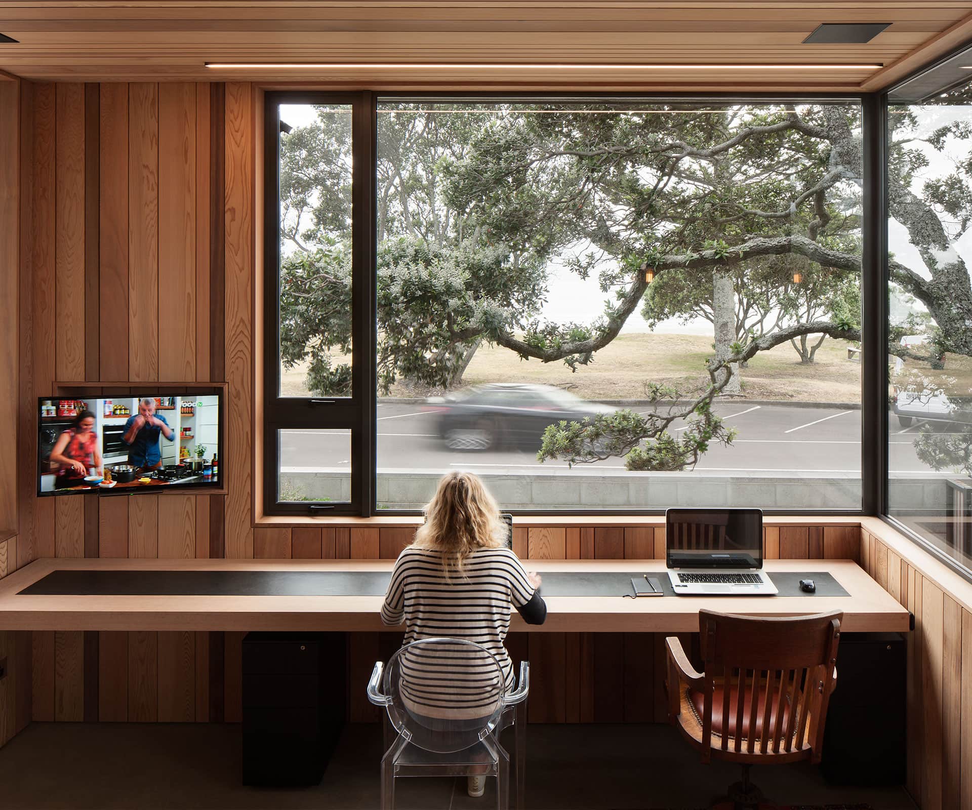
The entire structure is designed around the tree. The office sits beneath the pohutukawa, a couple of steps down from the living area; carefully placed windows capture the sea and the tree at every possible angle, with the ability to shut down each for privacy and open them for ventilation.
There are perforated screens with double glazing, and automatic blinds for privacy. And thanks to the openness of the front house, the back now has view shafts it never had when the cottage stood there.
A courtyard bridges the two houses and creates a private area – “like camping with tents around a space in the middle”, says Mayo. A greenwall covers the back right-hand corner of the front house to reduce the scale of the building and create visual interest.
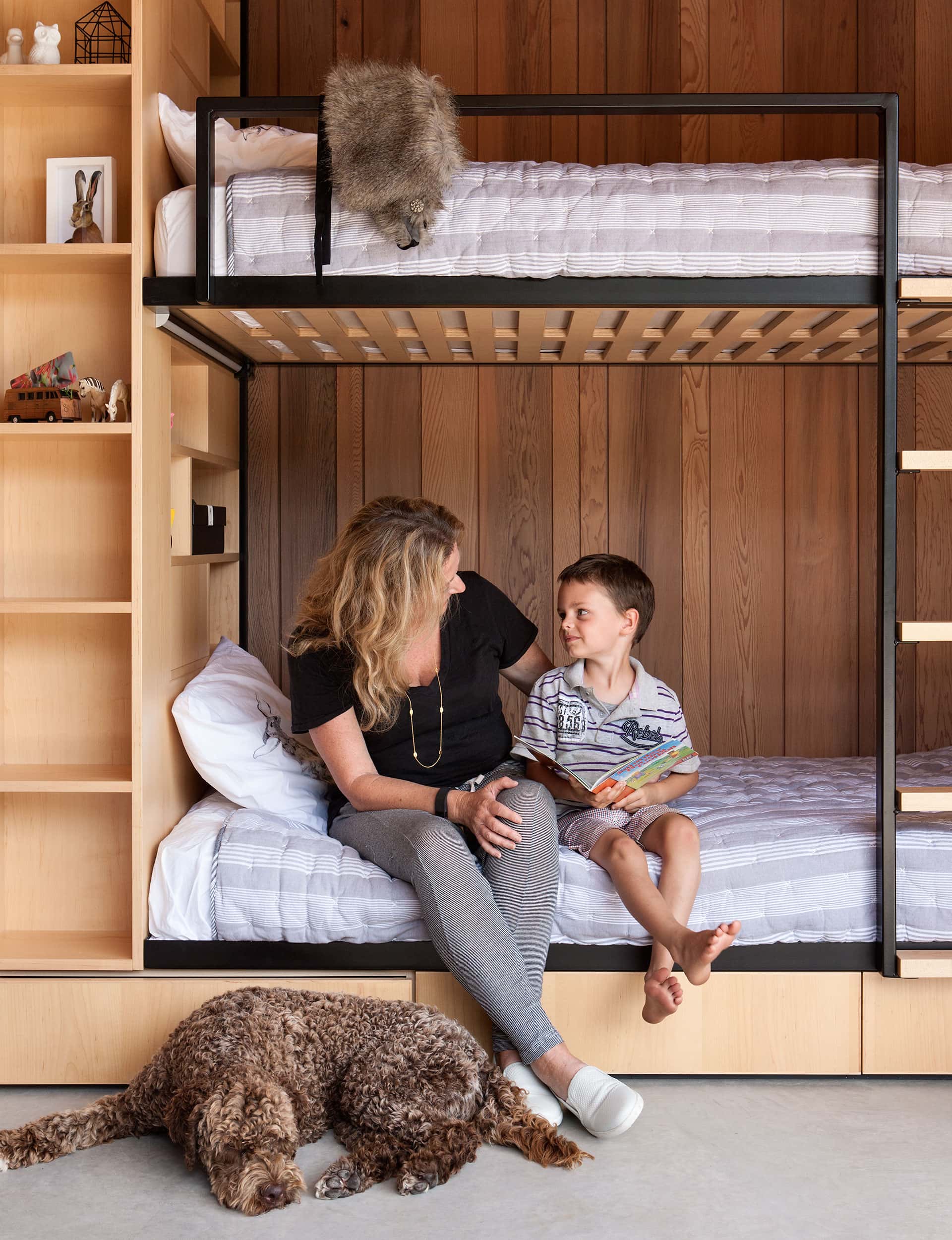
The property now has a total of six bedrooms and four bathrooms, but the front house only contains two of them: a master bedroom and a bunkroom for the three grandchildren. Every scrap of space in the house is lived in. “I think we have maximised it by minimising it,” says Coyne.
After looking through the house that day, I drove past at night and it was lit up inside, silhouettes moving through the spaces. And I changed my mind: this is my favourite. It’s new and beautiful and it serves the purpose all houses should – it’s only as big as it needs to be, and it’s designed to bring people together.
Words by: Aimie Cronin. Photography by: Simon Devitt.
[related_articles post1=”58194″ post2=”60904″]
