NZ at the Venice Architecture Biennale

If you’re headed Euro way, there’s still time to visit the wonderful Venice Architecture Biennale, where New Zealand is making its first-ever appearance. The Biennale is on now and runs until November 2. The New Zealand exhibition, headed by creative director David Mitchell, responds to the Biennale’s theme of ‘Absorbing Modernity’ by making a case for a unique Pacific strain of architecture. HOME editor Jeremy Hansen asked John Walsh from the New Zealand Institute of Architects, who organised New Zealand’s Biennale presence, about the exhibition.
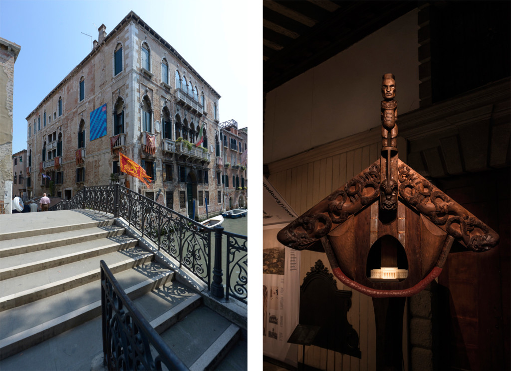
Palazzo Pisani, the site of the New Zealand exhibition at the Venice Architecture Biennale (left), and the whatarangi inside the New Zealand exhibition, with a small model of the Auckland War Memorial Museum inside it (right). Photographs by John Gollings.


HOME You were there! How did the New Zealand exhibition look, and how did it seem to be received?
John Walsh The exhibition, with its tent-like centerpiece and just-carved whatarangi, looks very ‘Pacific’, especially in the context of its venue – the ground floor of a building that has been standing in Venice for almost as long as New Zealand has been inhabited. And the lightweight ‘Pacific’ form of the New Zealand pavilion aptly illustrated the argument presented by its creative director, David Mitchell. Biennale Director Rem Koolhaas had asked national pavilions to address the theme Absorbing Modernity: 1914-2014. Does modernity mean homogeneity? Mitchell’s exhibition proposes there is something different about New Zealand architecture, and this difference is attributable to Pacific inheritances and influences. Visitors to the exhibition – journalists and architects, tourists and locals – seem to understand the story being told. The pavilion’s opening events were much appreciated. They were made special by Māori welcomes led by Rau Hoskins – one of the creative team – and Rihi Te Nana.
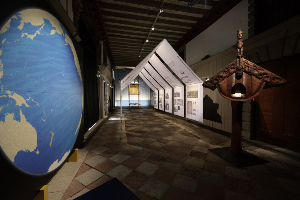
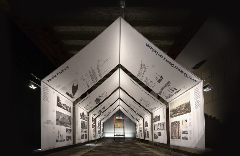
The exhibition featured a work (left) by Kim Meek that showed New Zealand's place in the Pacific, while the exhibition itself was presented in printed panels on a white, tent-like structure. Photograph by John Gollings.
The exhibition featured a work (left) by Kim Meek that showed New Zealand’s place in the Pacific, while the exhibition itself was presented in printed panels on a white, tent-like structure. Photograph by John Gollings.
The tent-like structure's panels featured New Zealand buildings that reinforced creative director David Mitchell's case that the country is home to a unique strain of lightweight Pacific style architecture. Photograph by John Gollings.
The tent-like structure’s panels featured New Zealand buildings that reinforced creative director David Mitchell’s case that the country is home to a unique strain of lightweight Pacific style architecture. Photograph by John Gollings.


HOME What did you enjoy the most about the wider Biennale?
John Walsh This Biennale is richer and more coherent than some others have been. Koolhaas persuaded exhibitors to stay on theme, and corralled a huge team to research his bits of the Biennale, one of which is Monditalia, a frank and engaging look at modern Italian architecture and its contexts. Fascism and Berlusconi, earthquakes and the mafia, books, movies, theatre and even dance – you could spend a day down in the Arsenale, where the Venetians once mass-produced their trading and fighting galleys. Some national pavilions survey a century of architecture, but others, more interestingly, focus on a moment or one tight idea. The French have a large model of the modernist house that was the villain in Jacques Tati’s film Mon Oncle; the Austrians have scale models of all the world’s parliament buildings (the Aussies’ Parliament is huge); the British focus on post-war modernism in its Brave New World heyday; the Germans have rebuilt the modest, democratic 1964 bungalow of the Chancellor inside their Nazi-tainted pavilion. There is a lot of thought-provoking stuff.
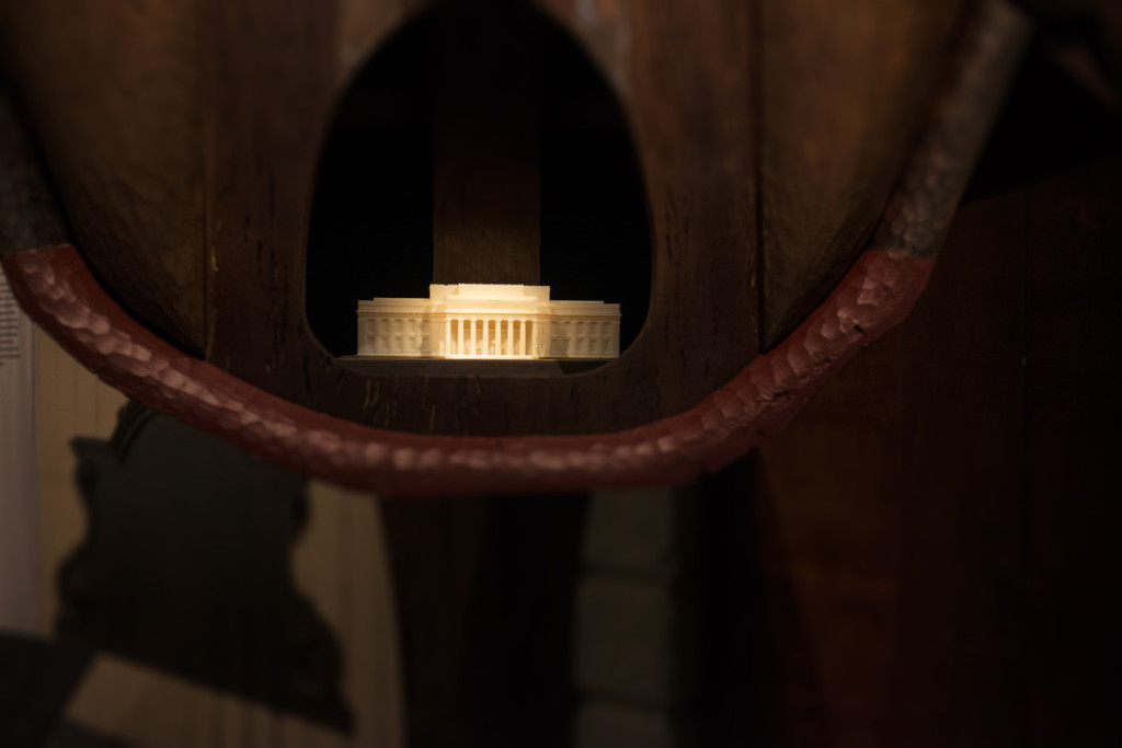
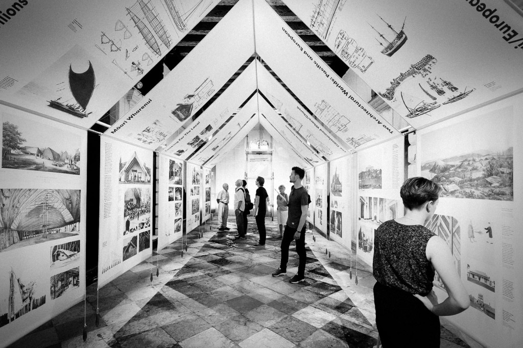
In a nifty bit of reverse colonialism, a model of the Auckland War Memorial Museum was placed within the whatarangi, an inversion of the wharenui that is housed inside the actual museum. Photograph by John Gollings.
Visitors inside the New Zealand exhibition. Photograph by Alexander Mayes.
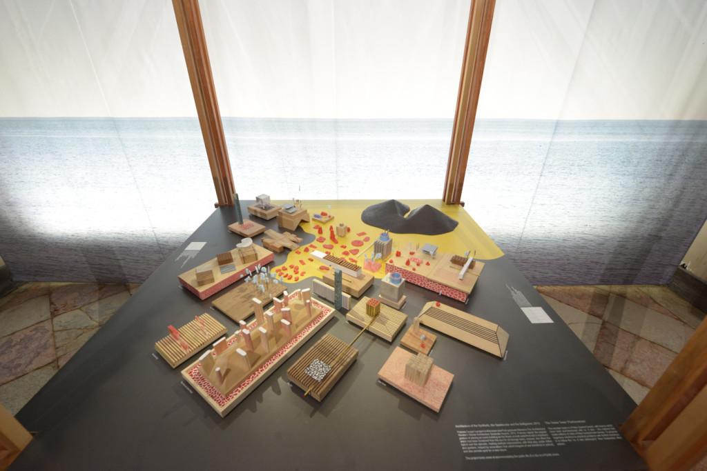
Models of proposed development at Auckland's North Wharf by Frances Cooper, an international award-winning graduate of the University of Auckland architecture school, were also part of the New Zealand exhibition. Photograph by John Gollings.
Models of proposed development at Auckland’s North Wharf by Frances Cooper, an international award-winning graduate of the University of Auckland architecture school, were also part of the New Zealand exhibition. Photograph by John Gollings.


HOME This was New Zealand’s first exhibition at the architecture Biennale. Does this mark the start of a more consistent presence there from the New Zealand Institute of Architects?
John Walsh We learned a lot this time around, and it would be good to build on our first exhibition. It’s a big undertaking, though, and we’ll need to find a sustainable model if New Zealand is to be a regular Biennale participant.

You can read more about New Zealand at the Venice Architecture Biennale at the NZ Institute of Architects’ dedicated site, venice.nzia.co.nz

Latest video features

In the Coromandel, a home with a humble profile and a thoughtful design makes the most of a stunning location.

Built with awe-inspiring attention to detail, this Arrowtown home is a fresh interpretation of a familiar Otago rural vernacular.

This sculptural Northland bach is a perfect north arrow on a remote farm high above the sea.

With the sun on its bow and the community at its stern, this is a house in which the elements are always front of mind.

Trending articles

Homes

Pavilion in the clouds

Five simple elements and the well-placed delivery of a stunning view define this minimalist, Hawke’s Bay home by Dorrington Atcheson Architects.

Homes

Urban bach

When a client’s brief is to “come up with something you think looks good”, the parameters are so open and the trust so complete that

Homes

Corner villa

This clear insertion into the back of a century-old Wellington villa provides an extra 135 square metres and a myriad of spatial experiences for the

Design News

Heart of craft

Step into the Auckland headquarters of design and make studio, Fieldcraft, and you’re immediately immersed in a world of creativity that extends well beyond these