Winner of the Kitchen and the Colour categories in this year’s HOME Interior of the Year Awards, this internationalist interior by Arent&Pyke is a soulful expression of creativity and intimacy.
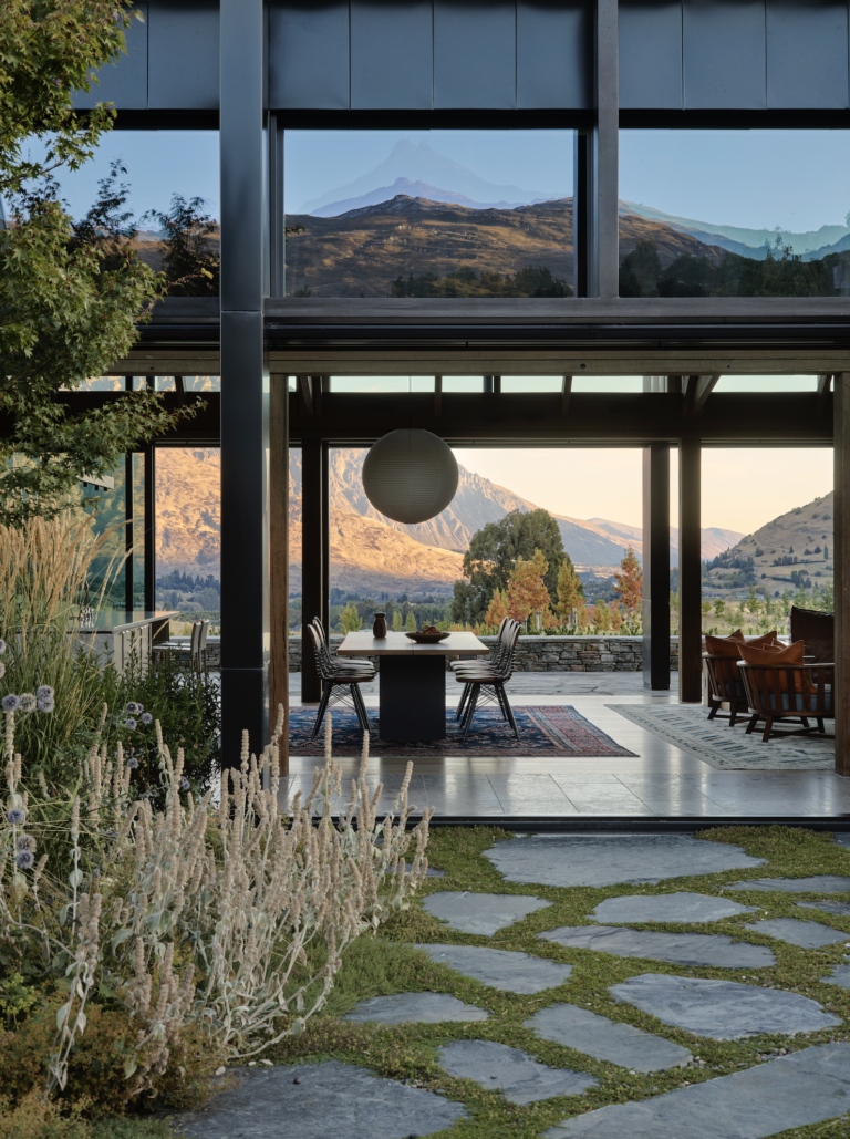
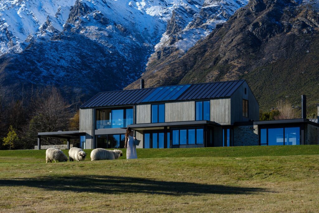
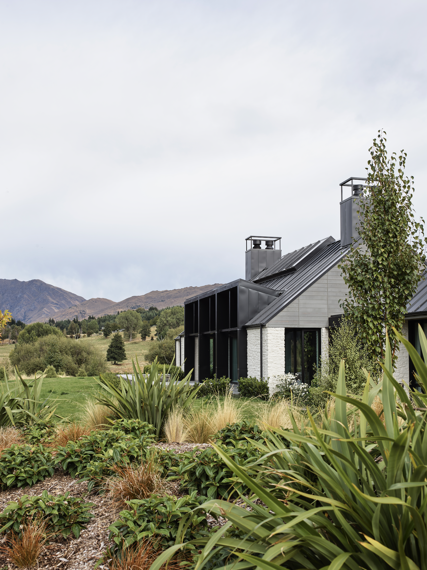
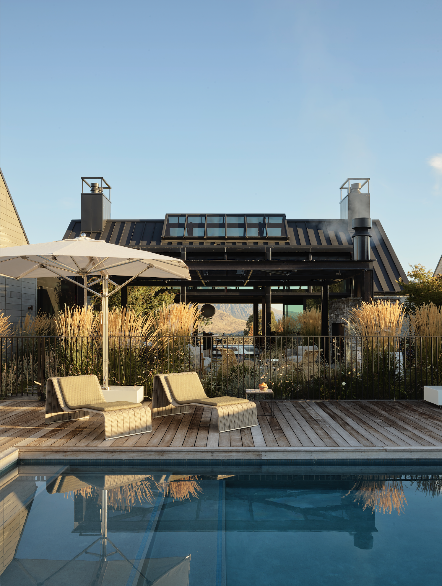
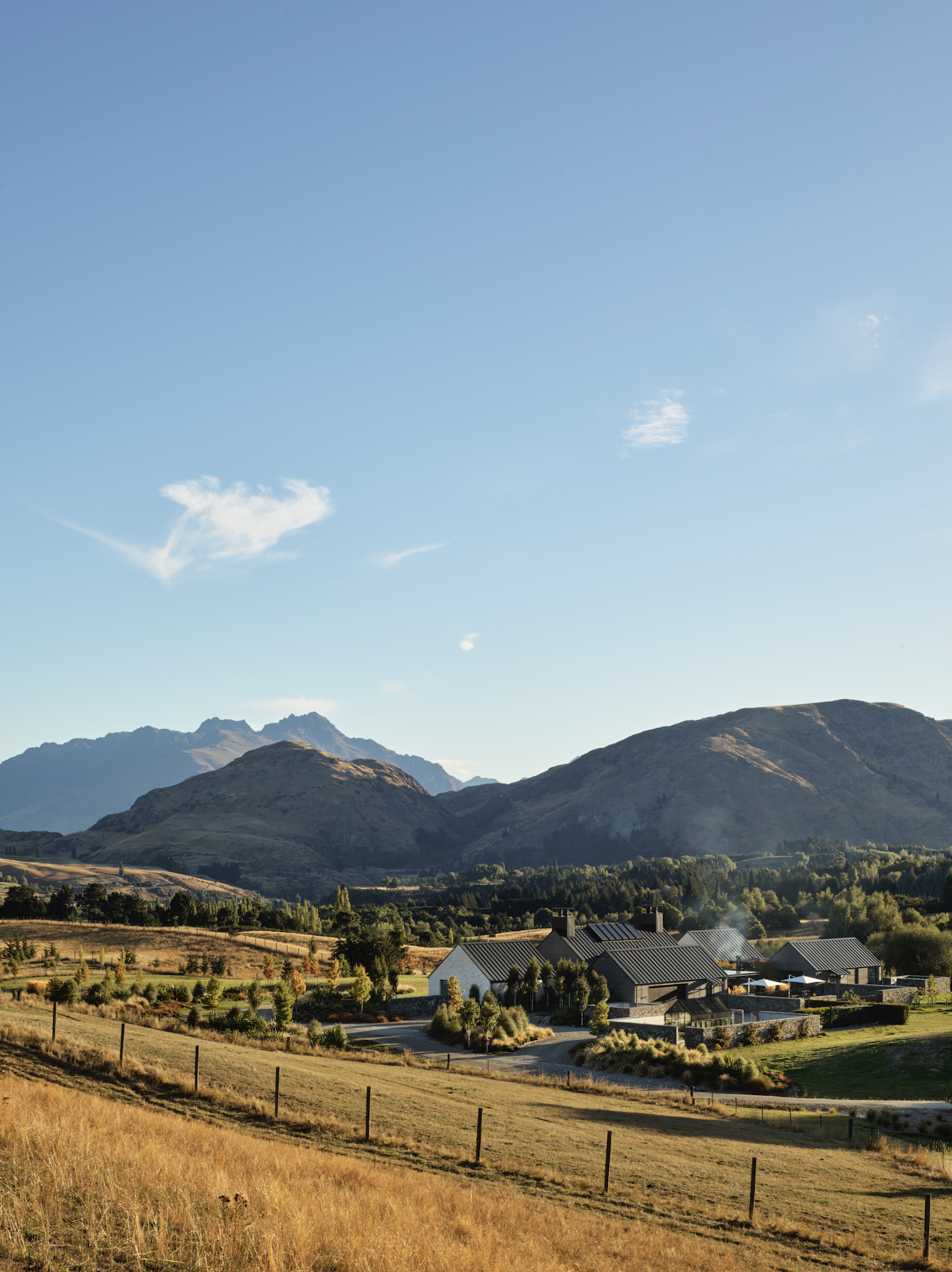
Within the vastness of the Queenstown skies, bathed often by sunlight reflected from fresh snowfalls; positioned on a 35ha plateau in the Wakatipu Basin; and overlooking the enormity of the alpine ranges — how does an interior bring human scale to such a picture?
How can a room ground and envelop its inhabitants or, like Sarah-Jane Pyke from Australian design firm Arent&Pyke asks on the phone, “How do you sit on the sofa and not feel lost?”
Having relocated to Queenstown from Sydney, a family of two adults and four young boys commissioned their ‘forever home’ from Auckland architects Sumich Chaplin. The idea was to create a comfortable rural lifestyle while still being close to the amenities of the city.
Given the vastness of the context, the architects realised early on that part of the project would involve creating “domestic scale within a dramatic rural landscape”.
As a response, they designed a cluster of horizontal single-level buildings around a central courtyard from which the main living spaces opened to both the north and south aspects.
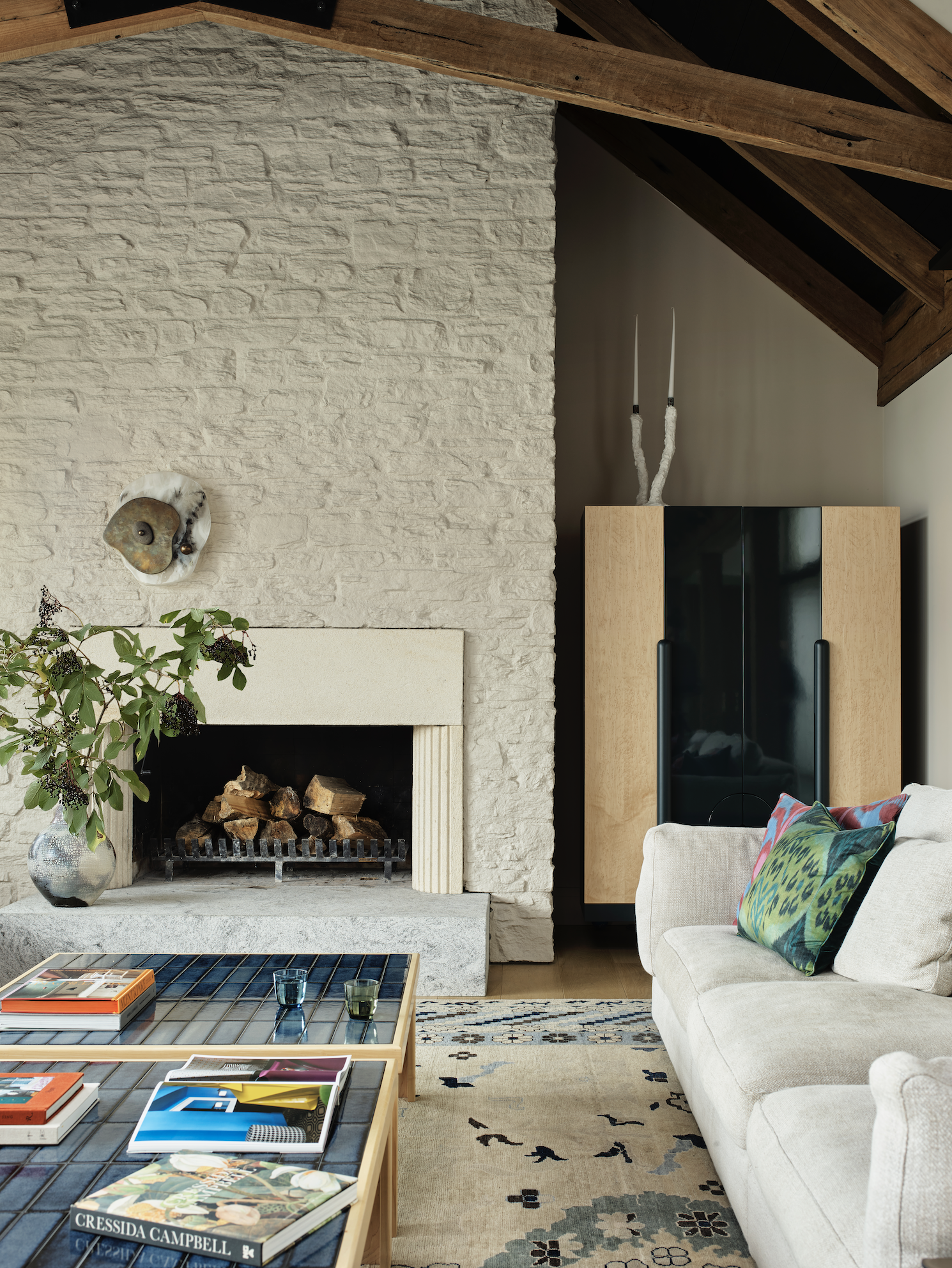
This is a generous, sprawling set of buildings connected by glazed flat-roofed galleries and natural rock landscape walls. The house is composed of cedar and bleached schist rockwork, steel roofing with a wide profile, and substantial glazing, all hung from a high-pitched gable and the modernised vernacular of the southern barn. It is traditional at heart and uses a highly recognisable vocabulary converted to modern standards of comfort.
“I flew to Sydney to spend two days with the clients and with Arent&Pyke,” says Matt Chaplin of Sumich Chaplin, on the phone from Bordeaux, “to go over the initial concepts of where we would take the interior and bring some of the exterior materiality of the house in.”
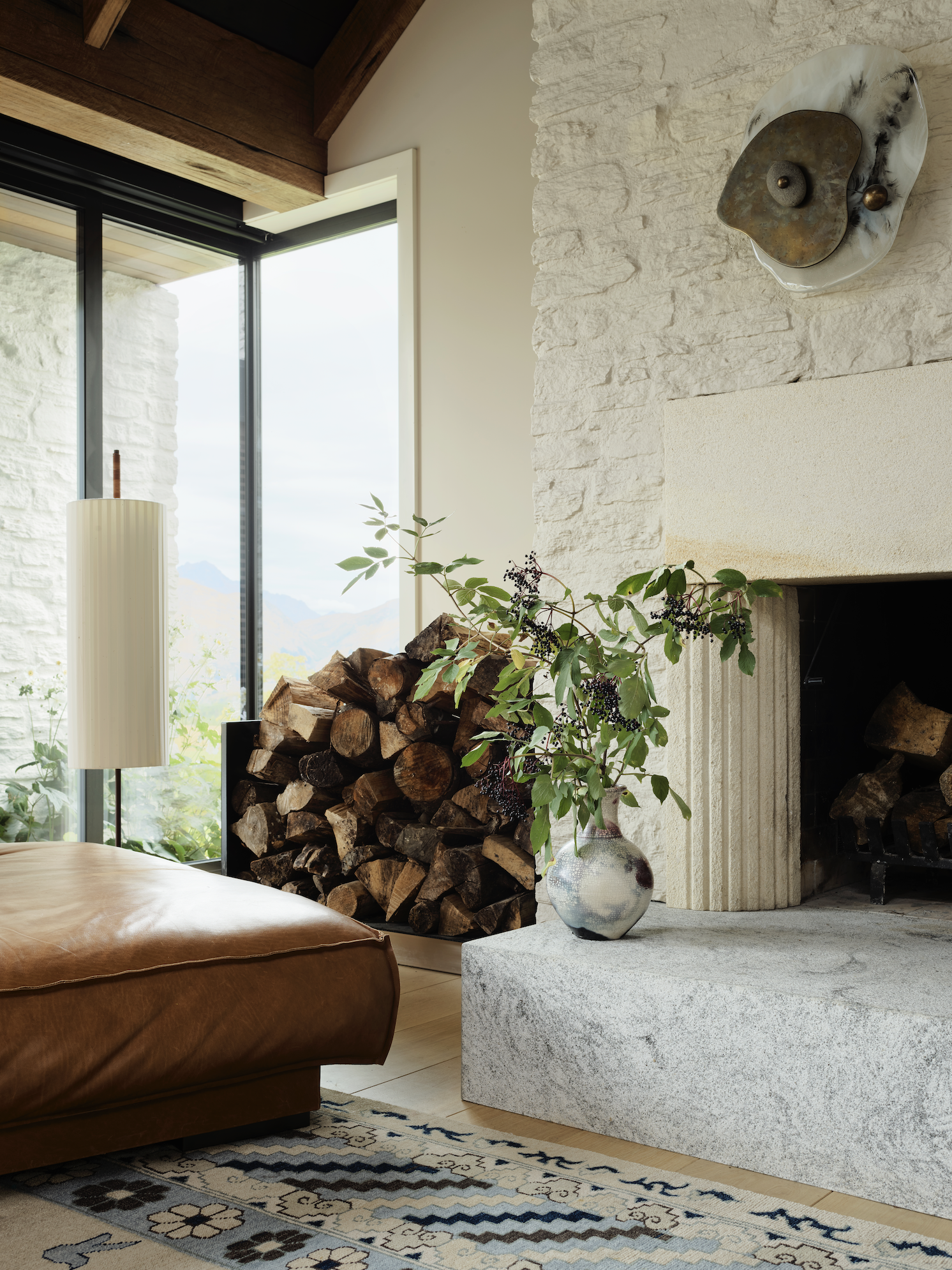
One of the main moves to conceptually rupture the envelope was to allow the rockwork cladding of the main living area and bedrooms to also line the interior.
“That was done referencing historical buildings that were very close to the site,” continues Chaplin. “Historically, they used to limewash the rockwork so that it helped keep [the house] warm because that would seal the rock. We spent quite a bit of time researching the methodology behind that and ended up finding a product to paint and wash the rock, and that was also taken into the interior.”
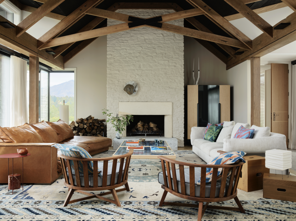
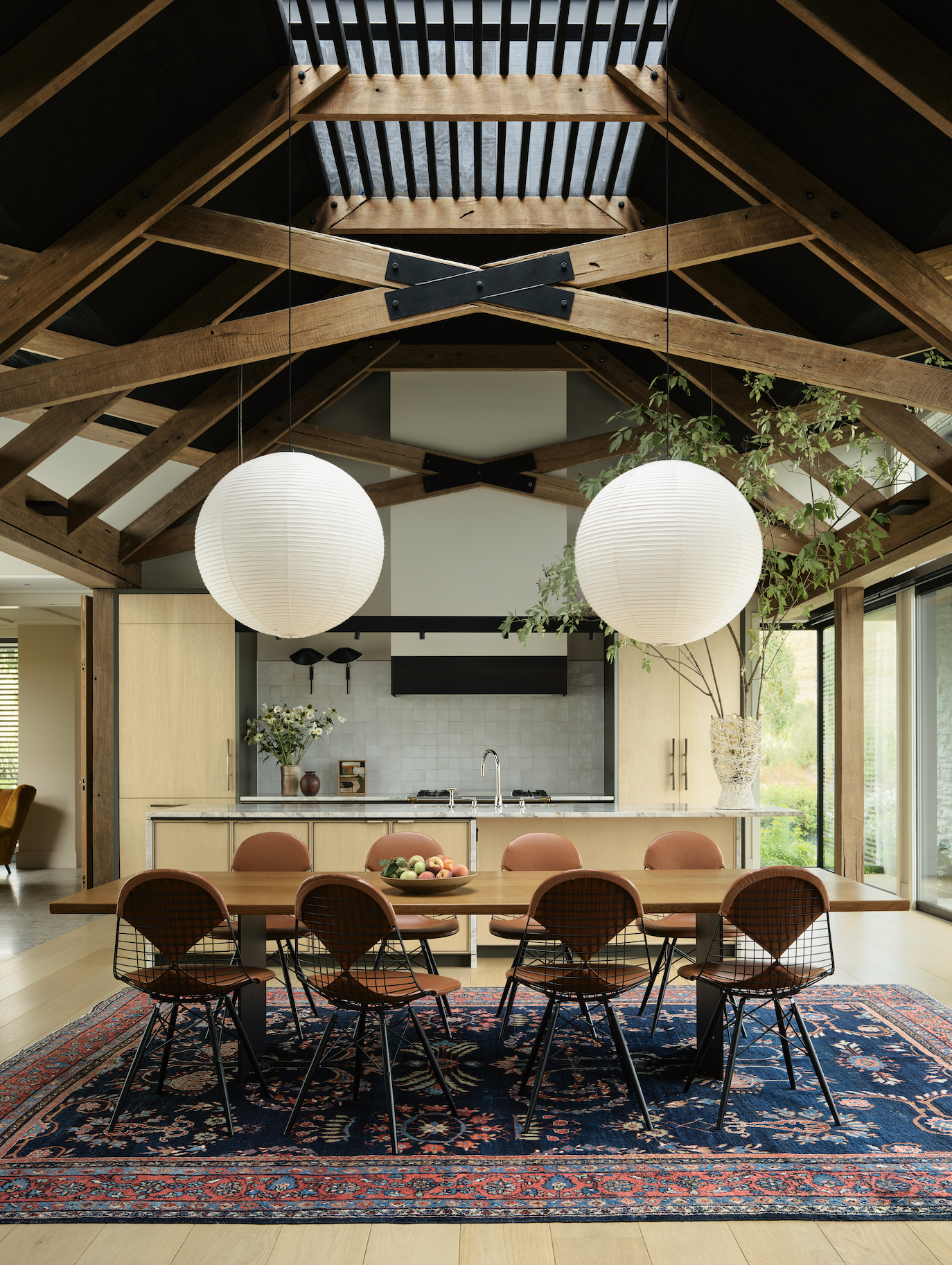
Continuing the historical references in the main living space — made up of the lounge, kitchen, and dining zones, and which was aptly named ‘The Great Room’ — Sumich Chaplin introduced recycled timber beams in elegant scissor trusses. They sit under a soaring, high-pitched gable and a ceiling lining that was, unexpectedly, stained in a nearly black colour. “We did a whole number of samples of that. In our minds, it was like, Is it going to be timber coloured or is it going to be white?, and then we thought, Maybe it needs to go even deeper … maybe it’s black!” says Pyke, confessing to trial-and-error experiments that involved the builder climbing scaffolds and pinning material to the rafters.
A wrong move would have been disastrous for delivery schedules, budgets, and reputations, and, as Pyke says, the trust given to her team by both the client and the architect was “considerable” — but was it merited?
“At the time, I wondered whether that was the right thing to do,” confesses the architect, “because it’s a big, lofty ceiling, and I wondered whether painting it dark was going to be overbearing.”
“It ended up being a masterstroke,” says Chaplin. “It was a beautiful move that resulted in a beautiful space, and the ceiling kind of disappears and the aged timber becomes the main element and is really exaggerated against the dark ceiling.”
Pyke: “It was bringing that scale down, bringing some intimacy into that room. We didn’t want the light kind of bouncing around, and we certainly didn’t want it to feel like a beach house with big white rafters and ceiling … especially because of all the light pouring in through the big skylights in the centre.”
The result in the main living space is reminiscent of a night sky, while the carefully designed lighting provides a warm glow: “It’s a very special place, and lighting was critical to get that right,” agrees Pyke.
Serge Mouille shades, Akari paper lamps, and spherical pendants add a gentle touch among the home’s robust frames, as does the crinkled Ingo Maurer desk light.
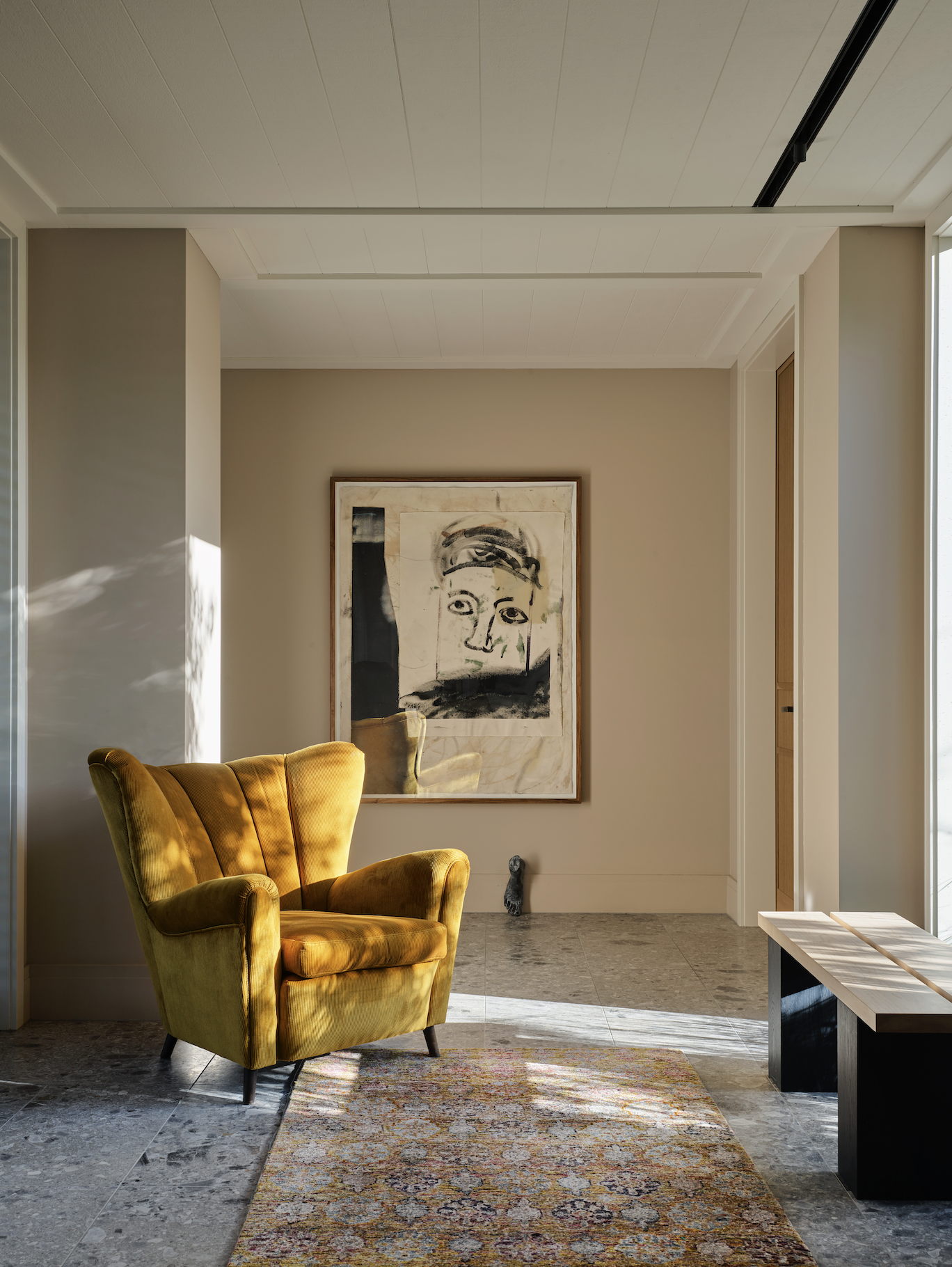
However, light is nothing without colour, and Arent&Pyke is fully aware of the importance of both of those co-conspiring within living spaces. “Our practice is founded [on] and known for colour,” says Pyke. “It’s a big part of who we are … so I think we have almost a licence to explore this with clients.”
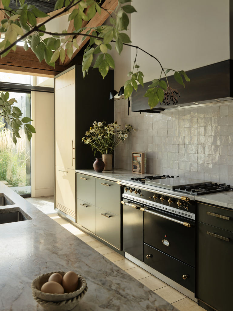
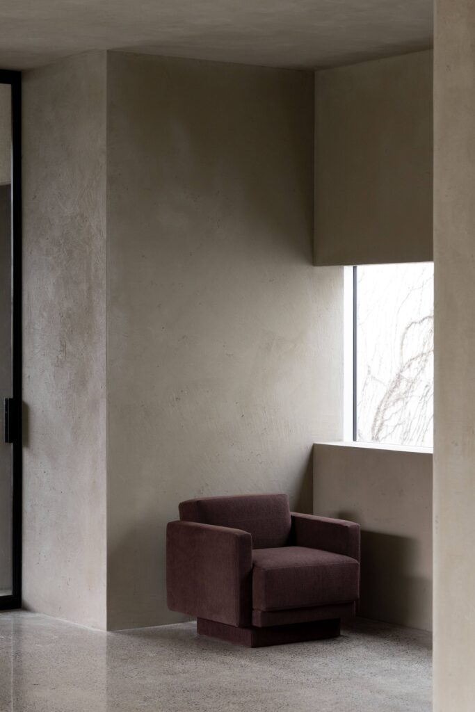
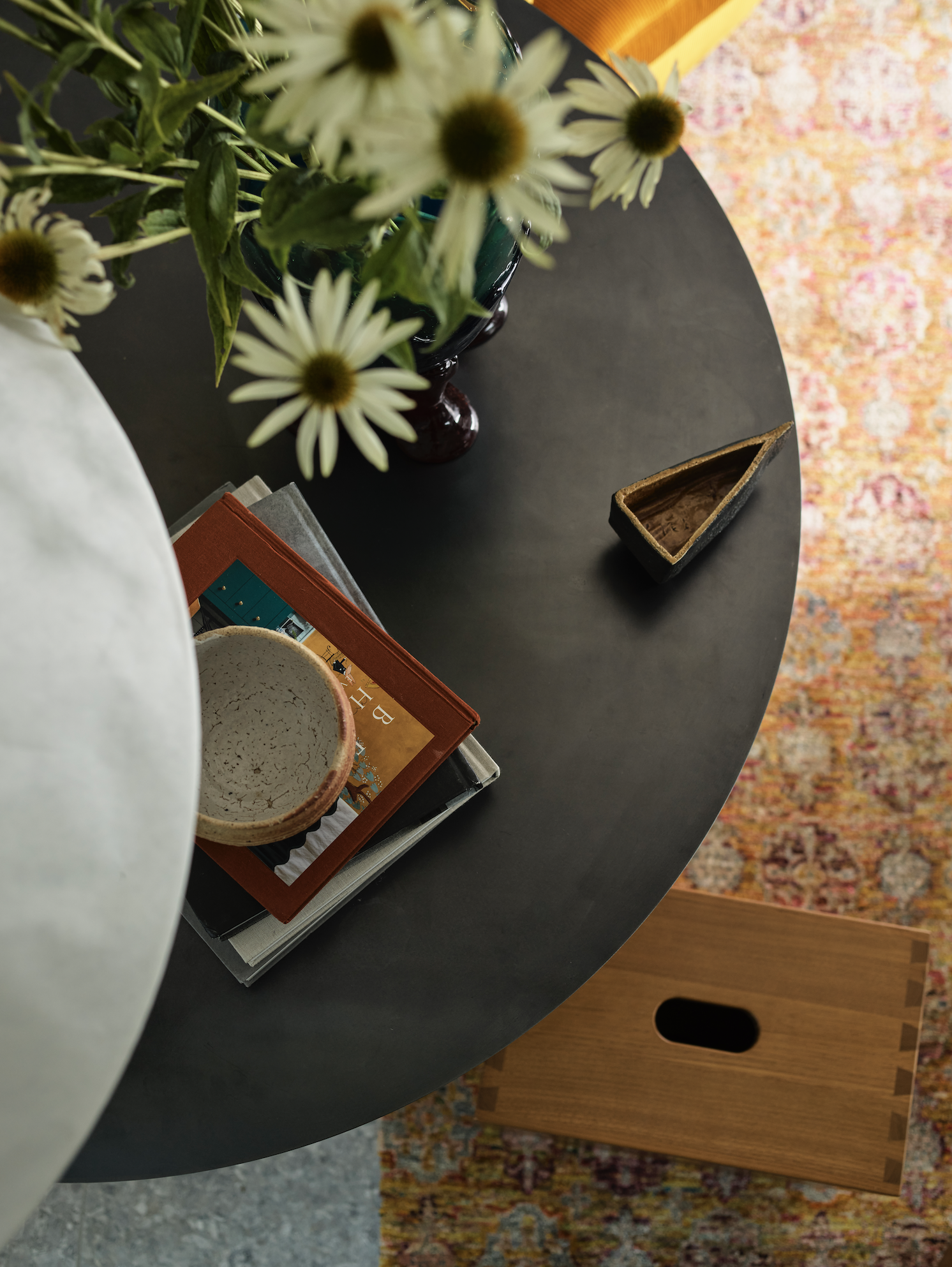
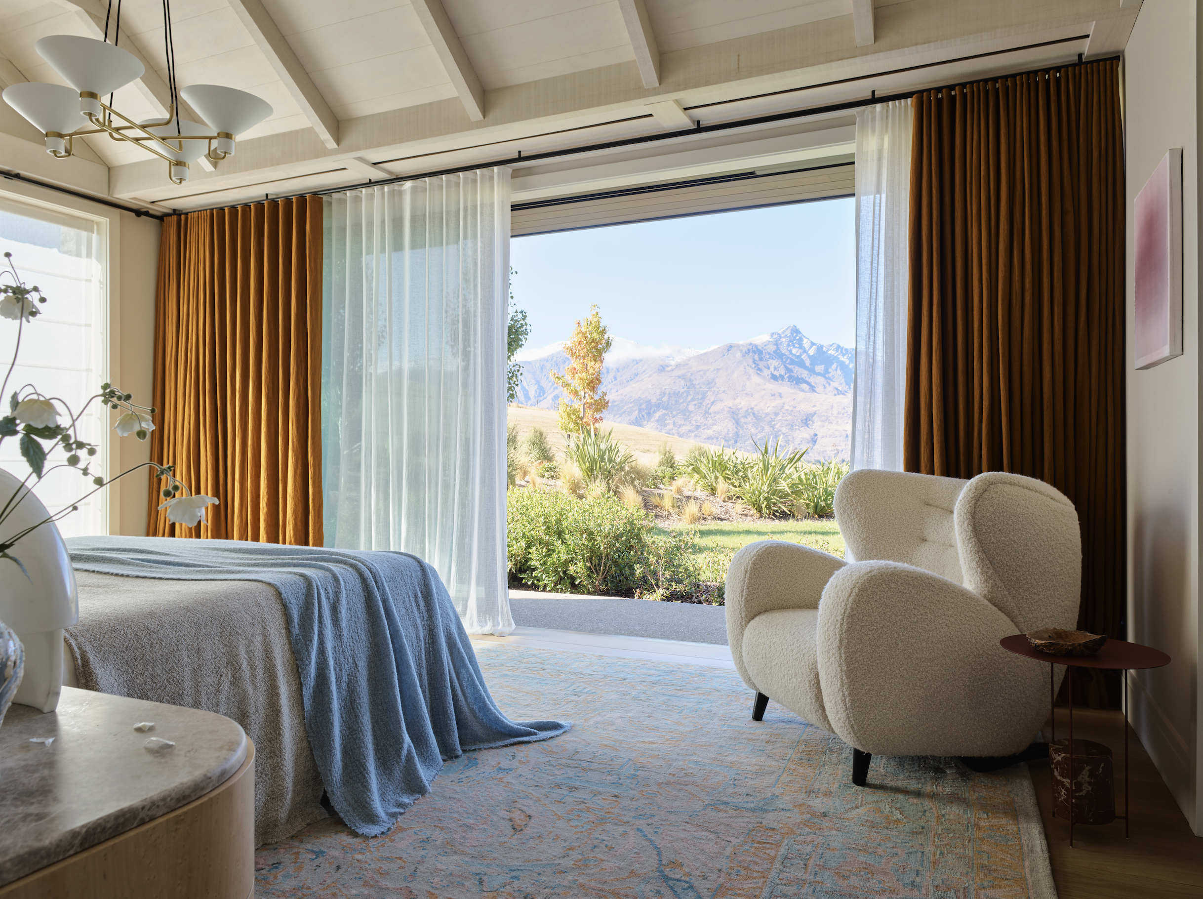
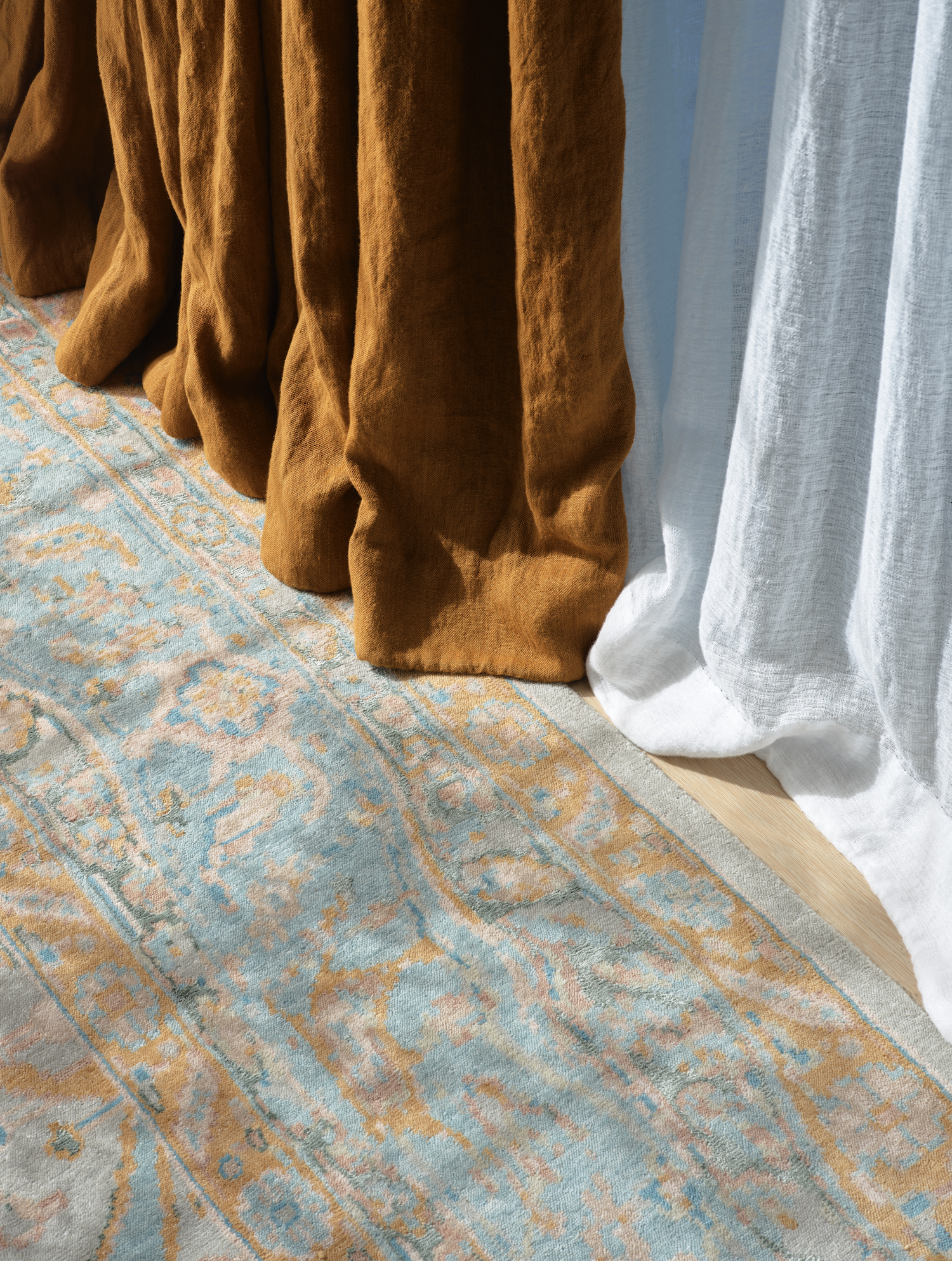
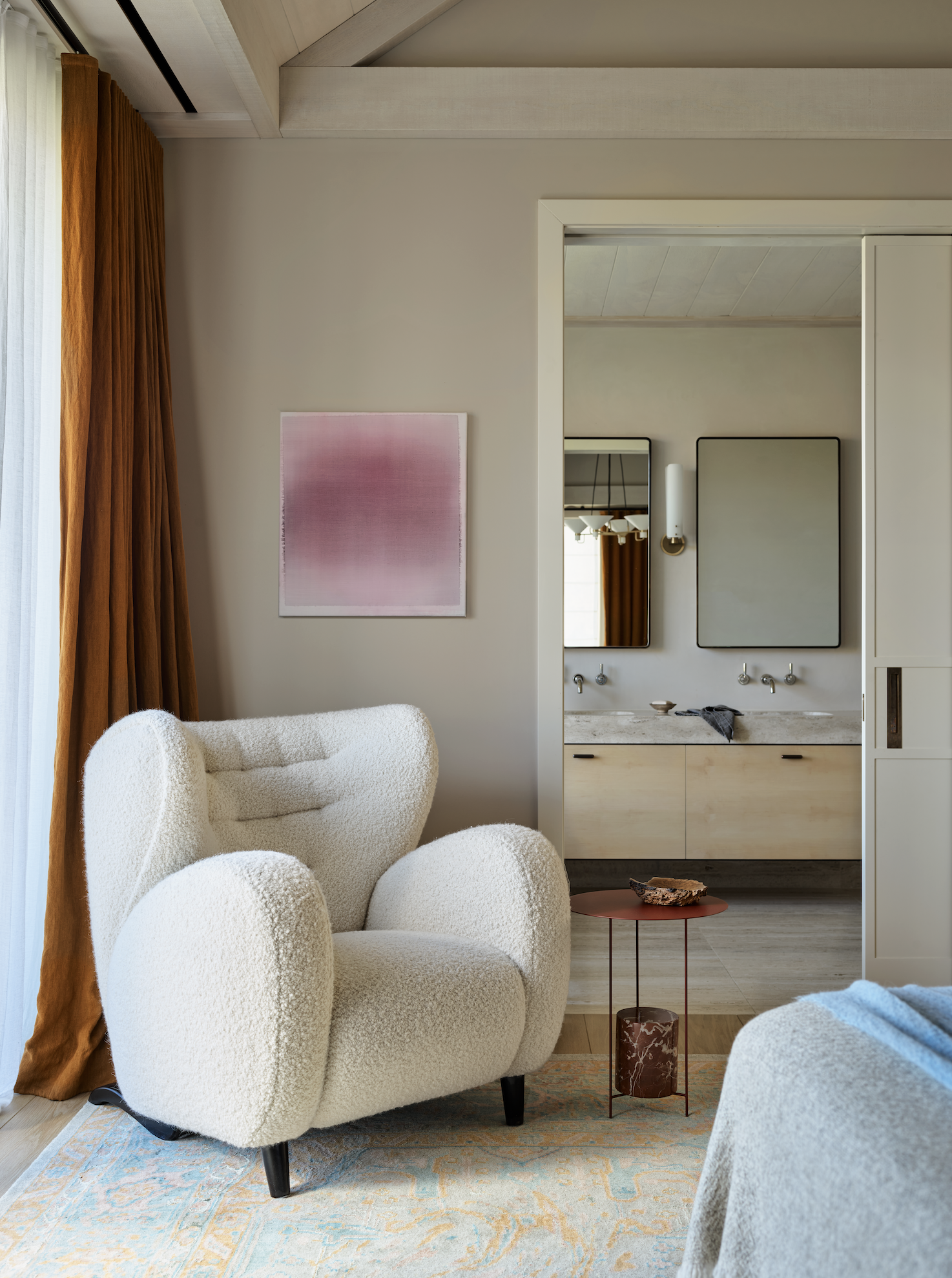
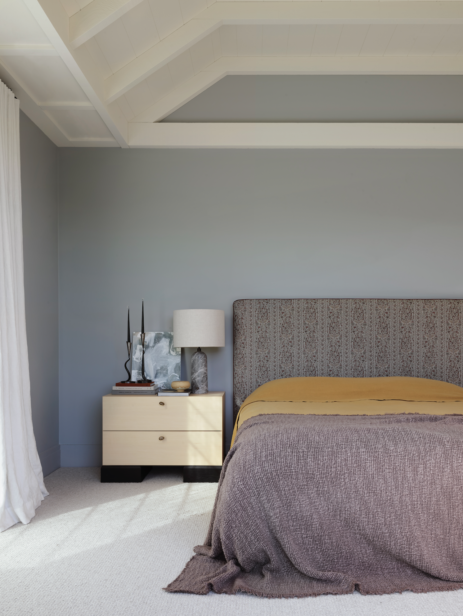
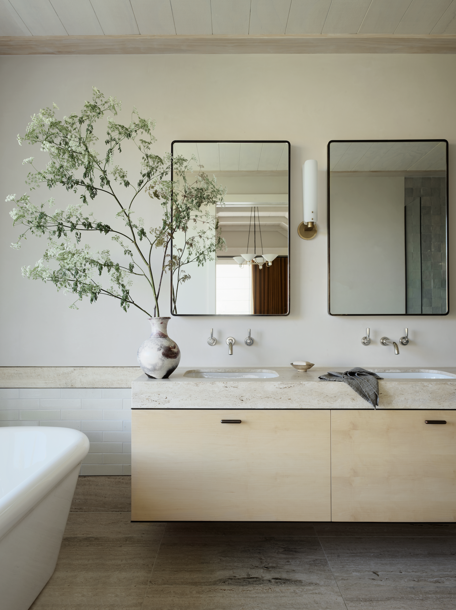
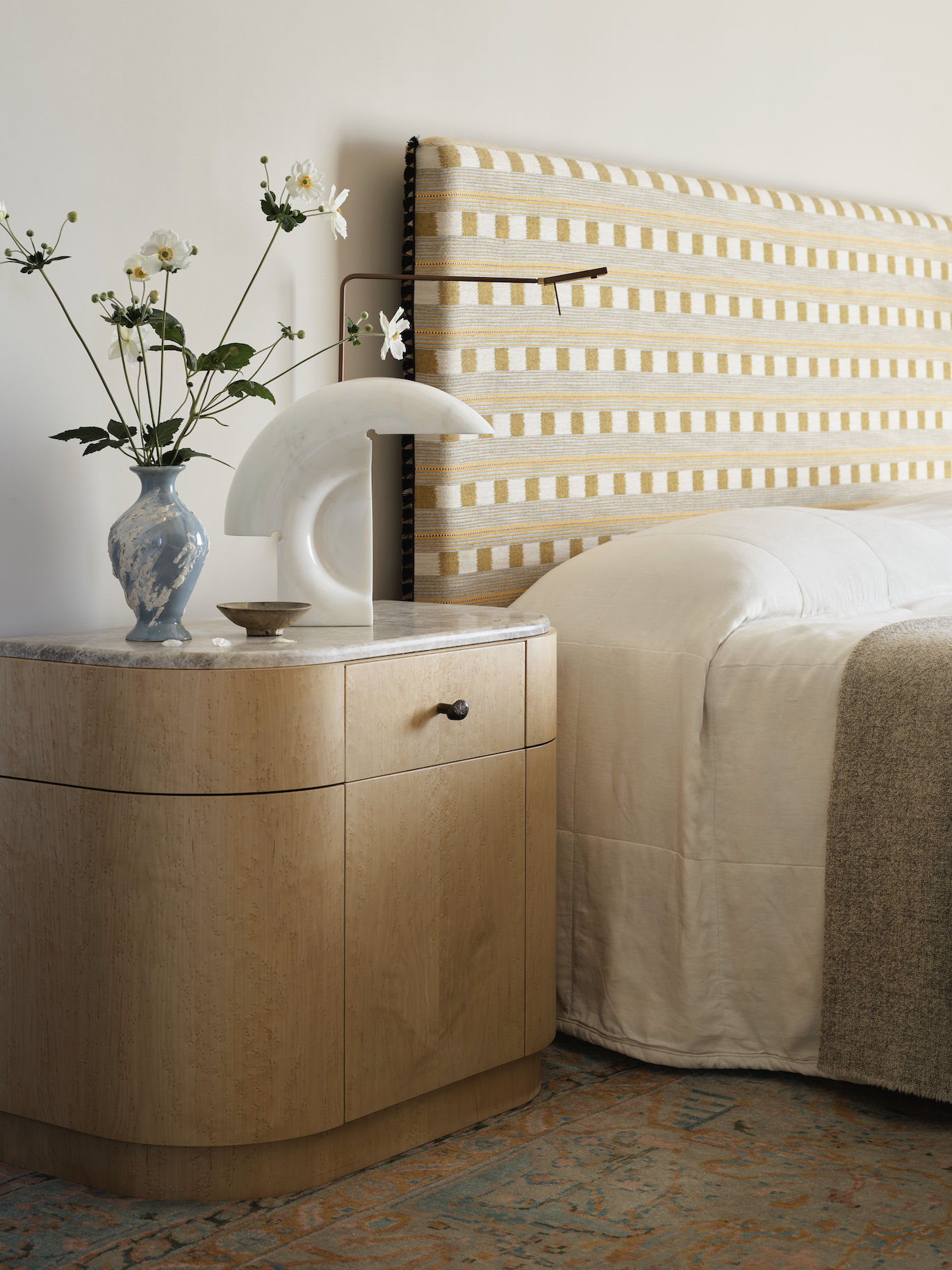
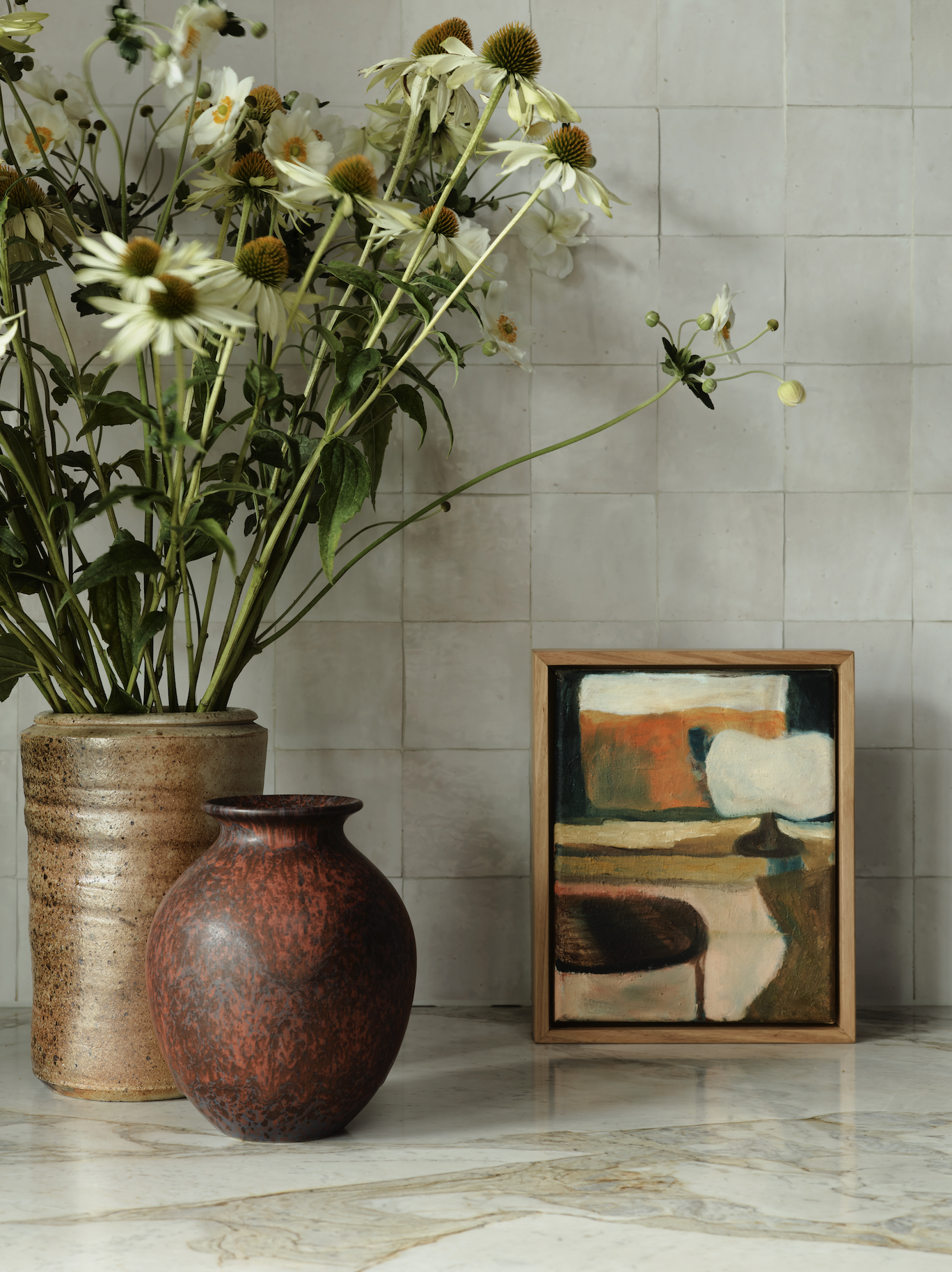
The designer — who is dressed in resplendent yellow during our conversation — hints at a slight disdain for ‘pops’ or ‘distractions’ of colour but prefers “swimming in it: we want to feel the immersive quality of colour. [In this project] we had this quite strong architecture, but we wanted the house to glow and to have a softness to it.” For that purpose, the crew used a base of what she calls “biscuity” colours: nearly edible hues that are at some points chalky, at others fruity yet soft. “We worked with all Resene paints, and we could see why they’re from New Zealand … the quality of light and the quality of the colour was just spot on.” The Resene palette included Triple Blanc in The Great Room and primary bedroom, Double Biscotti for corridors and games room, while the guest spaces use Silver Chalice and Alabscent White. Resene’s Triple Ash is used for the secondary bedrooms and Kangaroo in the bathrooms.
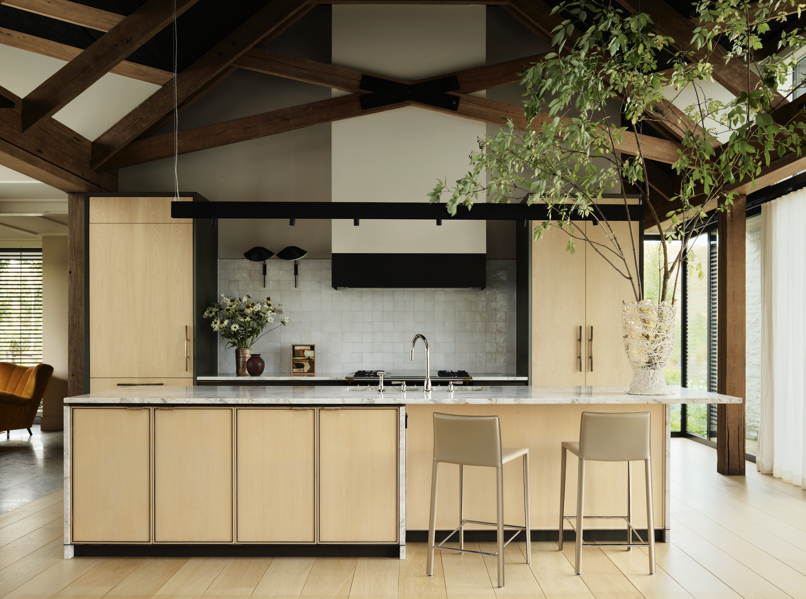
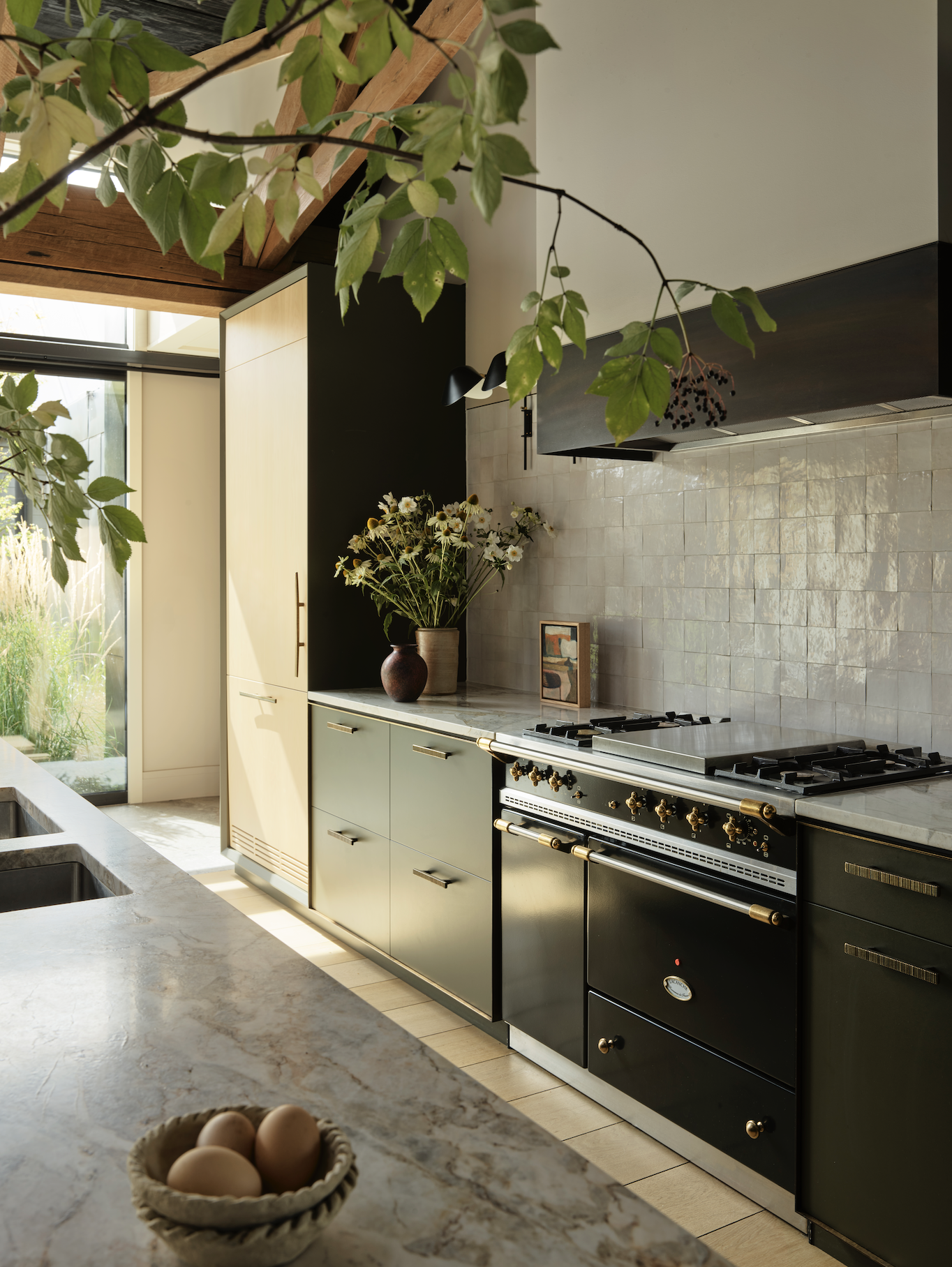
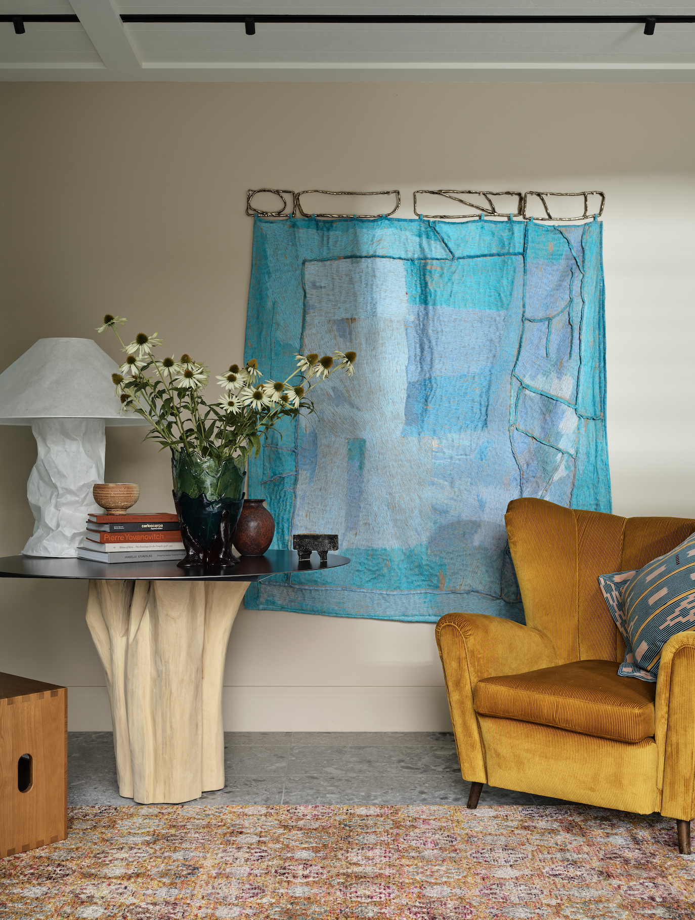
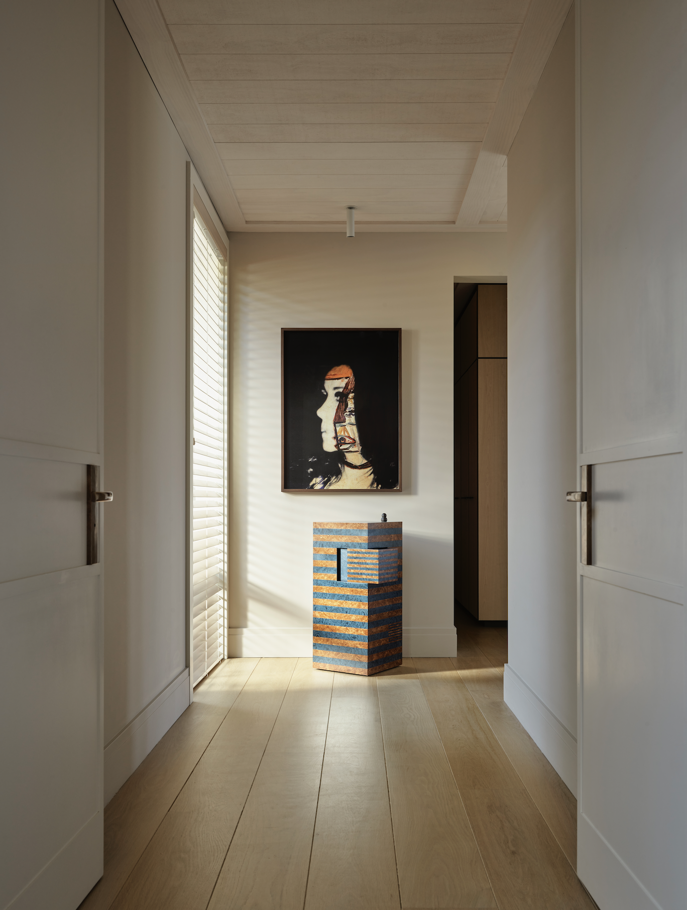
This from the designers: “Wholesome variants manifest in hues of oatmeal, nutmeg, and cinnamon, plus the alchemic shimmer of bronze articulating joinery handles and lighting fixtures, grounding sightlines beneath lofty ceilings.” Meanwhile, deeper colours ground the living area, like boulders redirecting the flow as colour swims around them: “from the kitchen’s bottle green joinery to indigo rug highlights and the tiled coffee tables, plus rich caramel leather. Softness pervades in the entrance foyer and primary bedroom, with walls enveloped in gentle ginger glows”. They speak of “almond-shaded pitted travertine” and “the golden honey hue of the maple joinery” — a delightful menu that is at its best in both the main bedroom and the home’s impressive kitchen.
The kitchen is one of those spaces where a lot of this project’s ammunition comes together to cause maximum wow. The La Cornue French cooker introduces sculptural nuances, “as does the chiselled detail of the island’s waterfall edge that echoes the brusquely chiselled pillars of the fireplace’s surround directly opposite”, according to the designers. Arent&Pyke also selected or custom made some of the artwork — such as the Living Room View by Ella Dunn from the epic Saint Cloche gallery in Sydney — which shares space with a jaw-dropping selection of furniture and design items from the likes of Gaetano Pesce, Cassina, Flexform, Gebrüder Thonet Vienna, Henry Wilson, and Perrin & Rowe.
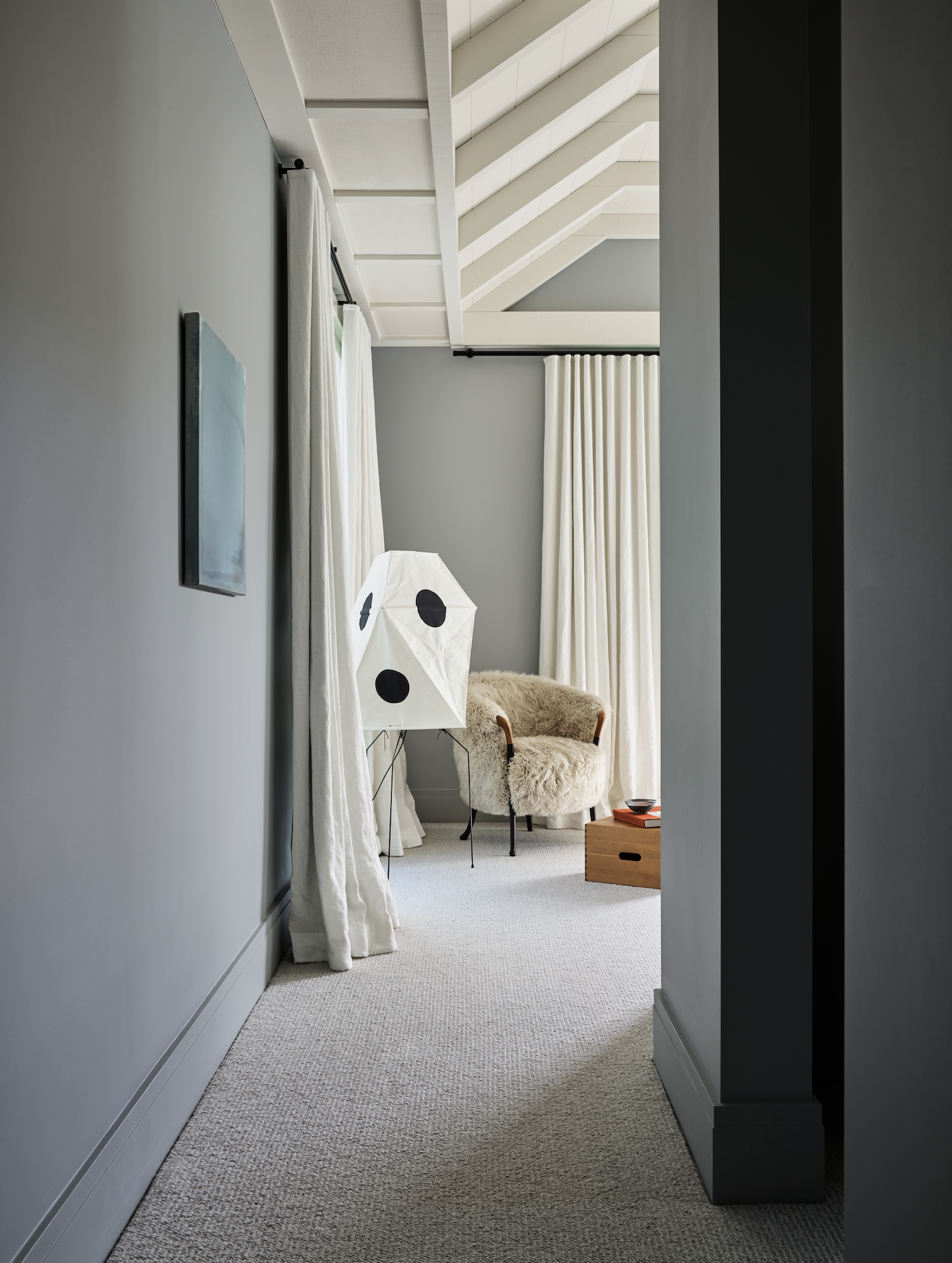
The various areas that stem from the kitchen and compose The Great Room are demarcated by oversized patterned rugs and an eclectic arrangement of furniture conveying nostalgia and relaxation while at the same time exuding a sense of playfulness. “I think it’s about invoking a little bit of romance, you know?” says Pyke, noting that nostalgia — that blend of remembrance and romance — is a great tool with which to evoke a lived-in feeling from new architectural spaces. “How else can you have an immediate sense of history?” she says. “Sure, you’re going to have the history that you create over many, many years in the home, but what does the interior feel like on day one?” Pyke speaks of the importance of bringing in a touch of vintage but treading carefully so as not to distract from the architecture.
Yet, beyond the excellent balance of tradition and contemporaneity in this house, past the international heavy-hitting designer names and the refreshingly bold colour schemes, this interior triumphs due to its inherent joie de vivre and soulful approach to family life. It is a meticulously crafted space that takes the grandiosity of its context and compacts this into jewel-sized moments that will surely keep its inhabitants engaged, amused, and comfortable for years to come.
Words: Federico Monsalve
Images: Anson Smart


