The interior flow of this waterfront, central Auckland apartment has been reimagined by Four Walls Architecture with flow and minimalism in mind.
The Point apartment complex is an imposing, late-’90s edifice composed of two, L-shaped blocks built around a large, rectangular courtyard where a couple of Paul Dibble bronze sculptures stand as if frozen in time.
The material palette is that oft-repeated modernist/industrial one that has come to define much of Auckland’s waterfront: exposed aggregate concrete, steel, and lots of glass. The complex was launched in the early 2000s and an educated guess is that the real estate advertisements of the era would have described it as “luxurious” or “executive” living in and amongst the burgeoning America’s Cup village.
Nonetheless, the architecture — by Craig Craig Moller — has managed to retain a certain timelessness. This could be due to the timber accents throughout — just a tad more colour-infused than modern sensibilities are likely to be drawn to; it could be the ‘can’t go wrong’ location; or it could be the subtle but omnipresent sense of proportion. There is also the internal expression of steel and the criss-crossing movement of the sun along the open-plan, public spaces.
The complex looks cavernous at first, and one walks into the atrium expecting echoes from one’s own boots or those of the few workmen around; yet what comes back is a sense of spatial generosity and warmth. The long corridors here are glazed and offer views into the courtyard; the bridge-like structures connecting all apartments offer sightlines and a sense of conviviality rather than seclusion from neighbours.
This particular unit was purchased five years ago by a Christchurch couple as a pied-à-terre to be used when visiting their Auckland-based family. Eventually, the now semi-retired pair decided to sell their Canterbury house and live a somewhat nomadic life between the two cities and in two small, central apartments.
When bought, it “was rough as a bag”, says one of its owners. “It had been leased out for years and the joinery, the laminate, and the floor were scratched and lifting.”
Maintenance aside, aspects of the layout were puzzling. One-and-a-half bathrooms in a 65m², one-bedroom apartment struck both owners and architects as somewhat over the top. The space had been highly compartmentalised, which affected circulation flow and, in turn, led to a “bedroom [that] felt trapped and got little fresh air … it was a bit stuffy”, says the client. There was also an issue with lack of storage.
To solve these problems, Four Walls Architecture directors Amy Hendry and Claire Paterson tackled the interior as if it were a blank slate, a process that was somewhat reined in by three structural raisers that could not be moved in any way.
“This really limited the planning,” says Amy. “It was just like [doing] this big jigsaw puzzle; we needed many different planning sketches.”
The winning design opened up the clogged arteries of this small, northwest-facing apartment and instated a delightful flow and freshness to the materials with an attention to detail that borders on the microscopic.
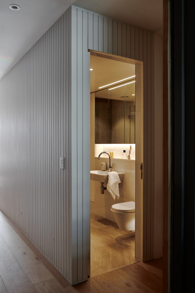
The original, large corridor that started at the entrance was slimmed down. Its adjacent half-bathroom was removed to allow for added storage space and a larger, single bathroom with improved fittings and surfaces.
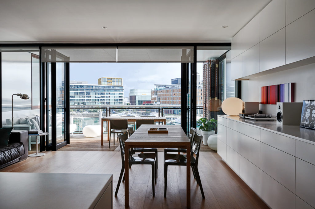
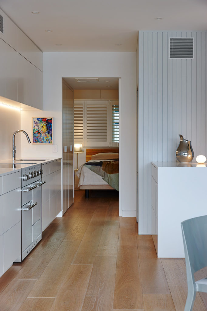
The kitchen — formerly a U-shape directly bisecting the flat — was put right up against the northern wall, thus opening up a corridor between bedroom and living room and ensuring the much-desired air and light flow.
“You can now circumnavigate the whole apartment,” says Amy.
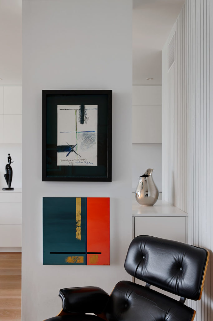
After this impressive jigsaw rethink, Claire “picked up the project and designed this interior as one massive piece of joinery,” says Amy. “Cabinetry became all about the finest details, and using every single inch of space, and getting everything down to the last millimetre.”
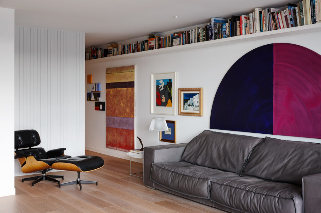
“The first thing [the owners said] was ‘storage, storage, storage’,” emphasises Claire, and some clever solutions were conceived for this, such as lining the bedroom-to-kitchen corridor with concealed closets, putting bulkhead storage above the bed, and installing a long, thin bookcase high up along the living room wall.
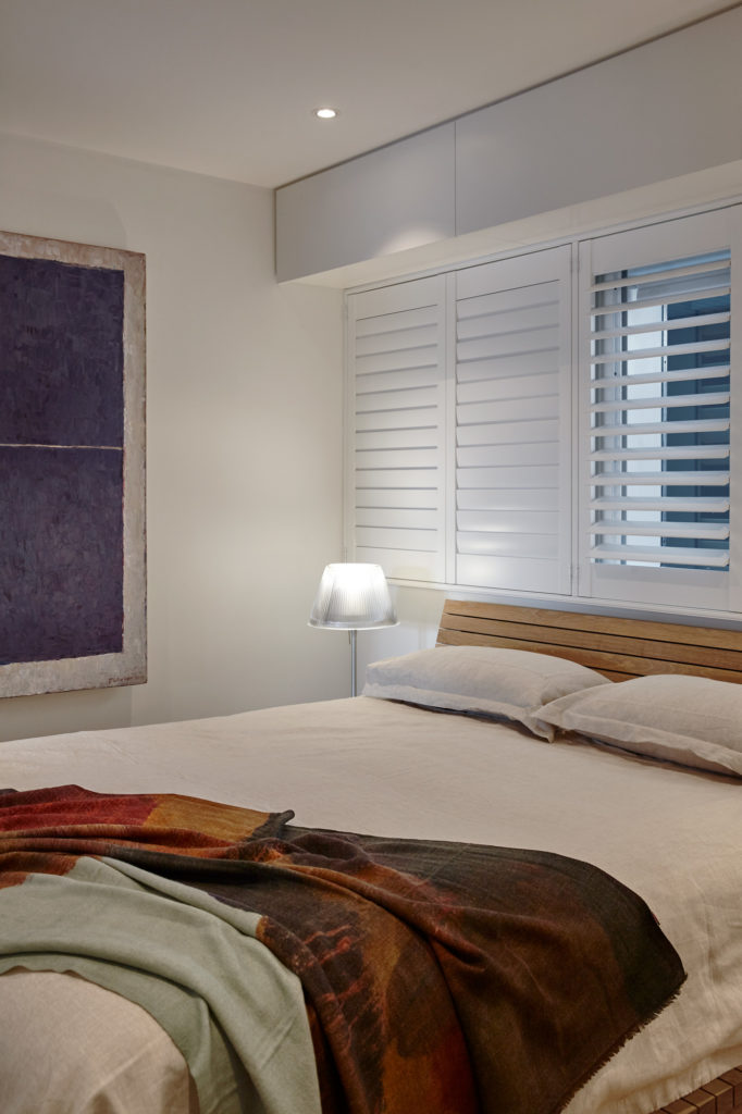
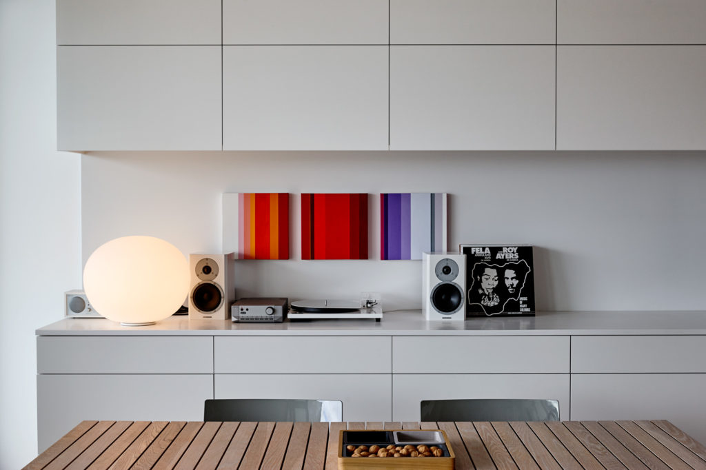
The move to use white on most surfaces had a double purpose: the cleanliness of palette and lines chosen partly to allow the owners’ art to breathe without any colour or textural noise and partly to match an impressive and robust white cooker.
The Corian and white lacquer kitchen seems almost crafted to emulate the large, snowdrop-white stove with its chunky handles and inherently classic yet contemporary persona. The owners have also amassed a selection of feature lighting pieces, a turntable and speaker set, artwork, and furnishings that complement the interior in a way that Dieter Rams would probably be envious of. The soothing, white horizontality is complemented by translucent spheres and globes and, other times, by the ridged shades of Flos lights.
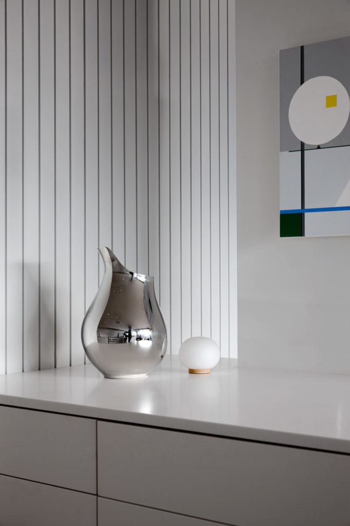
“We knew that we really wanted a timber feature, which would have no art on it, in the middle of the space,” Claire says.
To this end, the shell of the central volume — which houses storage and bathroom — has been clad in thin, vertical, western hemlock shiplap; its white colouration is just a tad different from that of the kitchen, accomplishing a solidity and anchoring to the volume.
For such a small space, this waterfront, urban apartment is replete with design detail.
For Claire, the best reward was to have the client say, “I feel like I’m 20 years old when I wake up in this space; it makes me feel young and youthful!”

