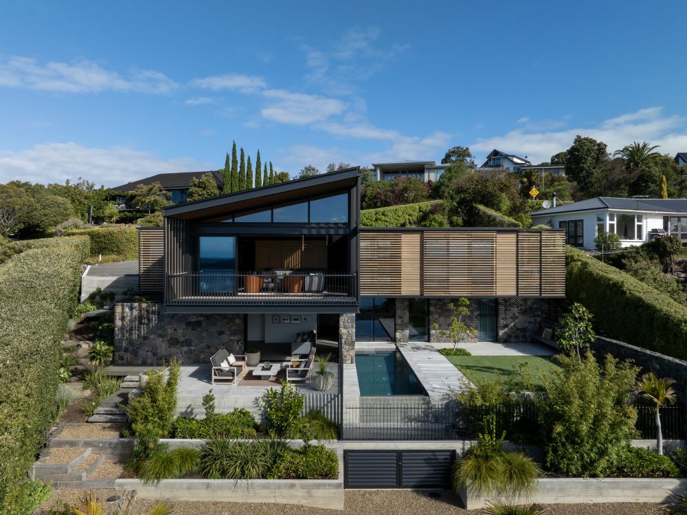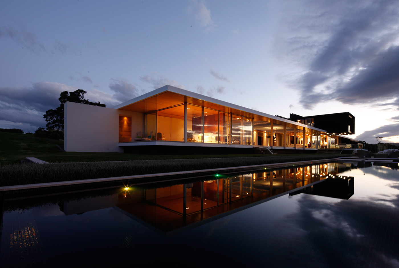
One long, lean house and an unforgettable view
The image above is such a showstopper it requires an explanation. First, the location: a peninsula north of Tauranga that the owners, Philip and Celia Crawshaw, purchased after conducting detailed analysis of rainfall, wind and sunshine hours all over New Zealand in order to find the best place to live, climatically speaking (they are New Zealanders who formerly lived in Palmerston North).
They then interviewed a few architects and sought their opinions about what to build there, eventually deciding that their aspirations – which included a home with sculptural lines, a sense of restfulness, a focus on quality and permanence – were best aligned with the rigorous modernism espoused by Andrew Barclay of Warren & Mahoney (who designed the building with his colleague Richard McGowan). “I’m interested in how you reduce and simplify,” Andrew says.
At first glance, the home looks neither reduced nor simplified, but bear with us. A little more about the brief: Philip and Celia have a blended family of six children, most of whom were still spending long periods with them when the design process began way back in 2003 and now range in age from 16 to 29. They wanted the kids to be able to stay, and for the house to feel comfortable when just two of them were there.
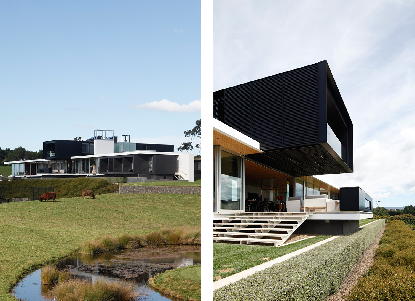
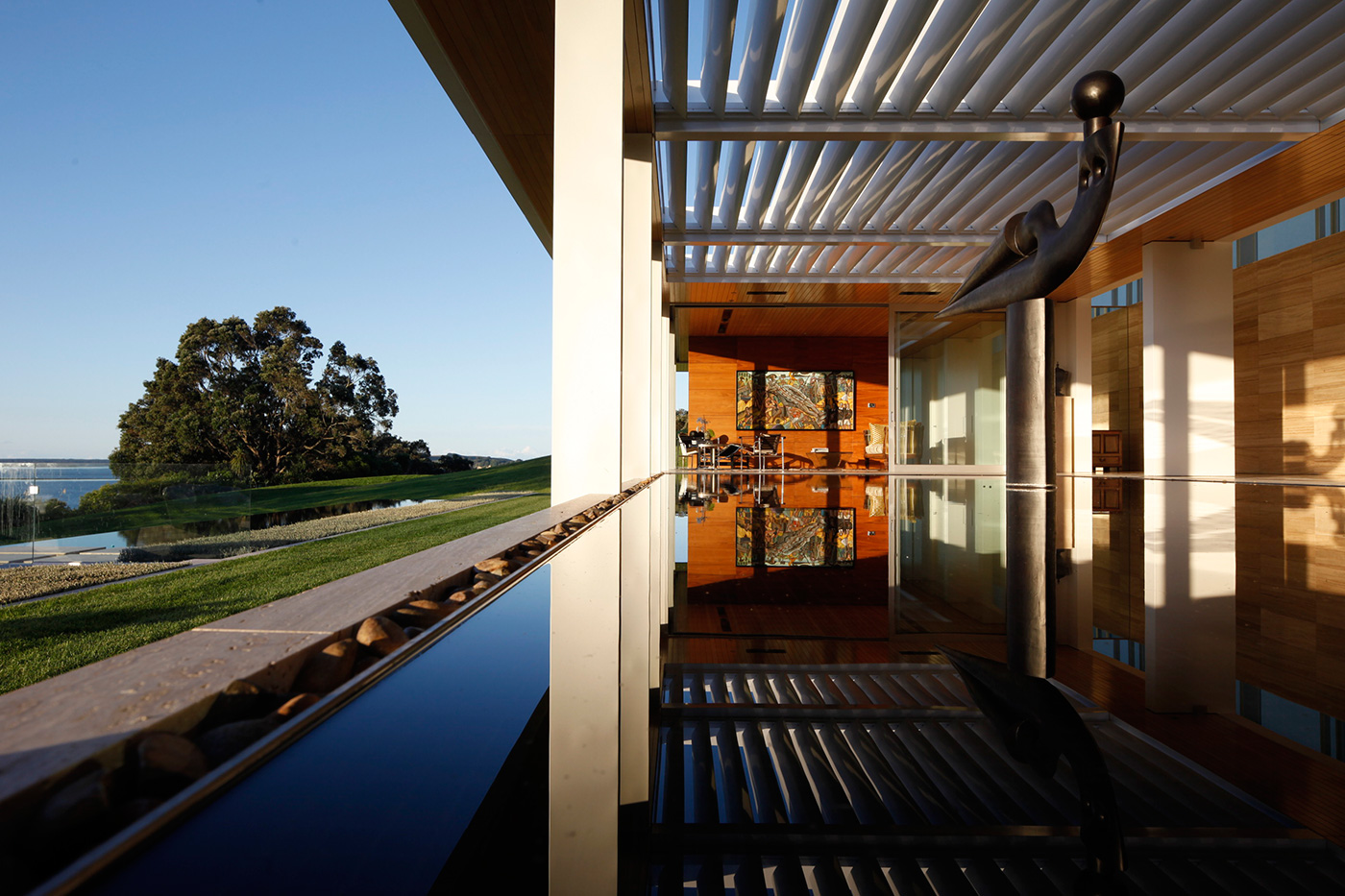
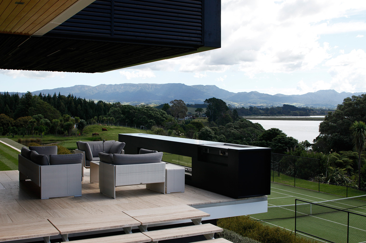
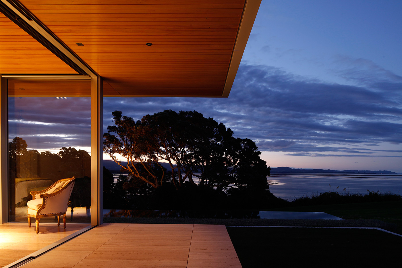
The home’s form is undeniably dramatic, but it is also simple, a long, straight axis running along one of the contours of the site, topped with what Andrew describes as “a black tube of space placed transversely”. The ground floor is anchored by a wall that turns its back on the driveway and the hill rising behind it. All its main spaces face the view north, including the bedrooms, living areas and a beautiful outdoor room with a reflecting pool and a large sculpture by Paul Dibble.
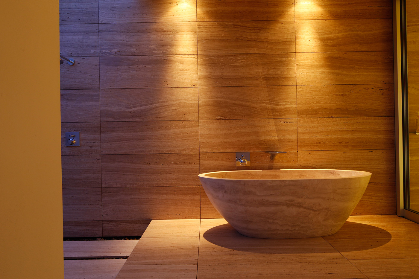
The material palette is pared-back: concrete, travertine, steel (as well as selective insertions of interior timber). In this, the home refers not only to Mies van der Rohe’s famous 1929 Barcelona Pavilion, but also to precedents from the Warren & Mahoney stable: the Christchurch homes and other buildings of the 1960s and 70s that possess, as Andrew puts it, “a language of simple solidity, the idea that good-quality materials and firm kinds of spaces that are made confidently are better in some cases than highly complex spaces”. Adds Richard: “We weren’t looking to do something new, just something good that would last the distance. I’m interested in longevity.”
If it all sounds terribly straightforward, it is interesting to note at this point that Philip and Celia were not die-hard fans of modernist architecture. Their Palmerston North home (“a genuinely old house full of defined rooms,” Richard says) was designed in the 1920s by the award-winning architect Horace Massey. When they decided to move north, Philip and Celia determined it was time for a change. “We did like living in a classic house,” Philip says, “but when you move on you can’t recreate what you had before. I wanted to go to something that was completely different.”
It’s worth noting the distinction here between modernism and minimalism – where minimalism is completely stripped back, many early modernist homes were deeply humane, full of natural materials and the owners’ art and objects. Philip and Celia wanted the latter approach. “We didn’t want an echo chamber effect,” Philip says. “We wanted it to feel comfortable and welcoming.”
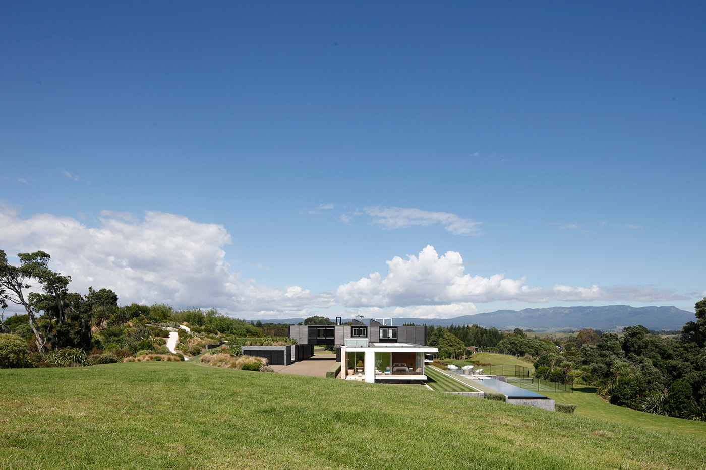
The site is beautiful, but an early geotechnical report quickly revealed its limitations. “The land’s really crap, just unstable volcanic ash,” Richard says. Although 6 hectares (14 acres) in size, “there was only a tiny nub left that the house could be built on.” Fortunately, the nub turned out to be ideal, high enough up the site to enjoy good views, but still sheltered from southerly winds by the hill behind it. Even though this is a big house – about 600 square metres in total, including the outdoor room – the way it is sited means it is not overbearing in the landscape.
Philip and Celia didn’t have a long wish-list, but they were interested in the European idea of entering a courtyard before moving into the house, a way of encouraging sheltered outdoor living by dissolving the barriers between indoors and out. Visitors pass under the bridge-like form of the home’s upper floor before walking through the front door, which opens directly into the outdoor room.
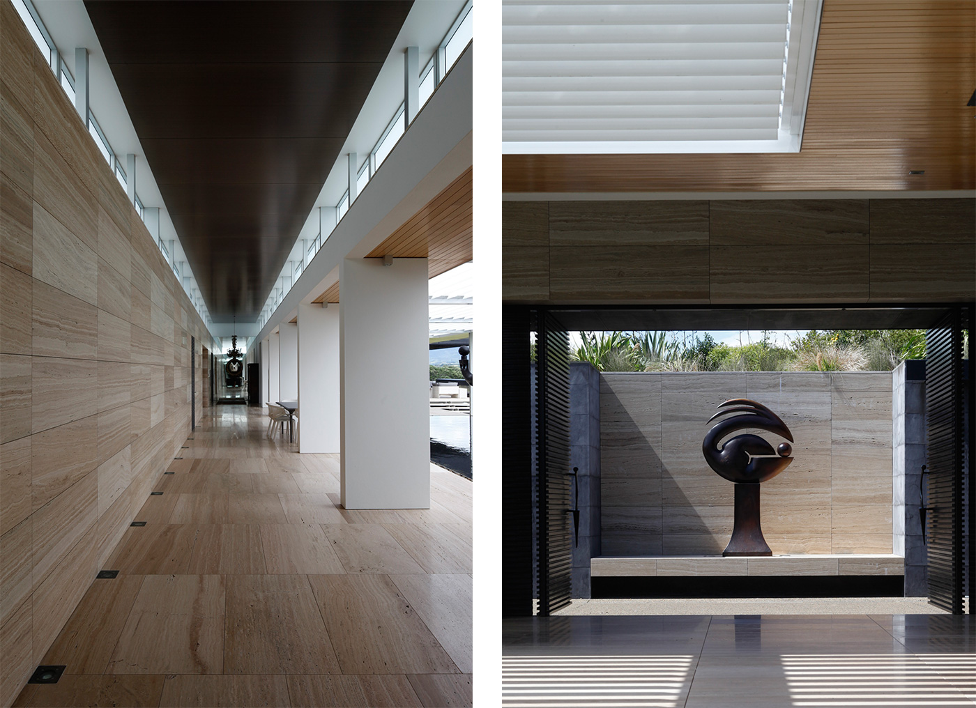
It’s a surprising disruption of what we’ve come to think of as the normal entry sequence to big houses, where a dedicated foyer sets the stage for a stately procession into the house. But this, as Richard says, is a country house, not an urban one, so the visitor must first pause in this remarkable indoor-outdoor room to take in the view, the reflecting pool, the sculpture, the rear wall of honey-toned travertine. It’s breathtaking, and you’re not really even in the house yet.
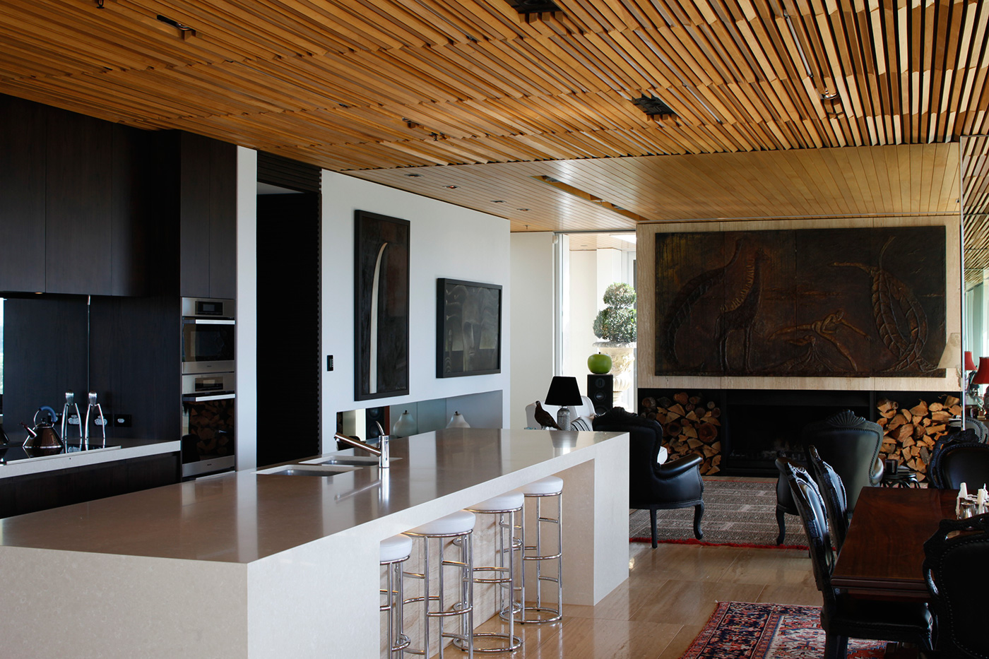
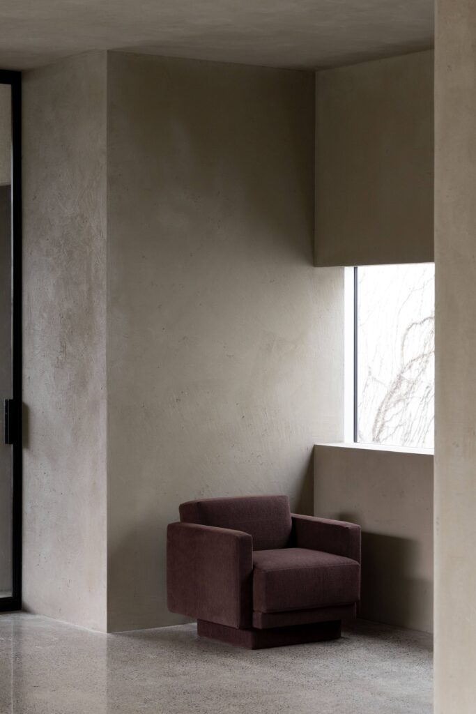
More upending of expectations. The home’s main living area, which is entered from the outdoor room, is not a grand, overblown spectacle, but an intimate open-plan sequence of sunny sitting area, a kitchen and dining space, and a compact formal sitting room with a fireplace. An intricately battened (and relatively low) macrocarpa ceiling adds a sense of warmth (and acoustic softening). These are spaces in which Philip and Celia can feel comfortable when just the two of them are home, and if they’re entertaining large numbers of people, the outdoor room easily copes with any overflow. Guests stay in an elegant suite at the home’s eastern extremity, while the kids occupy the west wing, which has a row of three modestly scaled bedrooms and a small living room.
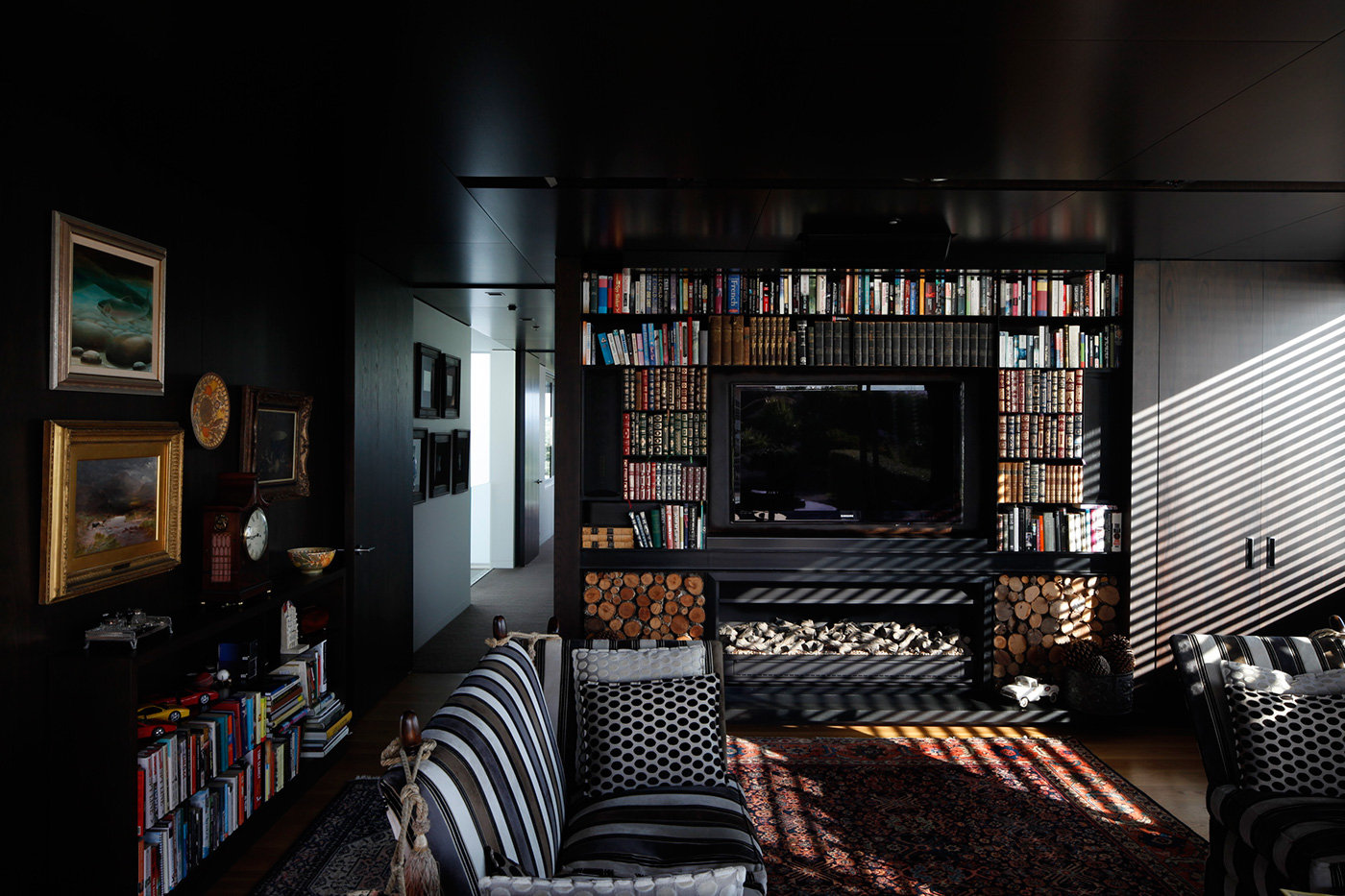
The home’s upper floor, or what Richard calls “the Darth Vader upstairs bit”, shares this intimate scale, housing the main bedroom, an ensuite, and a snug, cave-like library and study to which Philip and Celia retreat to read or watch TV during wintry evenings. Importantly, this level stretches across the driveway to connect the house with an outdoor sitting area and vegetable garden at the rear of the site, where the highest point has a view south towards Mount Maunganui. The upstairs volume also cantilevers over the front of the house to shade a north-facing seating area.
For an architect, designing a big house can be a double-edged sword. A generous budget might offer a certain amount of freedom, but large dwellings can be complex beasts over which it is easy to lose control. Here, though, Andrew and Richard’s rigorous scheme proves robust enough to accommodate complexity without sacrificing clarity. Andrew understood at the beginning of the process that the house was to be “simple and strong and bold”, a place that reflected Philip and Celia’s desire for a life of “reading, privacy and quietness”. It’s a simplicity that Philip hopes will endure long after he and Celia are gone. “It’s slightly indulgent and certainly not commercial, but it’s a very satisfying feeling living in something that feels permanent,” he says. “It’s something that will hopefully be around a lot longer than us.”
Unapologetically strong and simple, this house is designed to last for generations. –Jeremy Hansen
Q&A with architects Andrew Barclay and Richard McGowan of Warren & Mahoney
HOME You don’t design many houses these days. How did you get this job?
Andrew Barclay Houses are very personal things. They belong to the people in a very direct way. It’s about doing what the client needs to make his life work. They’re amazing opportunities to have. This client interviewed a number of firms and chose us through an interview process. I visited the site and had an evening with them and just talked about life, and we got to like each other and things went from there.
HOME How did you decide what was right for the site?
Andrew Barclay The open stretched pavilion idea was a very quick response to the brief. That idea stayed from the first night to the end of construction. The transverse [upper] block was not generated instantaneously. It’s a connecting device to the rear of the site.
Richard McGowan It needed to be something that sat with the contours rather than against them. They wanted an elegant and crafted thing in the landscape.
Photographs by: Patrick Reynolds.