Mimicking the angles and formation of a canvas tent, this family bach in Tairua pleats and folds, burying its lines into the dunescape.
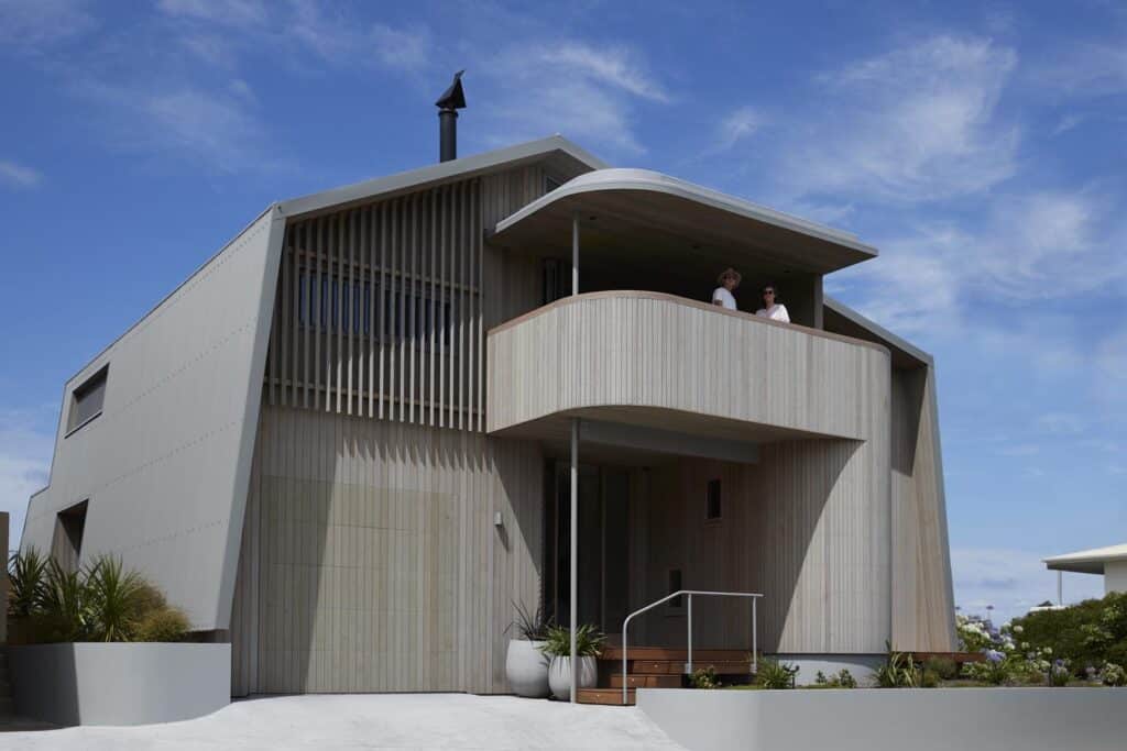
Designed for an Auckland-based family of four, this holiday home had to deliver a multitude of spaces and functions, including separation between teenage and adult areas; sheltered and open spaces; and, of course, an intimate connection to the coast — specifically, the ability to see the surf break.
Thanks to the vision of architect Kelly O’Sullivan from Strachan Group Architects, that connection has been honed and amplified over five split levels and gives meaning to three distinct views: the dunescape, the ocean, and back towards the Coromandel Range.
“There’s a 100m reserve along the beachfront, which this site sits on the edge of, so despite being beachfront, it really feels quite private. The only passers-by are the neighbours making their way through trodden paths down the dunes to the sea and back, so, while it is private, there is a sense of community here,” Kelly tells us.
The site slopes down 4m from the east to the western boundary, where the entrance sequence begins.
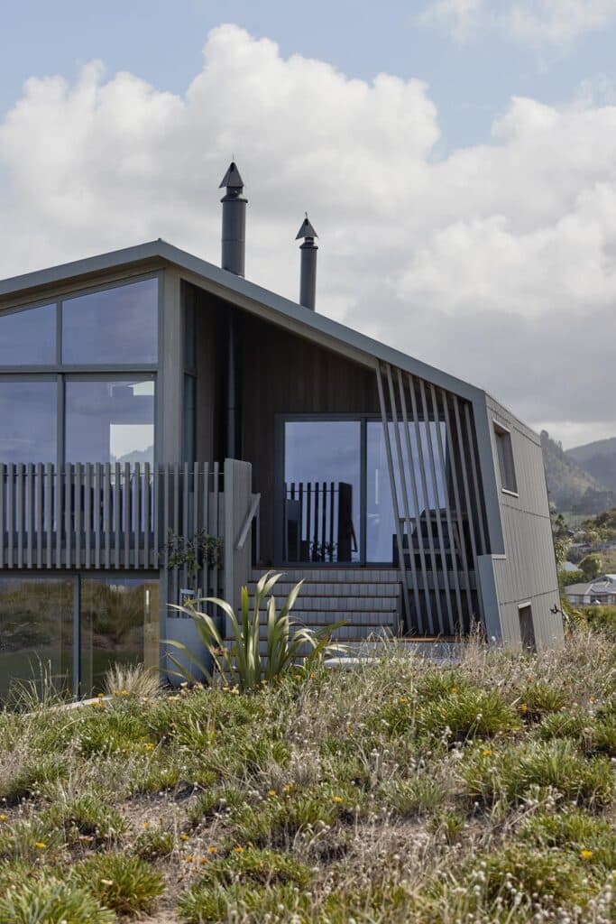
“Due to this slope, we wanted to tuck the eastern side of the house into the landscape, almost as if it was the brow of the dunes,” Kelly explains. “Walking back to the house through the sand, this elevation doesn’t feel too large, a contrast to approaching from the west, where you are met with a full two-storeyed building.”
To mitigate that scale, the western elevation was conceived differently — a softer approach was taken, integrating an intricate curvature and cylindrical forms, nautical and almost retro in feel.
Here, and on the opposing eastern elevation, the house is porous and open, while the north- and south-facing elevations are closed, wrapped in corrugate, and embody the ‘canvas tent sides’ with their sloping walls.
A covered entrance sits underneath a west-facing deck, designed to capture the views towards the Coromandel Range and to provide a sheltered outdoor area when the winds from the ocean mean that outdoor living to the east isn’t practical.
Guest and children’s bedrooms and bathrooms on the ground floor level are pushed to the edges of the plan to allow for the central entry, leading into a rumpus room with kitchenette.
“The rumpus room becomes the belly of the house, glazed to the west and east, and leading out to a
raised eastern deck where the view encompasses the rising dunescape.
“Moving up through the nautically curved circulation, the main bedroom suite peels off to the right, while directly ahead another small level shift elevates the dining and kitchen spaces. The breaking surf is experienced from this ‘indoor veranda’, and, to the west, a lower roofed barbeque area offers a compressed contrast to the kitchen/dining volumes,” Kelly explains.
These five level changes meant the eastern elevation could have become visually complex, so the idea was to unite and simplify it by using vertical timber screening.
“Something we often focus on in our practice is what we call the ‘living on the veranda approach’, where the room becomes the ‘deck’,” Kelly tells us.
In this case, by designing timber screening that doubles as a balustrade on the outside of sliding doors in the kitchen/dining area, it meant a balcony didn’t need to be tacked on to an already complex elevation, and the room opens to the outdoors, at once an interior and exterior space.
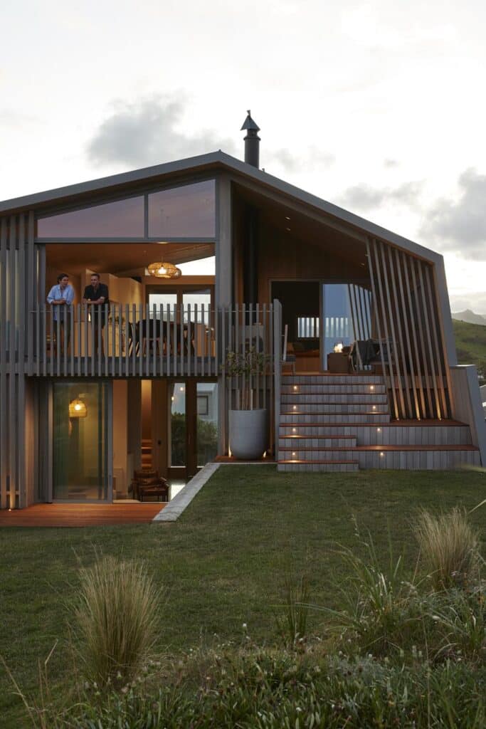
Stepped down a half level to the south of the central kitchen and living area, the same timber screening is used on the main bedroom’s deck, which is covered by a large eave; on the other side of the house, the outdoor fire area is also sheltered with timber screening, this time meeting the roofline following the angle of the northern wall, and placed to frame views of Shoe Island in the distance. Here, an outdoor fire becomes a magnet for entertaining, with steps leading down to a grassed area and the dunes.
Shiplap cedar covers the western and eastern elevations, a softer element against the corrugate of the tent sides.
“We used Dryden Wood Oil in Platinum to allow the timber to weather off and pick up the light, dusky grey tones of the sand dunes and coastal environment, while the corrugated aluminium in Sandstone Grey continues the same light, coastal tones to really anchor the building into its context,” Kelly says.
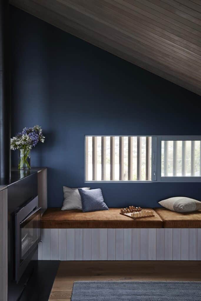
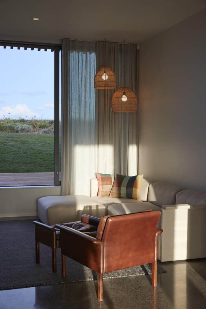
Adjacent to the kitchen, a snug is stepped down 300mm and nestled beneath the angled walls.
“This space is under the canvas of the tent; it’s a cosy corner, intimate and internal. An inbuilt seat with burnt orange squabs and a cosy Simon James couch to curl up on in the colder months cater to this being a beach house for summer and winter,” says Kelly.
Walls are painted a deep blue in this lounge, a moody element in contrast to the white of the main spaces. The blue is echoed in the kitchen and bathroom tiles; in these spaces, though, a paler tone is used to reconnect the interiors with the hues of the sea. Light blue doors throughout the house continue the link to dusty ocean blues.
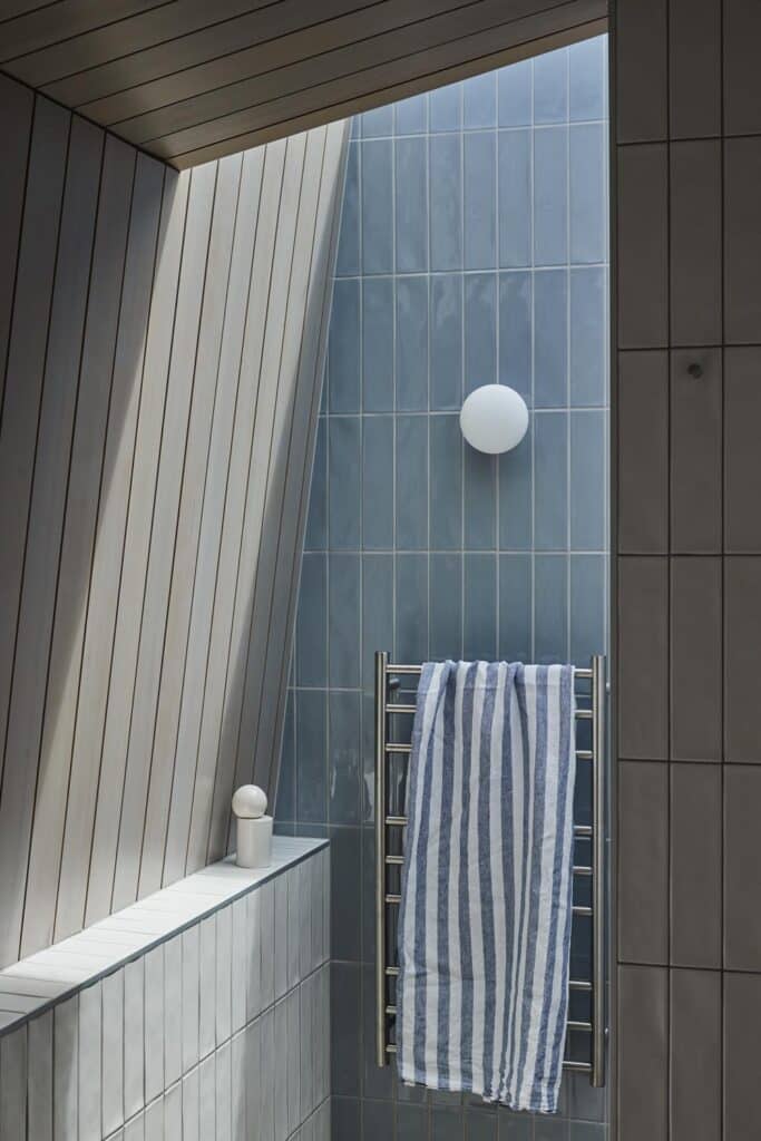
Western Hemlock features prominently throughout the interiors, lining the ceiling of the main living space and kitchen, the bedrooms, the curving stairway and hall, and elements of the bathrooms.
“In the en suite bathroom, there’s a sense of drama with all the materials combining: timber, the light blue tiles, and white with the light falling in through the skylight,” Kelly says.
Gazing out at the ocean from this ‘tent’, it’s hard to imagine a dwelling that would be more fitting for site and purpose than this.
