Drawing on eight distinctive New Zealand landscapes, each reminiscent of a particular era in our colour evolution between 1830 and 1930, a new collection from Dulux is designed to turn a fresh lens on heritage renovations. We explore some of these meticulously curated pairings of colour and landscape and their historical origins in our built environment.
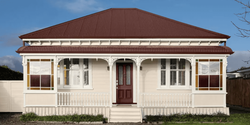
Developed in collaboration with heritage architect Joanna Theodore, the collection seamlessly blends tradition with a contemporary approach, utilising her extensive experience in significant heritage projects across the United Kingdom and New Zealand.
The collection comprises 48 authentic heritage colours curated into eight palettes, each showcasing six harmonious colours.
“The goal was to bring a fresh approach to heritage design,” Joanna tells us. “Using the Dulux Colours of New Zealand range, we were able to create schemes that were both inspired by New Zealand’s landscapes while also historically accurate to important periods of its history. From early 1830’s cottages through to 1930’s Art-Deco buildings, this collection has something suited to all styles.”
TUSSOCK PLAINS
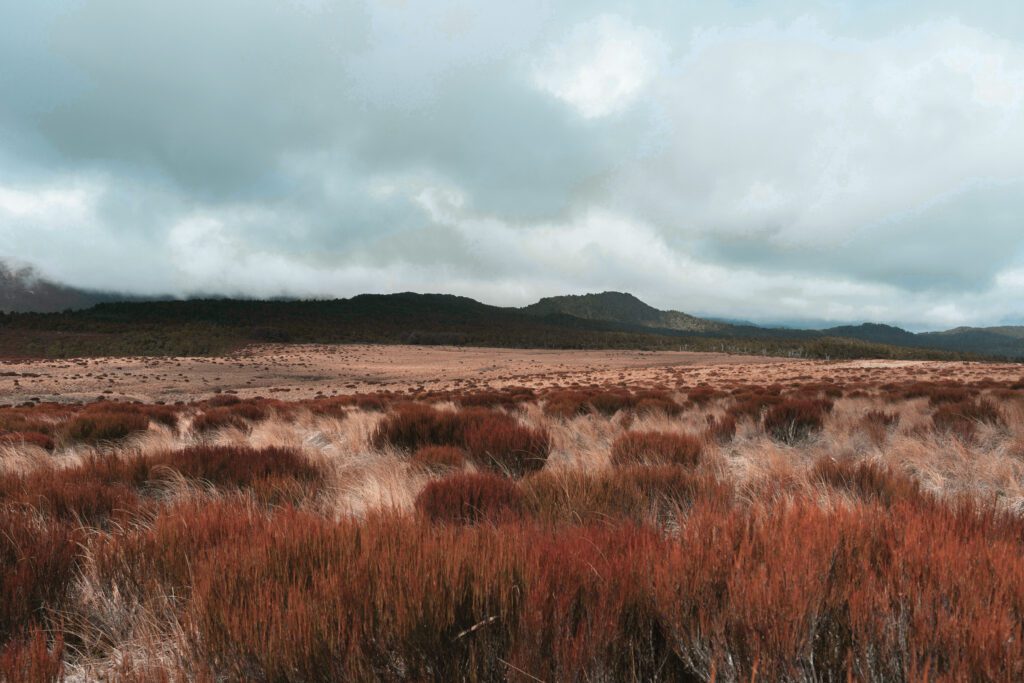
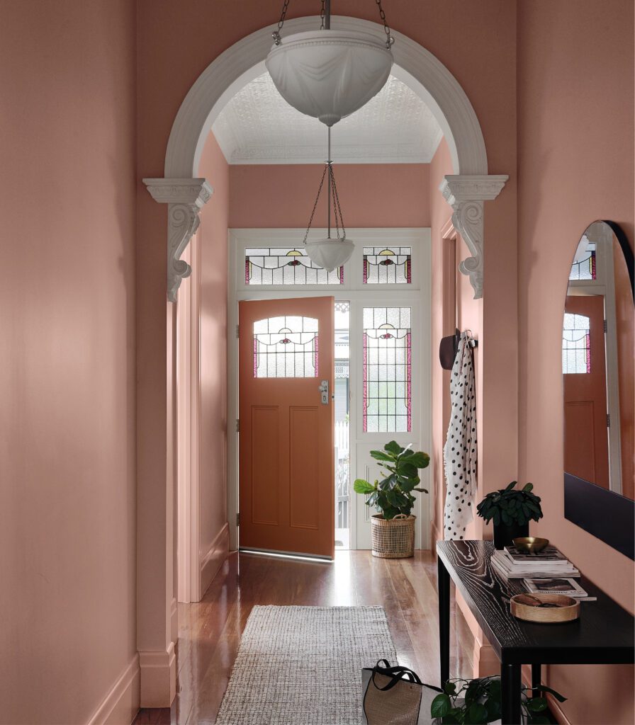
Taking cues from vast alpine tussock plains, this palette reflects many beautiful, soft hues found in Victorian interiors. Powdery pinks like Dulux Garston and Kākahi pair perfectly with the mid-tone dusky pink Gouland Downs and the coppery tan of Ponsonby, balanced out by the cool white of Aoraki.
Tussock Plains captures the essential warm colours evident during this era, often combined with blues and greens.
LIMESTONE ARCHES
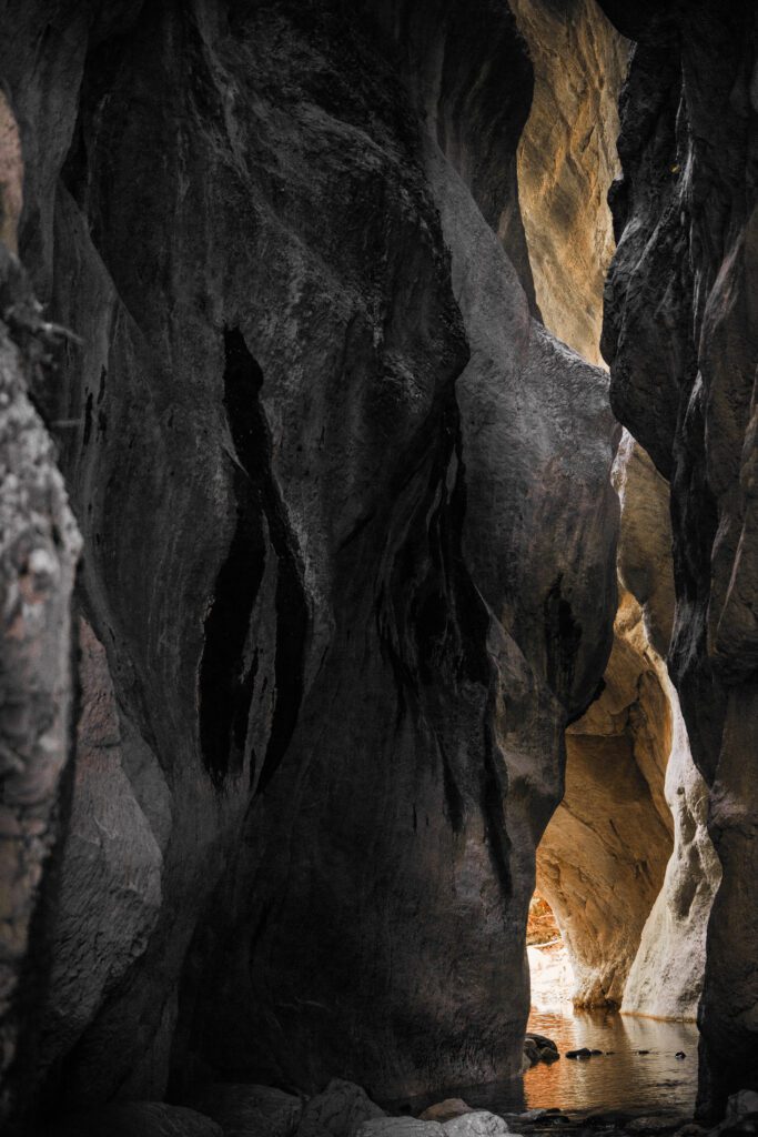
Inspired by the limestone arches of the upper South Island, this palette references the stone buildings constructed around the turn of the century. Buff hues were prevalent on exteriors during this period, often paired with deep reds. Tones like the soft tan of Dulux Ōmarama, through to the buttery yellows of Albury, work well together to express rustication and relief on a facade. Corresponding colours such as the dark charcoal of Rāwene and the creamy Sandfly Point Quarter, work perfectly for highlighting architectural details, while the richness of Gimblett Rd adds depth.
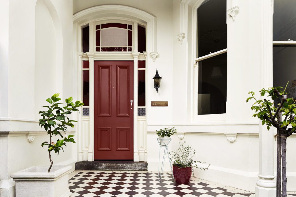
SANDSTONE CLIFFS
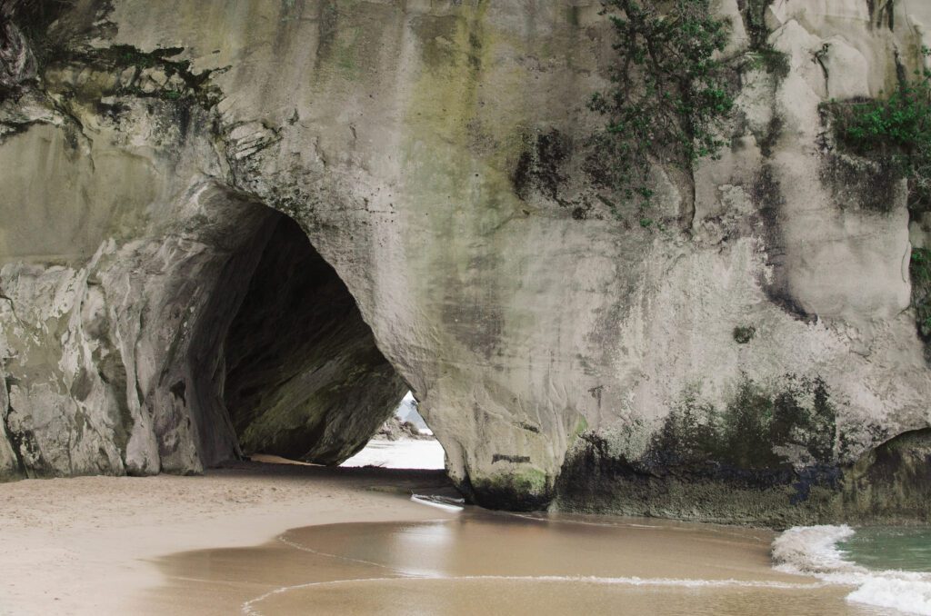
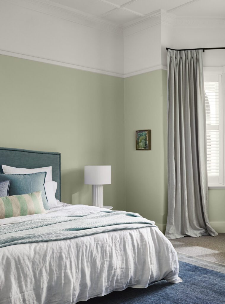
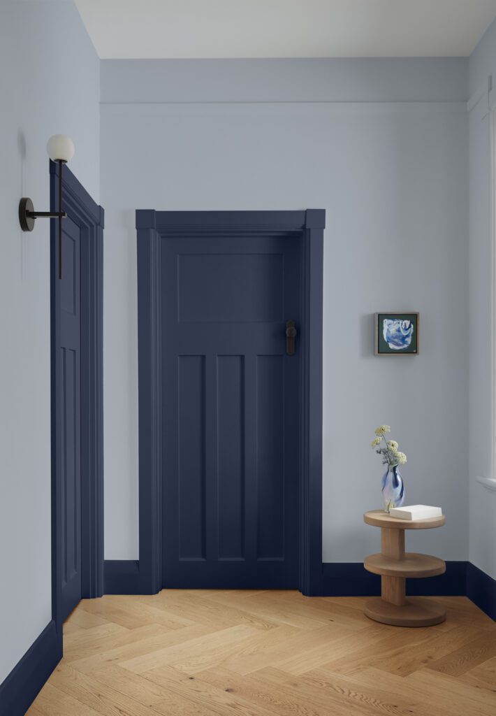
This palette embodies the hues of the dramatic sandstone cliffs found along many parts of New Zealand’s rugged coastline. The pale greens, sea blues and warm greys in this palette became popular with the influence of the early Art Deco period. Colours like Dulux Rakaia and Martins Creek can be used on both interiors and exteriors. Trims and details can be defined in soft, warm whites such as Cardrona, or deep grey-browns like Castlecliff. Soft greens like Okains Bay and mid-blues such as Clifton are perfect for the front door or as beautiful interior colours.
ROCKY SHORE
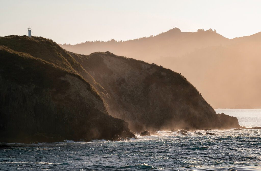
Infused with a sense of openness, Rocky Shore embodies a new way of living found in the early bungalow era. The bungalow was deeply rooted in craftsmanship, and this palette references the use of natural materials, such as exposed wood. Light to midtone browns like Dulux Frankton and Marokopa Falls pair beautifully with the grey-blue of Lake Wakatipu.
For a contemporary interpretation, Lake Wakatipu can be used for the façade of a bungalow, with trims highlighted in the soft white of Avalanche Creek. Alternatively, architectural details can be accentuated with darker tones, like Moonlight Creek or Coalgate.
RIVER VALLEY
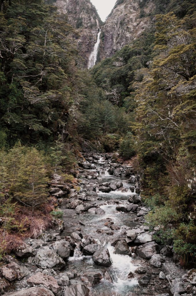
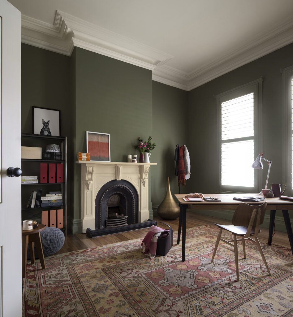
This pallete’s greens, creams and burgundies are seen in the richly decorated designs of the mid-19th century. Colours reminiscent of natural stone, such as Dulux Morrinsville and Kaimanawa Range, are ideal for an exterior colour scheme. These colours work well when paired with greens such as Happy Valley and Kōpū, and can be used with accents of burgundy like Pātea.
The River Valley palette is a rich and emotive colour scheme designed to work well on a wide range of heritage homes and buildings.
View the full Dulux Colours of New Zealand Heritage Collection.
