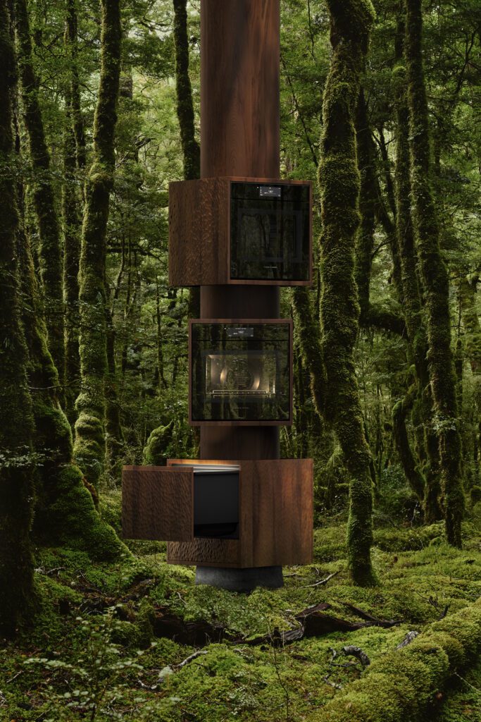
The winners of the 2024 Dulux Colour Awards seek to set precedents; to evolve our design language, and to create communities. They evoke responses, and offer insight into new ways of engaging with colour — perhaps no more so than the New Zealand Grand Prix winner, a project that artfully reimagines affordable housing.
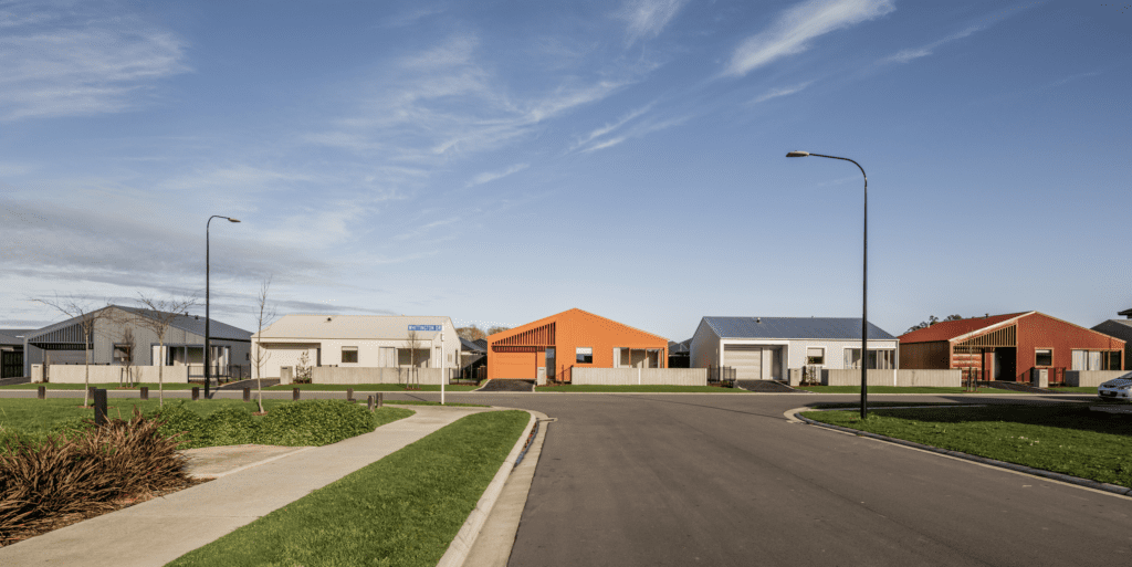
Designed by Common Architecture, Seven Colourful Little Houses is a project that illuminates the opportunity we have to create change and to cast a contemporary narrative on suburban living. Put simply, this project
is a row of houses in a developing subdivision just outside of Christchurch yet it has so much more to
offer than its functionality.
As Dulux colour specialist Davina Harper puts it, the project “sets an exciting new precedent for this typology, highlighting colour as a cost-effective, joy-inducing and highly impactful design strategy.”
The success of the project is perhaps in its ability to capture the intangible; using colour to embrace a sense of possibility — a new way forward. On an unassuming suburban street, this community within a community was given a vibrant identity — and it’s something that the architect behind it says is what we need more of as our New Zealand design identity evolves.
These homes weren’t designed and built to sell; rather, they were envisioned from the outset as affordable homes that would provide long-term rental accommodation. With that in mind, affordability was a key driver in design decisions, and colour formed the ethos of this little community’s soul.
Lined up side by side, the homes present a deep dive into abstract, contemporary, and well-used colours, some familiar to our suburban fabric, and others the opposite.
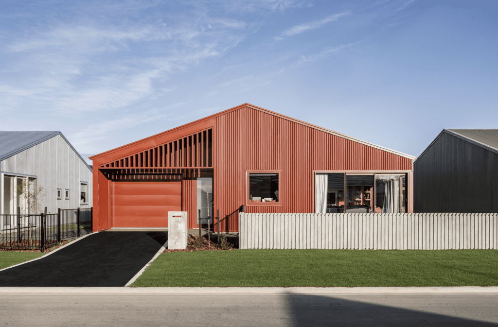
“The success of the project is that they form a cohesive whole. There is no fencing between the homes, so we were never trying to present them as individual properties, although they each have their own character. It is in their connectedness that they work well,” Daniel Sullivan of Common Architecture explains.
“When choosing the colours, we looked at those that already existed in suburban settings, and those that didn’t. The latter became a way to express familiarity in a contemporary form.”
The houses at each end of the row, the bookends to the enclave, articulate the colour evolution. At one end, Dulux Duralloy New Denim Blue represents the familiar, and at the other, Dulux Duralloy Wizard presents the future. “Moving through the palette in this manner was suggestive of an evolving way of thinking when it comes to residential design.”
It wasn’t just the colours themselves that were important to Daniel’s team though, it was the relationship between them. “Once we had the colours, we sat down and played a game of cups, testing how the colours sat in alignment with each other. We ended up with Dulux Terracotta in the middle, with Dulux Mist Green, Dulux Scoria, Dulux Titania, and Dulux Silver Pearl in between.
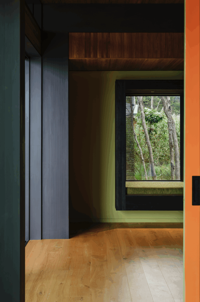
“What also works really well here is the relationship between light and shadow, and the way colour changes in response to the angle of the sun. There’s a real dynamism to these homes that is accentuated by the corrugated metal profiles and louvres, which deepen the shadow play, and, ultimately, the experience of colour.”
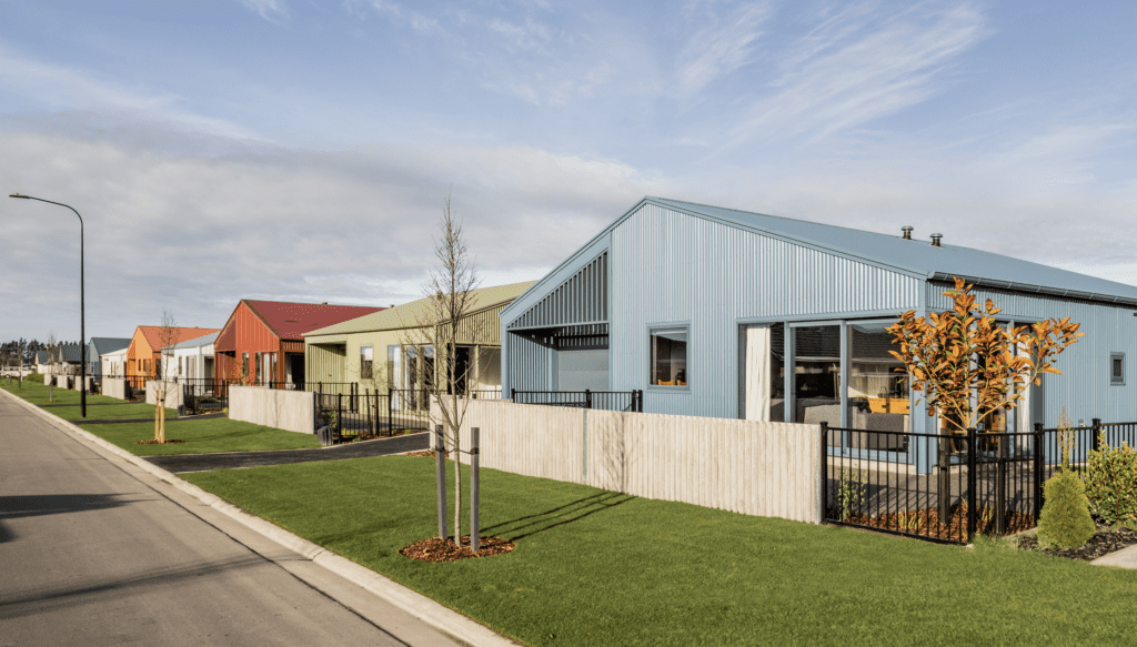
As a whole, this project has successfully reinvigorated the concept of suburbia, and introduced a new narrative: one in which affordable housing and great architecture can coexist, and in which colour is a vital part of a brighter future for our suburbs.
“We are a young nation and when it comes to architecture and design, I think we are finding our voice. Housing has such a huge impact, not only for the occupants but in terms of the wider context; the streetscape, the neighbourhood, and the community. With clever design, we can create positive outcomes for residential architecture — across budget and scope — with colour at the fore.”
Alexandria House
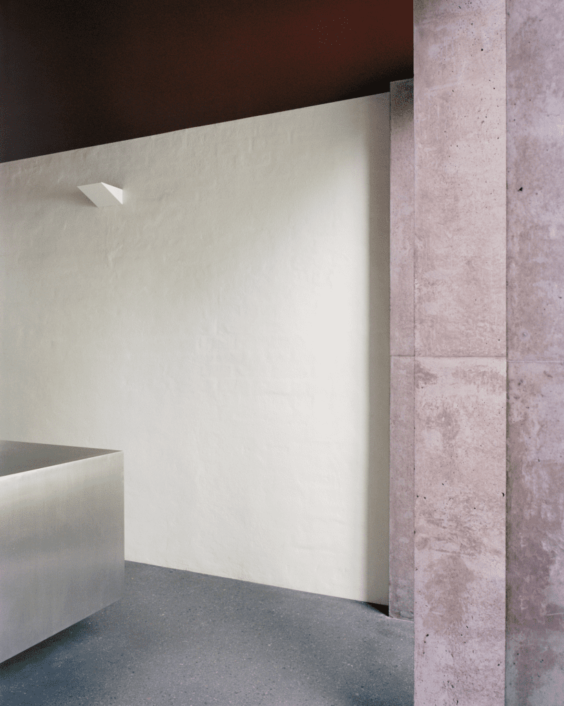
Alexandria House by Lachlan Seegers Architect took out the Australian Grand Prix title with a bold move; a singular gesture in the colour blocking of the ceiling in Dulux Cumberland Red, a deep, burnished red described by the judges as “a highly original design decision that boldly challenges accepted norms”.
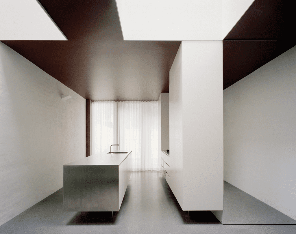
Intensifying the impact of this strategy is the juxtaposition of this painted ceiling with natural-white walls (in Dulux Cardrona), a stark contrast that results in the roof plane precisely articulating the interior’s spatial relationships.
It is a defining move, bold in its simplicity and impactful in the drama it creates, particularly during the day, when the glossy surface takes on nuanced hues as the natural daylight shifts. By night, the effect of the darkened ceiling is equally surprising, as it essentially vanishes to create a void akin to the night sky.
Minimal and quiet, any potential starkness here is cleverly offset by the soft textures of earthy hues, pigments, and aggregates on select surfaces. It all coalesces into a deeply moving, soulful space, an architectural wonder exemplifying the power of a single colour and the potential of a unique strategy, confidently executed, to establish a new paradigm.
