


A selection of artworks from the private collection of legendary New Zealand architect Sir Miles Warren will be offered at Webb’s upcoming Works of Art
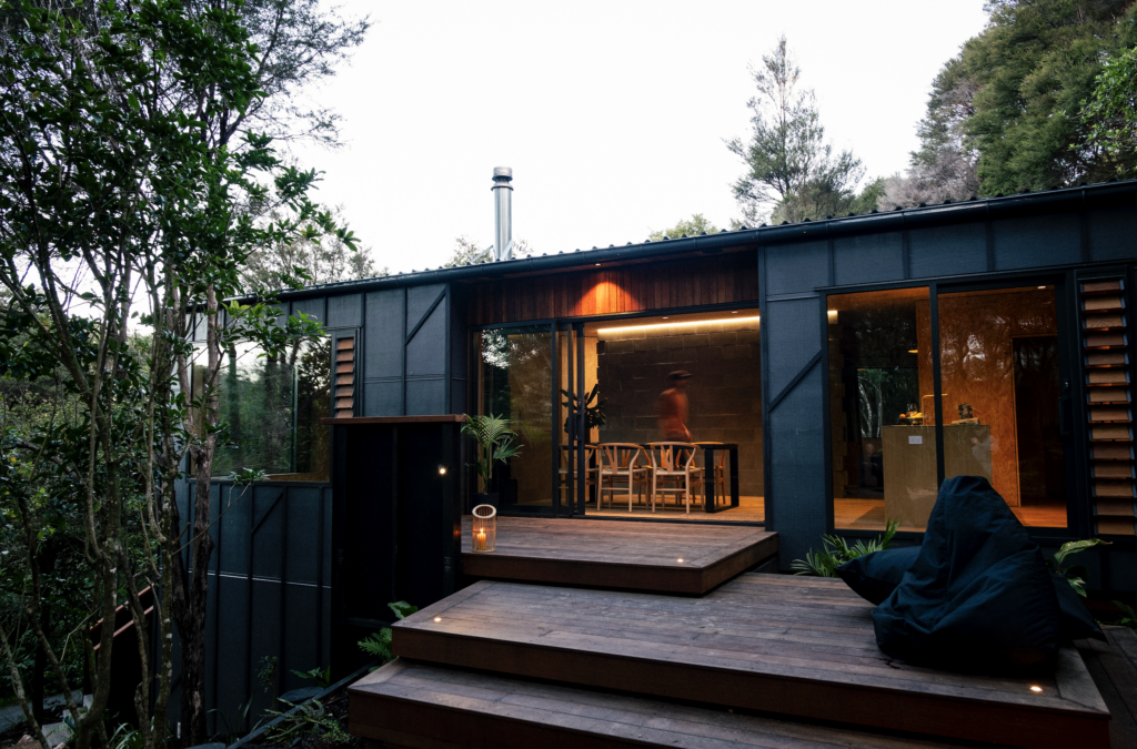
This award-winning cabin on Waiheke Island by architect Vaughn McQuarrie and interior designer Sara Fraser of Sartoria is on the market for the first time.
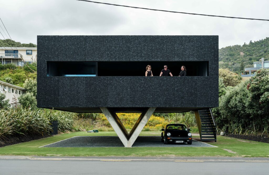
Named the 2025 Home of the Year, this unmissable yet small beach house took 14 years to complete.
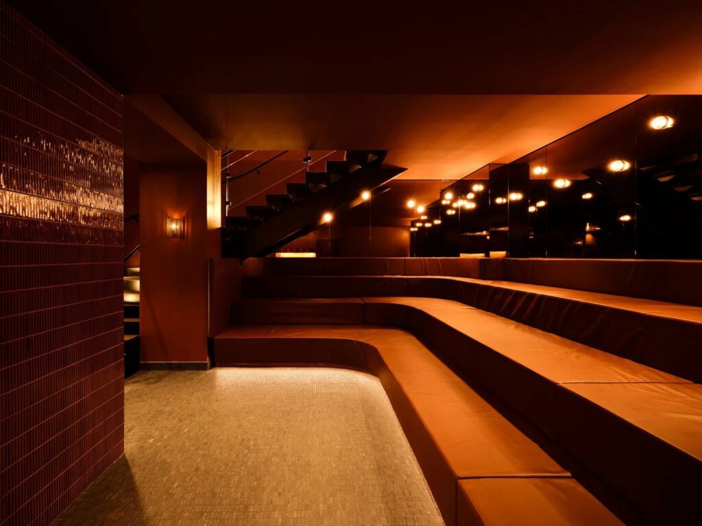
Designed by Toronto studio Futurstudio, Sant Roch reimagines ancient bathing rituals through contemporary architecture and sensory design.