Mário Luz devises a simple form — three cedar boxes anchored by a central concrete spine — that settles effortlessly into a flat, rural Cantabrian landscape.
Twenty minutes north of Christchurch a relatively new development is centred around a golf course and man-made lake. To the east, Pegasus Bay stretches up towards Kaikoura.
It’s a place with a certain rhythm to it, but one where the vernacular is still emerging — sites in the development were first sold around 20 years ago. This site is one of the larger ones, at 2600 square metres, but Pegasus straddles the divide between medium and low density, with sites of varying sizes.
This house was envisioned as a holiday home for an airline pilot who routinely flew to and from New Zealand — and had been visiting the region since childhood — and a place where golfing would be at his doorstep.
According to architect Mario Luz of Dalman Architects, “The brief was brief. We knew he wanted a holiday home with separate areas — one for him and his partner, and one for guests. We knew he appreciated vertical cedar cladding, but apart from that it was really open to interpretation.
“Especially because it is a flat area, we felt early on that we really needed to make sure the house settled well into the land.”
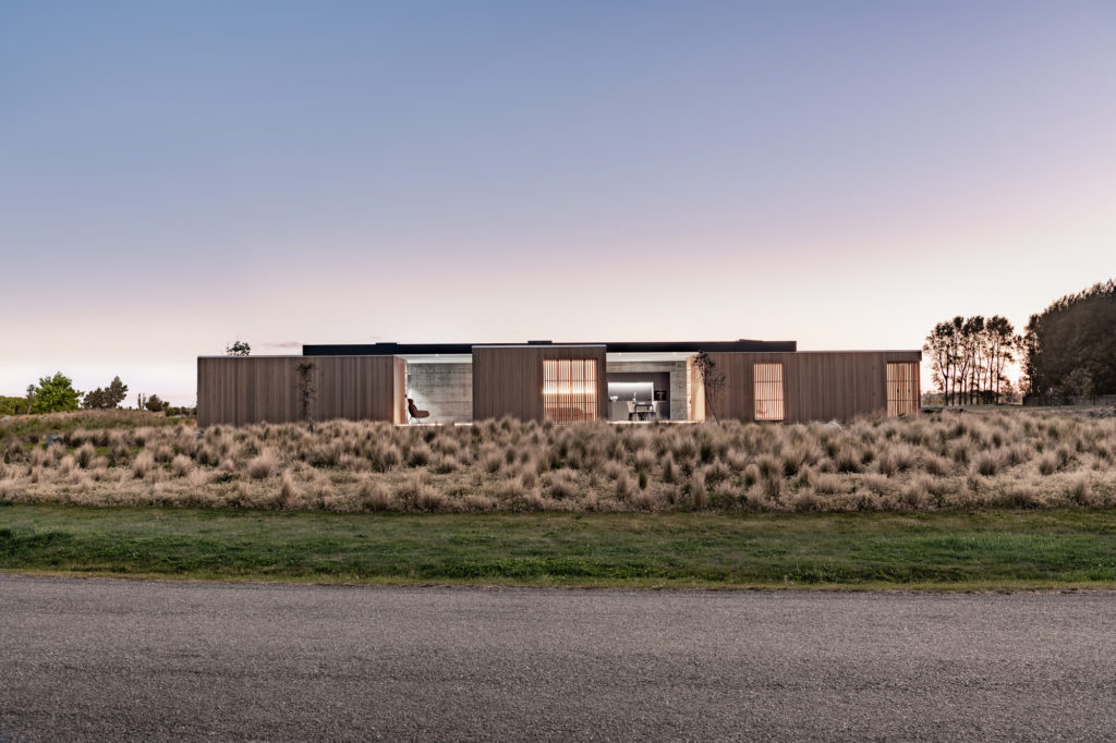
It’s a place of green and brown hues; native grasses abound, and the flat rural surrounds stretch out for kilometres to the west past the meticulously manicured grounds of this site’s immediate context, Pegasus Golf & Sports Club. It’s a far cry from central Christchurch, just down the road, and an area that has been favoured by locals in the decade since the devastating earthquakes rocked the region. Once completed, Pegasus is expected to be home to upwards of 6000 people.
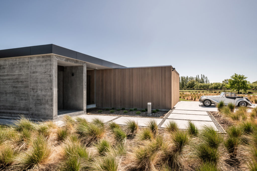
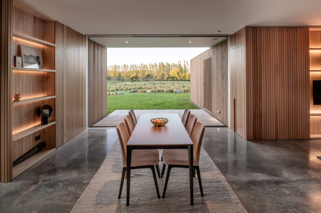
The form that transpired is simple, designed to unfold gracefully across the site, maturing into its environs as the cedar cladding weathers. Essentially three cedar boxes connected by glazing and a linear concrete spine, it’s a place of versatility, designed to be both open and closed, at once inside and out, and one where this lack of delineation between the two allows for a sense of being able to tee off from anywhere in the property.
The concrete spine houses the utilities and services, including a fireplace, while a grey kitchen falls into the background, cleverly carved out of the spine.
“The board-form concrete creates texture and aligns with the cedar of the boxes. We wanted to ensure we kept to a grey palette in this spine area, where the kitchen is located. Sliding doors at either end of the kitchen conceal the service areas of the kitchen, which retreat into the spine. It’s an intentionally recessed space with a skylight above to draw natural light in,” Mario explains. “The use of grey makes it feel like a more intimate space in contrast with the white and glazing of the rest of the area that wraps around the cedar boxes and is framed with glazing.”
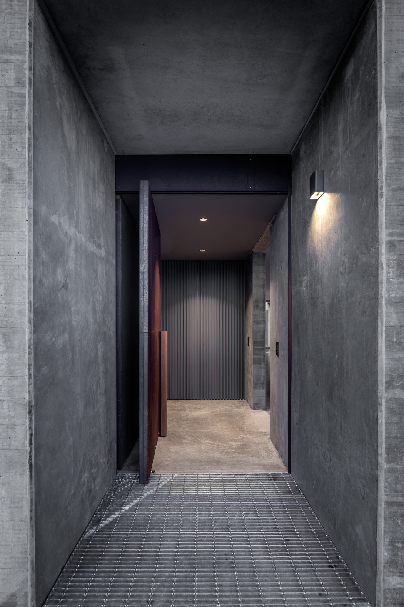
Every door and window in this house — aside from one near the bespoke Corten steel entry door — was designed to slide away into a cavity, to accentuate the sense of the building being a pavilion.
Lighting is intentionally sparse in the open-plan living areas that wind around the three boxes.
“The client didn’t want lighting overhead. He wanted to be able to control the lighting more intricately with lamps, which is why there are just two downlights in this area, outside of the kitchen. It means we could create a clean, crisp ceiling free of interruptions,” Mario explains.
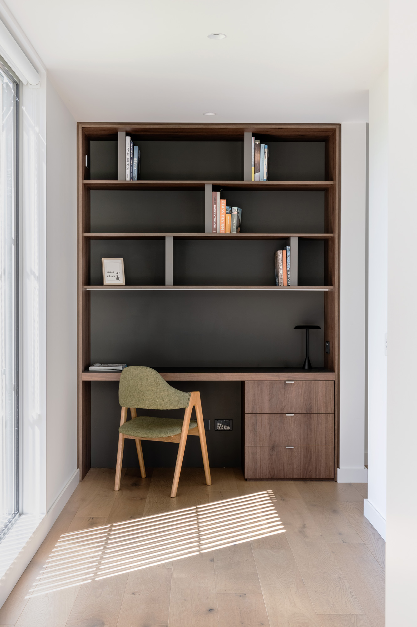
Additional lighting is incorporated into inbuilt shelving units.
The first ‘box’ houses the main sleeping area, a bathroom, and an office, while the second and third house the guest area, and garage, laundry, and storage respectively.
The bedrooms are small, white, and crisp, almost hotel-like in their appearance, aided in part by the use of a vanity outside the bathroom that becomes, as a result, a wet room rather than a full ensuite or bathroom.
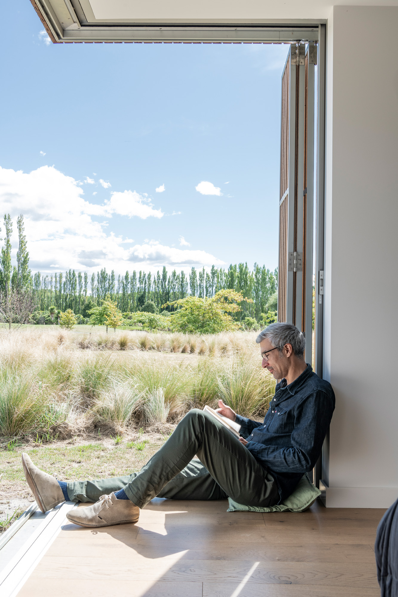
Marion says that part of the design of the bedrooms was centred around ensuring they would open up in a complete way to the outdoors. The result is rooms where glazing on two sides slides away, leaving a corner of each room completely open to the elements — and the golf course. Exterior folding timber screens allow for privacy and shading when the rooms are open.
“The bedrooms are designed to be cosy and more intimate than the voluminous living area,” Mario mentions.
Three outdoor terraces offer multiple options depending on the time of day and weather. Two face the sun and the north, and the other looks to the west.
“While there is a nice subtle transition between terrace and interior here, I think the ultimate effect in this house is the feeling of being outside when inside, as if you can tee off from anywhere in the house,” Mario tells us.
Words Clare Chapman
Photography Stephen Goodenough
