Sitting up on steel plinths with a sheltered internal courtyard, discover how Herbst Architects have taken a standard footprint and cleverly twisted it in on itself to create this incredible holiday home
[jwp-video n=”1″]
Q&A with Lance Herbst of Herbst Architects
What was the brief like?
The brief was quite straightforward. The clients essentially wanted a beach house with a main bedroom, guest bedroom and a bunkroom for overflow. But they put a lot of faith in us. They were quite architecturally experienced, as they had built houses before and understood the ups and downs that go with that process. They were really good at briefing us, then empowering us to come up with an interesting response to the brief.
Describe the roof design. What were you trying to achieve visually, and how complicated was it technically?
The idea with the roof was to lift the perimeter up all the way around the building and separate it from the wall pane by a continuous clerestory window to engage with the tree canopy. Inversely, we wanted to keep the parapet height of the courtyard as low as possible to allow a view up to the trees and mountain from the living room and passages to the bedrooms, and to allow as much light as possible to penetrate.
This resulted in the inward sloping roof – the dominant feature of the house. Technically, it did get complex in that the plan is not a true square, but the ceiling plane needed to resolve internally on a fixed datum line and critically at the four folds of the ceiling. This resulted in the ceiling and roof planes being at different pitches on two of the roof faces, so it required detailed 3D modelling to resolve the structure and junctions. We thought it was pretty tricky but our incredible builders were totally unfazed.
[gallery_link num_photos=”9″ media=”http://www.homestolove.co.nz/wp-content/uploads/2018/04/piha8.jpg” link=”/inside-homes/home-of-the-year/home-of-the-year-2018-piha-herbst-architects” title=”Read the full story here”]
In your design of the ‘Lindale’ bach on Great Barrier, you deliberately preserved the feeling of camping, including some of its inconveniences. In the book, New Zealand Houses by Patrick Reynolds, you were quoted as saying “convenience robs a holiday of its rituals”. How is your approach to this house different?
Ha, I’ve got into a bit of trouble for that comment. But there’s a difference between a bach, where you might only spend a few weeks every year, and buildings where people might want to spend two months in July, when it would not be responsible to make people walk outside to get to the bedroom. We might do that in a real bach, when we have clients who go along with that and we can push it really hard. But it doesn’t really apply when we’re talking about a beach house.
How is a beach house different from a home-house?
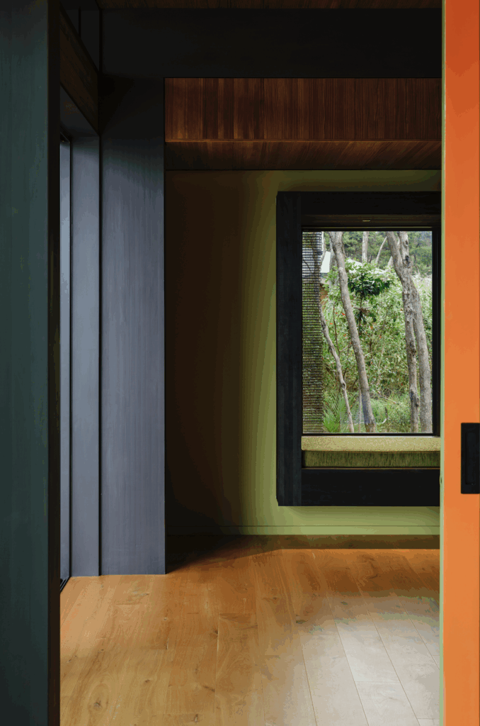
It needs to feel like a beach house, like you’re getting away from the city, but be friendly in all weather and sustain prolonged occupation. You still want to create a feeling of difference, in terms of how it’s made and the materials used, and the way it engages with the natural environment. Here, you have expansive sea views and the trees feel like they’re coming inside; it allows for a very powerful response to nature.
