A thoughtful extension has given new light and shape to a clifftop house overlooking Cox’s Bay. Discover how generous spaces and custom touches have created a restful retreat

A thoughtful renovation has allowed this clifftop home to celebrate its view
The owners have just returned from holiday and they couldn’t be happier to be home. With a tranquil view of Coxs Bay in Auckland’s Waitematā Harbour, and light filtered through pōhutukawa, their newly renovated home is a holiday in itself. Their brief to Ben Lloyd and Mike Hartley of Lloyd Hartley Architects was to create a beach house in the city. “It’s extremely peaceful,” says one of the owners. “Whatever day you’ve had, you can come here and forget about it.”

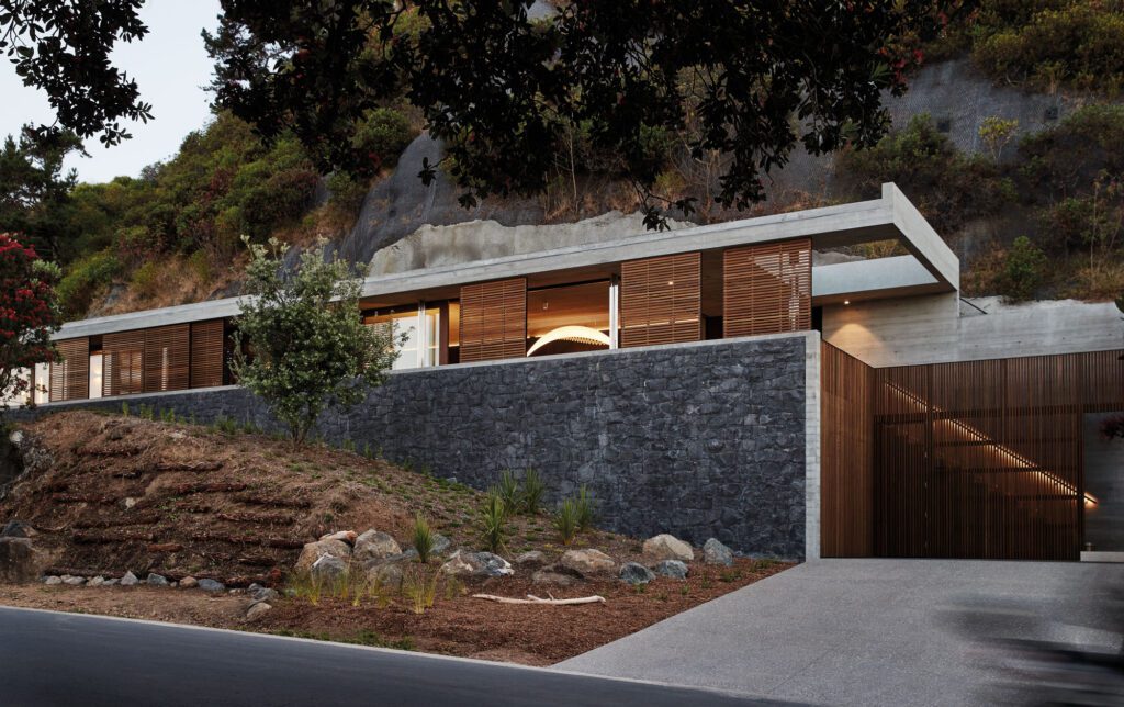
The original home was a shapeless 1960s box with a block base and brick top. But if it had been bowled, existing usage rights on the south boundary would have been lost; a new footprint would have to retract into the section. Instead, Lloyd and Hartley re-imagined the top storey as a living area in the same shape as the original, only with an entirely new roof and structure, and openness to the view. An extension – containing the main bedroom and three children’s bedrooms – stretches to a sloping garden at the back of the property. Another significant move: the garage now sits under the new bedrooms and a space below the extension creates a covered entry court. (A media room and pool, meanwhile, are pending.)
It’s the first family home for the owners and their three daughters – the couple had young twins when the project started and welcomed a third daughter along the way. Before embarking on the renovation, the family lived in the house for two years to get a feel for the place, and it then took more than four years of working with the architects to strike the right balance of what they wanted to achieve. The house was the first major project that Lloyd and Hartley took on after establishing their practice. “There were a few iterations that time allows you to work through,” says Lloyd. “It’s a collaborative process – we’re certainly not closed to our clients’ ideas because, ultimately, they live there.”
The simple pitched-roof form belies the complexity of the alterations that took place. The house is reached down a long, straight driveway, which opens out into the entry court, a roomy pull-up space that borrows a restful view of the neighbour’s tennis court. “Now, if someone comes to see you, they are standing under shelter rather than waiting in the rain,” says Hartley.
And it’s a lovely place to dwell. There’s welcome containment in the court’s timber-lined ceiling, while travertine tiles are carried through into the interior, the flush effect visible through full-height glass panels that wrap the gallery-like space where a commissioned sculpture stands. The full-height timber door strikes just the right note with a column of brass – it runs the height of the door, set into it, projecting at an elegant angle in the centre to form a handle. A slim light crosses the entire timber ceiling, stopping at the door.

The main living area, which fringes the water, has become an open-plan kitchen, dining and living space, with a wide west-facing deck. The considered layout is a show of moderated light, obscured and celebrated views.
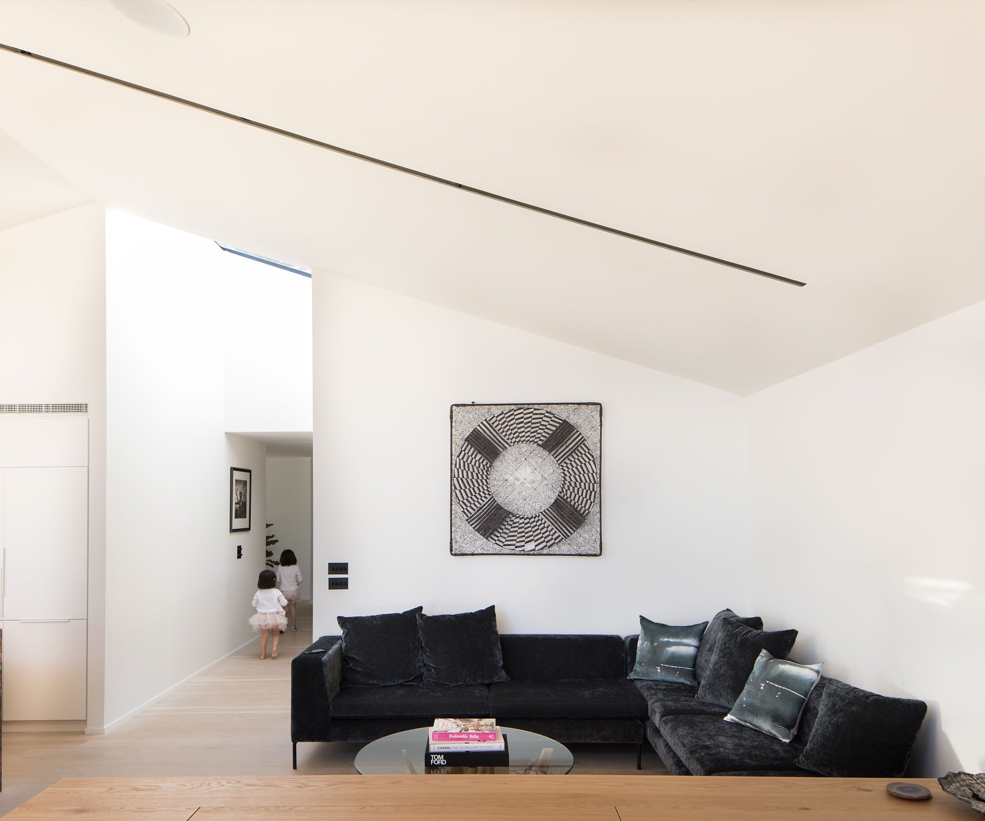
Up top, one of the first things to alter was the ceiling. Originally 2.4 metres, flat and with pelmets that impeded the dreamy water views: “It was like wearing a wide brim floppy hat that dipped down in the wrong place all the time,” says Hartley. The ceiling now follows the new roofline and is 3.9m high at its peak. Slim steel poles are pulled back from the corners, allowing full-height sliding doors to open the space up to the deck – the result is a sense of weightlessness.

The open-plan space has various zones, each offering their own unique perspectives. On the south side of the room, two lounging zones – a corner couch and day bed – are separated by a sleek oak veneer cabinet, which hides the TV. A separate living area has been designed as the kids’ space, yet it’s still in view of the main living room. On the north side, the kitchen and dining table flank a marble island. Hartley describes the piece, from SCE Stone & Design, as an artwork in its own right. “It’s like a piece from the middle of the earth that’s been drawn up,” says Hartley. “It’s amazing.”

A bench in the same fusion marble runs along the north wall, where a window is positioned as a pass to the side deck. Here, cabinets are strategically placed to obscure a neighbouring home. Key materials are used elsewhere: blonde oak floors, black steel and bespoke brass accents. And they’re used to great effect – in the brass banister recessed into the wall leading up a floating staircase, say, or the slim brass toe kick in the kitchen.

After many years of gestation, the house finally delivers on the view that initially attracted the owners. The sculptural branches of a pōhutukawa filter the tidal and light shifts of Coxs Bay – Lloyd and Hartley’s design is polished and recessive, enveloping and engaging, while celebrating the cliff-top setting. “It feels like you are floating close to the water,” says the owner. “The view gives us something special every day.”

Words by: Jessica-Belle Greer. Photography by: David Straight.
[related_articles post1=”78709″ post2=”77723″]


