Despite this Kaipara Harbour home’s modest budget, PAC studio team managed to create an elegantly rural space for this Auckland commuter
In recent years, aspiring first-home buyers in Auckland without a million or two to spend have been faced with a stark choice: move out or give up. In doing the former, some found a lifestyle that turned out to be better than the one they’d left behind – as the owner of this modest home by PAC Studio discovered. “I was working six days a week and I realised I needed to change my life,” he says. “I changed my diet, started doing yoga – and the house was an extension to that.”
It started with the section, up a very fetching arm of the Kaipara Harbour near Pahi, which the owner found one afternoon quite by accident while visiting the area. His is one of nine sections in a small enclave carved out of 3870 square metres of regenerating native bush, with a share in a large reserve, and it cost less than the average Auckland renovation. The cute seaside village of Pahi is nearby, as are the townships of Maungaturoto and Paparoa. There’s a good local pub and an excellent weekly farmers’ market.
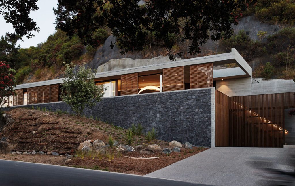
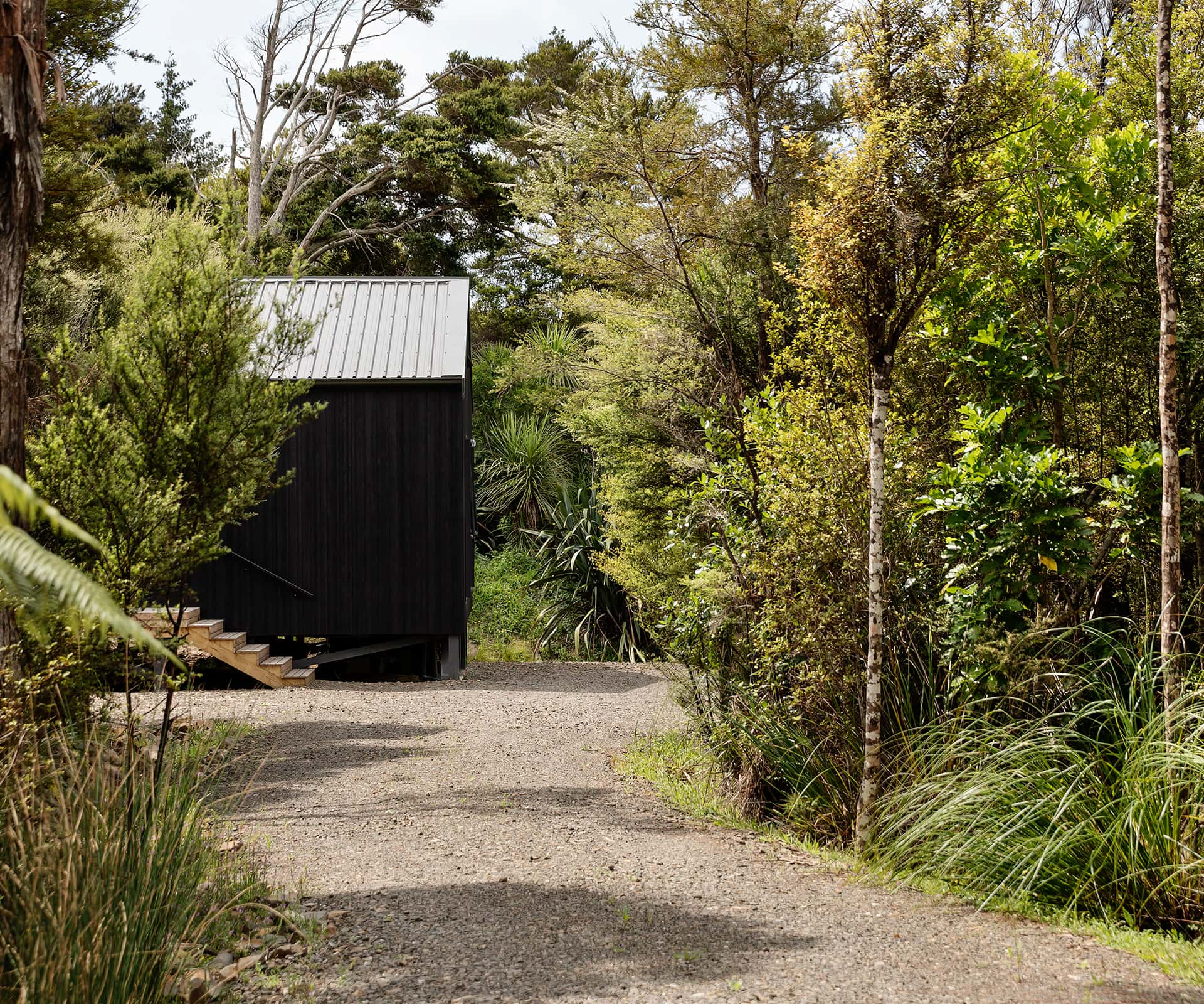
Tucked down a long, curving, bush-lined driveway, the site is private and gently sloping. At the time of purchase, a bund of soil was piled up close to the top of the gentle slope, which obscured the view of the Kaipara Harbour and made it feel claustrophobic – but the view from the top was magical.
“It’s just so beautiful,” says Sarosh Mulla of PAC Studio, who visited with Aaron Paterson, PAC’s director, not long after their client bought the site. “He found a lovely spot pinched between the bush and the water – you’ve got close-ish neighbours, but at the same time it feels really private.”
Their client asked Mulla and Paterson to design a modest house for less than $400,000. The challenge was to design a semi-permanent house that was more than a bach, but not something that felt like a suburban house transplanted to the country. The owner spends a few days a week here, commuting to a studio apartment in the city and working between his office in town and the oak kitchen table here. Eventually, he’ll live here almost full-time, making the trip to Auckland as meetings demand. As a result, there’s a determinedly internal focus to the place, with plenty of walls, broken only to take in particular views. There’s a sense of retreat and shelter to a house that’s used as much in winter as it is in summer. “The idea was the flip between moments – when the sea was lovely you’d turn your back on the bush, and in a howling gale you look at the bush.”
The architects’ first move was to sculpt the site, digging out the bund and pushing the earth down the site, before springing the house up on piles so that the front touches the earth and the eye runs out to the view. Their initial design – while lovely – came in too expensive: with a sawtooth roof and exposed trusses, the cost quickly spiralled past the modest budget, so they pulled back, seeking inspiration from the highly rationalised building methods of group-home builders. They worked with standard off-the-shelf trusses, a flat ceiling and a square form to increase efficiency; the client happily dropped the third bedroom and en suite from the brief, and the project became much achievable.
The design is obsessively rational. The PAC Studio team sweated each and every detail, seeking the most efficient plan possible. A series of modules are based on standard plasterboard sheets and predominantly standard windows to reduce cost, avoid waste and speed up the build, which only took a few short months. Even the over-sized skirting boards are a trick, which allowed the builders to use entire plasterboard sheets despite the generous 2.7-metre stud height. “It’s just so rational,” says Paterson. “Sarosh did heaps of work on how you set out a truss, its size, how you do the footings and piles. Everything is designed to be the most economic and get maximum bang for buck.”
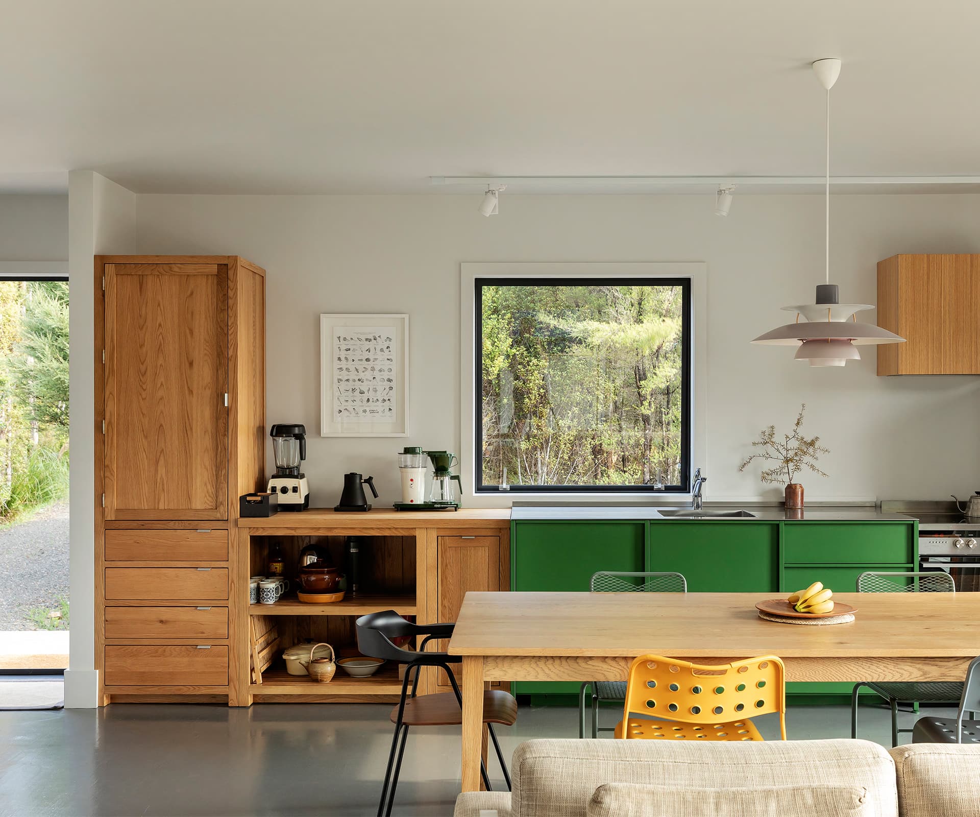
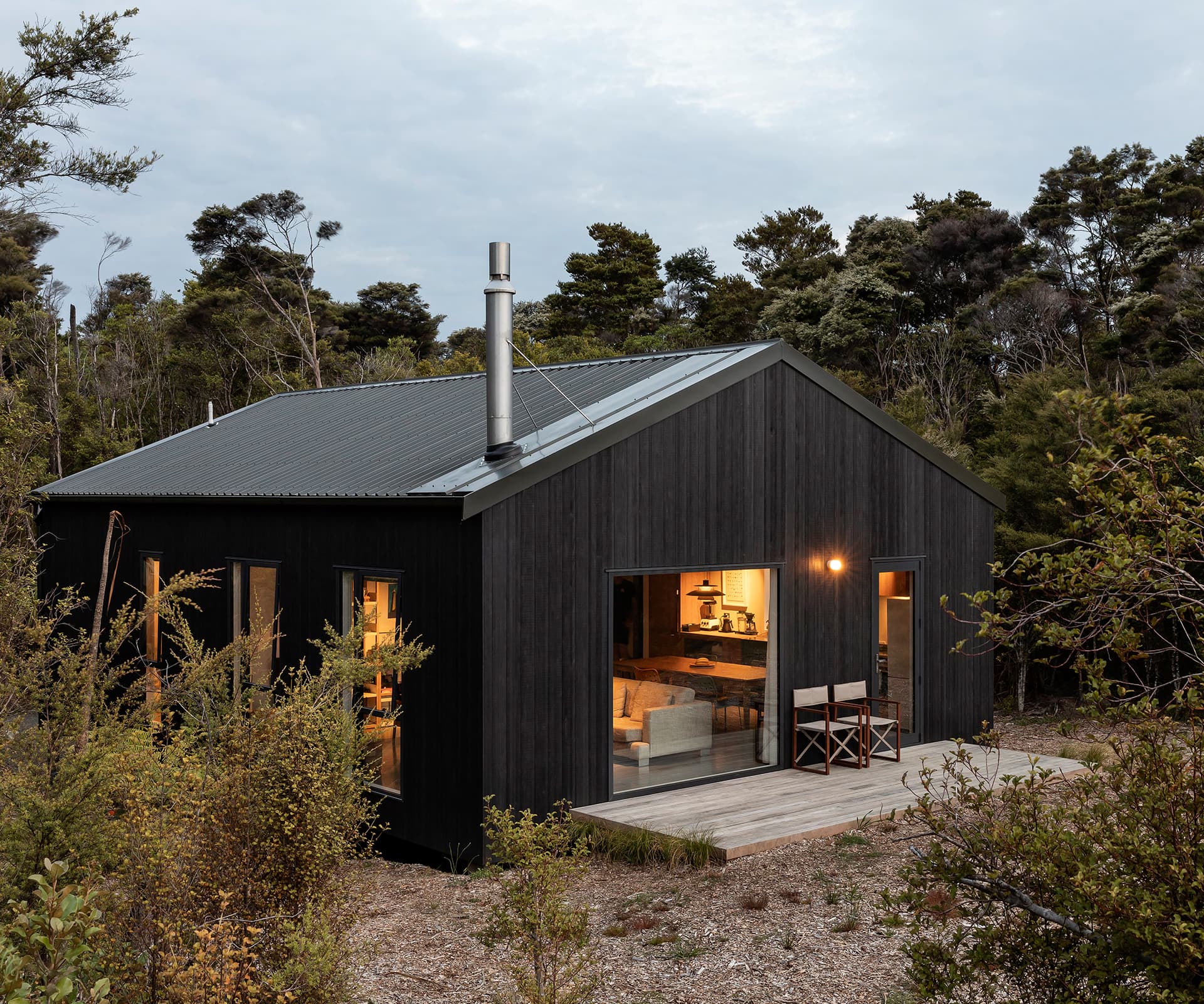
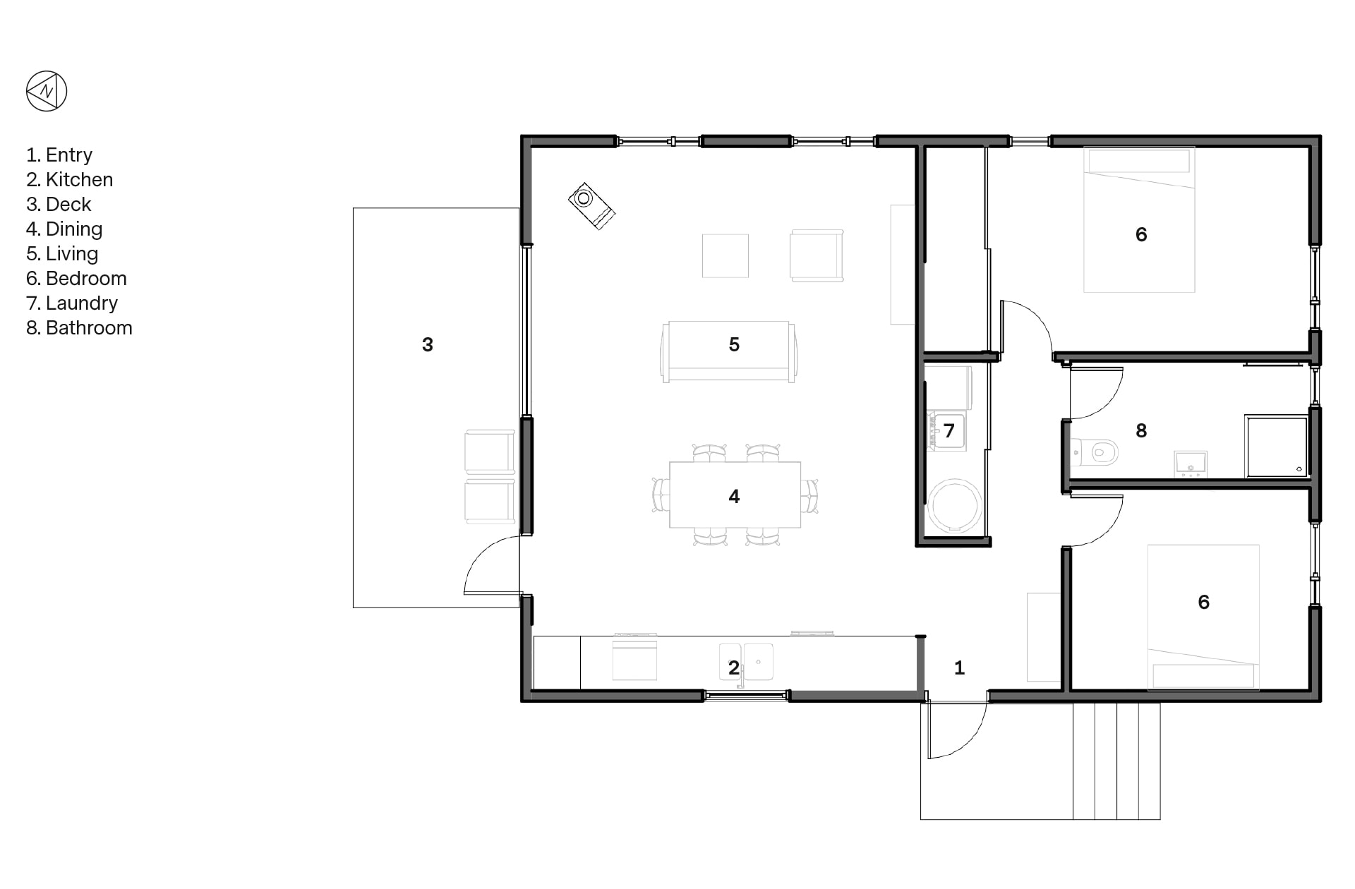
Despite that, the house is a long way from suburban group home: rather, it feels elegantly rural. It has a simple language of black-stained timber and green corrugate roof, with exposed grey-painted piles. You step up a flight of stairs to a small deck, then into the house where a sort of mudroom acts as a ‘pinwheel’ between the private and public parts of the house. The design is carefully thought through so that private areas are not visible from the living spaces – and this makes the home feel much bigger than it really is.
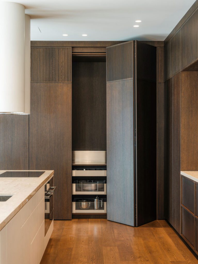
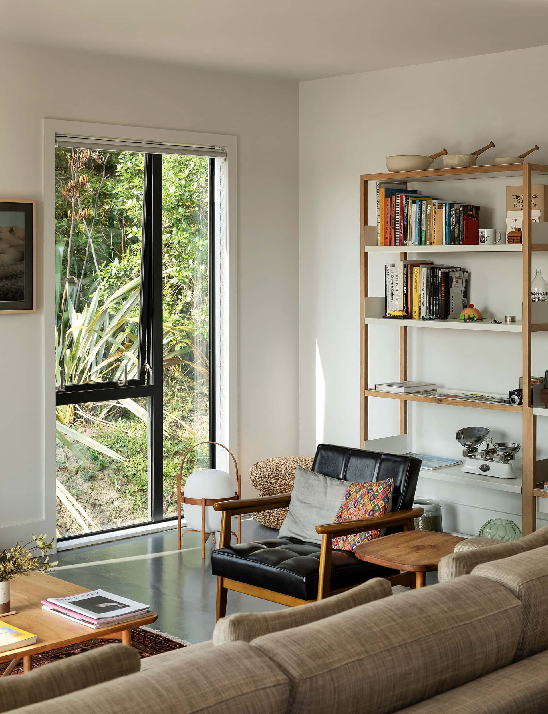
Despite the modest budget, there are some lovely details. The floor is painted plywood, which lifts an otherwise prosaic material to something elegant – it’s a trick the studio has used on other projects. The high stud makes the square living area feel airy and expansive, while tall windows open up views to bush and sea. The kitchen is a particular triumph: a custom-green ‘KXN’ kitchen by IMO, teamed with oak cabinetry, it feels like a contemporary take on a farmhouse kitchen.
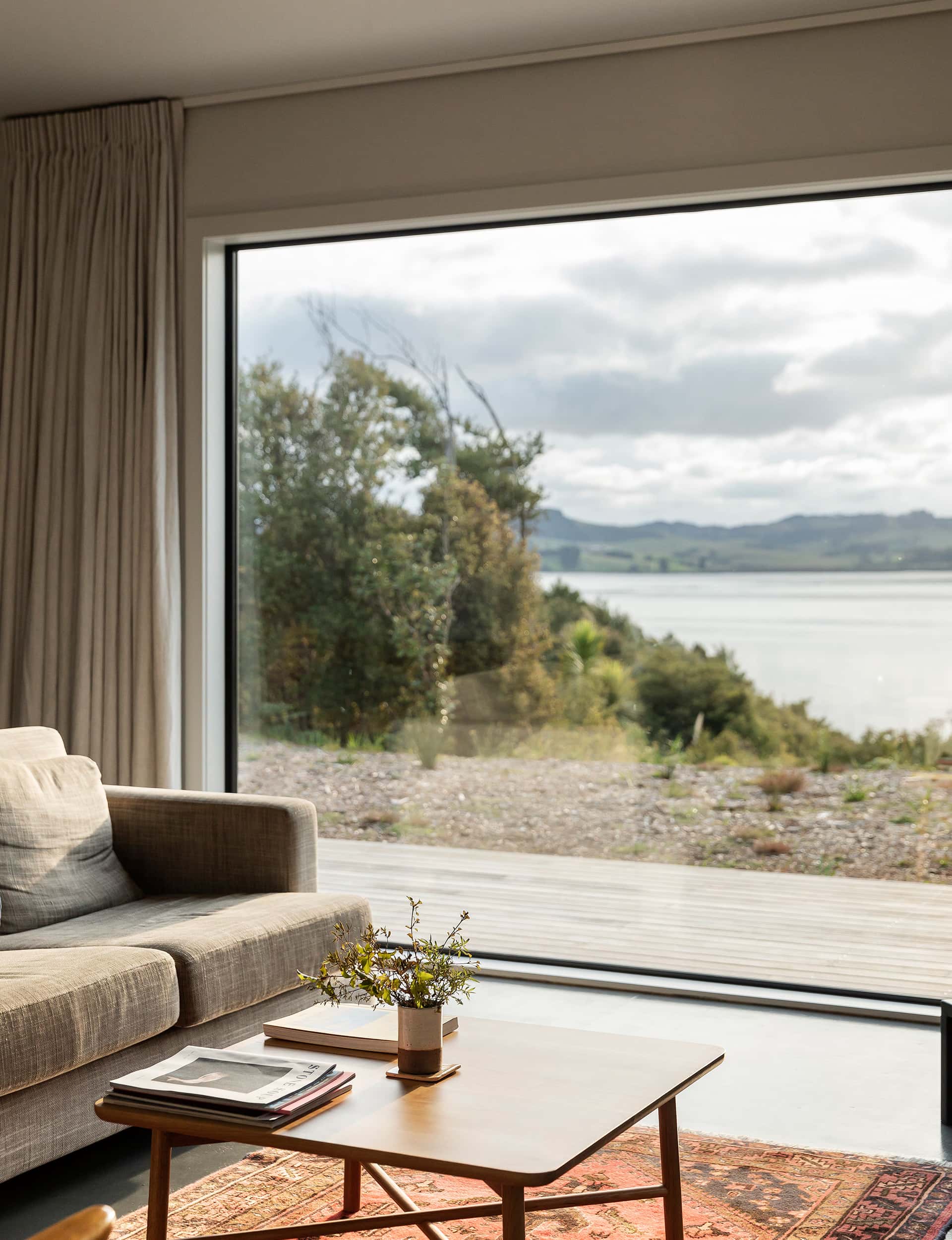
The large square window in the living room, meanwhile, is a perfect spot for morning yoga, and it also fends off rain and wind in a howling winter gale. “It needed to feel special,” says Mulla. “It’s not a standard window and comes right down to the floor. If you had doors there you’d never open them, and you’d have a bulky frame.” For the owner, the house has quickly become a retreat from the pressures of work and a place to think. “It’s a reset button,” he says. “I’m putting a stake in the ground.”
Words by: Simon Farrell-Green. Photography by: David Straight.
This article was first published in HOME New Zealand. Follow HOME on Instagram, Facebook and sign up to the monthly email for more great architecture.
[related_articles post1=”32090″ post2=”68702″]
