For her Interior of the Year Emerging Designer entry, Elena Parry of Fremont Studio put forth her Queenstown Hill holiday home renovation, which shows the designer’s trajectory, maturity, and forward motion.
Elena Parry of Fremont Studio had an interesting trajectory before she arrived at interior design. Academically, she has completed degrees in Marketing, Clothing and Textile Sciences, and Design; a post-grad Diploma in Advertising; and another in interior design. She has studied at the University of Otago and the University of Texas. When HOME reached out to the entrepreneurial designer — who also balances life as the mother of two boys under 5 years — she was on the other side of the globe exploring Italy.
For this year’s HOME Interior of the Year Emerging Designer category, Parry entered Queenstown Hill, a small holiday-home renovation that showed her progression as a designer and gave the judges a glimpse into her predilections and influences.
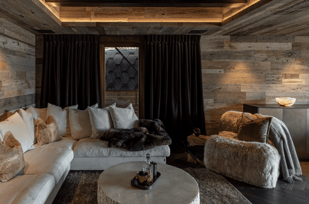
Conceived as a sanctuary away from the hustle and bustle of Auckland city life, the home required a substantial facelift, presenting a fantastic opportunity for the young designer to think creatively and expand on the knowledge she had gained from smaller projects.
According to Parry, her goal was to design a residence characterised by texture, contrast, and a sophisticated use of warm, ambient lighting. The word ‘bunker’ was high on the brief, as a way to both visually insulate the residents from nearby properties and create a feeling of safety and comfort in a region that can be known for its cold weather.
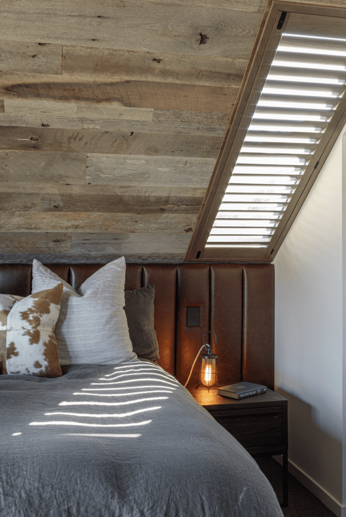
Reclaimed wooden panelling and aged brass detailing ensure the space fits somewhere between alpine hut and slightly more up-market resort offering.
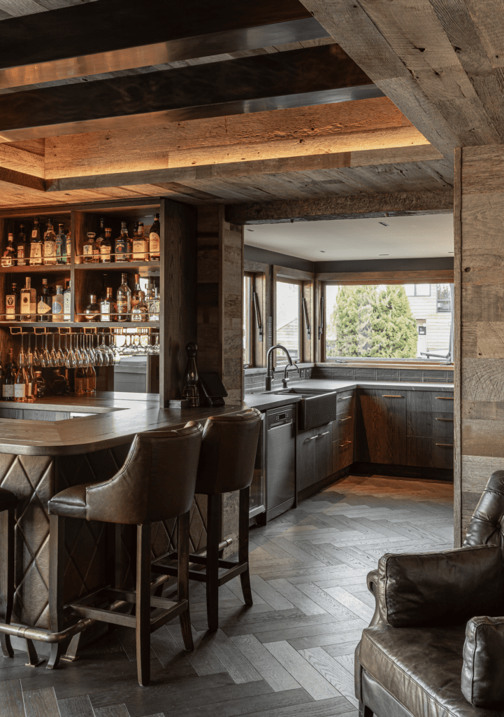
As a standout feature and social focal point, the home has a bar and living room replete with leather, stone, plush textiles, parquet flooring, and allusions to rural living. Brass inlay and an upholstered bar front add a rustic charm, according to the designer.
The kitchen underwent a complete redesign that included repositioning the benchtop, the addition of feature lighting, and bespoke gas-strut windows that offer an uninterrupted view of Lake Wakatipu. The laundry was relocated to the garage, with a cleverly designed laundry chute in a hidden cupboard in the kitchen. This relocation allowed the designers to create a concealed bedroom and bathroom on the ground floor.
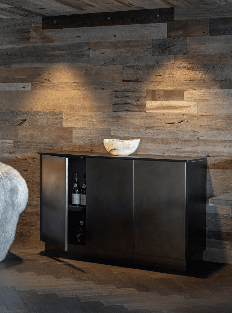
Custom steel wood stacks and the patina of brass accents throughout the house give this project a warm, inviting glow.
We caught up with Parry to understand some of her motivations and crystal-ball the future for our 2024 Emerging Designer of the Year.
HOME: University of Otago, University of Texas, marketing, advertising, clothing, and textiles — and now we are chatting to you in Italy! Tell us how so many different experiences have formed you into the interior designer you are today?
Elena Parry: My pathway to where I am today hasn’t been linear but I’ve always had a passion for interior design. I have extensive knowledge in branding, marketing, and project and client management, which has helped with creating my brand and business, managing projects with difficult deadlines, and communicating with stakeholders. I also have a keen interest in clothing and textile sciences, and what makes each fabric unique, which plays [a huge part in my] role and [in] selecting the best options for clients. Travel has always been a passion, and I am inspired when exploring different cities and cultures. We have just finished a trip to the UK, Copenhagen, and Italy, so I will be taking what I have learnt there back to the studio.
What has been the biggest learning curve since you started your own firm?
Not feeling guilty about juggling the demands of a growing business, whilst balancing the needs of family life. It is a constant juggle. And, never assume that other people know how you might want something finished! Detail is everything.
What is one interior solution you feel most proud of?
The bar area in the Queenstown project mentioned above. We had a very small space to work with, but needed to retain the view out to the mountains and fit in storage, and the ice maker, as well as retain the character of a bar and all the beautiful details that made it. I think we nailed it, and the client is really happy with it.
How would you describe your own personal interior style, or the ‘signature’ of your studio?
It includes a lot of colour, but I also love classic, sophisticated spaces that involve texture and an interesting use of materials and fabrics. I am drawn to spaces that have something a little unexpected or special that makes each project unique. When I approach a new project, I ensure that I understand the style of the home and what the client needs and what their preferences are, and from there build out the concept. No project is the same, so it shouldn’t look the same.
Panelling and cabinetry were crucial aspects of your Queenstown project; what do you think were the keys to its success?
The character of the timber was what instantly drew me to specifying it. For example, VidaSpace mentioned that, due to the panels being reclaimed from European barns, sometimes you might stumble across a bullet or two in the timber. This was perfect for the vibe we were trying to create. We had an amazing team that helped bring my ideas together. Wedgerwood was instrumental in applying the panelling to the walls, including mitring so many panels for the ceiling details. It also did all the cabinetry work. I also had a great team of builders and trades who would keep me updated with how things were going if I couldn’t be there in person.
Do you work closely with architects during early design stages? What do you think is important during that stage?
Yes, I have worked closely with architects in Christchurch, Auckland, and the UK. It is key at the early stages that the architect and interior designer are on the same page, and that they are both helping the client’s vision come to life from a practical and functional point of view. If the team is working together from the start, the client has a much better outcome and there are less surprises down the track from a budget and design [viewpoint].
What would be your dream assignment, and how would you tackle it in your own signature style?
I would love to design and build our own home one day! I’ve got a lot of ideas around what I would like, but it all comes down to the stage of life, location, and the canvas I am starting with. All I can say is there would be colour, natural stone, timber floors — and a walk-in-wardrobe just for me.
Are there any colours/materials/textures, etc. that excite you at the moment, and why?
I saw some really beautiful ideas on tiling on our recent travels around Europe, specifically high-gloss tiles at scale that have such boldness. In Copenhagen, not only do they do colour well, but [they] also mix textures such as steel and timber, which [gives] this lovely warmth and industrial feel. In London, I saw some incredible wallpapers, and hand-printed fabrics from multi-generational fabric houses that are so stunning. I think getting to know the craft that goes into each product is really special, and [gives] more meaning when discussing with clients.
Words: Federico Monsalve
Images: John Williams
Judges’ Citation
Intense use of texture combined with strong architectural elements create a successful blend of moody and rustic richness. This mature project shows a young designer — with a variety of interests — worth keeping in your radar.

