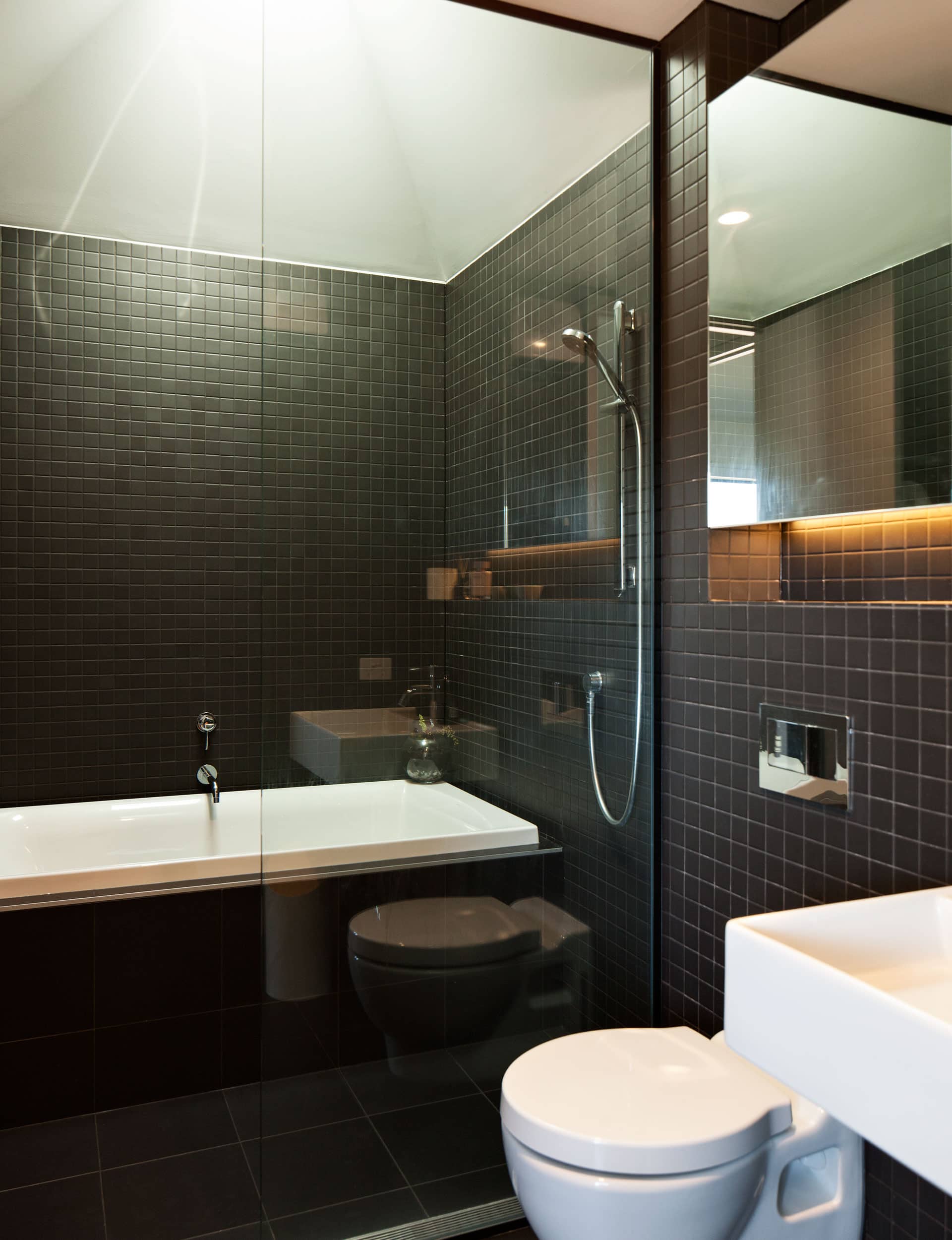
CoLab Architecture helped this family bathroom and guest WC find common ground by breaking tradition and blending the two

This family bathroom blends functionality with minimalist design
Architect: Tobin Smith, CoLab Architecture
Location: Lyttelton, Christchurch
Brief: A main bathroom in the Kelleher family home that doubles as a guest WC.
How does this bathroom differ from the bathroom downstairs?
Tim Kelleher: The downstairs bathroom has no bath; it’s mainly for our kids when they grow up.
Tobin Smith: The design veered away from the more typical approach of a separate guest powder room on the living level. Instead, we put more energy into a shared family bathroom that doubles as the guest WC. The bathroom downstairs is more utilitarian: a fit-for-purpose design.
What needed to be considered when designing this space for a young family?
TK: Baths happen every second night for the kids, so it’s a happening place. The bathroom is functional. We were looking at a fixed shower head, but someone convinced us we’d need a detachable shower head for cleaning. I scoffed at this as I thought whatever looked best would suit us. Now we are often hosing off sand, dirt or whatever else you can imagine our kids find themselves in. But, as practical as the detachable shower head is, there’s the nagging thought of something minimal.
The sculpted ceiling over the bath emphasises the space and funnels natural light into the centrally located bathroom. How did the idea evolve?
TS: We wanted to do something more dramatic than a simple square skylight cut into the ceiling. Tim was very trusting. I think it’s awesome!
The wet area conserves space but appears more generous than a shower over the bath. Tell us about it?
TK: This has been really useful. At bath time, the kids splash around a lot. The bath and shower don’t feel like two things in the bathroom – they work as one.
TS: This idea is common in Japan, where washing and bathing are associated but often separated. The end of the bathroom becomes a wet area that utilises the long narrow space, but also helps contain the mess of young, enthusiastic bathers.
Get the look
Basin Teorema by St Michel. Bath Kohler. Lighting Built-in LED and recessed lighting. Tapware Minimalist by Methven. Tiles 46mm matte black from Reptiles. Vanity Maelstrom Joinery. WC Kohler.
Words by: Penny Lewis. Photography by: Simon Devitt.
[related_articles post1=”49019″ post2=”49884″]


