Architect Pip Cheshire discusses one of Auckland city’s most ambitious apartment precincts now in phase two of development
The first stage of SKHY refitted an existing 1970s tower: this is more low-rise. How did that shape the project?
The tower sets the scene; it’s a robust and sculpted form and we develop that way of making space in the low rise buildings. The buildings step down from the height of the tower to join the neighbouring street frontages and in doing so bring the occupants of the low rise apartments into closer relationship with the garden courtyard and streets beyond.
You’ve called it ‘urban acupuncture’.
Just as the insertion of a small needle can have effects well beyond the point of penetration, so might the insertion of a carefully thought out mixed-use development have an effect on a larger area, in this case a bit of the city that has been beaten up by traffic planners over the last few decades. SKHY is not alone up there of course, but just as acupuncture uses a number of needles, SKHY will add its significant presence to the regeneration of this very interesting bit of the city.
How did you anchor it to the surrounding area?
I think the area is anchored to the building! The site is in such a commanding position on the hilltop. The building was cloaked, its energetic modelling concealed behind accretions from the last few decades. We have taken the shears to in a process of editing and reduction and in so doing strengthening the aesthetic.
How did you balance the industrial with the domestic?
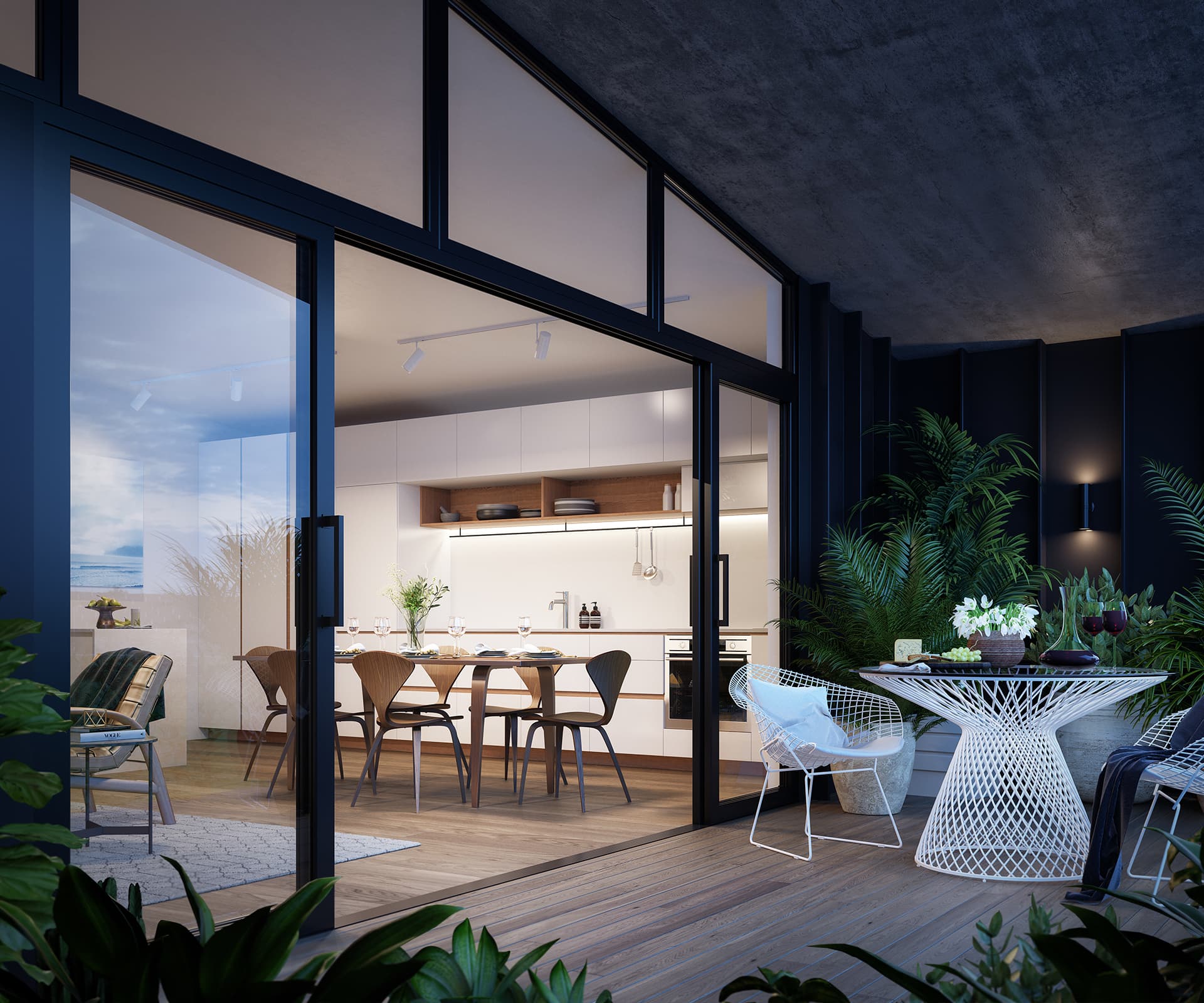
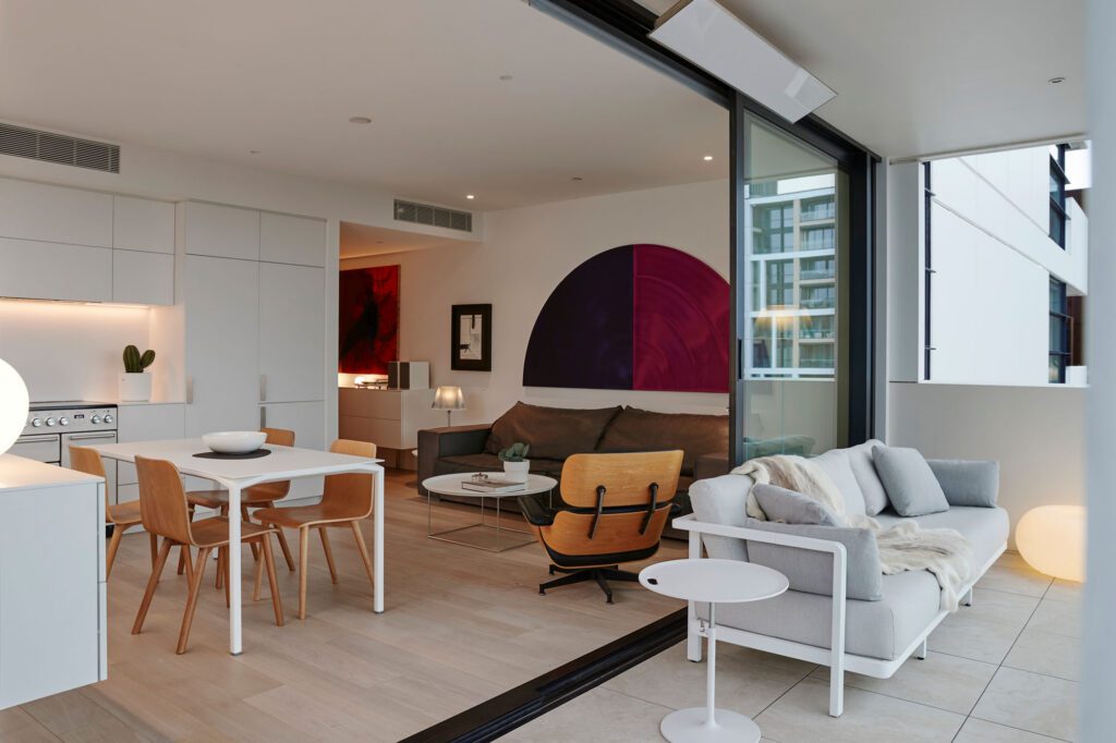
The aesthetic is a response to the tower’s revealed structural skeleton: the revelation of as much of the buildings’ bones overlaid with comfort, style and warmth – an approach we’ve variously called ‘humble special’ and ‘the raw and the cooked’. We maximise storage to house the essentials of urban living and make sure everyone can see the full moon.
Scroll to take a closer look at the apartments
