Despite the tight budget, limited space and little natural light, these bathrooms have a luxurious feel. We get the design details from architect Christopher Beer
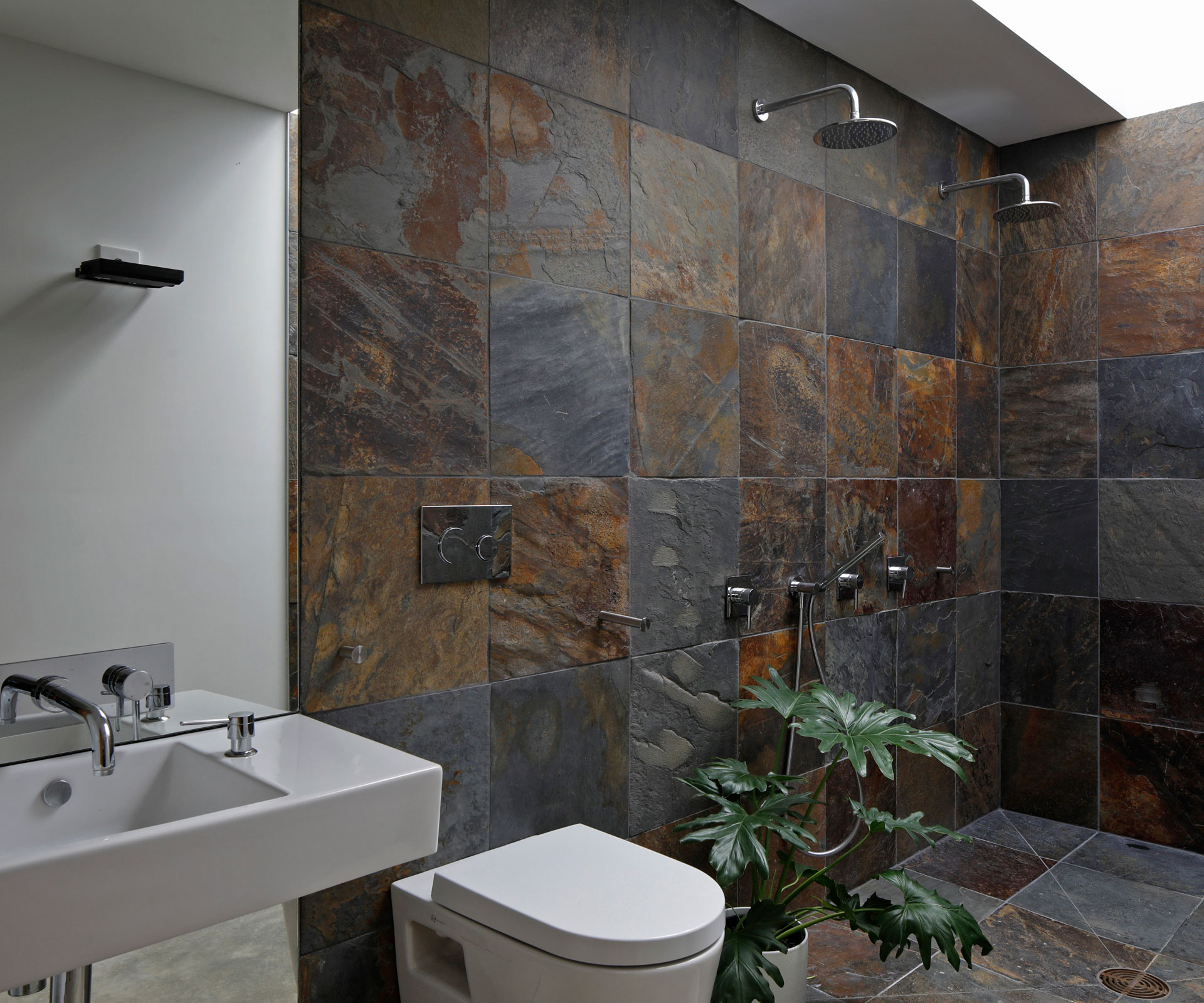
Slate tiles give this Cambridge bathroom a rustic connection to nature
Architect: Christopher Beer
Location: Cambridge, Waikato
Brief: Create two luxurious internal bathrooms while working to a tight budget.
You’ve used slate here, which you’ve used elsewhere in the house. What was the attraction?
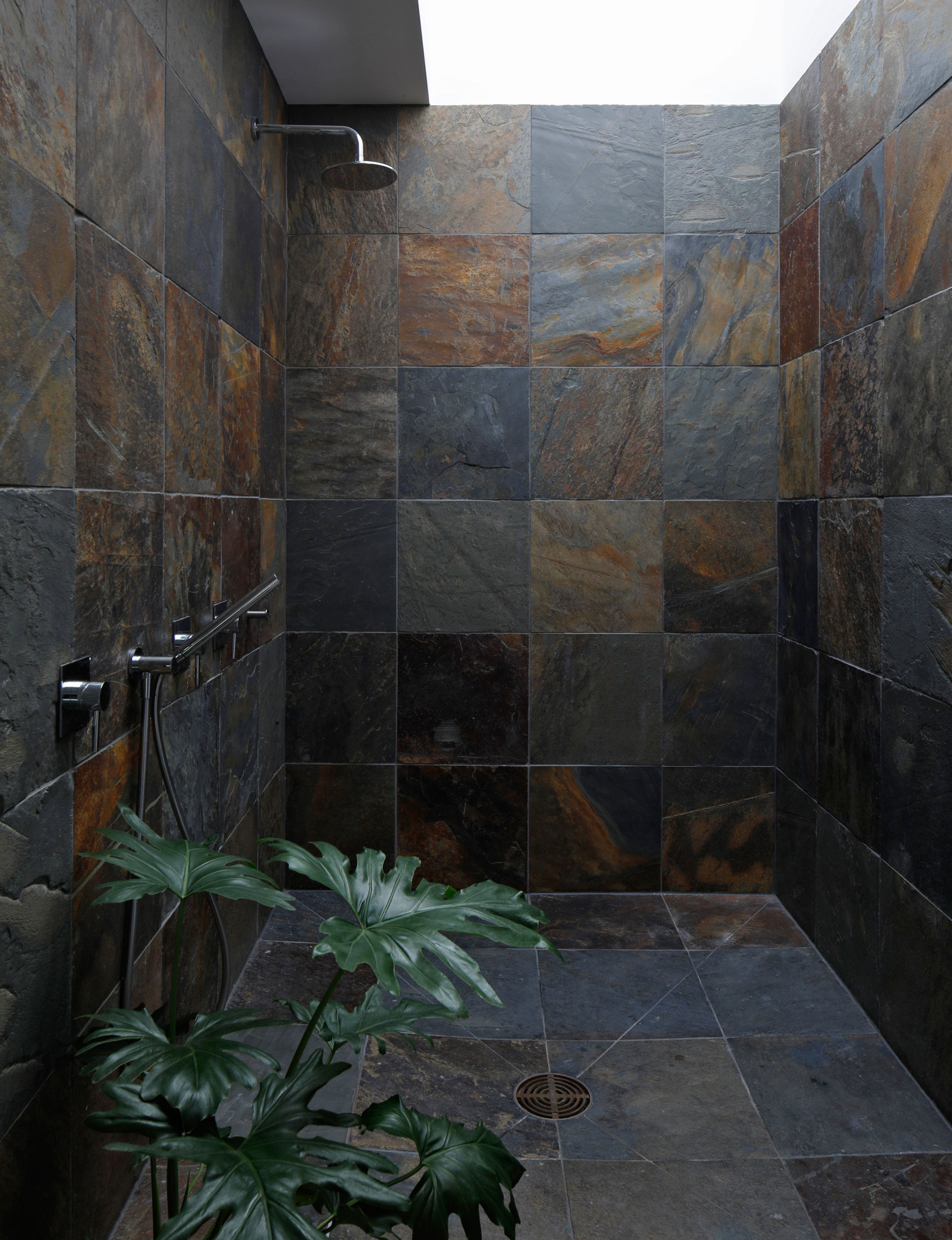
Slate is fantastic material because it’s so authentic: just tiles split from natural stone. Visually, it conveys both luxury and rusticity and, when used in a bathroom, brings warmth to a space which can often feel overly cool and slick. Standing on its rough and uneven surface brings a natural, primal feeling to showering – like standing on a rock beneath a waterfall.
The two bathrooms are internal. How did you get light into the space?
Large skylights are used, which flood the spaces with a beautiful, diffused natural light. We were working within a tight budget, so the skylights were created using simple, low-cost materials: corrugated polycarbonate roofing above with a flat, twin-wall polycarbonate sheet beneath.
Tell us about the door from the bedroom – there’s no handle?
We wanted the shower room to be private and feel quite separate from the bedroom, so the door is disguised from the outside as a weatherboard-clad wall. Being handle-less reinforces this appearance, and to open the door, one simply pushes (in the right place) and enters the room – the door self-closes behind.
Bathrooms are expensive and the budget was tight, yet the results feel luxurious. How did you achieve that?
Luxury can be conveyed by visual elegance and simplicity, and also through the feel and substance of fittings and surfaces. The budget was allocated accordingly, and firstly focused on things that are seen and touched – quality tapware and tiles. Slate is used extensively to envelope and imbue the space with that sense of quality and luxury.
There’s no cabinetry around the sink. How did you deal with storage?
Functionality is important with small spaces, so we located storage within a wall to the side of the basin, behind full-height bi-fold doors. These doors fold open to reveal floor-to-ceiling storage, and their location means that they can remain open while the room is in use. The doors are flush with the adjacent wall surface, so when they’re closed they’re invisible, giving the room a clean, uncluttered appearance and enhancing the feeling of spaciousness.
[gallery_link num_photos=”10″ media=”https://homemagazine.nz/wp-content/uploads/2017/04/img6-2.jpg” link=”/inside-homes/home-features/courtyard-home-in-cambridge” title=”See more of this home here”]
Photography by: Patrick Reynolds.
[related_articles post1=”69758″ post2=”69150″]
